We all know the looks of suburban homes built in the early 2000’s. Basically they are mini-McMansion type homes, with open plans and high ceilings.
I’ve been getting some questions coming in with homes that have travertine tile and even though I’ve posted so much about how to update your look if you have that flooring, people still need personalized answers.
Today I’m sharing two examples of questions that I recently looked at, below.
My blog contains affiliate links. Any purchases, at no additional charge to you, render me a small percentage, are most appreciated and make this blog possible. :-)
Dining Room in Home #1 - Stuck in the 2000’s
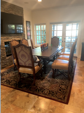
This homeowner had a problem with how to update their dining room, while keeping most of their furnishings and the travertine tile floor as is.
This Tuscan style with a travertine tile floor needs a bit of an update to have a more timeless appeal. carlaaston.com
You can see the travertine tile floor and a stacked stone fireplace. This space is open to other areas of the home, obviously, because of the tv over the fireplace.
I like that they lightened up the paint, it looks fresher already. She said it is a warm white. With a muddy beige paint color on the walls (like most homes did in the early 00’s), this space would really be stuck in time.
She wanted to know what kind of rug would be a good to replace this one and what to do about the dining chairs.
I think these are good places to consider for a change actually, so A+ to her for realizing that!
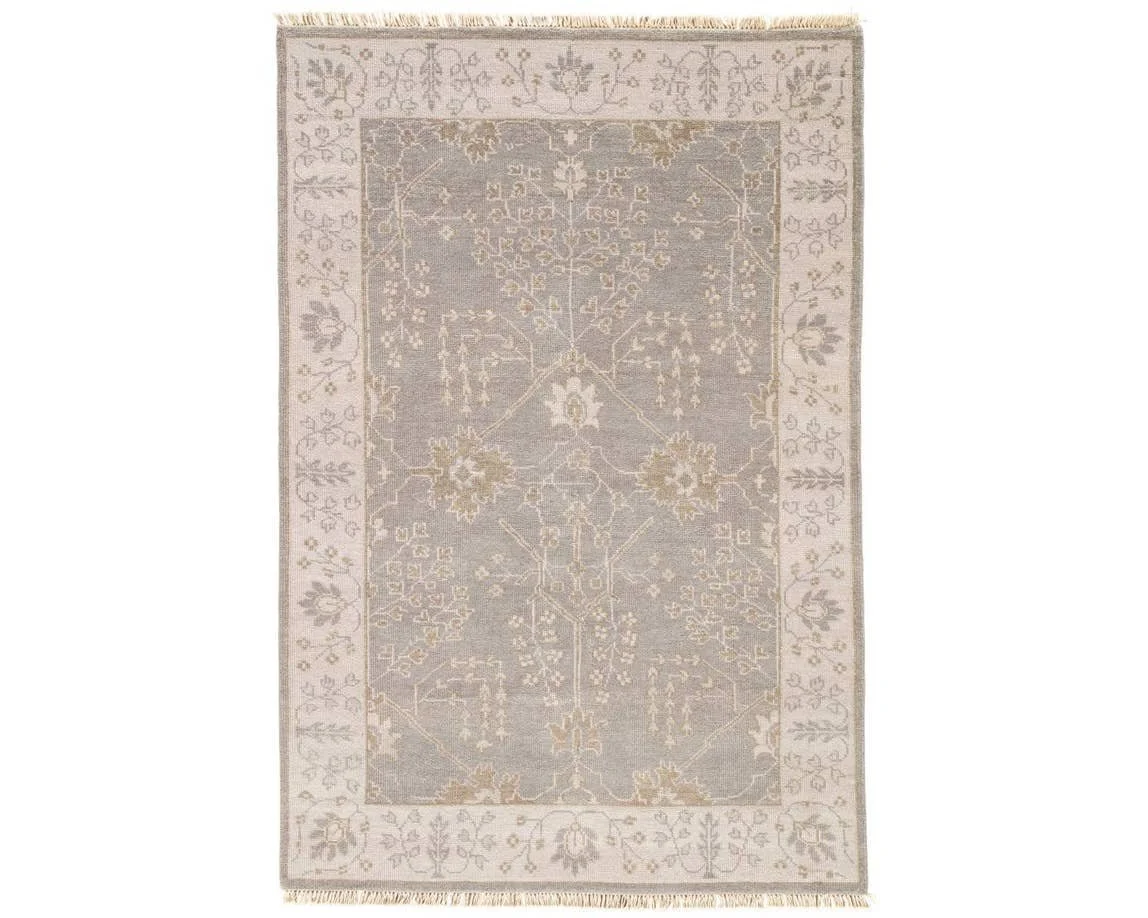
Here are a couple of rugs I would suggest. I like Oushaks in a lighter color for this room. They would work with the style of furnishings but have a fresher look. (Click on the rug pic for a link.)
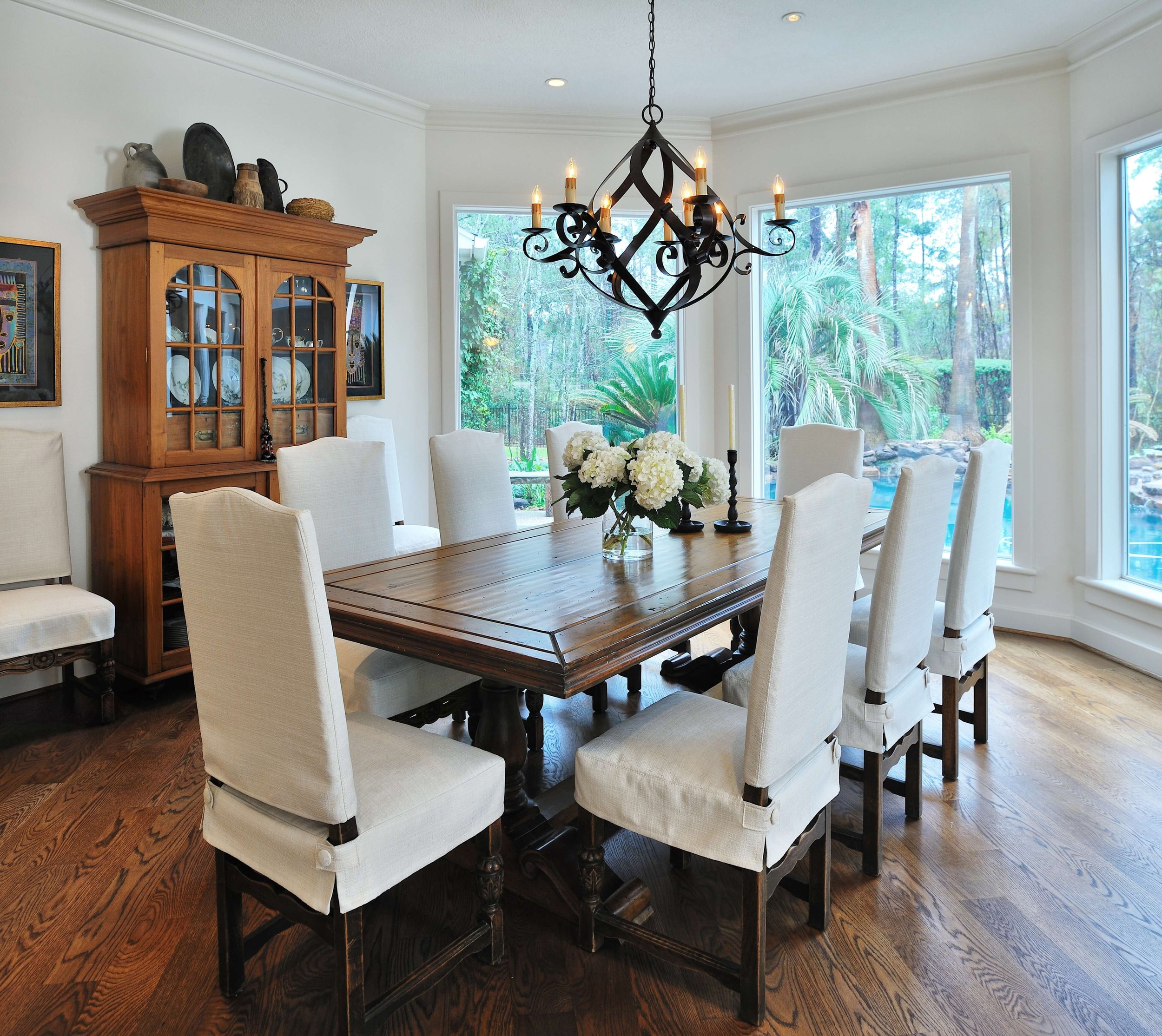
I would then just slipcover the backs of the chairs. I like the idea of not having the exposed wood frame on those backs and it looks like those light leather seats are in good condition and really not worth changing.
This home I worked on more than 10 years ago had a similar style table and chairs and we opted for custom linen slipcovers that ended up working great.
An updated Tuscan or “old world” style dining room that has a more timeless appeal. carlaaston.com
I think making those two changes would give that dated dining room look a refresh that has a more timeless appeal.
Flooring and Furnishings Changes in Home #2 - Stuck in the 2000’s
The biggest problem with this home is the multiple flooring materials used. While a travertine tile like this is not used that much anymore throughout the living spaces of a large home, I do think it would be fine to keep this travertine tile.
Pro Tip - Wood flooring retains its value longer in homes, adds more value to a home overall and renders more flexibility in the years ahead with opportunity for refinishing, etc.
The reason I would recommend keeping this is that there is cheaper, more dated tile in the kitchen that really needs to be replaced and carpet in the family room beyond that. There needs to be consistency and the flooring in the kitchen and family room need to be brought up the level of the quality of the home, in my opinion.
The homeowner was not looking to replace all the existing travertine anyway. Therefore, I recommended that she just add that travertine floor tile all the way through the kitchen and then the family room.
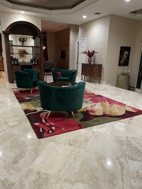
Living room with travertine tile flooring
The homeowner was getting some new furniture but needed a bit of direction here. carlaaston.com
The homeowner was getting some new furniture but needed a bit of direction here. carlaaston.com
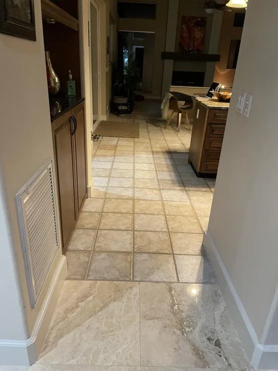
Transition of travertine to tile flooring at kitchen, with carpet beyond in family room.
Not crazy about the transition from the travertine floor in the living area to the smaller porcelain or ceramic tile in the kitchen. It would be better all one material, and definitely pick the higher end of the two, the travertine. carlaaston.com
I would take the new travertine tile floor in the kitchen on into this family room as well. carlaaston.com
The other question she asked me was about furnishings in the living room. She didn’t know what type of rug to get. She was looking at moving to some blue tones for this space and wanted to do a statement blue sofa.
I recommended a large, oversized rug, in a design something like this. That will help to soften this space a bit. I don’t like the idea of having an all blue, more solid rug in this case, but a look with more of a melange pattern would work well.
Then, I suggested she paint the raised ceiling area in a blue color that would work with the sofa to spread that color a bit around the room.
I’m thinking some curvy furniture like a large serpentine sectional with some swivel chairs might be nice in this big open room. I shared lots of examples of these from Highpoint Market this past fall.
Long, curved sectional sofas seen at Highpoint Market 2021. These were popular and many showrooms displayed them on their floors. carlaaston.com
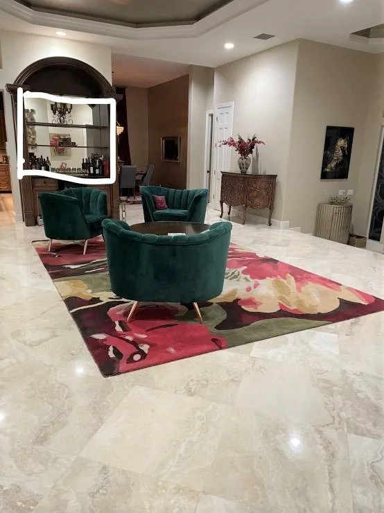
I’d also replace the mirrored wall behind the bar that really just reflects the light beige walls and makes that space feel like a pass-through. I’d have that become a visual destination with some blue color in a tile backsplash there to speak to the new color scheme and give that area some interest.
With mirrors, you always have to be more conscious of what they are reflecting than almost anything else. I’ve written a post on my top tips for selecting the right mirrors and the best locations.
I outlined that space in white, below.
See how that mirrored backsplash wall at the bar makes that space appear all open or see-through? It’s because it reflects only the beige walls that are all around the room. carlaaston.com
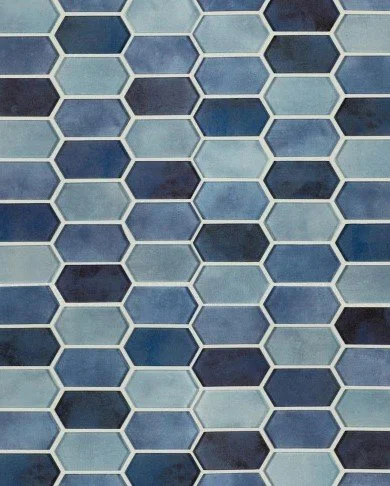
I like a glass tile in a melange type look. This mosaic tile might be a good option for that wall. Works well with the rug too.
I really like when color or finishes are repeated around the room. It just reinforces the look and style you are trying to create.
Do you have a home stuck in the early 2000’s? You might want to take a peek at my Designed in a Click™ service to help give you some suggestions like these above. I’m taking openings in February currently. You can submit now, but I won’t be able to answer until mid-Feb, after KBIS, the national kitchen and bath show.
I have lots of tips and thoughts on choosing flooring for your home in this downloadable pdf book. Before you go and make a big investment in new flooring for your home, you might want to check it out.


