Today, I’m sharing a home tour of a remodel project that I worked on years ago.
This job was resting on a page in my site that isn’t in my blog, and I’m kind of resorting things and updating a bit and wanted to get it in here and really, just rewrite the story.
I did a little editing of photos to get them up to today’s brighter looks. I updated the layout too, the images were really small and the copy rather long-winded, on the previous page.
It just didn’t reflect the way I share my projects anymore considering everything I’ve learned about blogging and publishing in the last 10 years.
So, I thought it would benefit from a new format. :-)
Why this Remodel project is worthy of a reboot
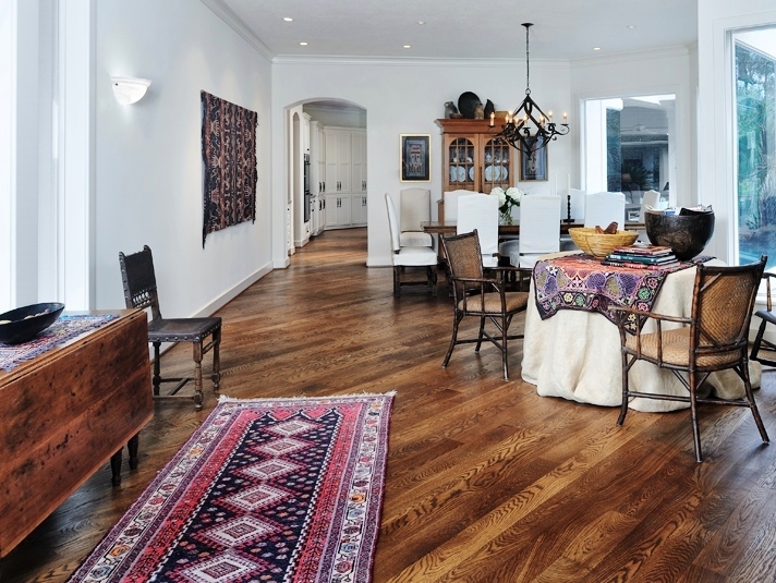
What I loved about this project was how we simplified the envelope to create a soft, clean but rustic backdrop for this homeowner’s collections and art.
We incorporated one of my favorite techniques for simplification in an interior, painting walls, mouldings, and ceiling the same color. I still do that often on projects.
I think this one stands the test of time and find it really interesting to go back and see how this project fares today.
Beaded purses in plexi boxes as wall decor | Boho style
Today…..a “boho” style?
While the word “boho” wasn’t commonly used as a style for interiors back then, but it kind of comes to mind today when I look at this project.
The homeowner had lived overseas many years and was a textile artist herself, so her interest in hand woven items and objects with history, texture, and pattern from around the world, was keen.
It definitely has a global, collected vibe.
Before And After Photos of the living and dining room
BEFORE remodel - tile path with carpet needed an update in the living and dining room.
Here’s a “before” photo of the living and dining room. It had a tile path on one side of the space and then carpet on the side where seating was to be.
Everything was a little pinkish in color tone too, the tile, carpet and paint. It just didn’t vibe with the richness this homeowner wanted to convey and didn’t make a good backdrop for her collections and style.
Rather limiting and dated, wouldn’t you say?
Adding the wood floors and paint in a warmer white really helped create a more appropriate backdrop.
In the dining room, all the wood furniture with the wood flooring would have been a bit overwhelming. However, the white linen slipcovers we did on the dark upholstered, Mediterranean style chairs, gave them a fresh new look.
The homeowner had those made in a simple style and as a result, they don’t look dated at all.
Kitchen And Family Room
BEFORE Remodel - Whitewashed cabinetry had turned orange/yellow over the years, tile floor was dated, wonky island had to go. #kitchenremodel #hometour
The kitchen and family room, just beyond the dining room there, had the same paint color and tile, and the whitewashed cabinets had turned rather pinkish-orange over the years.
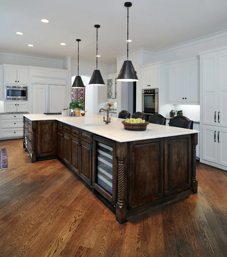
We knew we wanted to redo the island because of its wonky shape. The space was so big too, we knew the island could be bigger and dropping the raised bar would really give it a more central focus in the space.
As it was, the raised bar kept that area behind the bar as more of a pathway, like the tile path in the living/dining room.
We wanted this space to feel more like a destination and a place where activity was centered and people were encouraged to gather around.
BEFORE Remodel - Whitewashed cabinetry had turned orange/yellow over the years, tile floor was dated, wonky island had to go. #kitchenremodel #hometour
Painting the perimeter cabinetry cleaned up the look and redirected the focus to the contrasting island.
We brought that focus down to this space with a dark wood finish that repeated some of the wood furniture style scattered throughout the home. Capping the island with a lovely textured, leathered shellstone counter invites you to touch and notice the countertop in the space.
BEFORE - The tv cabinet or entertainment center was quite dated and needed a remodel. #tvcabinet
The family room had a built-in designed for a tube style tv, which had to go.
The color of the wood here was the same as the kitchen, but there was so much modification that needed to happen for a flat screen tv, it wasn’t worth keeping and painting.
We went with a stained cabinetry here to repeat the look of the kitchen island.
The other side of the living room and entry had a short hallway with the study, powder room and master suite.
Let’s take a walk down there.
I love how this image really shows all the white envelope so well, and how the interesting collections of the homeowner really feature within.
We added new wood doors, in the remodel, that repeat the floor finish. They bring a warmth and quality that enhances the furnishings.
Study / Home Office
BEFORE - Home office built-ins
In the home office, we painted, did the wood floors, painted the cabinetry and added a stained wood top to the built-in.
In hind sight, I might add some textural wallcovering to the backs of the upper cabinet and then the “backsplash” area above the counter.
Back then we totally maxed out the budget and didn’t have extra for something like this, but it could be added in at any time, right?
BEFORE - The extra cabinetry in the powder room wasn’t necessary for this homeowner. Removing that created a more elegant style for this bathroom. #bathroomremodel #powderbath
Powder Room
The powder room was also the pool bath, and had the exterior door there and a tall cabinet for pool towels and such.
The homeowner, however, didn’t need that extra storage, so we did a new cabinet here and made the space a bit more elegant with a limestone counter, sink and backsplash.
That quatrefoil mirror was custom made. We couldn’t find anything like it in the size needed for this space.
BEFORE master bath remodel with fake columns and big cultured marble surround | #bathroomremodel
Master Bathroom
The master suite got the same paint, wood doors to the bathroom, and then we cleaned up the look in the bathroom by removing the columns and the big tub with it’s surround.
I love the ledge we built on the back wall, taking the stone floor up to the slab limestone top there.
It provided a beautiful backdrop for the tub and the homeowner’s dark toned finds.
The Moroccan fixture in the center of the bathroom gives off a unique pattern at night in the soft, curved space.
A place for the kitties!
Previously, the cat litter box rested in the unused big tub, but we couldn’t have that anymore.
We filled in the unused kneehole space in one of the two vanities for the box and opened up the side for the kitty entrance. It worked beautifully and I’ve done this kind of thing in several jobs since.
Kneehole space in cabinetry that was made into a cubby for the cat box | #designingforpets #catbox
Cat box to be used in the new cabinet , with exit out the side wall. #catbox #designingforpets
Bathroom cabinetry was modified for the cat box cubby with an exit out the side wall. | Carla Aston, Designer | Miro Dvorscak, Photographer #remodel #cabinetry #designingforpets #catbox
This little hallway heading to the shower stall showcases a homeowner rustic piece and keeps the creamy white envelope going.
The woven wood shade brings some of that natural element up into the space and gives privacy with a top/down opening lift system.
Hallway to the shower in the master bath has a spa-like feel with a rustic stool. Carla Aston, Designer | Miro Dvorscak, Photographer #bathroomremodel #spalike
So, did you like this little walk down memory lane with me?
I think all the remodeling work we did here stands the test of time and continues to showcase the homeowner’s unique pieces in a thoughtful and simple way.
It’s interesting, I’ve worked on several homes in this area from this same original builder since this project.
This builder used lots of angles in the floor plan, the mouldings were super simple, chubby and big, the cabinetry was a wood finish, etc. You can really see the similarities in style between the three houses in the before images.
This remodel was updated for resale last fall.
There is a kitchen featured in this post with several others, see if you can guess which one it is? :-)
Oh, and he loved wonky islands. :-)
Sign up below for more remodeling and design goodness coming straight to your inbox every week. :-)


