One of the handiest decorating tools available that can add so much to an interior is a well-placed, beautiful mirror. When you are choosing mirrors for wall decor in rooms other than bathrooms, the frame, size, shape and several other factors play into the selection process.
I have to say, one place where clients can get really bogged down in their final decision-making on a project is when it comes to art or wall decor.
I can recommend pieces I think will look great all day long, but clients can get super particular when it comes to style, color, subject matter, etc. regarding the items they will hang on their walls. I understand, they want their art or wall decor to speak to them and have meaning, not just look good.
Save this decorative mirror selection guide for future reference!
As a result, I often make lots of recommendations for decorative mirrors.
I love them over consoles, in entry halls, dining rooms and bedrooms, anywhere they can reflect light or something interesting. I think almost any room can handle a nice decorative mirror and honestly, it’s a much easier decision for the client.
Using beautiful mirrors in some strategic places can minimize the more challenging selection process of artwork, with the guidelines I’ve shared below.
At the bottom of this post I share one of my favorite places to use mirrors in a bedroom.
My 5 best tips for selecting mirrors for wall decor
1) Overall Size
Size matters here. I love going larger, but really it is about how the mirror fits into the wall space. If you have a tall wall, a taller mirror is definitely in order. I love using “floor mirrors” on tall walls, above a piece of furniture. They can really make a statement.
I used full length or “floor” mirrors that were 72” tall in this living room with high ceilings in the Seasonal Living Showhouse. They scaled out nicely over a console and above the piano on the adjacent wall.
5 Tips For Decorating Blank Walls with Mirrors | Don’t be afraid to go with really tall floor mirrors in two story spaces, hanging on the wall like I did here. They should scale with the room. carlaaston.com
5 Tips For Decorating Blank Walls with Mirrors | carlaaston.com
5 Tips For Decorating Blank Walls with Mirrors | carlaaston.com
I also recommended exceptionally tall mirrors above the consoles in this wall decor Q&A as this space was a two story room.
5 Tips For Decorating Blank Walls with Mirrors | Don’t be afraid to go with really tall floor mirrors in two story spaces, like this one. They should scale with the room. Click through to see what I recommended for this living room fireplace wall. carlaaston.com
5 Tips For Decorating Blank Walls with Mirrors | carlaaston.com
5 Tips For Decorating Blank Walls with Mirrors | carlaaston.com
This tall mirror was used effectively above a console in an antique shop with high ceilings.
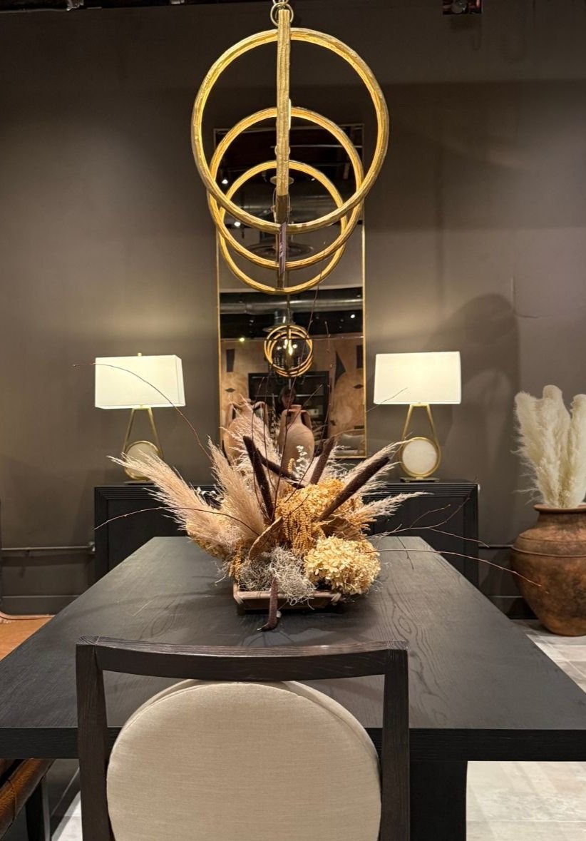
A really tall, oversized mirror was used above a console in this warehouse type showroom with high ceilings at Highpoint Market. It made for a dynamic reflection of the high ceiling, the light fixture and the wall across the room.
2) Mirror Frame
If it’s not really about the mirror particularly, if it is more about finding something decorative for the wall, then I will usually make a statement with an interesting framed mirror.
While a thin, plain frame might be great in a bathroom to get maximum mirror space for make-up and shaving, in a big open room like a living room, dining room or entry hall, you might need something more. Often, a bigger frame with more detail or color will make for a more interesting look and add to the decor of the room.
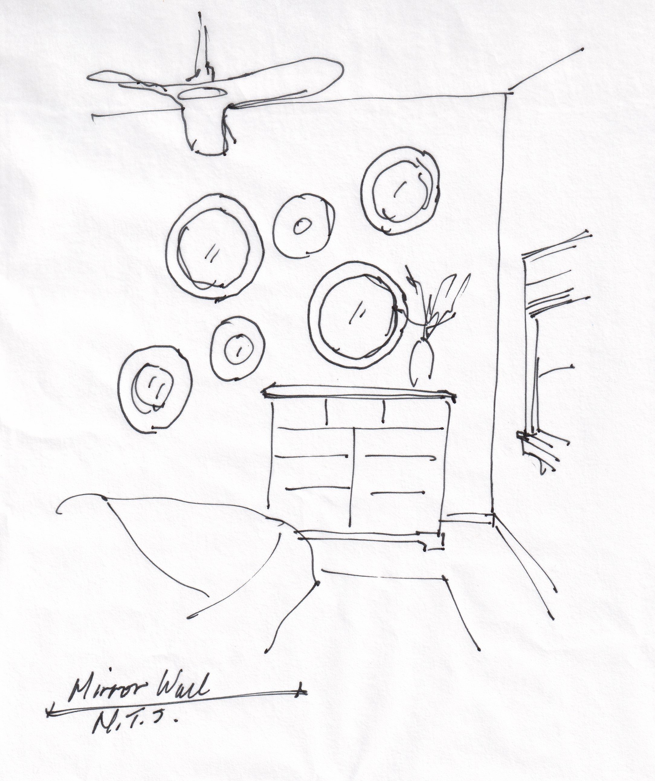
In this Designed in a Click™ consultation, I recommended a wall of round mirrors with more substantial frames as this arrangement was really about the shapes and layout more than the reflective quality of the mirror.
BEFORE - Blank wall in bedroom with one small round sunburst type mirror.
I suggested a collection of round framed mirrors with wide frames to fill the wall and accentuate the asymmetry of the look. 5 Tips For Decorating Blank Walls with Mirrors | carlaaston.com
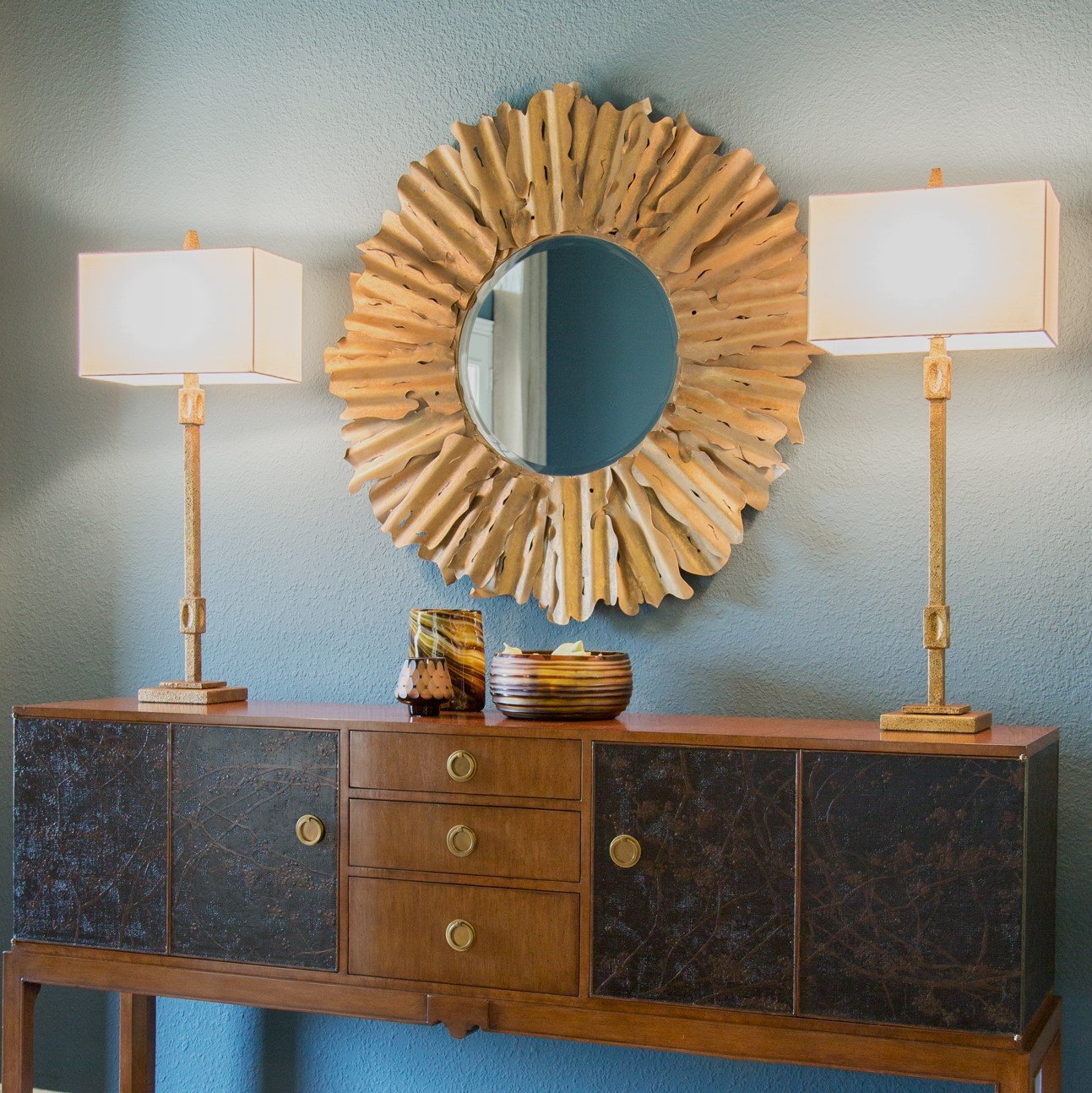
Here’s another wide framed round mirror with an interesting metal detail. Having the reflective quality is nice, but the gilded finish and the mass of the frame against the blue/green wall makes the big visual statement here.
5 Tips For Decorating Blank Walls with Mirrors | carlaaston.com
Here’s a thick rattan frame that makes a bold statement, seen at HPMKT, last spring.
5 Tips For Decorating Blank Walls with Mirrors | carlaaston.com
This decorative filigree mirror seen at HPMKT last spring was definitely all about the intricate detail.
3) Shapely mirrors add interest
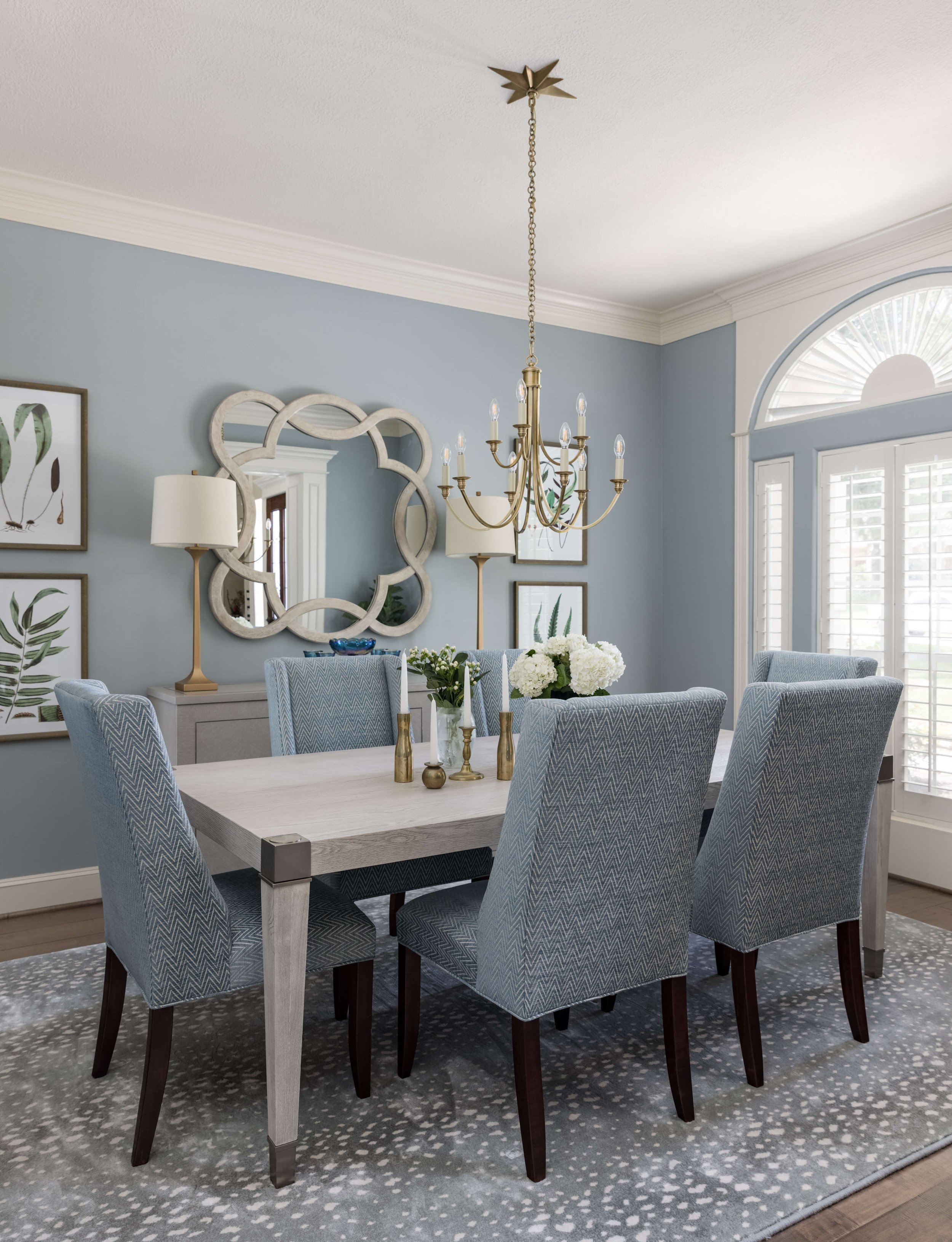
I love unique shapes, like this scalloped edge in the dining room and then the shapely pair of mirrors flanking the fireplace below. This breaks up the wall nicely and adds a lot of interest. It looks a little more special and unique too.
5 Tips For Decorating Blank Walls with Mirrors | carlaaston.com
5 Tips For Decorating Blank Walls with Mirrors | carlaaston.com
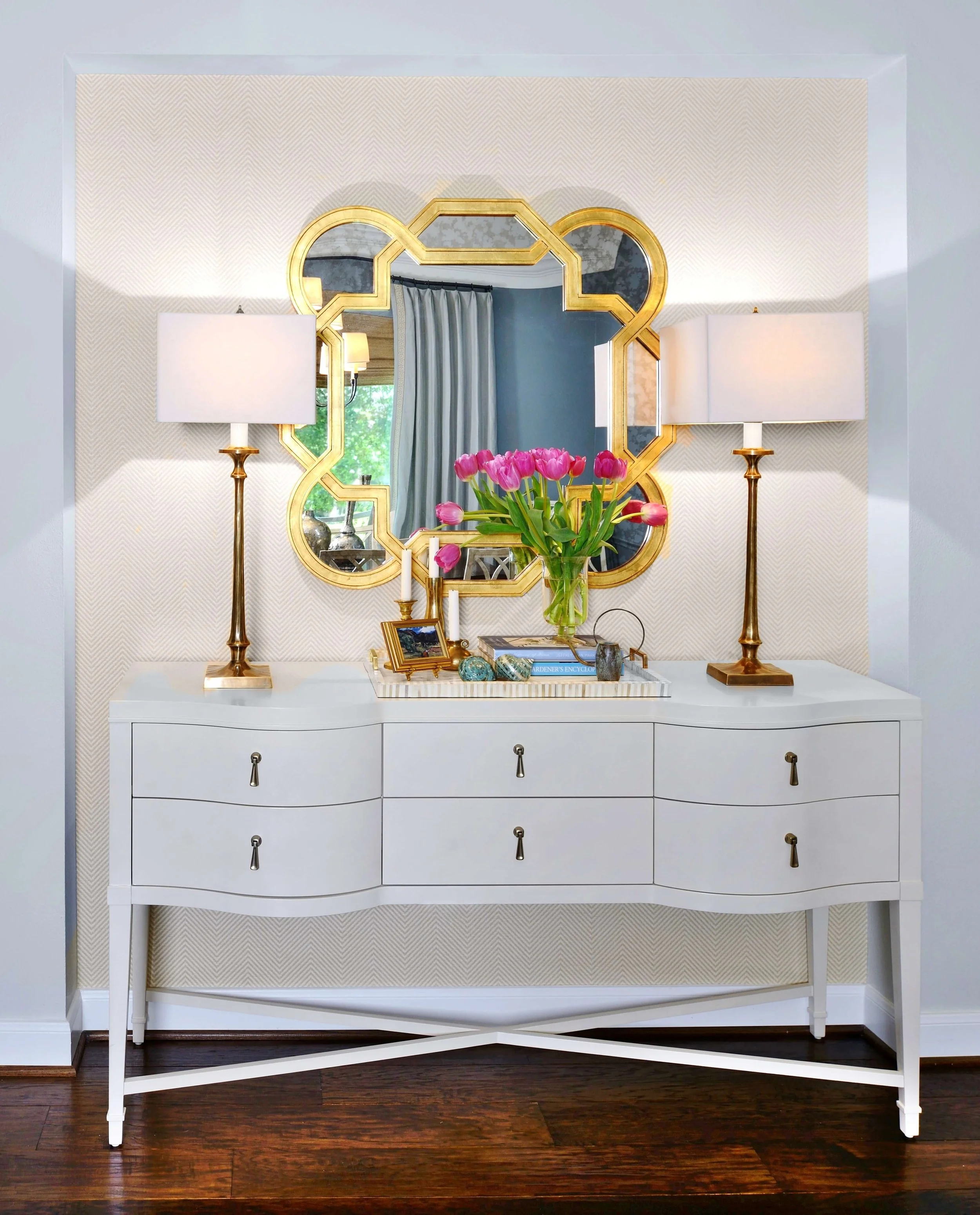
Here was another scalloped shaped mirror with a gilded finish that stood out on the light grasscloth wallcovering.
5 Tips For Decorating Blank Walls with Mirrors | carlaaston.com
A lovely oval mirror seen at HPMKT this past spring. 5 Tips For Decorating Blank Walls with Mirrors | carlaaston.com
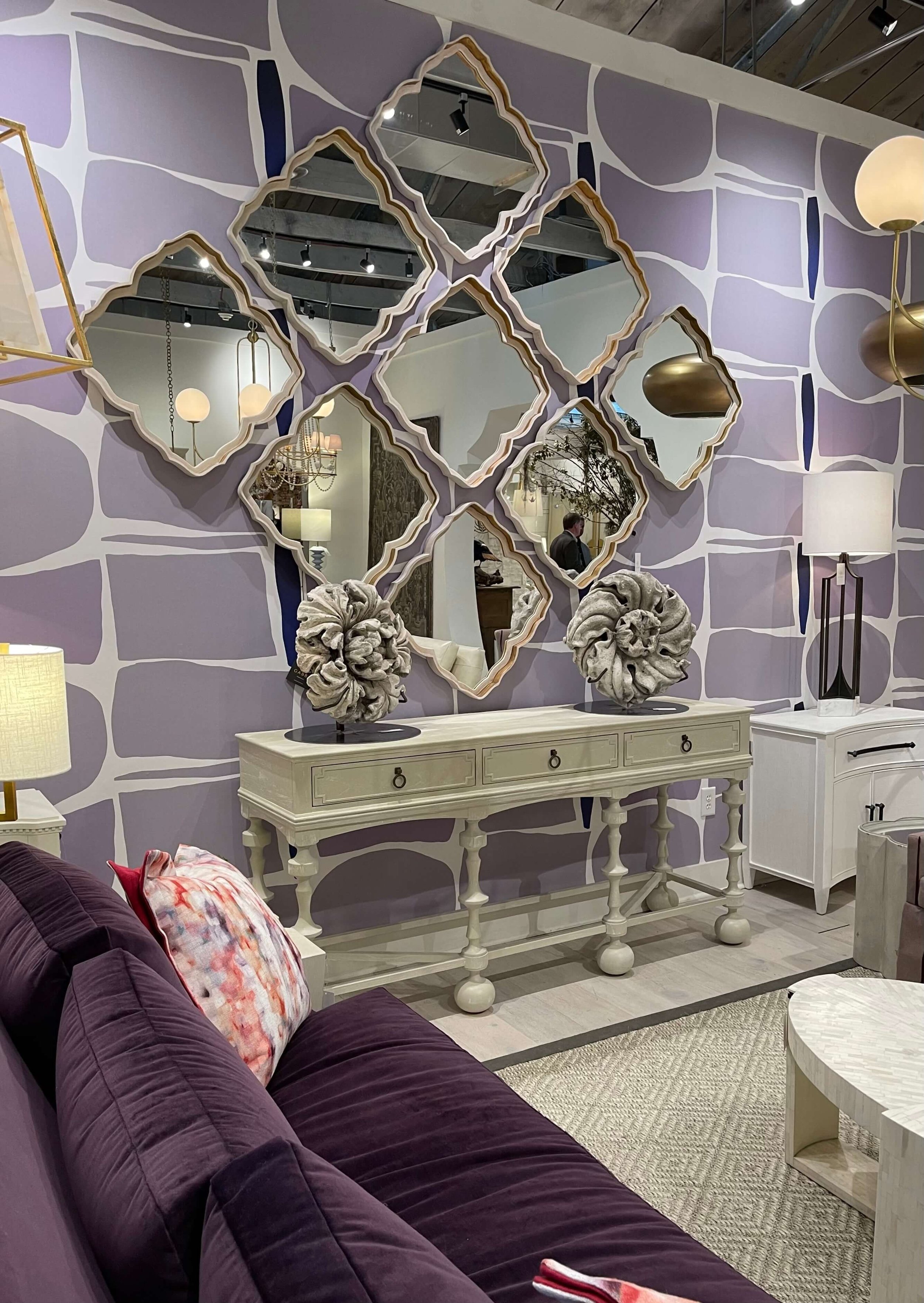
Round shapes really appeal to me too and can be a nice contrast to a square or rectangular shaped wall space.
These round shapes look like bubbles popping up behind the sofa and create movement and interest in a deep, blank corner.
I love the grid that these mirrors create and how they line up with the banquette. It has the appearance of being a banquette built under a window.
4) Contrast with wall color or tone
The interesting trellis design of this mirror, below, is made better by the considerable contrast between the dark wall and the white frame.
5 Tips For Decorating Blank Walls with Mirrors | carlaaston.com
If you are doing a simple small frame, contrast with the wall color or with the wall color that is opposite the mirror.
When small or thin mirror frames blend in to the wall and reflect that same color back, the mirror is rather lost and doesn’t come across as much of a distinctive visual presence.
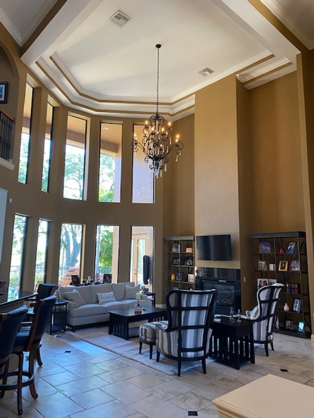
Here’s a Designed in a Click™ consultation I did where the homeowner had a round mirror with a simple thin frame. She had a tall ceiling here and I felt it looked a little spare.
I ended up suggesting that she paint the wall an accent color, like a blue-gray, to make the round shape stand out more on the wall. It would be a round bright spot on the darker wall. (Some small stool ottomans would work below the console too, to create a more filled in appearance and add some softness at the tile floor.)
5 Tips For Decorating Blank Walls with Mirrors | carlaaston.com
5) What is the mirror reflecting?
You really must be particular about this. I witnessed a major design faux pas with mirrored surfaces in a public bathroom many years ago and I’ll never forget that lesson learned! Always consider what is opposite the wall where the mirror will be hanging.
I love this round mirror mounted in the square paneling with a substantial gilded frame finish. It beautifully reflects the chandelier and bounces the light back into the room.
5 Tips For Decorating Blank Walls with Mirrors | carlaaston.com
In this dining room, below, the homeowner was going for a simple, clean-lined look.
I selected a thin metal framed oversized mirror as it reflected the white plaster chandelier silhouette against the navy blue room opposite this space. That broke up the wall visually and made a strong but simple visual statement.
5 Tips For Decorating Blank Walls with Mirrors | carlaaston.com
This was a project done some years ago, pictured below. I always loved how these vertical mirrors reflected the light from the window and entry.
Not only did they do that perfectly, but they added a wood element to the room with the framing. The trellis grid related to the pattern in the drapery fabric and added an architectural design to the space.
5 Tips For Decorating Blank Walls with Mirrors | carlaaston.com
Lastly, a mirrored wall to finish off this post and one of my favorite places to hang mirrors!
In this showroom at Highpoint Market, this wall takes center stage. It is so dynamic and creates a memorable, showstopping moment.
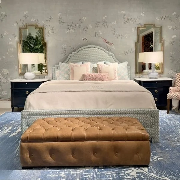
One of my favorite places to hang mirrors is above nightstands in a bedroom. They really add an extra layer and brightness to the room, by reflecting light either with the lamp or from the windows.
Here’s a beautiful set up seen at a High Point Market showroom this past spring.
Here’s one of my projects where the mirrors really reflected the light into the room placed above the nightstands.
Wall Decor Masterclass Guide
Need more tips on what to hang on your blank walls? My Wall Decor Guide is just what you need to figure it all out for yourself.
It’s full of tips, real life case studies and has many different challenging scenarios presented to help you select, arrange and hang anything on your blank walls! :-)


