I recently had an email consultation for a primary bedroom that needed some finishing touches. This homeowner had a great start, but it felt unfinished and didn’t wow her when she walked into the room.
This is a great example of my Designed in a Click™ consultation service, where I can help give you some new ideas or suggestions that you might not have thought of before. Sometimes people just use me as a sounding board too, to run their ideas by. I’ve even had other designers use this service, to help them get over a hump in their own projects.
Sometimes we are just too close to the problems to see the best solutions, you know?
Whatever the reason, I like doing these as they help me see what problems people have so I can tailor my blog with design solutions that readers can relate to. I’m a big picture, problem solver at heart, which is really the one major advantage to hiring a designer for your project. These feel like design exercise to me. :-)
So, let’s talk about this primary bedroom and what had this homeowner stumped!
My blog contains affiliate links. Any purchases, at no additional charge to you, render me a small percentage, are most appreciated and make this blog possible. :-)
Primary Bedroom Design Dilemmas
Here were the pics of all the bedroom walls. She felt it was a little lackluster and wanted to know how to deal with some of the blank walls. The window/door wall was right across from the entrance to the bedroom too, and it just didn’t feel designed.
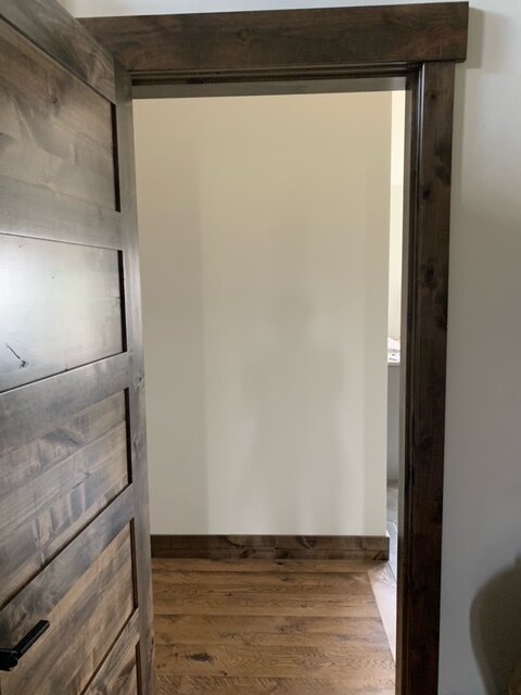
Primary bedroom hallway entry looking to window wall beyond. It felt a little lackluster and needed some wall decor. carlaaston.com
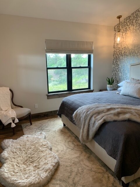
Primary bedroom window wall. The bed faces this wall and it is the first thing you see as you walk into the room. carlaaston.com
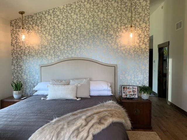
Primary bedroom bed wall. This wall had been nicely designed with the wallcovering and an upholstered headboard, but the pendants were hung too high to function as bedside lamps and the nightstands needed to be replaced. carlaaston.com
Primary bedroom that needed some finishing touches. carlaaston.com
Primary bedroom dresser wall. This wall needed some wall decor and a way to relate it to the bed wall. carlaaston.com
4 Main Design Dilemmas Needing Finishing Touches
Here were her questions and my responses, below.
1. Dresser and Window Wall - The view looking into the bedroom shows the end of a dresser with a window behind it. It looks very “blah” and I’m not sure what to do with the space. When I look into the room it doesn’t draw me in. I thought about curtains but that isn’t favored by hubby. What do you suggest?
First of all, I'd suggest doing something with the dresser wall. While you wouldn't see it directly when walking into the room, you will notice something going on there as you walk into that space.
I like the idea of doing an asymmetrical round mirror collection, scattered on this wall. I like the way they would reflect the light from the windows, it will accent the sloped ceiling nicely and it would create some drama there. I've got a sketch here for you.
Here are some links to round mirror options.
Here's a blogpost that talks about decorating walls with scattered round pieces as an interesting option for wall decor.
I'd also change out the pulls on the dresser. It just looks dark and rather traditional/old school and it will feel more brightened up with some kind of cool tone type finish on the hardware. It will relate to your wallpaper wall more then too, for a look that feels more tied together.
I don't know what size your existing holes are apart, but something like these would be nice. These pulls have an organic look, but a finish like the satin nickel would be nice to brighten things up. They come in a few different sizes, knobs and a backplate too.
You could try the Silicon Bronze Light finish, it's more rustic looking, but I'd want it to go more cool toned, not warm. Not sure how this finish looks in real life. You can buy one and then return it if you don't like it.
Now, for that window/door wall.
I feel it is really heavy looking and a little rustic compared to the lightness of the bed wall. The dark wood trim feels a little overbearing. (Here’s the pic again.)
Window / door wall opposite the bed wall in this primary bedroom that needs some design attention. carlaaston.com
You could very well do a wall of drapery fabric, as that is a great way to camouflage incongruent windows and doors. When open though (and it looks like you have a nice view), the dark wood will still be there.
Consider Painting The Wood Trim
My suggestion is to consider painting the trim in this room, the door trim, baseboard, and window sills, all to match the color of the walls. You still have a strong wood element in the room with the floor and the dresser. I just think overall, it will feel more like the bed wall is looking. You don't have to do the door, it's the trim that feels more heavy to me.
I totally understand if your husband or you don't want to do this. Really, I do. You could paint just the apron below the sill on the 3 windows, that would blend it into the wall and make it feel slightly less heavy overall.
Whether you do the painting or not, here's what I'd recommend to dress up that wall.
Window valances could be made to dress up the window wall in this primary bedroom. carlaaston.com
I'd do a window valance to cover the tops of the windows and add height and dress up this wall. You could do a pattern here and tie in with the wallpaper on the opposite wall.
See how this valance was done with a Roman shade (photo below)? We had windows that looked a little low and we wanted to add some pattern in the fabric. That's the same idea that I'm sharing for you.
Window valance over Roman shade as example for primary bedroom window treatment. carlaaston.com
I would come out about 3" on each side of the window with the width and then about 15" above to mount the top of the valance, about 18” - 20” overall. Obviously, the bottom 4" or so of the valance covers the top of the installed shade.
You'd have to get a custom window treatment workroom to make them for you, but valances aren't that expensive to make, depending on the fabric you choose. They take a lot less fabric than drapery panels.
In terms of fabric choice, I like maybe a larger scaled geometric (not a floral so it wouldn't compete with the wallpaper). I would do something that has a shade of gray that works with the shade color, looks like those are a light gray.
The work room should have fabric books you can choose from and they can help direct you to some choices for those. Make sure you compare to your white paint color too.
2. Bed Wall - On the wallpapered wall behind the bed, the light fixtures seem too high and the nightstands too low for the bed height. I would like to replace nightstands but am unsure of materials, finish, and optimal height.
Yes, those lights are too high if you wanted to use them as reading type lights or substitute them for a typical lamp on the nightstand.
The problem now is that the electrical wires have likely been cut and you can't lower them without having the fixtures rewired. You can check that by removing the cover plate and see if there is excess wire balled up and shoved into the j-box.
If so, you might be able to lower them enough to make a difference. If not, if you can't lower them, then you could get new fixtures and have them installed at a lower height, or just get additional table lamps on top of the nightstands and have these pendants function more as accent lighting.
If you do additional lamps, I'd do some kind of task type lamp, like a desk/reading lamp, maybe with an articulating arm. I would not do a traditionally styled table lamp with the pendants.
Something like these, above, would work. I actually like the idea of a brushed or satin brass finish, to contrast with the silver wallpaper and add some layering to this bedroom.
My overall opinion of this wall is that it feels like the furniture is crowded onto the wall. I think the nightstands need to be more narrow, so there is some breathing room. I like the idea of a lighter, painted finish on these too, so I'll give you some selections for these below.
I actually like going really lightweight, like with this nightstand.
Not sure how this compares to the height you have, but most nightstands now, are 30" or lower, so this is about a standard height, at 29". I feel like with a style like this you can go wider. Since it is on legs and does not have a cabinet, it will look less crowded. It's kind of a generic campaign style too that goes with everything.
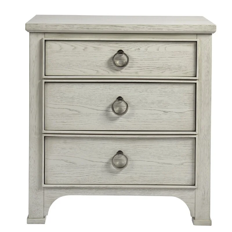
This nightstand, below, could be an option too. I like the light finish and it is 28" wide, so substantial without being too small. It's a little rustic with the wood grain showing through, so it works with your dresser. I like that it is cream in front of the silver wallpaper.
Again though, not sure what width you have existing there. You may need something even more narrow, but these two are looks that I would go for.
3. Bedding - The comforter can be replaced but I am more concerned about the decorative pillows. The pillows in photos can definitely go! I prefer a single long pillow because there’s nowhere to set a bunch of pillows when sleeping in this tiny bedroom.
Since the wallpaper has a rather small type floral, I'd go with something bolder for the pillows. I like the way you stacked the bed pillows. You might try getting gray pillowcases for those, to sort of blend into your bedding.
There isn't much diversity of pattern out there for long lumbar pillows that are in stock online. Most of those you see on Instagram and on designer's profiles are custom made. You can get solid ones online, or some bohemian type looks with lots of woven texture, but you might want something more to pick from.
For example, This website has some of those in a really long lumbar. Here's a nice gray lumbar pillow, with some textural stripes.
I'd take a look at Etsy, there are lots of people who sew and make custom pillows with designer fabrics and you can get large lumbars or any other size you want, made to order. This one is nice, velvet gray and white. This looks like a good vendor and I rather like the simple, blocked design.
By all means, read the reviews and ask for samples of the fabric if you can. These are really budget friendly, looks like!
4. Entry Hall To Bedroom Wall - The last concern is about the view into the bedroom (hall) from the area approaching it. It is visible from our front door. This isn’t ideal but it’s what we have. I’d like some artwork but unsure of size, color, landscape or abstract.
Okay, for this wall, you want to address the whole wall.
Primary bedroom hallway entry looking to window wall beyond. It felt a little lackluster and needed some wall decor. carlaaston.com
Entry to bedroom suite, bathroom to the right, hallway to bedroom on the left. This blank wall needed to be addressed. carlaaston.com
I'd go for some large triptych type pieces, centered on the wall, and just hang them side by side. If you only see part of one of the pieces from outside the door to the room, that's okay.
I do like these abstract art pieces in the gray tones. They are soft for a bedroom and you can do three of them in a row or maybe four of them in a grid. I see you have a high ceiling here, so four might work.
You could do a gallery wall here of mixed pieces, but that would be a lot of items to collect and hang, if you don't already have them. Also, if you do the round mirror wall in the bedroom, like I suggested, a gallery wall with various sized pieces would be rather the same idea.
I prefer these to be a simpler arrangement here then and just have some overall soft color that spreads over the wall.
Primary bedroom walls to receive art and decor to help finish off the room’s design. carlaaston.com
I hope she sends me pics when she’s done! I think it will be a lovely bedroom.
Need help finding just the right nightstand for your bed? I’ve got a post right here that can help.
Find out more about my Designed in a Click™ consultations at this link.
If you are a designer, and are curious how I use these to add extra income to my business each month, gain wider reach as a designer, and make good use of my real talent and skill as a designer (as opposed to a procurement specialist or project manager) then check out this post about my ebook guide I wrote just for you!
Pin this image below to Pinterest, to save for later!


If you've purchased a new bed recently, then you might have noticed that your old nightstand might not be tall enough anymore.