Sometimes it's just unaffordable or structurally impossible to make the exterior changes you might want to make in a remodel, with regard to windows.
If you find yourself in that situation, you can use window treatments to actually mask undesirable architectural features.
using window treatments to hide architectural flaws
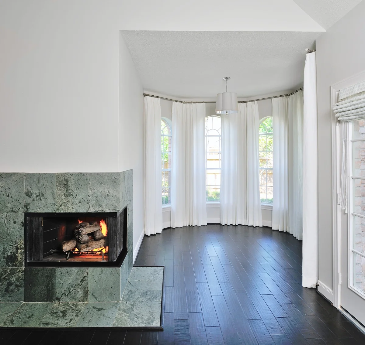
Here's a project where the windows were two different heights and widths all in the same alcove. So similar....but not.
In this case, I wanted to wrap the entire area in traversing drapery to mask the different sizes. The drapery would create a more seamless appearance that would flow better and create a soothing ambience in this bedroom.
Traversing drapery panels minimized the look of these windows of different sizes in this bedroom alcove - Designer: Carla Aston, Photographer: Miro Dvorscak
Traversing drapery panels minimized the look of these windows of different sizes in this bedroom alcove - Designer: Carla Aston, Photographer: Miro Dvorscak
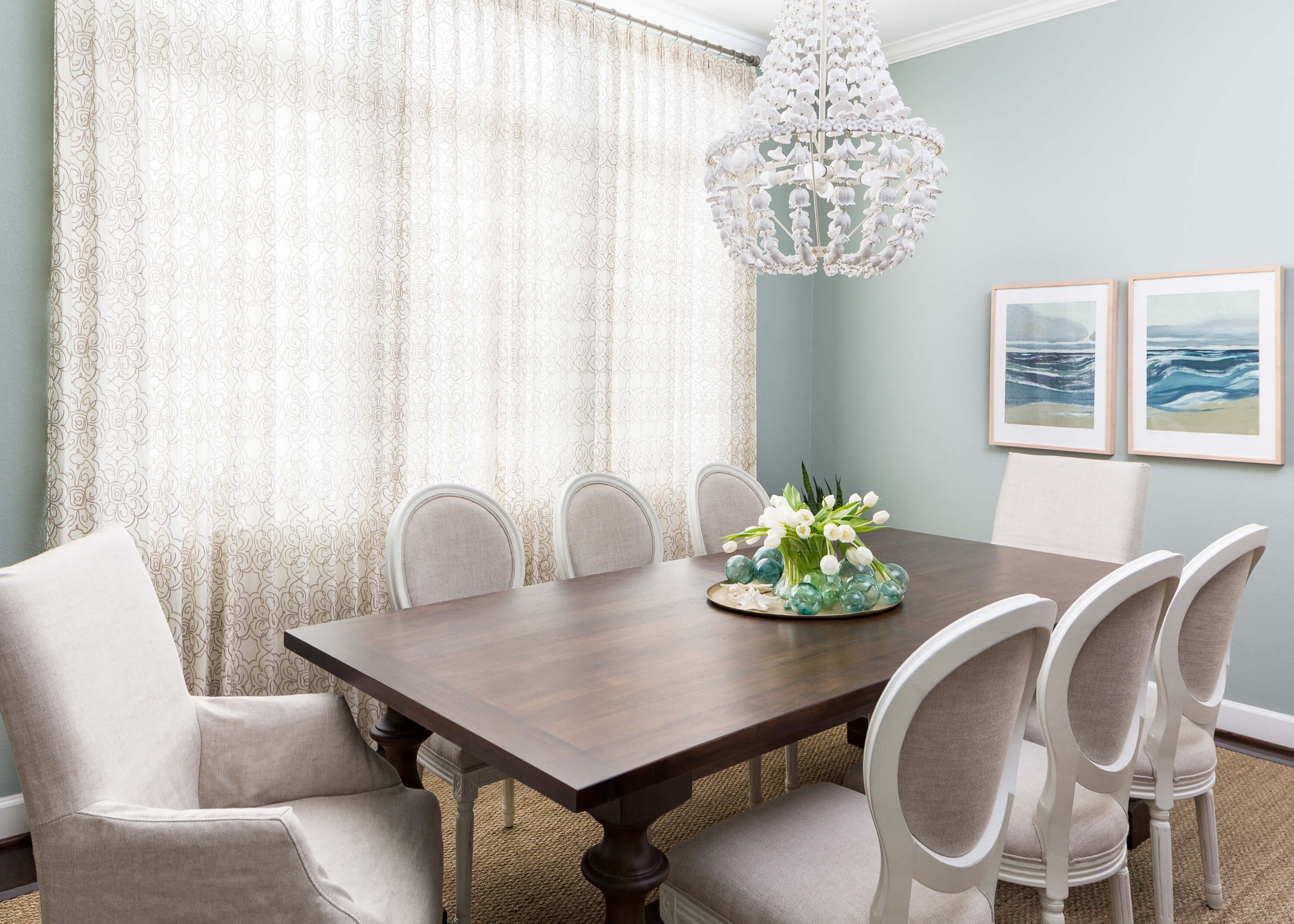
This big dining room window was a bit awkward, all chopped up with a sliver of an arch window above the main window. I wanted to declutter the look and present a simpler wall by using simple panels with a subtle pattern over all the windows.
Window wall with small windows above the main window renders a chopped up elevation. Carla Aston, Designer
A single, simple drapery treatment cleans up the look of this wall. Carla Aston, Designer
The simple drapery treatment presents a more elegant look in this dining room. Carla Aston, Designer
In many kitchen remodels that I consult on, where the homeowners are doing a partial makeover and keeping their upper cabinets and window over the sink, I often advise a valance or shade window treatment.
Why? Because they can mount it higher on the wall or at the ceiling, to open up that space at your head and give the illusion of a taller window and more height in the room. See the example in the link below.
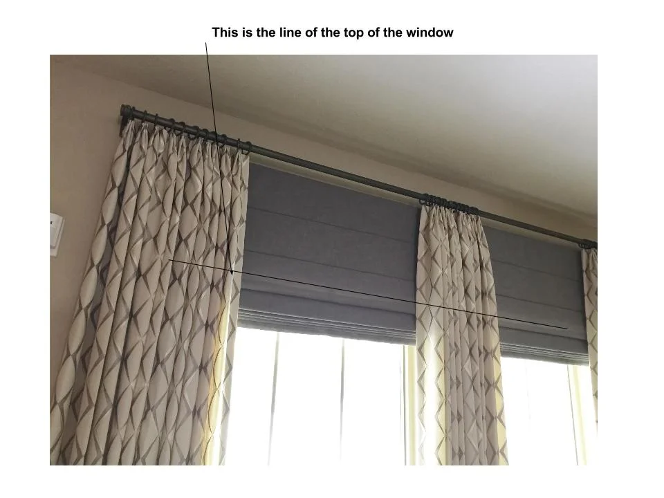
Hang Drapery Panels Higher
We almost always mount our drapery panels higher above the window to get the illusion of added height to the space.
See how these window treatments were mounted to give the effect of taller windows?
Drapery with shade mounted just under the rod to make window appear taller
This drapery panel with woven wood shade is mounted higher than the window.
Window valance mounted high above the window to make the window seem taller - Designer: Carla Aston, Photographer: Tori Aston
Check out more window treatment solutions for challenging situations in this post below.
This blogpost was thoughtfully written by me, Carla Aston, and not by AI, ghostwriters, or guest posters.
Pin this image, below, to Pinterest, to bookmark this post. :-)


I guess you could say this was a backsplash question. That is how it was uploaded into the comment section of one of my posts on backsplashes.
I mean, yes, there is a question about where to end the backsplash, but really, there’s a bigger design situation here, in my opinion. There’s the situation where the top of the cabinets and the top of the kitchen window line up and everything is all in a little row, below the ceiling.
I typically try to remedy this situation whenever I can. Here’s the reason why.