I guess you could say this was a backsplash question. That is how it was uploaded into the comment section of one of my posts on backsplashes.
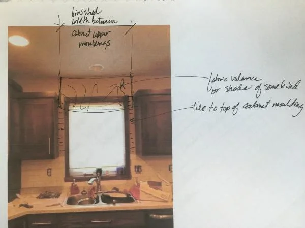
I mean, yes, there is a question about where to end the backsplash which you can clearly see how I advised her in the image below. But really, there’s a bigger design situation here, in my opinion.
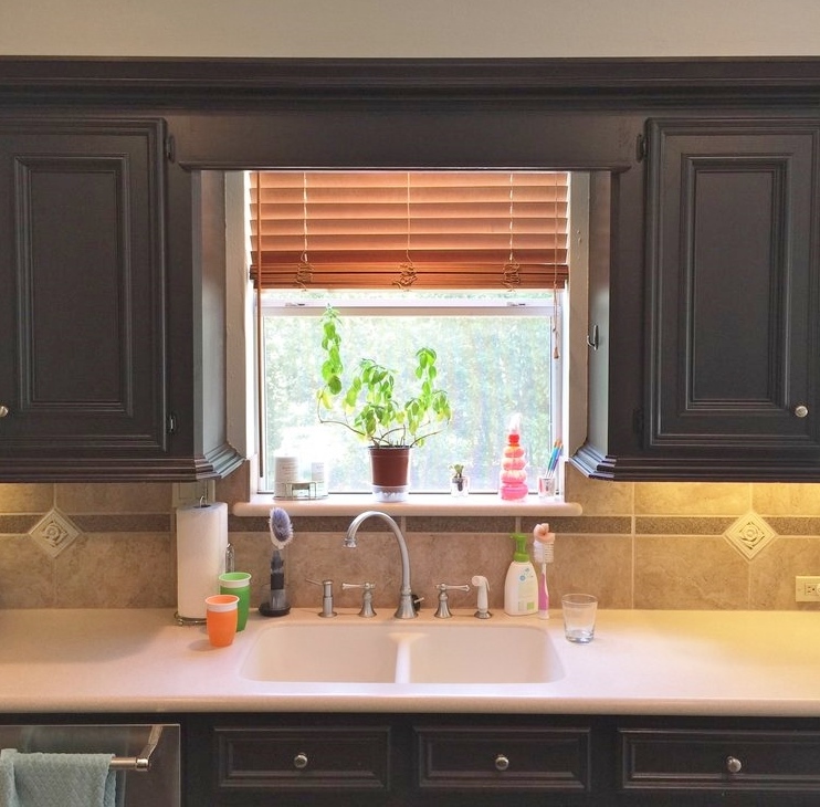
There’s the situation where the top of the cabinets and the top of the kitchen window line up and everything is all in a row, below the ceiling. I typically try to remedy this situation whenever I can.
Here’s the reason why.
A person stands a lot at the kitchen sink. Their head is there. They spend time there. They are looking out the window. Hopefully there is a window, because a wall in front of a sink is not typically that delightful and makes necessary time spent there feel even longer and more mundane.
Also, I am big fan of multiple levels of cabinets if you can’t have cabinets to the ceiling. Not everyone can go in and remodel to that extent and well, one boring horizontal line running around the top of the cabinet that is short of the ceiling, to me, sort of telegraphs an ordinary installation. It tends to look a little boring unless your design intent is to create a horizontal banding effect.
Not that I am a fan of a bunch of different levels or a really varied effect, I like a little consistency, but especially at the window, where your head will be, I like there to be space.
And height.
And a more lofty, open feel.
I like that space to breathe.
I don't want the homeowner to feel like they are gazing out of a porthole. :-)
Before pic
I also like to give that spot some visual attention.
One way to raise the visual height of that space at the kitchen sink, one way to deal with a short window that you can’t replace or one that lines up with your cabinets short of the ceiling, is to simply add a window valance or some kind of treatment at a higher level than the run of adjacent cabinets.
Here’s how I advised this reader to treat hers.
Design solution - Valance or shade mounted above window to add height and make this space at the sink feel taller and more open.
You can cover up that painted sheetrock and the very top of the window to make that window appear taller and give that space the height it needs to capture attention and breathe.
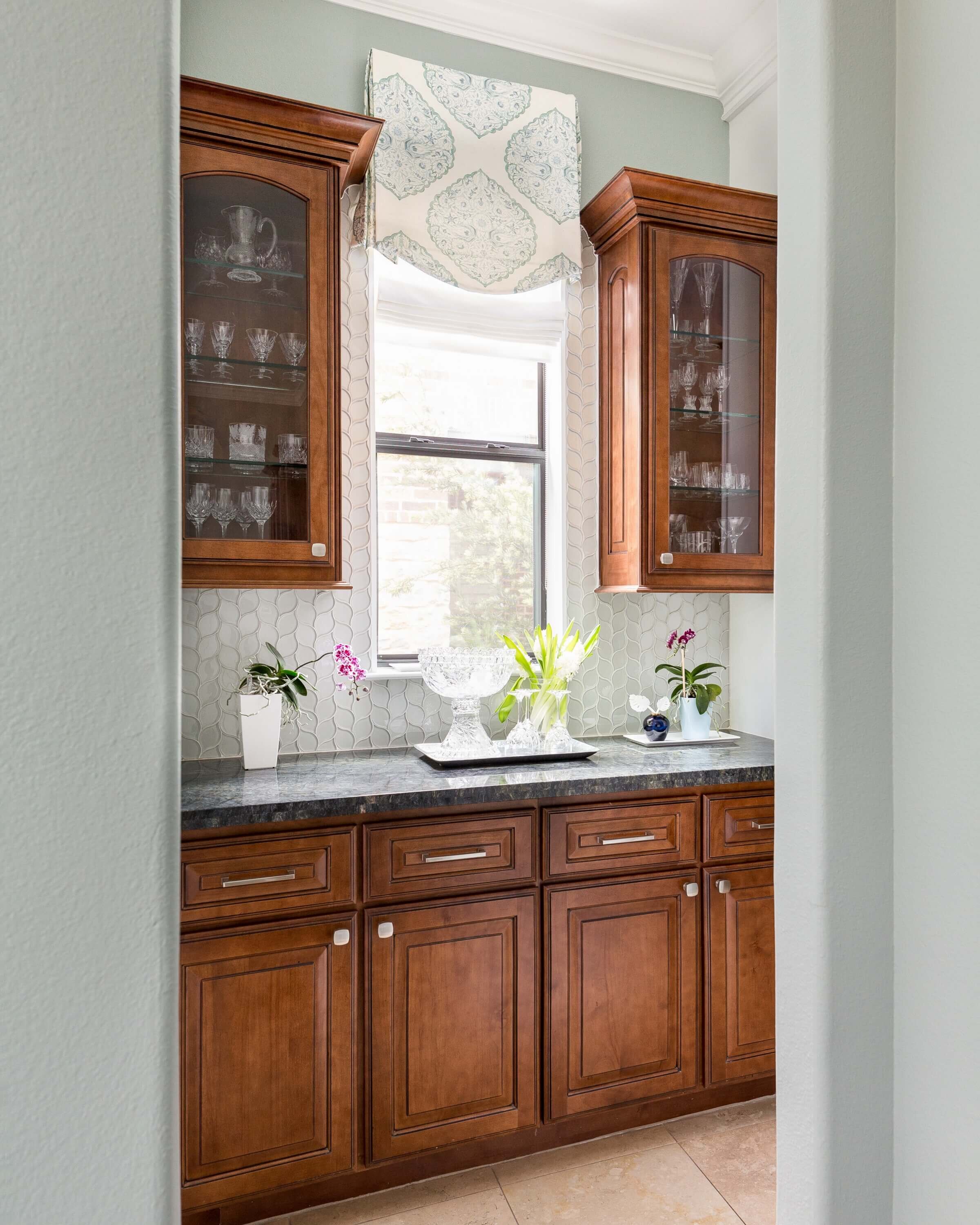
Here’s a pic, below, where we did just that on a job.
The backsplash tile travels up the sides of the window to the crown and the window valance touches the crown on both sides, so that tile ending is not exposed.
How to make your kitchen windows appear taller and more open. Carla Aston, Designer | Colleen Scott, Photographer
And, another existing kitchen window, below, that was made to appear taller. We added a buffalo check valance that hangs at the crown and just over the top of the window, covering that flat sheetrock space.
How to make your kitchen windows appear taller and more open. Carla Aston, Designer | Miro Dvorscak, Photographer
Need more tips, advice, and design goodness delivered to your inbox twice a week? Sign up for my email list below. You’ll automatically get my 5 Fave Bookshelf Styling Tips that will pop up as a link, right here when you enter.


