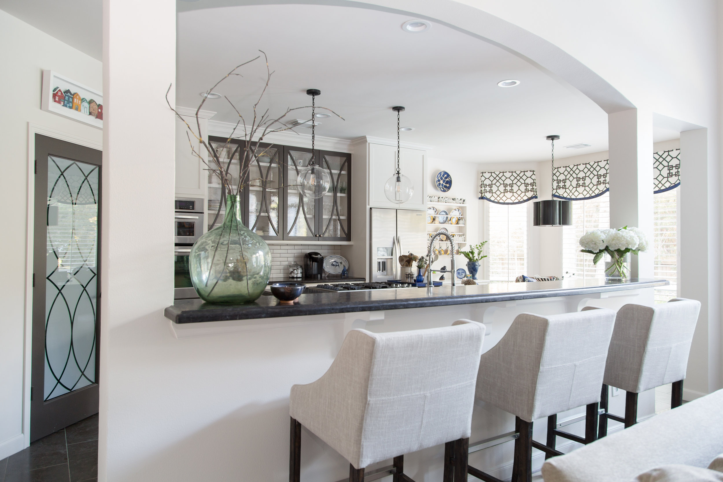
These days I find myself going back to this idea more and more in my projects....walls, mouldings and ceilings all the same color.
Why? Because it makes your room's envelope a seamless experience.
The space around you expands and the barriers that are walls and ceilings, seem to disappear and float away.
I have written about walls and ceilings the same in this post and then walls and mouldings the same in this post.
I have done this in my own house. All my walls, ceilings, and mouldings in my open areas are the same color, Sherwin Williams Aesthetic White. (One of my fave whites, BTW.)
I can't tell you how much more expansive my home feels with out the delineation of contrasting trim mouldings and ceiling. The ceilings seem higher when the same color wraps the whole space.
You might be saying, "Of course, it's white." ;-)
Well, it is a neutral, taupe-ish white. It doesn't look white next to bright white, but it looks white standing on its own. You know, color is always influenced by the other colors around it.
I've done this with dark spaces too. I just recommended this to two different clients to do the same thing in darker spaces with more dramatic color.
There are times to use various colors on walls, trim and ceilings, and then there are times when having one color bleed all over the space is more appropriate.
When you apply the same color to walls, mouldings and ceilings, you get these end results:
It removes the focus from the lines or planes of the envelope and helps hide unwanted quirky architectural details.
It gives more attention to the objects in a space.
It feels like it's wrapping you in a cocoon or that it's opening up the space to feel no limits.
It cleans up the visual field.
It's just like I told this homeowner in this Designed in a Click consultation, you don't want to accentuate the line outlining the top of the room when you could draw more focus to the nice floor or the colorful furniture.
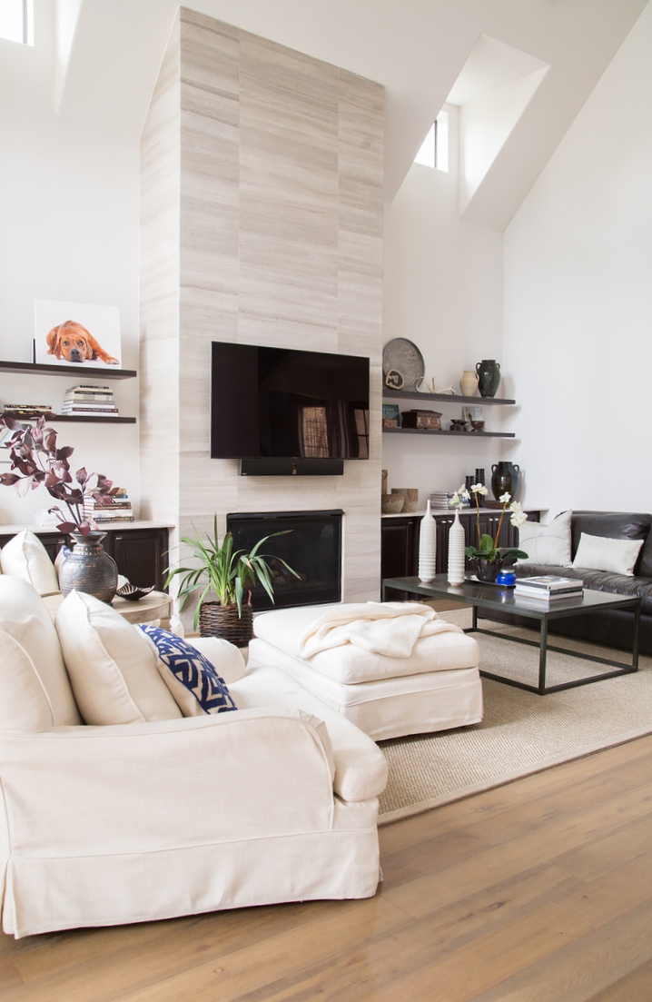
What if I had painted the walls one color and then left the ceiling white in this living room, below? Can you imagine the wonky lines it would have created at the clerestory windows? Wouldn't that have been taking attention away from the fireplace then and created some unwanted geometric shapes up there?
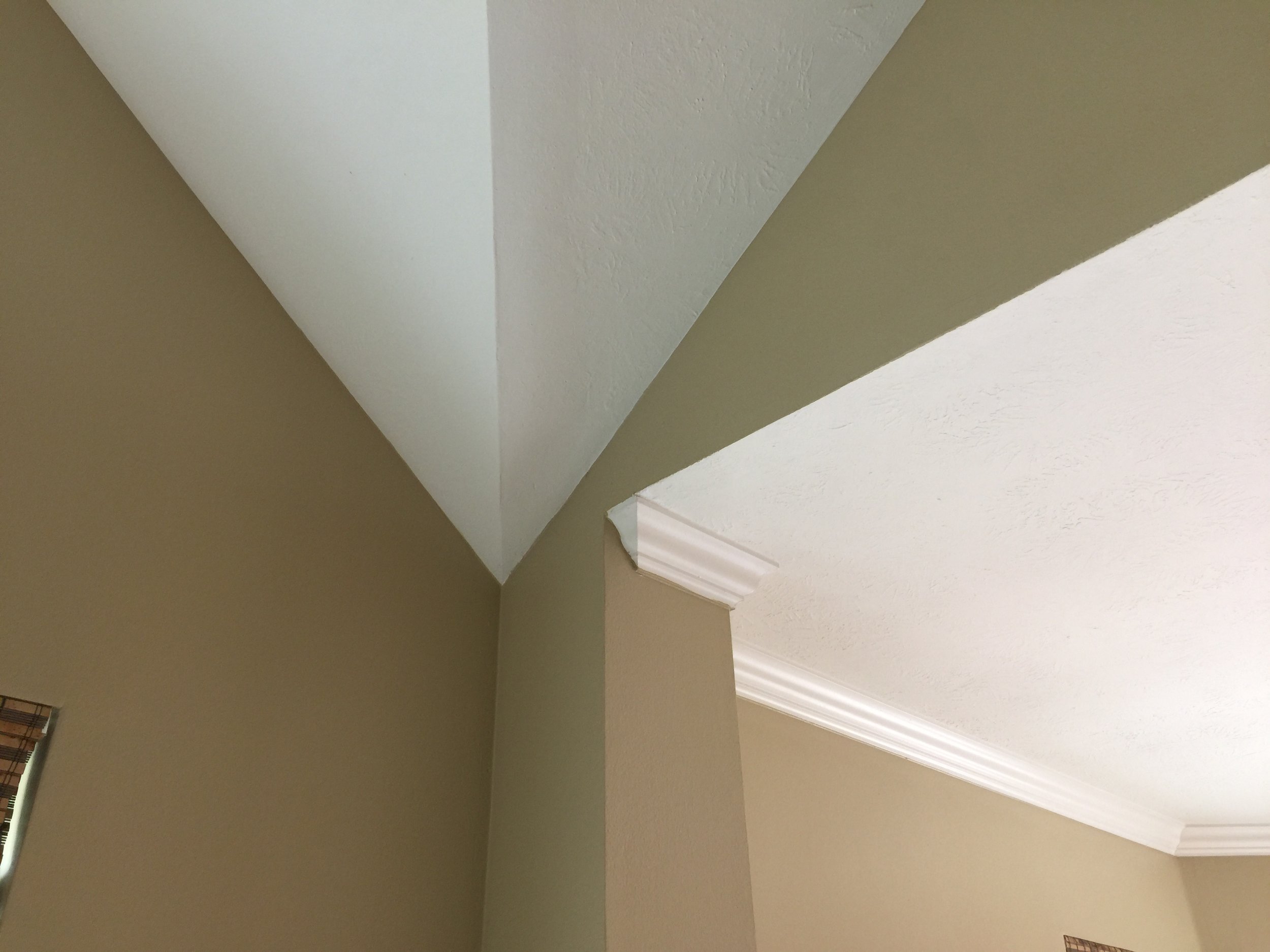
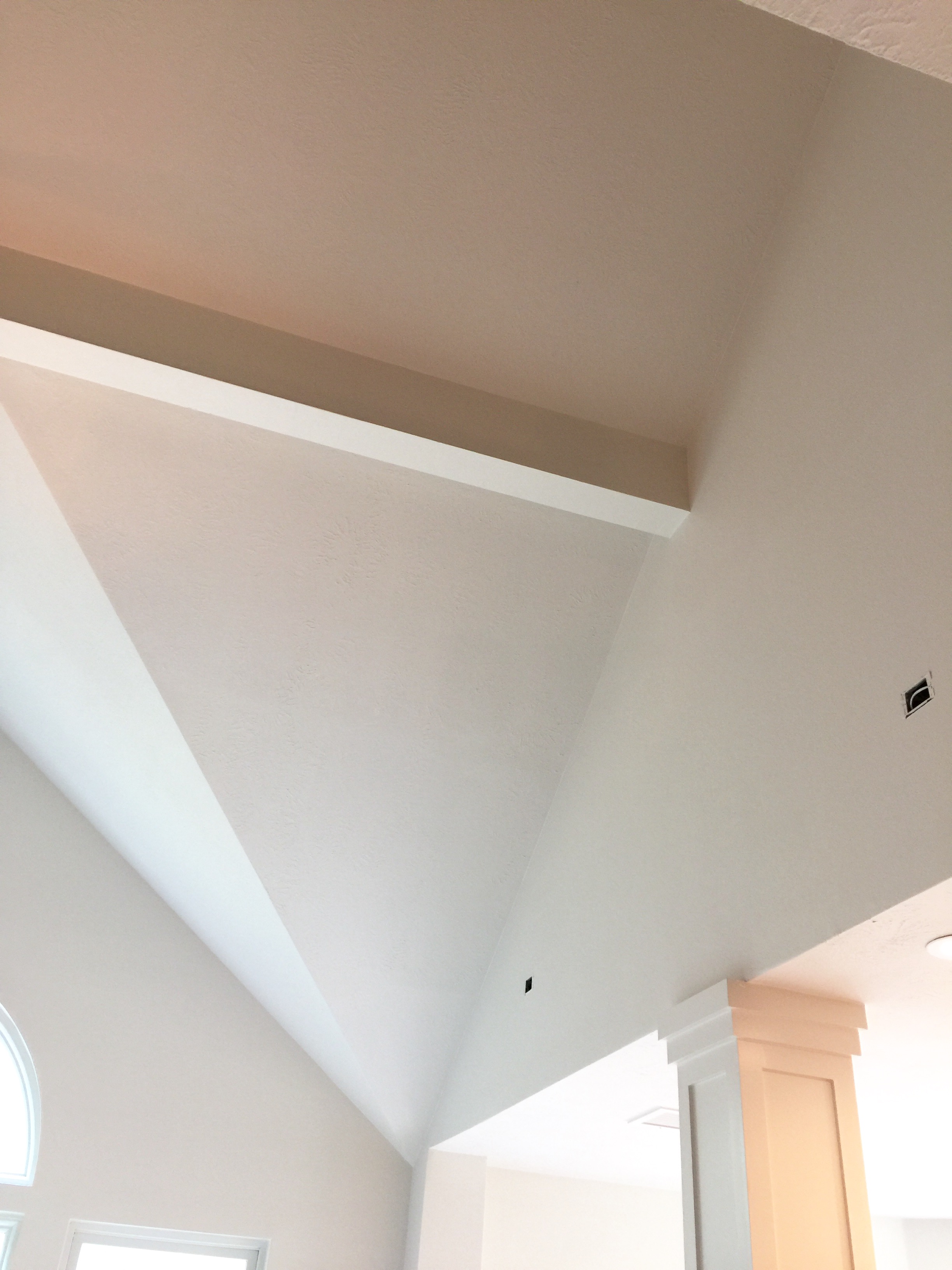
Here's a job that is almost completed. The before pics show the awkward transitions from walls to ceilings at the columns, etc. Now that this is all one color it really feels like a seamless envelope and seems more open and spacious.
BEFORE - Awkward angles are accentuated with walls and ceiling contrasting
AFTER - Awkward angles are diminished by having walls and ceilings same color.
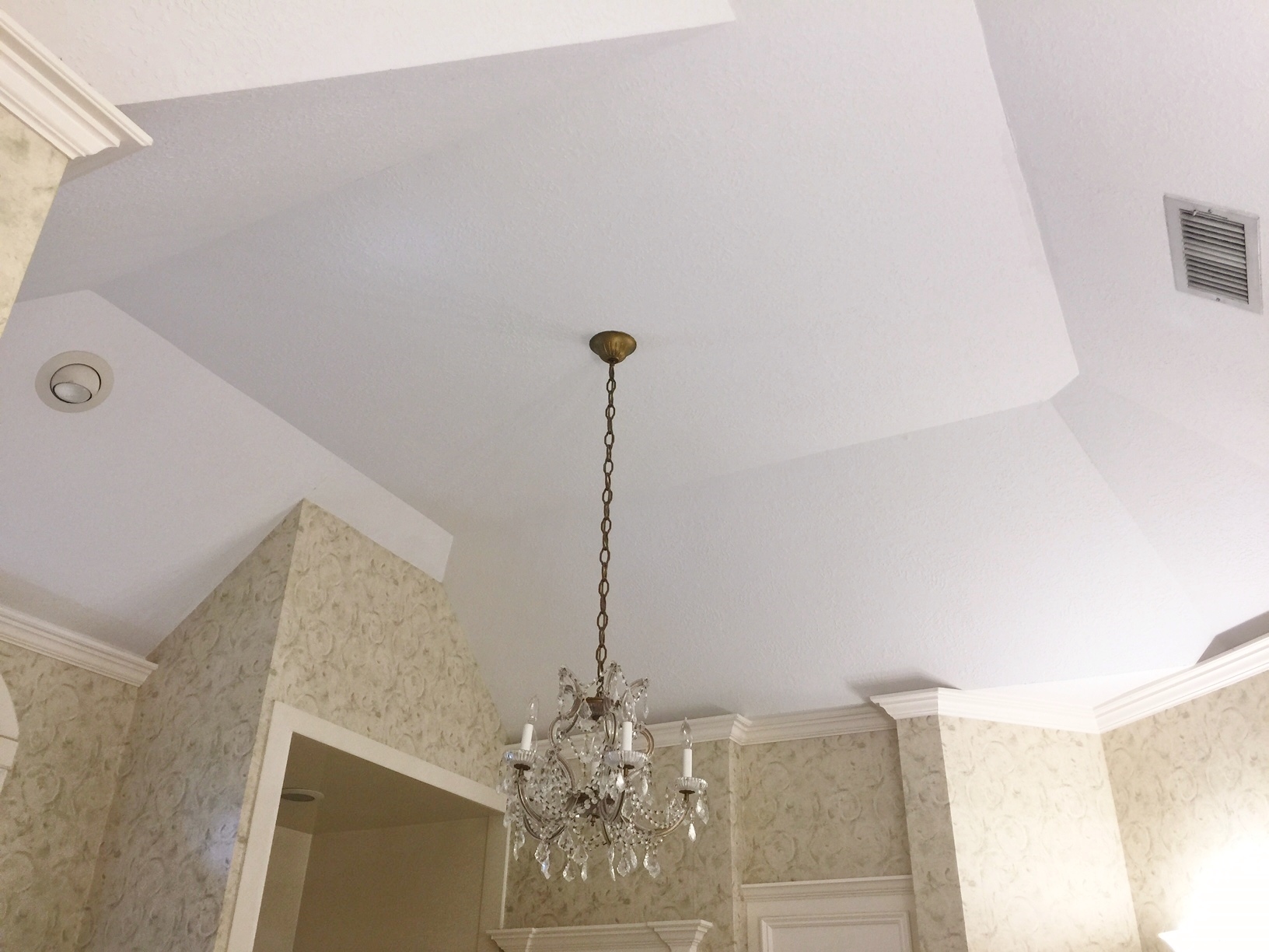
We are definitely going to be removing wallpaper and crown in this upcoming bathroom remodel, pictured below. Painting the walls and ceilings the same will visually diminish the many angles and planes at the ceiling.
BEFORE - Many angles and planes are accentuated at the ceiling with crown moulding and wallpaper.
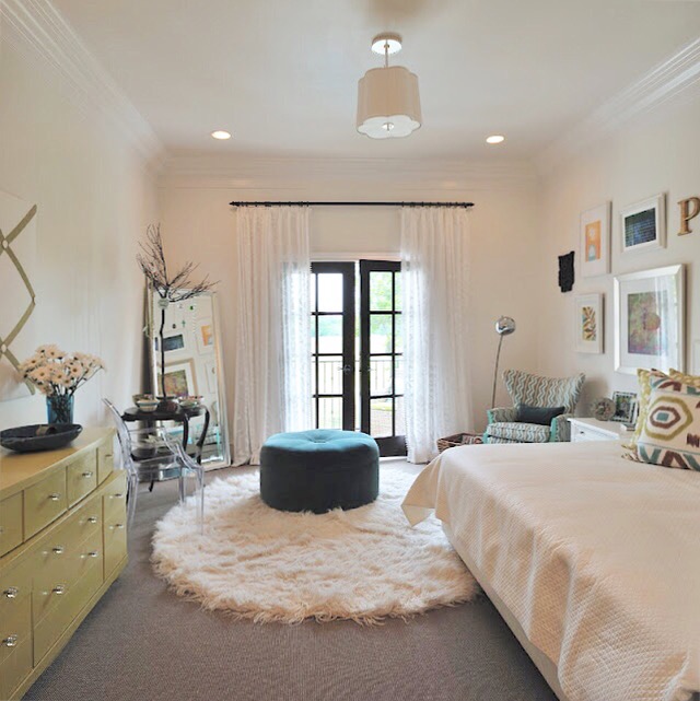
This girl's bedroom went all one color for a light, open, expansive feel.
Of course, it doesn’t have to only be a white paint. Here are some examples of color drenching that are quite spectactular.
Powder rooms are great places to color drench, like this one in the Greensboro Junior League Showhouse. Designer: Beth Clarke of Space Haven Home.
My guide for all things paint or color related is out!
I've compiled a guide to help with all those issues people have with selecting paint. This downloadable pdf is full of great info, with links to some of my most popular posts on paint, lots of Q and A, and some additional commentary.
No need to hire a special consultant or pay for a giant book of info when you can have my handy guide to refer to, right on your own computer. :-)
Click here for more info! #paintcolors #paintselection #wallpaint

