I recently had a consultation, via my Designed in a Click Q & A service, about a fireplace that had an asymmetrical look. The homeowner needed to put the tv above it, but the whole wall configuration puzzled her with what to do.
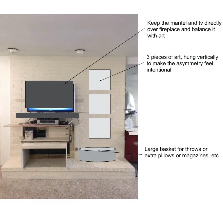
Here's the photo she shared of her remodel in progress.
And here's what I recommended.
There are really multiple ways to handle this scenario, getting all fancy and expensive. However, the easiest, least expensive way to deal with a situation like this, is to add artwork that will balance the asymmetrical architectural feature.
You can see this was also done in the Southern Living Showhome I visited back in September, designed by the Chairma Design Group. This little kitchenette in the guest house is tucked under the stairs and that angled bulkhead sort of feels a little large and blank with the kitchen cabinetry and all in the same view.
I like how they added some ceramic art to that wall to balance the look and make that architectural element look included in the design of the space.
I also like hanging artwork up high sometimes. These days, homes are being built with higher ceilings and those tall walls can sometimes just look like a big void. Adding art high on the walls can balance the heaviness of furnishings in the room at the lower level with all the blankness of the expansive walls up high.
This idea works well with art that doesn't really need to be examined up close to appreciate it.
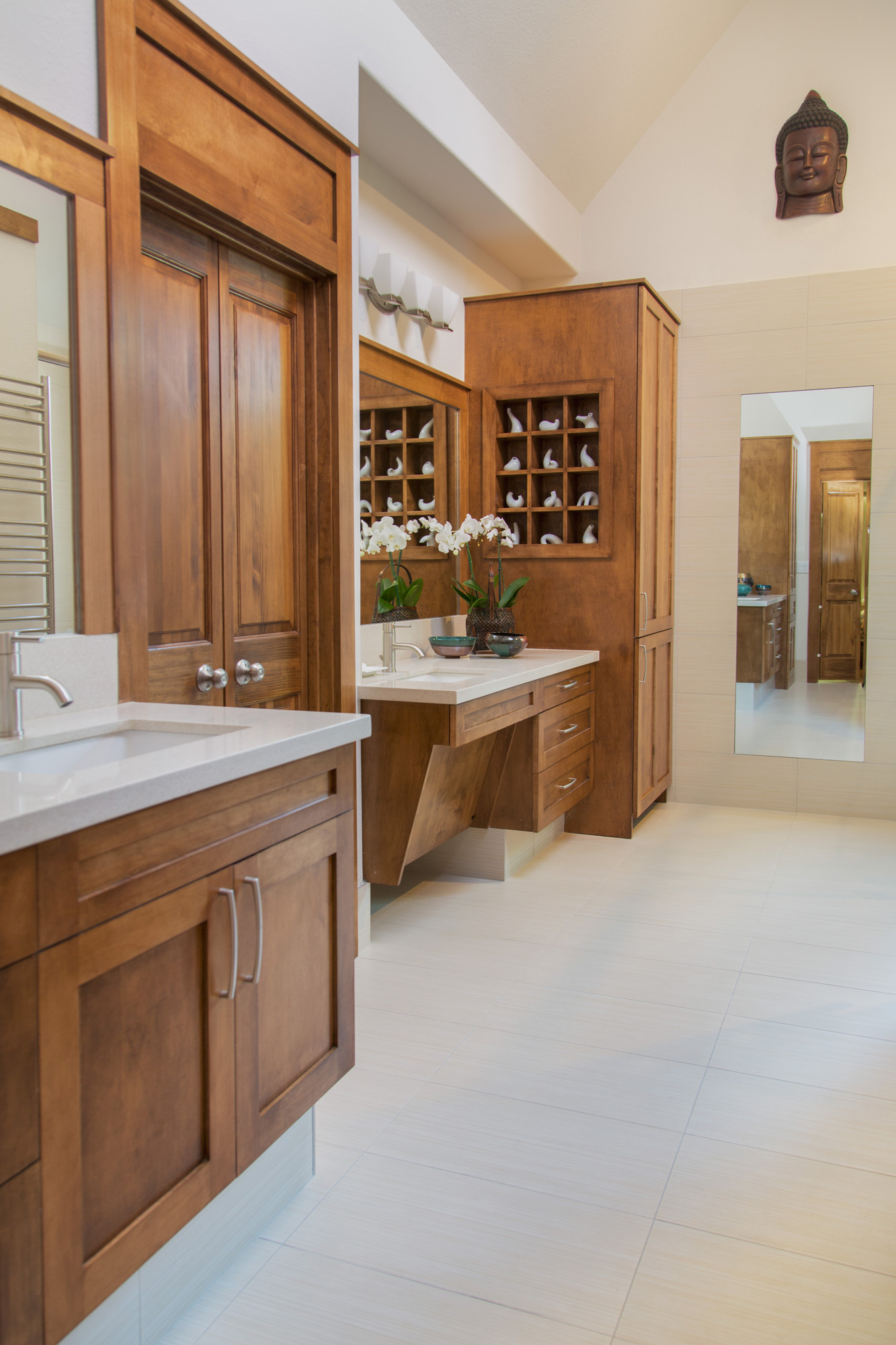
In this bathroom below, we hung my client's carved Buddha up high in the bathroom, to draw your eye up to the tall, expansive space and add some of the wood tone to that space up high.
In my own kitchen, I hung my daughter's framed paper mache houses up there to add interest and balance the full height cabinetry with the shorter pantry door.
Are you a designer who wants to learn some of the best practices and goals I've discovered, offering one-time interior design consultations via email or in person?
Check out my downloadable pdf for sale here to find out more.


