I’ve seen a lot of dining rooms in my consultations and in my client’s homes that often needed a refresh.
Many times, people don’t want to spend a lot of money there because of these main reasons.
My blog contains affiliate links. Any purchases, at no additional charge to you, render me a small percentage, are most appreciated and make this blog possible. :-)
3 Reasons People Don’t Want To Spend On Dining Room Updates
They purchased a big dining room “set” years ago that they don’t really want to get rid of. Even if they don’t like it anymore, it was a big investment and they don’t like the idea of replacing that.
They don’t use this room often, more for holidays and special occasions, so it isn’t usually a top priority to spend here. Many times the table, chairs and storage pieces are still in mint condition, so many people feel (usually husbands most of all) they don’t warrant replacing.
The purchases in this room can be pricey, and if they went with a matched set years ago, think they need to do the same again.
why is some investment in your dining room a good idea?
It is often one of the first rooms you see when you enter the front door of your home. This room can sort of set the mood or ambience of the whole home then. It’s a great place to make a design statement.
It can also be one of the cleanest rooms in the house too! While your family room may be covered in toys and clutter, the dining room can look tidy and neat, ready for visitors! You can actually SEE your style and taste in the dining room, unadorned with much of the daily clutter.
Because it might not get used every day, the furnishings in there might actually last longer and stay more pristine. All the more reason to spend a bit in this space, because the furnishings will outlast much of whatever else gets daily use.
This could be the room to go a little wild, to use some bold color or pattern, to do something different in your home. It’s a great place to step out of your comfort zone and experiment a bit design-wise. :-)
Furniture pieces like a sturdy large table and some dining chairs can come in so handy in everyday living. They can repurpose as a great game table, puzzle table, work table, home office set up. If you view this room as multi-functional, it might be more worth the investment.
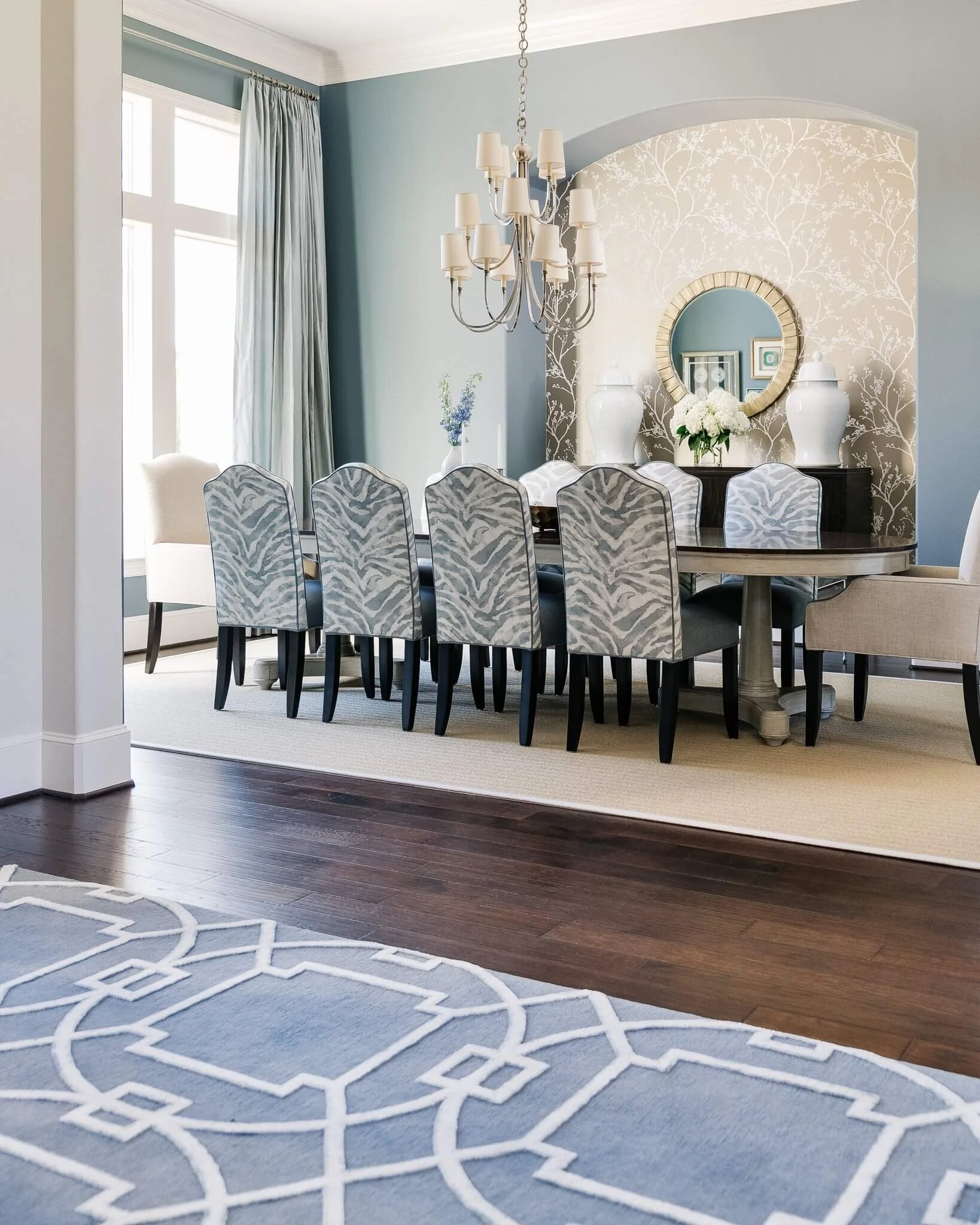
This dining room is just off the entry hall of a home. Color is used on the walls in this space, where a more neutral color is on the walls was used throughout the rest of the open spaces in the home. It was a good place to bring in color and a bit of wallcovering as an accent. Carla Aston, Designer | Colleen Scott, Photographer
Can you tell I’m a fan of the dining room?
Now, maybe your dining room has doubled as the home office or children’s school room last year. (Mine is now actually doubling as a store room for accessories for an upcoming photoshoot, right now!)
I get that dining rooms and all rooms in a home are best when used a lot and enjoyed.
However, I also get the idea of having a calming vista in your home, a place that feels finished, looks picture perfect and makes you feel like something is ready for guests at a moment’s notice. :-)
With all this in mind, IF you have a matched set and / or your dining space could use a bit of a refresh, how can you change some things up to get a new look you will love?
5 Ways To Refresh Your Dining Room Without Redoing It All
Before you start, it is good to take an honest look at what you’ve got to work with. Try NOT to focus on what you spent for each item you have, struggling to keep the most expensive items.
Instead, focus on what looks the best for your new look, what could feel at home in a space that was more updated. Basically, what are the best elements to keep in your dining room space, in terms of their design and impact.
1) Review the envelope of the room.
Do the walls need updating? Window treatments? Flooring?
These are changes that you are making to the overall value of your home. Try to lose the idea that these improvements are exclusively all about just wanting a change. For example, wood flooring in a dining room is a great base to start with.
If you have carpet or flooring that doesn’t flow through the rest of the open space in your home, having that all as one element is a nice upgrade that will benefit your home’s value when you go to sell.
In this consultation I did several years ago, I encouraged the homeowner to put in wood floors and get rid of the carpet.
If you have dated wallcovering or want a new wall color, that can make a big impact on your space. Paint is probably one of the least expensive ways to impact your dining room space, but if you have really dated items that are bringing your look down, don’t think paint will cure it all!
I have to say, I DO love draperies in a dining room! Even if people have no window treatments but shutters or shades for privacy elsewhere in their home, I still encourage them to do some drapery panels. Adding fabric in the dining room takes this space up a notch and adds an elegant look.
With all the hard furniture in a dining room, and many times, a lack of upholstered items, adding drapery often adds some much needed softness.
The gorgeous silk drapery does wonders for adding elegance to this dining room. Designer: Carla Aston, Photographer: Colleen Scott
This is a clients’ dining room, below, where we kept the table and chairs, reupholstered the seats, did a new rug, paint color, chandelier and window treatments for a fresh new look.
Overall, this update was more about changing the envelope of the space than mixing up the furniture.
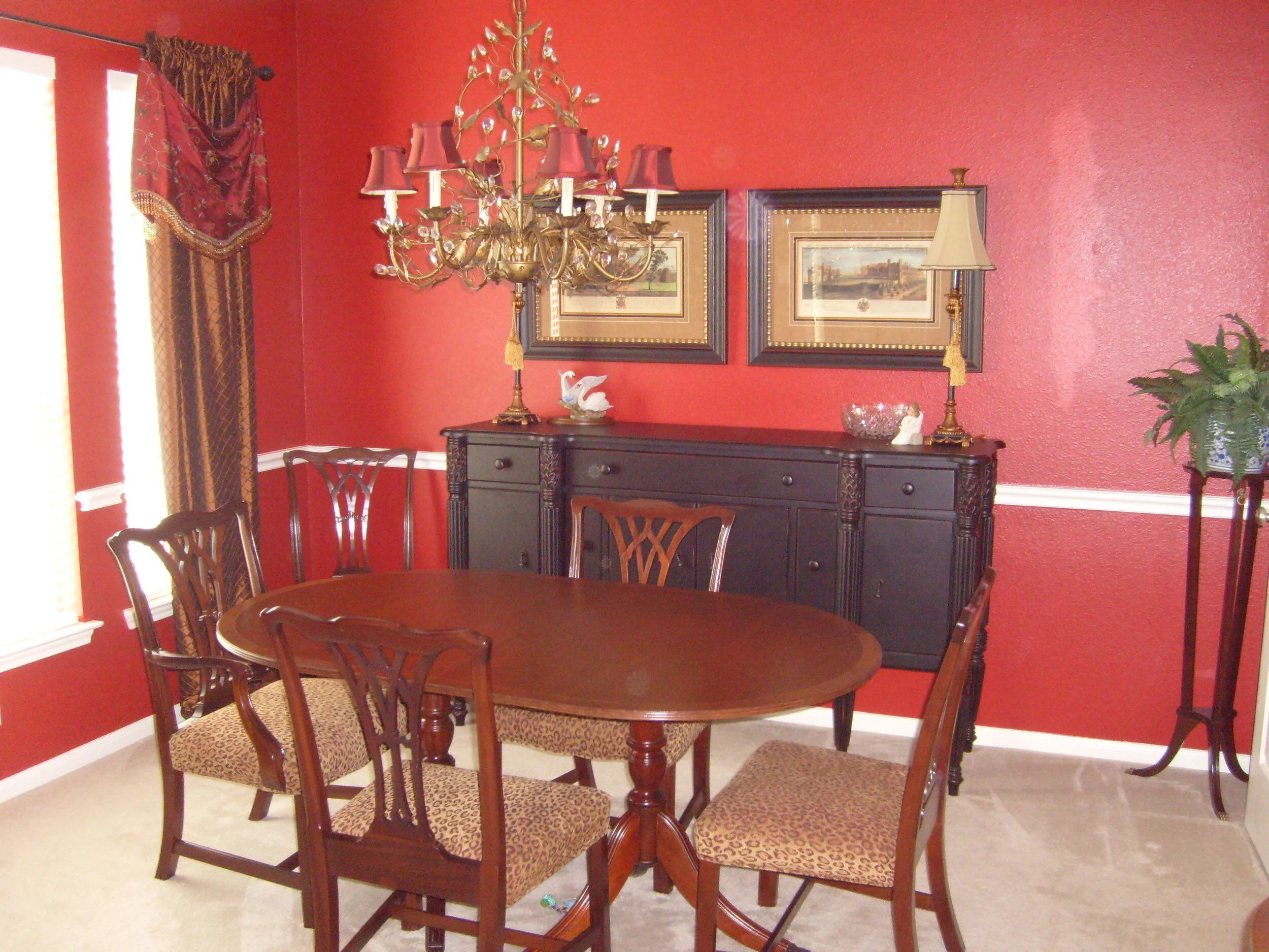
This colorful dining room’s envelope was made over while the traditional dining furniture was reused. carlaaston.com
2) Evaluate the table and seating realistically.
Let’s say you have that matching dining set that you’re tired of.
Evaluate what is the better of the two, the seating or the table?
Which could be made to work in a fresher look with maybe some reupholstery, refinishing or slipcovers? Many times you can replace either without replacing both seating and table!
This dining furniture was updated with linen slipcovers on the traditional, old-world style chairs. It lightened things up and gave a really fresh new look.
With this dining space, slipcovers were made for existing “old world” style dining chairs for a lighter, fresher look. Designer: Carla Aston, Photographer: Miro Dvorscak
Seating is one of the most expensive items in a dining room.
That’s right, dining chairs can really be a significant cost for a dining room, mainly because you need to buy multiples of them!
When I try to help a client mix up their dining room look, I might keep the chairs if they are in good condition and aren’t too far away design-wise from the look we are going for. I might reupholster them, do some slipcovers, or just get new head chairs, which can go a long way to update a dining space.
Compared to an item like the table, although a big piece and can be costly in its own right, it might make more sense to replace the table than the chairs.
That was exactly what I recommended in this consultation done for a living room and dining room.
In this open dining space, below, the wood table and bench were mixed with some dark stained wood dining chairs. The bench was a less pricey option than buying 3 more chairs and it definitely creates an interesting dining arrangement.
Don’t be afraid to mix your finishes to create a more dynamic look.
This main dining space in a bachelor’s new home was styled with a parson’s style natural wood table, bench and dark stained wood chairs for contrast. Carla Aston, Designer | Miro Dvorscak, Photographer
3) Review the lighting / chandelier.
Oftentimes, changing the central chandelier or pendant can make a big difference. If you have something that is really ornate that you don’t love, if your fixture has gold-tinged, frosted glass globes (more builder-look), then don’t hesitate to consider a change here.
This is a good example of the type of fixture I would change out. This gold-tinged glass is not in style these days and really dates the room. carlaaston.com
Here’s a great example of a project I worked on where everything in this home was brown. The homeowner wanted a lighter, more up to date look, but couldn’t do everything new.
We kept the furniture, did new paint and art on the wall. I think the light fixture change was one of the most impactful elements, looking so much lighter and more modern.
The “before” fixture is just the kind of builder-grade look I mention above that you should consider replacing for a more updated style.
Pendants / chandeliers that have a dated style like this one, are easily upgraded. There are nice, budget-minded options out there to get a more stylish look for your dining room. carlaaston.com
This dining room update with fresh paint, new art and a modern gilded lantern light fixture gives a fresh, new look to a homeowner’s existing furniture. carlaaston.com
This dining room, below, is a project I worked on over 10 years ago. This traditional dining room set was actually reused with a new envelope of paint, rug and window treatments with new fabric on the chair seats, a new console and mirror.
The chandelier to me, was such a sweet improvement. A modern, yet traditional look that really made this furniture feel classic and more up to date.
BEFORE - Traditional dining room in a dated style
AFTER - Traditional dining room furniture with an updated look, including a new, more clean-lined chandelier. Carla Aston, Designer
Here’s the link to this awesome chandelier that I have used in more than one project!
4) Evaluate your storage / case pieces in the room.
Do you have a hutch that matches your dining “set”? If so, it is time to let that go or maybe refinish it for a new look.
The fewer pieces that “match” the better!
Consoles with mirrors above can be good for storage and a great way to mix up finishes and styles in the dining room. They can also be used elsewhere in the house if you ever want to mix things up, as they are truly more versatile storage pieces.
I am a fan of showing off my collection of dishes. I have two charcoal metal pharmacy style cabinets that I bought about 20 years ago that STILL look great in my dining room. I love how they display my collection and add a bit of edgy look.
My dining room from a few years ago. I’ve since painted the walls white and added some cool art above the pharmacy style cabinets. No more piano there either. :-) carlaaston.com
Think of your storage pieces as a way to depart from a traditional wood look and step outside of your comfort zone there.
Using a painted storage piece with a wood table (or vice versa) is a nice mix!
I did this in a dining room for a client, pictured below, where we reused their existing parson’s style wood table and added new upholstered dining chairs and a painted wood console.
This painted wood console mixes nicely with the wood table and upholstered chairs in this dining room. I really loved the white tone on tone look of this console and decor for this location under the stairs. carlaaston.com
The homeowner’s existing wood table was reused in this dining room, paired with a new painted console and upholstered chairs. carlaaston.com
5. Wall Decor - Don’t forget the dining room wall decorating!
I love to use mirrors in dining rooms, to reflect light into the space from a window or to reflect the chandelier. You can combine a mirror with some art, to fill that long wall that often puzzles homeowners.
Here’s a project where I just had a photo shoot done this week :-) that I’ll be sharing soon. This is my iphone shot after the art install we did of this wall. I love the symmetry and how the art adds a lot of brightness and interest to this space.
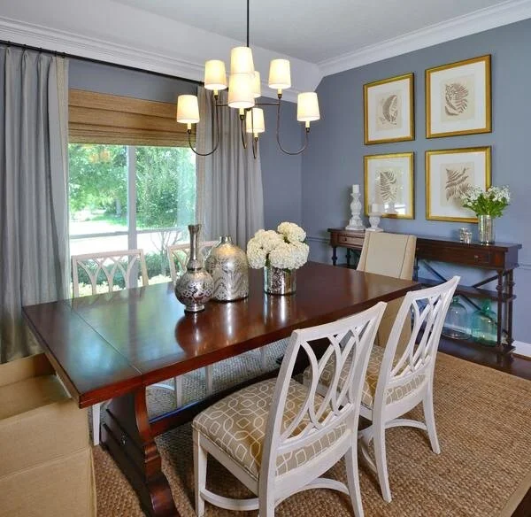
Wall decor in a dining room with a console, mirror and four botanical pieces filling out the wide wall. Carla Aston, Designer
Dining Room Consultation - Designed in a Click
In this Designed in a Click™ consultation I did recently, I used many of these tips above to formulate a plan for a new look.
This homeowner wanted help with wall decor, and wondered about her lighting, table decor and some other considerations. The wallcovering and drapery were staying, as was the rug and furniture.
She had a good start with the dining room envelope.
I liked the wallcovering, drapery and rug, those were definitely good to start with. I just felt like we needed more balance in the room, with all light on the top of the top of the room and all dark on the bottom, I felt there could be a better mix.
Before - This traditional dining room needs a bit of an update. carlaaston.com
Achieve a better balance by mixing up the furniture.
I also wanted to encourage her to think about changing out the table here. A light finished table would bring the white of the walls down into that central part of the room and mix things up nicely. I really liked this table, with a traditional, but more streamlined look.
Light finished wood dining table.
This dining table has a nice shape to the top, making the light finish more appropriate for a traditional dining room.
She could even go one step further and do some new upholstered head chairs, just to add some softness there too. Then, two of the existing dining chairs could sit on the wall on each side, sort in each corner. It would put the wood finish up on that wall a bit and add some detail.
Before - A light envelope, walls and drapery, make for a good base for starting this dining room refresh. carlaaston.com
The mirror feels a bit heavy and the sconces a little dated as wall decor in this dining room.
Wall decor direction for this dining room.
For her question on wall decor, I felt like the current mirror was a little heavy for the room and furniture. I also feel that candle sconces can be a little dated these days. I would prefer to see some art on this wall, with a different mirror.
I used an antiqued mirror, hung vertically, with some botanical prints on each side to fill the wall nicely. The navy art pieces brought the effect of the dark rug and upholstered seat color up to the white walls to create some balance in the space.
I much prefer vertically hung mirrors, rather than horizontally. I feel like a horizontal mirror just seems too much like a bedroom dresser mirror usually.
I do love round or shaped mirrors too.
Furnishings items for a fresh update to a traditional dining room. carlaaston.com
I mentioned that I didn’t feel any wall decor was needed on these two walls at the entrance to the kitchen. With the patterned wallcovering and a more major feature on the long wall, this wall is fine left without any wall decor.
No art really needed here on this wall with the main long wall getting a nice selection of wall decor. carlaaston.com
A new chandelier would be a nice update for this dining room.
For a change in the chandelier, a brassy, more simple look would be nice. And clustering some creamy white ginger jars and vases in the center of the table would be a nice subtle effect for the table decor.
I feel like this would give a really fresh, new look, keeping the walls, draperies, rug, and side chairs. She could start with the mirror replacement and art, then the table, and lastly, the chandelier and table decor.
That’s the beauty of these email consultations I do, you complete your room at your own pace. :-)
Check out some of the items I shared with her as options for this update, below.
Want even more partial dining room updates to peruse? I have two in this post, below.
Pin this image below to Pinterest, to reference this post later!
5 Ways To Refresh Your Dining Room’s Dated, Matched Look! This detailed guide will help you update your dining room, evaluating every element so that you can love your dining room again! carlaaston.com


I'm sharing an e-design project that I did recently with you today cause I really love this one and I think it incorporates a lot of what this homeowner wanted without being an exact copy of her inspiration images.
This homeowner was kind enough to allow me to share it here on my blog. Let's take a look.....