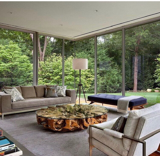
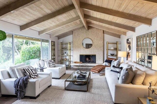
I’m sharing another Designed in a Click™ email consultation today, this one of a living room in a new home. I loved the modern, organic look of their inspiration pictures and was excited to help them achieve it in their new living room space.
Here are a few of their living room inspiration pics they sent. Very nice!
My blog contains affiliate links. Any purchases, at no additional charge to you, render me a small percentage, are most appreciated and make this blog possible. :-)
Living room inspiration pic, sent in by homeowner.
Living room inspiration pic, sent in by homeowner.
The homeowner reached out to me saying this was a little bigger than one of my normal email consultations. I sometimes do these at a quoted, higher rate, depending on how long I think it will take me. It really involved selecting some furnishings and laying out the space, so yes, it was a bit bigger than normal Q&A.
Living Room Design Dilemma
They just moved in to this home and were unsure of the furniture layout, the type of furniture to look for, etc. Almost all the furniture was going to go, they didn’t like the black leather in here. The two pieces staying were the console on the far wall and the yellow chair which they were going to reupholster.
They didn’t have a tv in the room at the moment, but were likely going to mount one above the fireplace.
My blog contains affiliate links. Any purchases, at no additional charge to you, render me a small percentage, are most appreciated and make this blog possible. :-)
Here are the pics of the living room.
Living room design consultation - carlaaston.com
Living room design consultation - carlaaston.com
Living room design consultation - carlaaston.com
My Recommendations for New Living Room Furnishings
Here were my thoughts….
First of all, I think if you are eventually going to put a tv in the living room, that a sectional would be a good choice for this space. That would get you some nice seating and then enough of it would be facing the fireplace for tv viewing.
Here’s one from Lee Industries. I like the simple, modern lines of this piece.
I'd also do two lounge chairs or recliners, you actually have the room for them to recline there. Here are some from Bradington Young, that are a simple, squared off style, but by all means, check them out and get something that sits well for you. I like the idea of a caramel colored leather, you have that color leather in your inspo pics and it works here.
A round table in between those could be something like this.
I think doing an organic type coffee table would be nice (rather like in your inspiration pic) and would get you a distinctive natural element in the space. This one would relate to the fireplace material. I like the organic shape too.
(Blog readers - I can’t find this table online right now, it must be currently unavailable. However, I have a few options below.)
Here’s an optional coffee table that’s a little more rugged looking.
I’ve always liked this whitewashed tree stump coffee table since I saw it in a Highpoint Market showroom.
I would also move all your plants out of the dining room into the two window corners of the living room. You don't have room in the dining really and it looks crowded in there. You have plenty of room in the living and plants are always better in groups unless they are huge.
I like this sort of modern rustic vibe here and the fact that it marries beige and gray. You can add some art over the sectional then and some pillows in warm neutrals with abstract, organic patterns.
A sofa table and small lamp would be good behind the sofa, over by the entry. It just creates a finished look at the back of a sofa.
I like the live edge wood of this sofa table with the contemporary base.
You can do a floor lamp beside it there in the corner.
On the console wall, I'd add two tall lamps for height and a little detail, and then bring two of your dining chairs over to flank each side to fill the wall and have a place for those chairs, out of the dining room but close by. It will make the dining room feel less crowded.
I like the iron finish on these lamps. It will add some delineation to the wall.
I'm not sure your rug will be big enough if you do the sectional against the wall. If it works, that one is fine. If you find you need something bigger, this one is a simple graphic design from Jaipiur Living that I like for this space. The one I drew in on the plan, below, is 10 x 14.
Here’s the furniture layout sketch, below.
Window Treatments
To finish this room off, I'd get some draperies on the windows, maybe some sheers is all you need if you don't need privacy. It just creates a finished look to have some kind of window treatment if you don't have trim moulding around the windows and it is nice to have some kind of covering on the front of the house.
You can do a simple Euro pleat, on a thin rod, something really simple that will add texture. Here is a fabric from The Shade Store, a good supplier that you could use if you don't have a local source to make you some window treatments.
One last piece of furniture
I see all the picture frames there behind the sofa and would suggest doing an enclosed look etagere over on the wall by the dining room, for some of the most treasured photos you want to keep out on display.
Here’s the etagere I’d use, it has a woven covering which would be a nice refined texture and a pretty color too.
I’d go for some frames in organic materials, marble and onyx, so they blend nicely with the style you are going for here.
Extra Note - Add some beams
If you ever wanted too, you could add some beams, much like in one of your inspiration pics. A center beam and then about 3 or 4 beams on the slanted ceiling area would work.
That would add some warmth and texture to this room. No need to do a full wood clad ceiling, but the beams would rather elevate the look overall I think and add to the earthy, textural vibe.
Here’s the storyboard with everything put together.
Some advice for the Dining Room too
I think the dining room needs some drama. (The dining table was a 60” round that expanded with a leaf. They said they were planning to reuse it, but were now reconsidering.)
Dining room design consultation - carlaaston.com
I'm thinking the existing dining table is too wide at 60" both ways. I am also not fond of the darker, polished finish for the more organic look you are leaning toward.
I think a rectangle or more narrow oval would be better. I'm also wondering if the rug in here is really necessary, it just serves to break up the room more, and I feel like I want this room to be more empty and dramatic.
Paint the room dark for some drama and variation from the living room.
I would opt to paint this room a dark color, you could do a dark warm gray, charcoal or even go with a dark blue/gray if you want to add a color.
SW Gauntlet Gray
SW Charcoal Blue
I'd paint all the trim the same color and the tray or soffit area of the ceiling too. You could do a contrasting color on the highest part of the ceiling, a lighter color, but not white. Maybe a warm cream color.
I would layer in drapery panels that were the color of the walls to add richness, drama and envelop the room. It will make it feel cozy and "designed".
Your artwork in there would look great on top of a dark wall.
It is hard to make dining rooms feel special, as there is not that much furniture in them. You do that through carefully selecting the few pieces and doing some unique finishes like wallcovering or dramatic paint and drapery.
There isn't much softness in a dining room either, that's why I like drapery to add a luxurious and more intimate feel to this room.
I'd get a new light wood table. That will stand out amidst the dark finishes and the chairs will too. This is the table I would consider. It's a rustic creamy white.
I'd also get a new buffet console there, this one is more modern and only 12" deep, so it won't feel so crowded in there. I like the cerused face of it and the fact that it is a lighter finish that would be great on a dark wall.
Lastly, I'd do a narrow, tall mirror above the console, center those on the wall between the end of the wall and the door to the kitchen. I think you will then miss that switch on the wall there then, which is the idea here.
This one has clean lines but the weathered look, which works for your style. It will reflect the light from the window across the room.
Here was my sketch of the dining room.
A Bedroom With Similar Style
This living room and dining room reminds me a lot of a primary bedroom I worked on recently, also in a Designed in a Click™ consultation. See it below. I think they would work great in the same house!
Shop The Look!
Pin this to Pinterest to save for later!
Note about my Designed in a Click™ consultations: As with all remote type consultations, you are responsible for securing any samples and verifying sizes needed, etc. Colors and finishes may not appear as they show in the images online, so it always helps to get samples if at all possible.
Check out this email consultation service here - Designed in a Click!


I’m sharing a recent consultation here today, a warm, modern bedroom that needed some last layers to complete the look. This homeowner had good start and direction, she just needed to finish everything and make it feel cozy and comfortable. Come and see what last layers I proposed…..