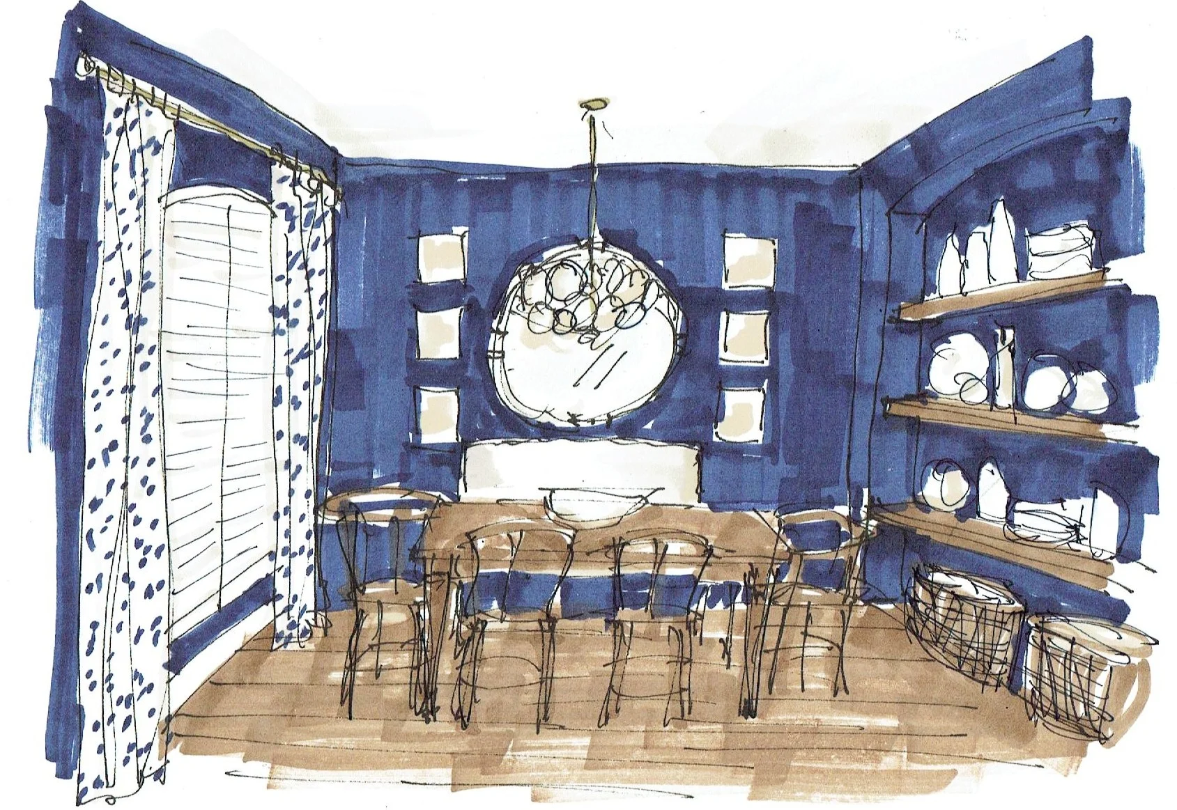
I'm sharing an e-design project that I did recently with you today cause I really love this one and I think it incorporates a lot of what this homeowner wanted without being an exact copy of her inspiration images.
While I don't have time to do too many of these online designs or Q&A, when I do, I am finding I enjoy them more and more. This homeowner kindly allowed me to share this with you here on my blog.
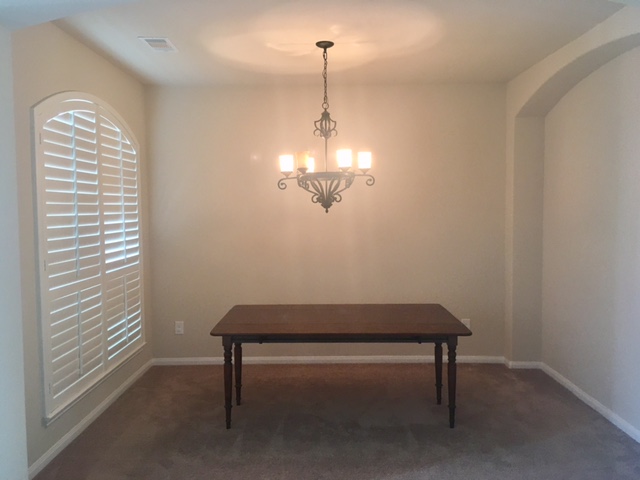
So, here was where we started. This was her dining room.
Dining Room Redo Before Pic
We had a table to work with and that was basically about it. She wanted to change the light fixture and had a thought about doing some open shelving in the niche instead of investing in a piece of furniture for some dishes and display.
We discussed the idea of putting in new wood flooring, as I felt it would be a good investment and keep her from having to get a rug to cover up that carpet. (That's what she had indicated she wanted to do at the beginning.) She had tile elsewhere in the house. Because really, the elephant in this room is definitely the carpet. That needed to addressed before anything else.
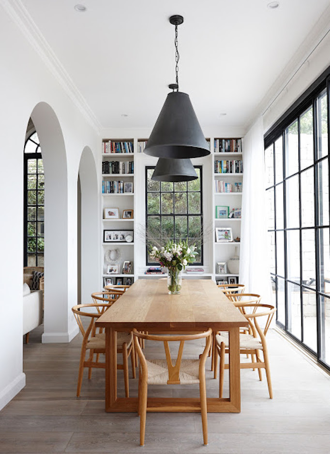
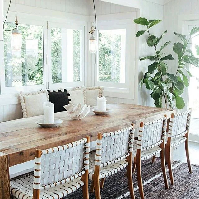
Here were her inspiration images.
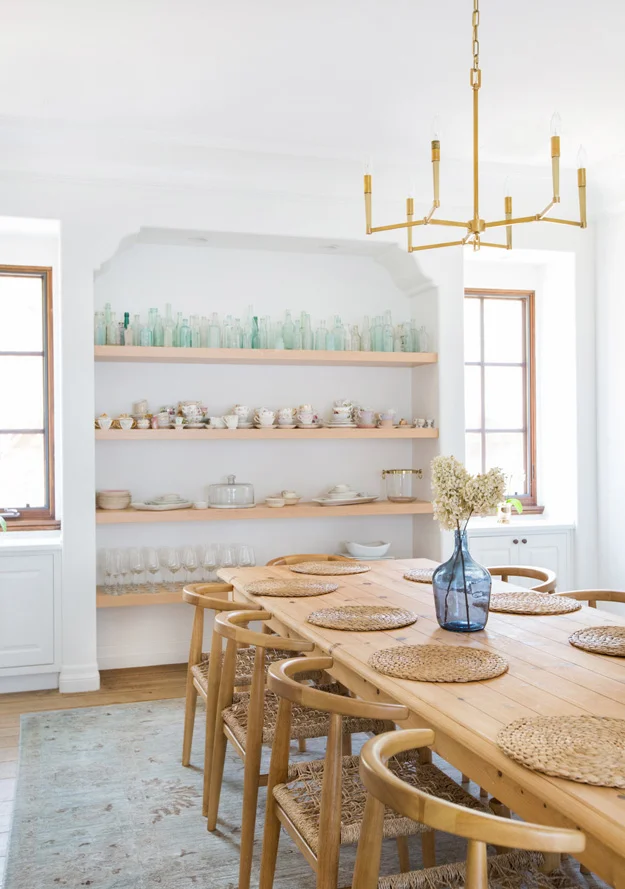
Image via: Becki Owens blog, Home of Olivia Babarcsky
Coastal dining room | The Grove at Byron Bay | Image via: bellamumma
Dining Room via: CocoKelley, Cassandra Lavalle
Image via: Desire to Inspire, Designer: Katherine Carter
She wanted a casual style, a light and bright space, and I felt it leaned a little California-inspired. So pretty!
Here was my description of the scheme:
I feel like your inspiration looks were kind of a California design style popular these days and so I went that direction. I think it looks fresh and young and will make your home bright and comfy, with some laid back style. It will give you a lot of room to grow into it, by adding new pieces here and there as time goes on. I really like this style and think it’s a great direction.
So, although I said “bright” above, I think this room would benefit from going dark, and pulling in the blue that will significantly cool down the warm tones and be a dramatic place to have color. I selected a navy blue, Benjamin Moore Champion Cobalt, to go with your white trim, white shutters, and white ceiling. (If you don’t have white on the ceiling, I’d do white there.)
I love that you are open to wood flooring in here, really almost any color would work, a medium tone probably hides most, so is most practical. I wouldn’t go with a dark wood floor.
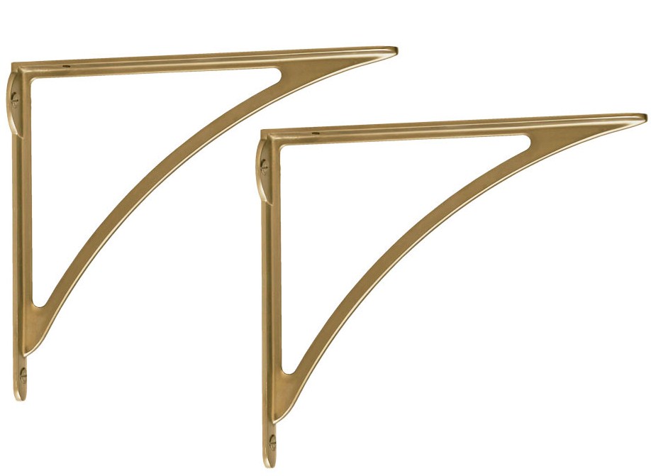
I like the shelving idea in the niche and have included some brackets for you. I pulled in some brass, because it just looks hip and works so well on top of the blue. I would do shelving in a wood tone to match the floor and keep them as thick as possible, at least 2 ½” thick. They’ve got a long span there and you'll have to have them cut to fit.
I did a light colored bench for some seating, as I felt like that would give you a nice backdrop and contrast nicely against the darker walls. It serves to add some softness to the room. I like the light colored wishbone chairs, they are well priced and kind of edgy but warm toned. You could pull those into any room and use them.
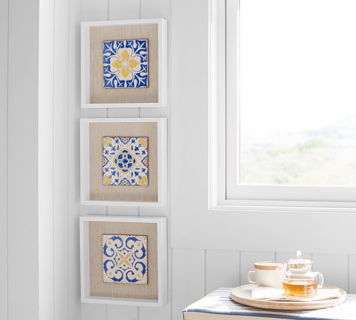
I did a big round mirror that is framed in a white to pop off the navy wall and then has the rattan trim to tie into the warm wood color of the chairs. Then I found these cute blue and white tiles framed in white, they’d look great flanking the mirror, 3 on each side, stacked.
The light fixture is a bit edgy, but I like the white-ish glass discs and the touch of brass. It feels lightweight, a bit trendy, but has some glamour to it.
I found a simple cotton white fabric here in my sample books, with a blue small ikat print. I think that would make great drapery fabric that you could add in. It would brighten the space and add some softness. You could do a brassy rod with a crystal finial, again, to brighten the space.
With all this, you can keep white dishes over on the shelves, add in white vases, pitchers, etc. They don’t have to have color or pattern, but could layer that in as you wish. Even a frosted glass or white glass bottles/vases would be fun.
Once the basics are in place, you can add things like a rug, some pillows, textiles on the table, etc. to fill in with some color.
The nice thing about this scheme....
....is that you can start slow and layer in as you can. Paint, wood flooring, and light fixture are first, then some seating, the mirror, shelves, and then the rest.
Now, when you get to the rest of the house, I’d go white or off-white, to brighten everything up and contrast to the blue. Then you can use blue as an accent color in other areas of your home and you’ve kind of tied everything together.
I did a little storyboard along with the quick sketch I did at the top of the post.
My blog may contain affiliate links. Any purchases, at no additional charge to you, are most appreciated and make this blog possible. :-)
I'm kind of jealous! I want that dining room. :-)
Time to redo my own!
Shop the look, below!

