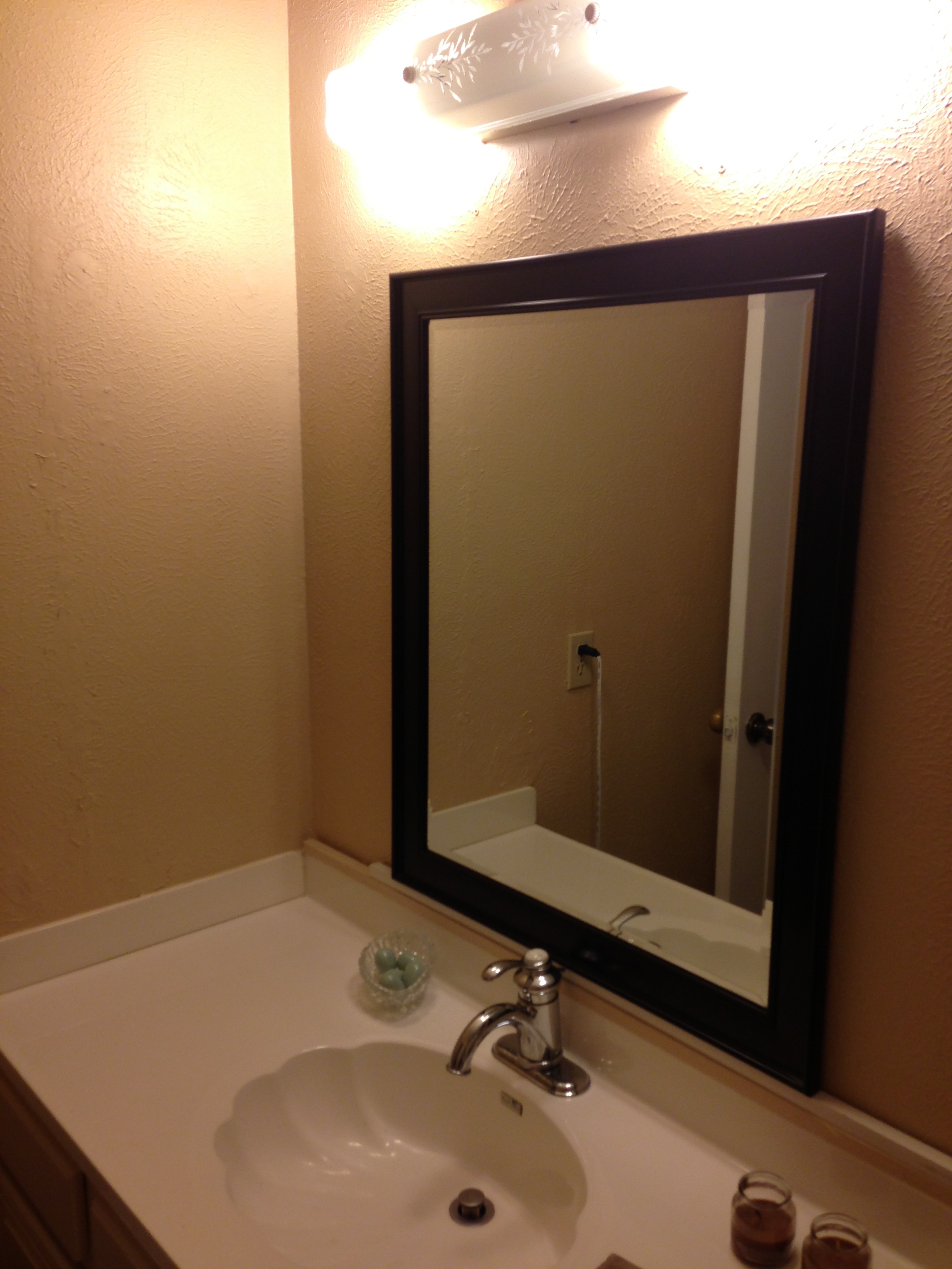
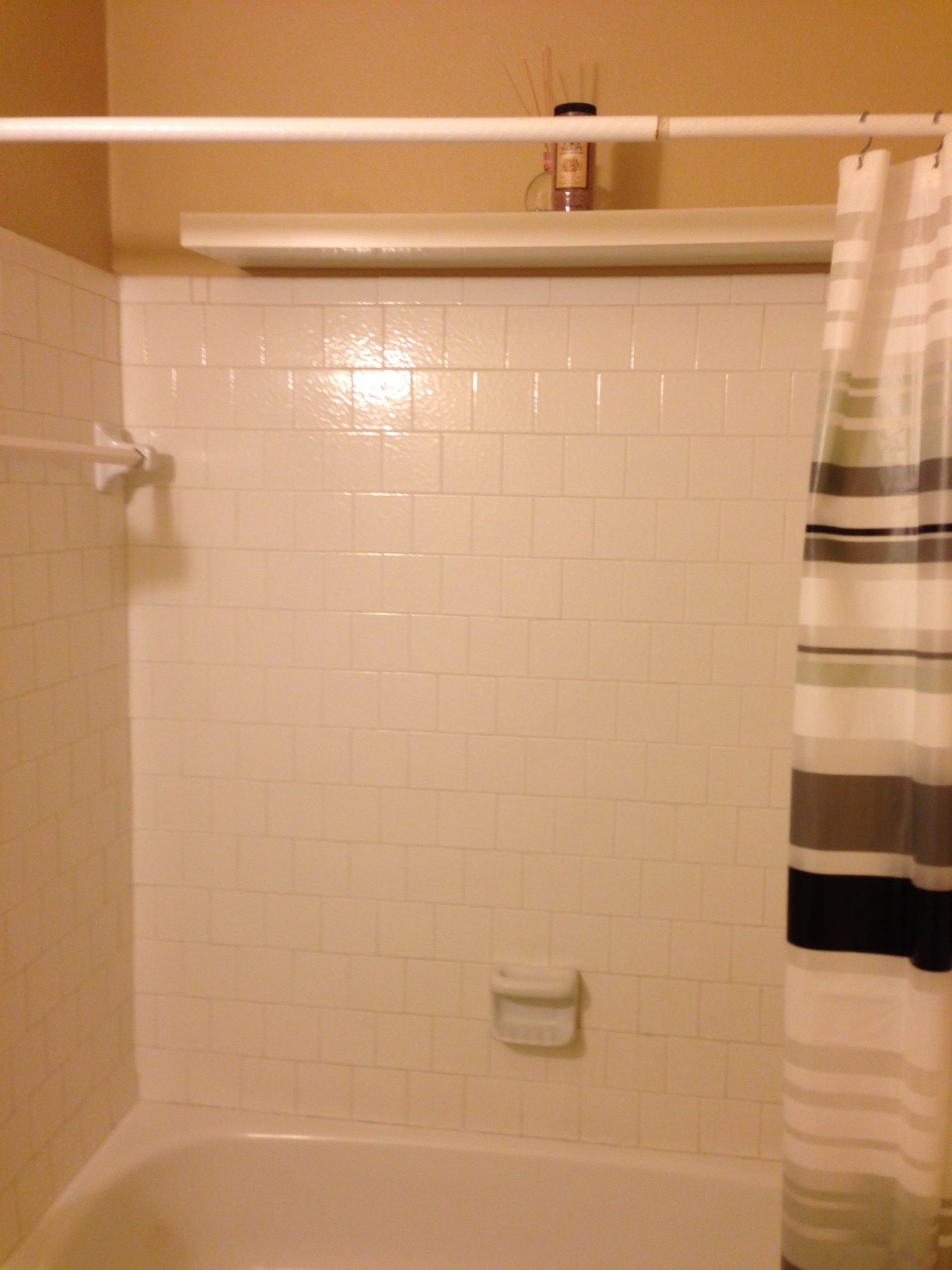
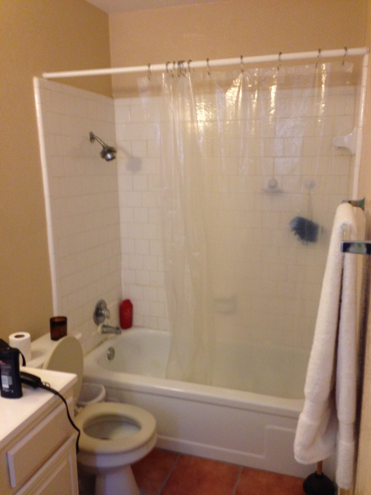
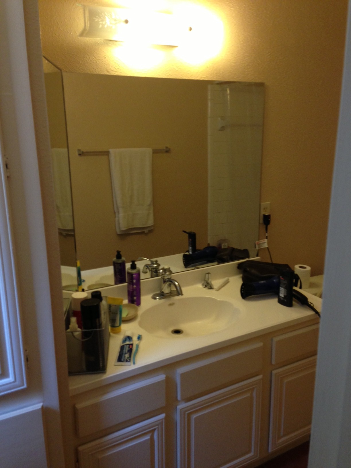
Last week I shared some before and afters of the kitchen, fireplace and entry hall for this project I did for a young, bachelor client of mine.
Now it's time for the bathrooms!
This place was a cool little contemporary house built in the mid-70s that really needed some updating with the love of a professional designer. :-)
I was happy to dote on this one for awhile because I knew I could make a dramatic difference in quality and appearance. After all, if we're going to do this thing, it better be dramatic!
This particular client was after a contemporary yet rustic look with a masculine feel, and I think we designed exactly what he ordered along with a little extra drama thrown in there for me!
These bathrooms have very basic layouts that could not change, so we updated everything to work within the scheme we began with in the main living area.
To keep our material transitions from visually screaming out at us and to help make everything appear larger, we made the tile floor in the hall bath similar in color and texture to the wood flooring in the hallway. I applied this same theory to the rest of the finishes, ultimately maintaining a simple monotone envelope with large scaled subway tile matching the wall color. Throughout the house the Marron Cohiba granite was used as countertop material to help with cost, as well as keep some high contrast and interest in there with its organic, textured finish.
Much better, right? I couldn’t resist the mustache print! ;-)
Next was the master bath.
Again, this was a very small bathroom that I wanted to make feel larger.
We took out the tub to do a shower, but the tub was tiny and we had a really tight depth to work with. When you have a shower curtain over the shower you can bump into it and the shower curtain moves freely with you. However, when you have glass there, you bump into something solid, making you feel a bit claustrophobic.
Along the back wall of the shower I designed an extra large shampoo niche to give the space about 3 extra inches of elbow room and it works beautifully! Every inch counts in a small bathroom. Looks good too!
One specific thing my client requested was a large mirror.
So even though I love a tall, vertical mirror, it was best here that we take that mirror as far vertically and horizontally as we could. I carried the countertop across the toilet and the mirror went with it to the edge of the shower tile. Then we ran the mirror to the ceiling and mounted the light fixture on top of the mirror, centered there, so that light would reflect even more in the space.
If you haven't checked out the rest of house, I strongly encourage you to. I'm quite proud of what we accomplished, and I'm pretty certain you'll find it to be quite inspiring. ;-)


