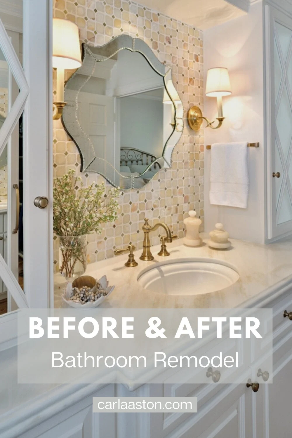
I’ve got a great before and after bathroom makeover today. It has some nice storage features and design tricks that you might want to use in your next small bathroom remodel!
I dipped into the archives for this one and yes, it is worth revisiting!
This project was resting on a page in my site that wasn’t in my blog, and I’m kind of resorting things and updating a bit and wanted to get it in here and really, just rewrite the story and present the images in a better format, more like how I post these days.
So, here it is, with all the special features mentioned below, so you can incorporate some of these in a bathroom remodel you might venture into on down the road. ;-)
Before Remodel - SMALLEST, DARKEST ROOM IN THE HOUSE
This client's master bathroom was just way too small in comparison to the rest of their home. It really needed more storage, but an addition to the house simply was not an option. The dark space needed light too, to give it the lift it desperately needed.
My job: Squeeze in a lot more space, light, and beauty out of their existing footprint.
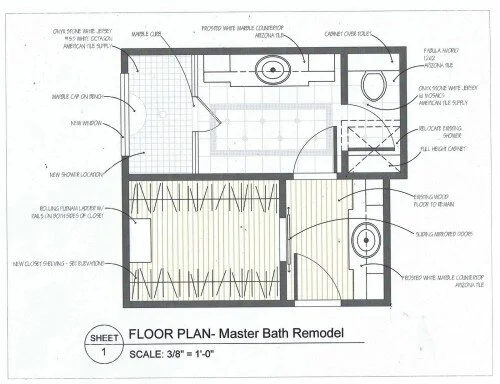
At the drawing board, I could see that dramatically moving things around wouldn’t help much. We had discussed doing away with the tub -- it was rarely used -- and creating a luxurious, larger shower in its place. Doing so would make room for a nice floor-to-ceiling built-in cabinet in a new enclosed toilet room!
Bathroom Remodel - We kept the same basic footprint, but deleted the tub for a larger shower and cabinetry in a private toilet room.
With these adjustments, we kept the costs from being totally outrageous and left some of the original integrity of the house.
Did I already mention how the space was very dark? :-)
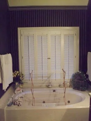
Well it was, and the dim navy wallpaper was largely to blame. Also to blame was the window with shutters that always stayed closed, ultimately making the space feel like an interior room within the house.
BEFORE REMODEL - Unused tub area and shutters that always remained closed.
BEFORE REMODEL - Shower stall next to toilet
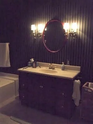
BEFORE REMODEL - Bathroom vanity with dim lighting
The closet was getting a reboot too.
They needed more organized storage and although we couldn’t access any more square footage, we could go higher with our storage.
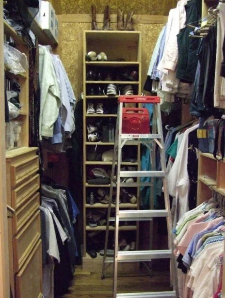
They left a ladder in the closet before, to access things they had up high. It was more than a bit inconvenient and in the way!
BEFORE REMODEL - Closet w/ladder to access items up high.
BEFORE REMODEL - Closet with mirrored backs of narrow doors
This bathroom needed a serious dose of natural light, and I knew just how I was going to let it filter in: with a new window and mirrors.
A New Window Brought in More Light
The window really had to be changed out if a shower was going to be installed in that location.
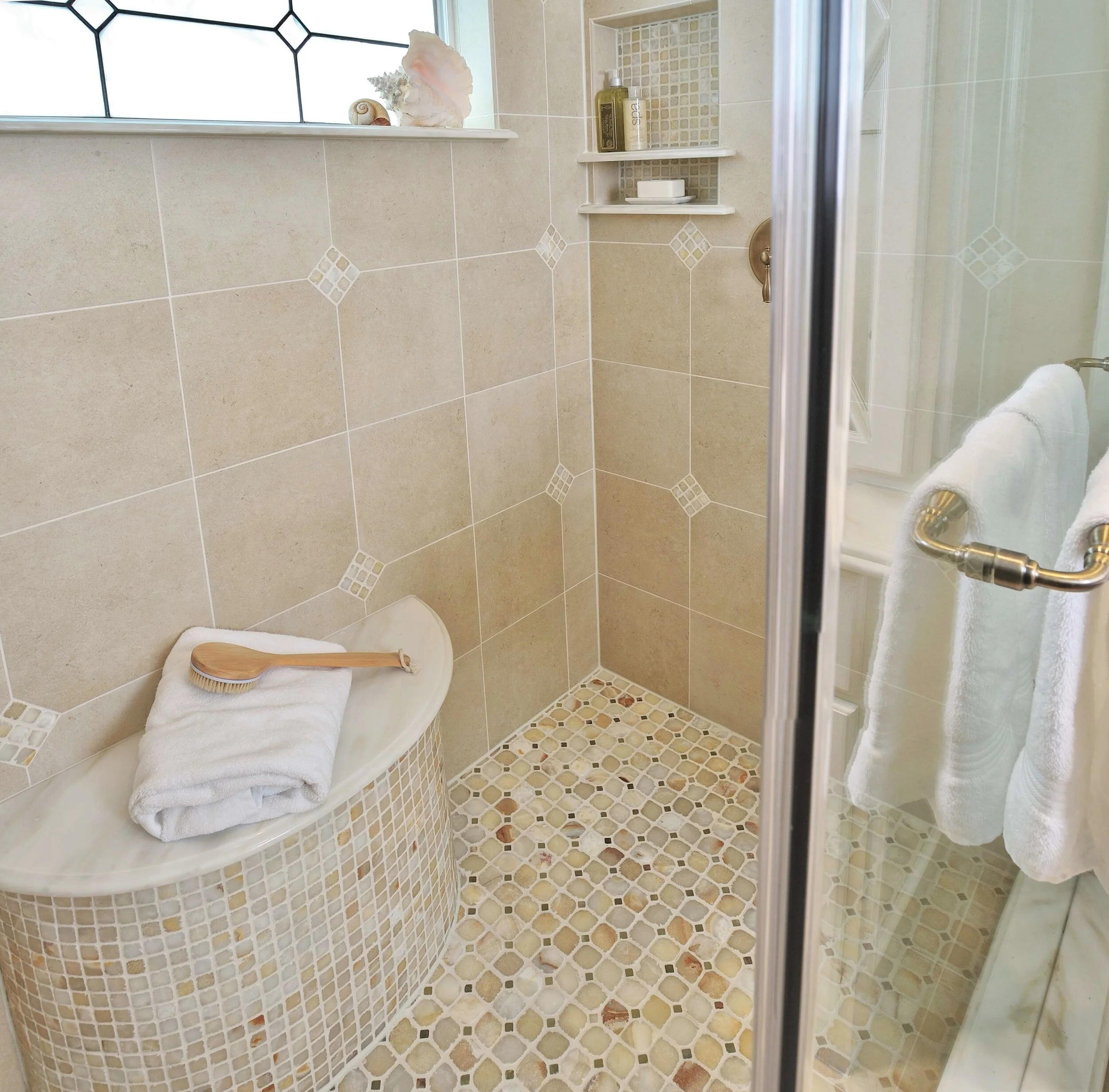
To accommodate it, we put in a smaller window -- up high -- to retain privacy and bring in lots of light. The milky glass (it’s not really blue as it shows up in the pic, it’s really a creamy white :-) had a coloration similar to the onyx and marble counters, and it beautifully complimented everything else in the space.
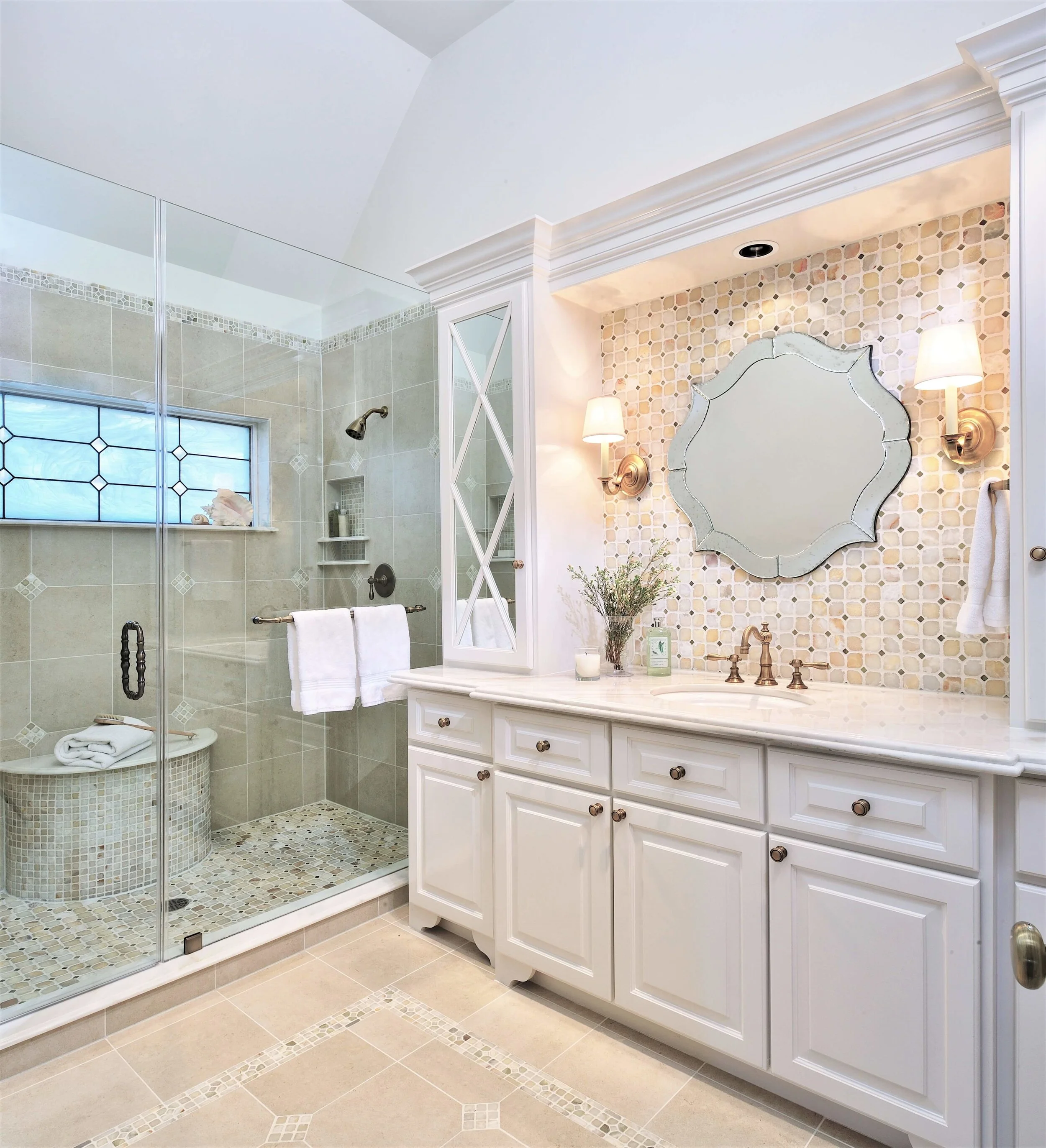
A new, higher window in milky stained glass repeats the mosaic tile pattern and brings much needed light into this bathroom all day long. The upper cabinetry adds much needed storage and mirrors bounce even more light around the room. Carla Aston, Designer | Miro Dvorscak, Photographer
The new, higher, stained glass window in creamy white, brought in lots more light into this small bathroom. Removing the tub and incorporating the demi-lune shaped seat in marble and onyx, captures a real luxurious feel. Carla Aston, Designer | Miro Dvorscak, Photographer
Strategic use of mirrors reflected light around the space
Mirrors were added to the upper cabinet doors to reflect light in and bounce it around the room.
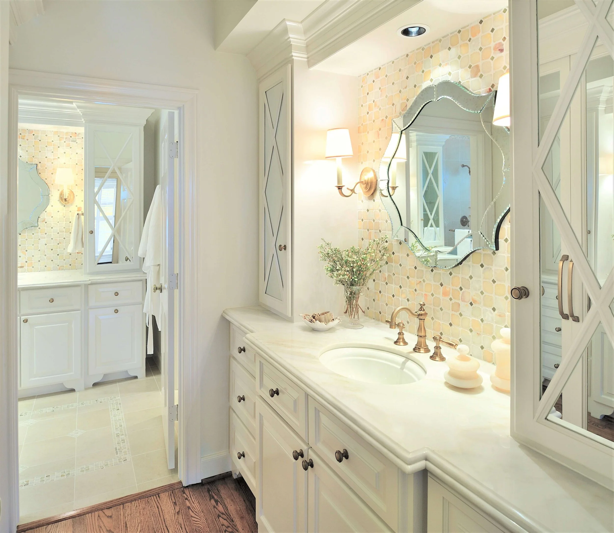
Do you see how the mirrored cabinet door in the main bathroom reflects the light from the master bedroom? They provide a lot of depth to the space. Also notice the X design on the doors...It adds such nice traditional detail and doesn’t make it seem just like a mirrored bathroom.
Those upper cabinets also helped provide additional storage in this small bathroom. An added linen closet in the toilet room and cabinet over the toilet brought this space even more needed cabinetry.
The mirrored cabinet doors bounce light around the space in this small bathroom makeover. Beautiful finishes and materials make for a luxurious experience. Carla Aston, Designer | Miro Dvorscak, Photographer
Beautiful FINISHES created a luxurious experience
Once the layout was decided, finishes were selected. The homeowner had seen the onyx mosaic tiles and wanted to use those in the space.
They provided a great stepping off point for the rest of the materials:
White marble for countertops and details, with some soft veining.
A white paint color to create a lighter envelope, as well as all kinds of pretty.
Antique brass fixtures and hardware to give it some warm color and enhance the look of the onyx tile.
A field tile of porcelain for maintenance and budget purposes to intersperse with the onyx.
Luxurious finishes such as white marble, onyx mosaic tile, brass fixtures and creamy white paint give this bathroom remodel a beautifully high end look. Carla Aston, Designer | Miro Dvorscak, Photographer
Check out the towel bar we used at the sink, above. It’s a long cabinet pull, not a towel ring. It fit perfectly in this spot and the outward curved shape worked well for a hand towel placement.
Closet Storage was maximized
Not only did we add cabinetry to maximize storage in the bathroom, but we were able to capture more storage in the small master closet.
Square footage was minimal here. Luckily there were high ceilings, so we went up with our storage placement. We used every cubic inch of the area, measuring clothing and bins to get maximum usage out of the small space.
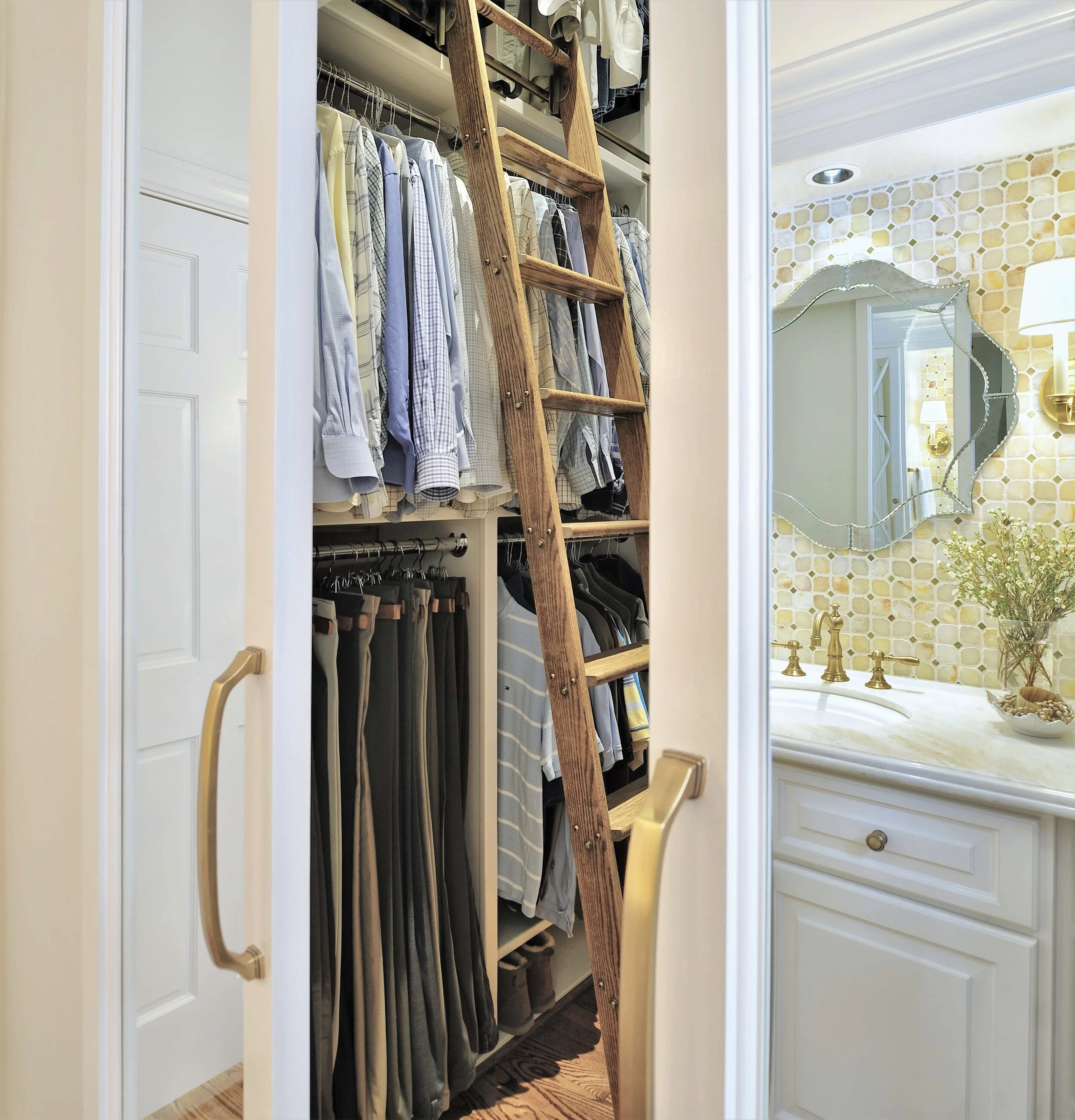
Now, how do they reach all their stuff when it's placed so high above them? A beautifully crafted, classic, Putnam rolling ladder, of course! The ladder pops in and out of a slot in the back and slides easily back and forth. I swear...these things are the best!
A rolling Putnam ladder was used in this tall but small closet. It tucks neatly out of the way when not in use. Carla Aston, Designer | Miro Dvorscak, Photographer
The other problem with the closet were the doors.
They swung out into the space and constantly annoyed the husband. As for the wife... She loved the full length mirrors on the backs of the doors and wanted to keep them open.
The solution to this was simple: Install barn door type hardware under a crown moulding pocket so the doors could slide open and shut with the mirrors exposed all the time.
I know it is hard to tell with all the reflection of the mirrors in this photo above, but those are the barn doors, slightly open, with the mirrors reflecting the vanity on the opposite wall. We’re peeking into the closet with the ladder in place there.
See how every inch of storage is used in there? We measured clothes!
I hope you enjoyed seeing this little trip down memory lane here. This bathroom was remodeled around 10 years ago! I think the design has held up and it still adds value to this home today.
If you’d like to see the kitchen that we came back and did a few years later, here’s the link to that.
DESIGN TOUR - A White Kitchen With A Soft Look And A Whole Lot Of Pretty!
Are you considering a bathroom remodel yourself?
You might want to check out my Bathroom Design Guide, a checklist of items and considerations that will help you remember that perfect item to go into your new bathroom.


