This was a project where a little bit went a long way.
We didn’t have the time, nor the budget, to redo this bathroom in my usual total-gut-job fashion, because we also had to allocate money to a bedroom that needed some "pretty". I'm relieved to say the project wound up being an absolute success, without spending a single cent more than was necessary ;-)
The Bathroom:
In the bathroom, there were things we had to keep, like the hard surfaces and cabinetry. And then there were things that had to go: the floral wallpaper, the mirrors and lighting, the faucets and window treatments.
My biggest challenge here was working with the tile floor that was taking charge of the color palette in the room. It had a definite pinkish tone that we were forced to acknowledge and work with.
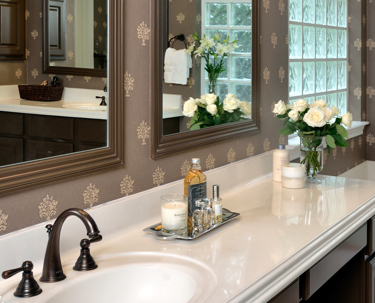
Before I came upon this wallpaper, I had looked through an entire library’s worth of books and samples. As soon as I saw it I knew we had to use it.
The medallions were the same color as the tile floor, but, on a field of chocolate, it didn’t read as pink - it read as a neutral.
The chocolate color added some drama, as it provided a nice contrast to the white counters and tub, both of which had to stay.
It was, in fact, the perfect solution.
BEFORE - Click to enlarge fullscreen.
AFTER - Click to enlarge fullscreen. | Photographer: Miro Dvorscak
Click to enlarge fullscreen.
I’m usually not a fan of short mirrors with lighting just above them as shown in the before pics. I think it just shortens the room and looks so builder standard.
By reframing the mirrors to be a tall, narrow shape, and locating the lighting on top of the mirror, we made a more stylish and custom look to the mirror/lighting combo on the wall.
Personally, I think it turned out to be an absolutely striking bathroom … without the gut-job!
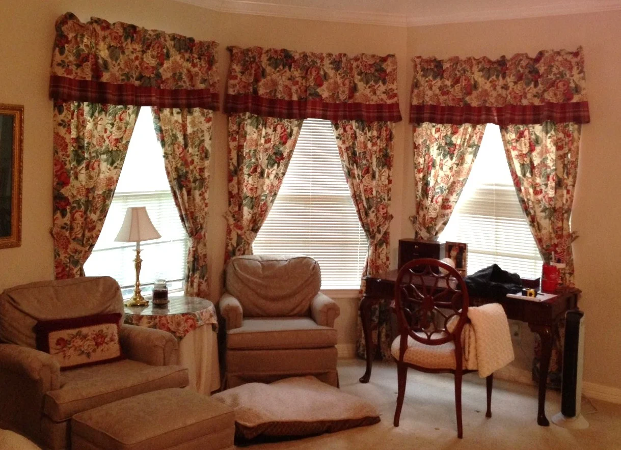
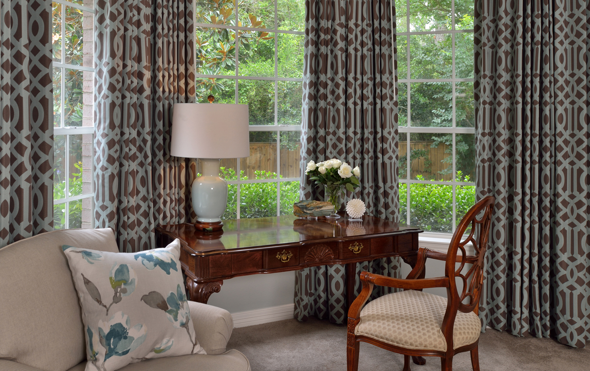
This homeowner also wanted some pretty things for the bedroom:
Some window treatments, upholstery, paint, carpet, bedding, lamps, etc, so we couldn’t afford to blow the whole budget only in the bathroom.
Below are the before and afters:
Don't you agree everything looks so much more sophisticated and polished?
I knew you would :-)


