
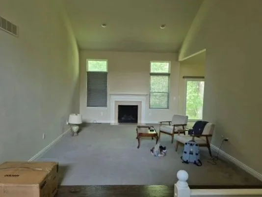
I’m sharing a Designed in a Click consultation done recently about this long, narrow living room with a very high ceiling.
The homeowners had purchased this condo to be near family and wanted to make some changes before they moved in. They were planning for some new furniture pieces and wanted to know what would fit best and how it would lay out in the room.
Here are the pics of their living room.
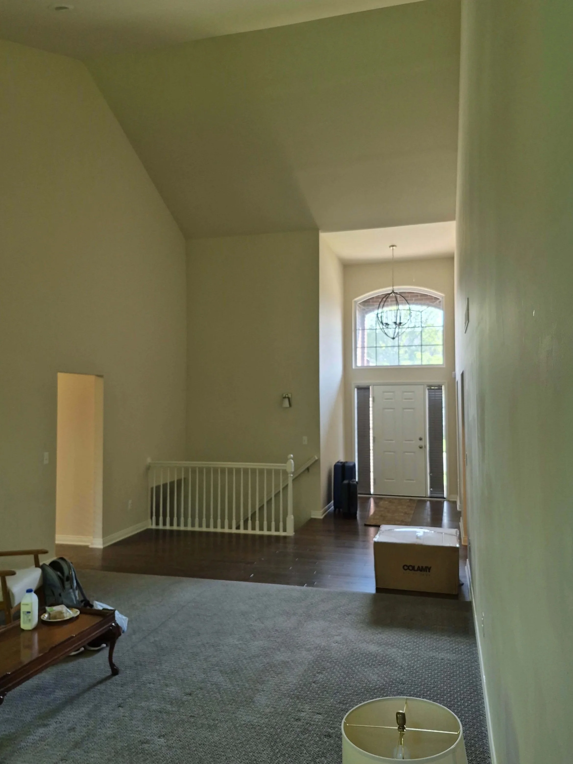
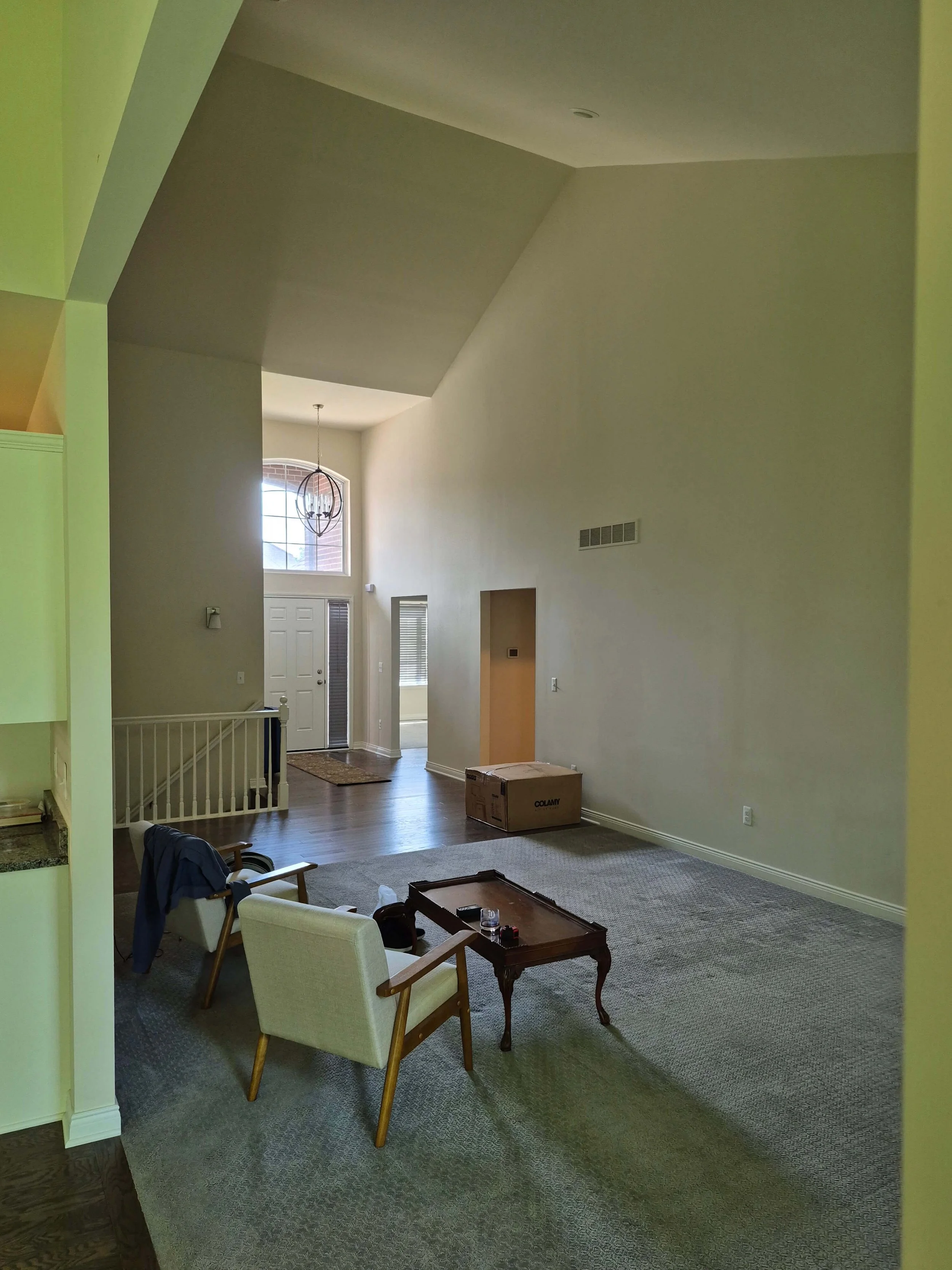
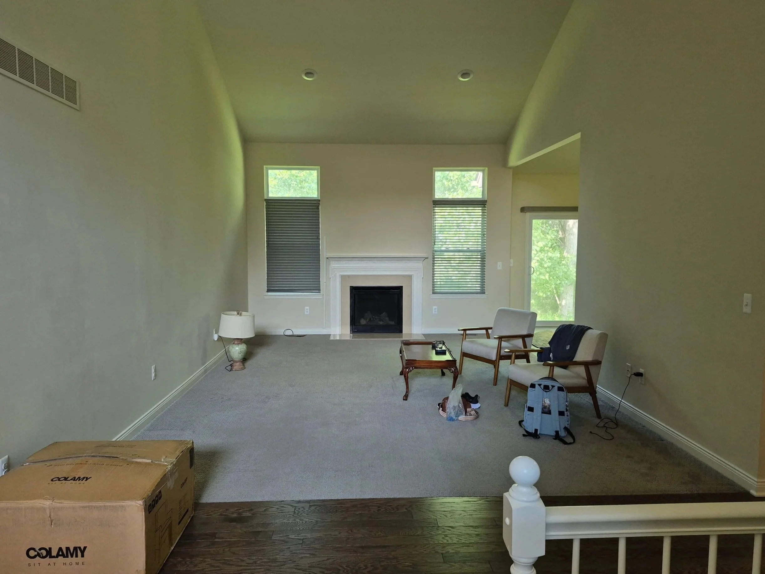
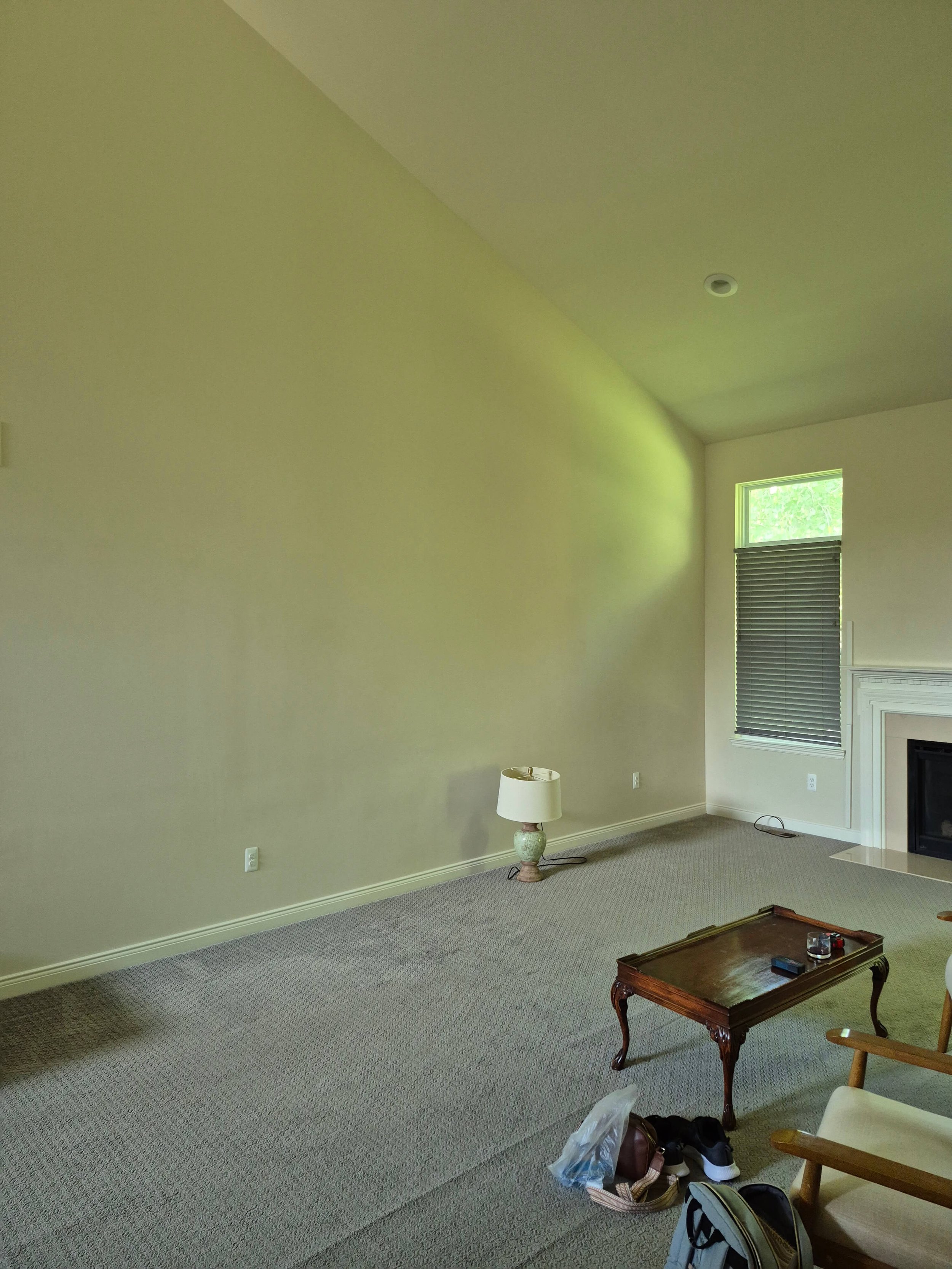
1) High Ceiling - One of the big issues they wanted solved was how to bring the height of the walls down, she felt dwarfed in this room. She was considering a tambour type wall paneling as an option. She didn’t want to do boxed type shapes with applied moulding on the walls as she had a lot of art to hang and wanted flexiblity with that.
2) Furniture Layout - They didn’t want the tv above the fireplace and were thinking of putting it on the long, tall wall in some kind of cabinetry with bookshelves and storage too.
They were considering a sofa with a reclining section in it and had two lounge chairs to reuse in the space. They also had a recliner they could keep if there was room.
3) Flooring - They were going to pull up the gray carpet but didn’t want to replace all the wood flooring to get it to match. They wanted to know what they could piece in that would work.
Here were my design recommendations.
1. How to bring height of walls down.
Divide the wall visually
One thing I've done before in situations like this is to do a horizontal strip of moulding to divide the walls up simply in a space, much like a wainscot.
I think that would work well here, a minimal effort for a big impact. Then you could paint the lower section of the wall and the moulding one color, like a tall wainscot basically, and leave the upper area alone. You could paint the upper portion and the ceiling if you want, but you could leave it as is, saving money and effort.
Here's a similar idea I used in this attic space that was converted to a den. Even though the ceiling was lower, there were weird angles I wanted to minimize and I wanted to paint everything above the top cap of the trim moulding all one color.
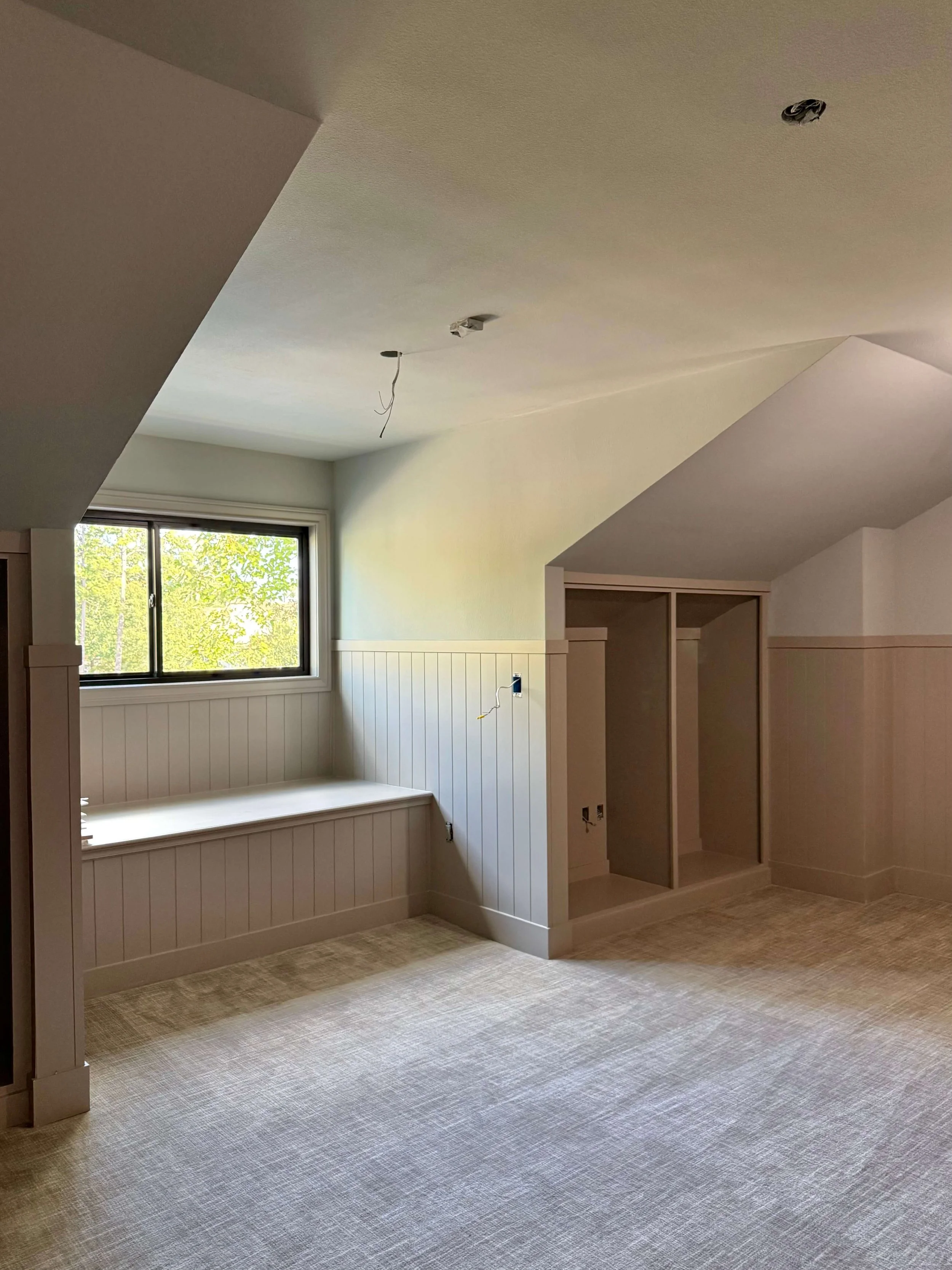
Upstairs gameroom almost complete
Their walls are much taller therefore the dividing moulding would be too, like at 9' high. That would break up that space effectively. No need to use paneling, like we did here, you can just paint the wall and the divider trim moulding.
Drop light fixtures down into the space
I would add two pendant type light fixtures in there to drop down into the space (on dimmers). I see there are some downlights in the ceiling, so maybe the electrical could be used to power some pendants. I like something like these, but suit your own style. I rather like the wood tone on this fixture.
I also like this one too, more of a vertical orientation.
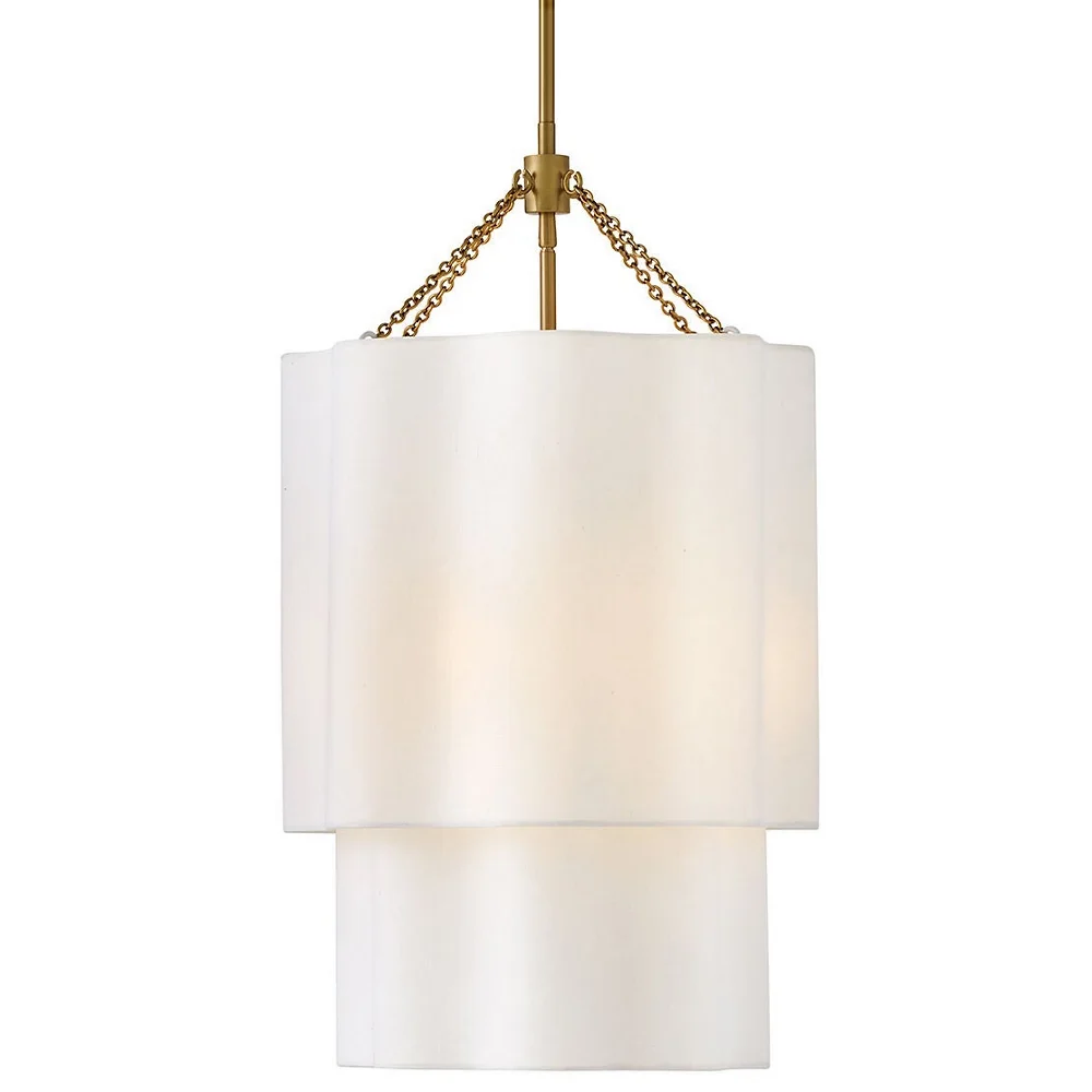
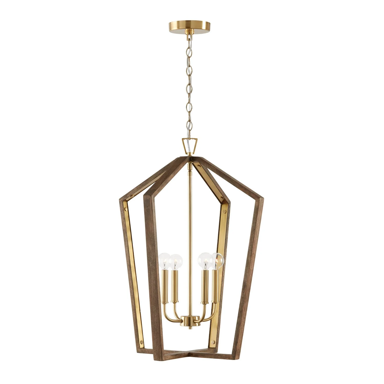
Even though there would be only two fixtures in this tall space, I’d put them on dimmers as you might only want a warm glow in the evening.
Add ceiling treatment
Lastly, to visually bring the ceiling down, I'd add a beam at the peak.
Just one single wood beam, stained to match the wood flooring, would really help here I think. You can get faux wood beams that are lightweight. Especially if you are able to add two pendants, I think you'd have a much more interesting space up there.
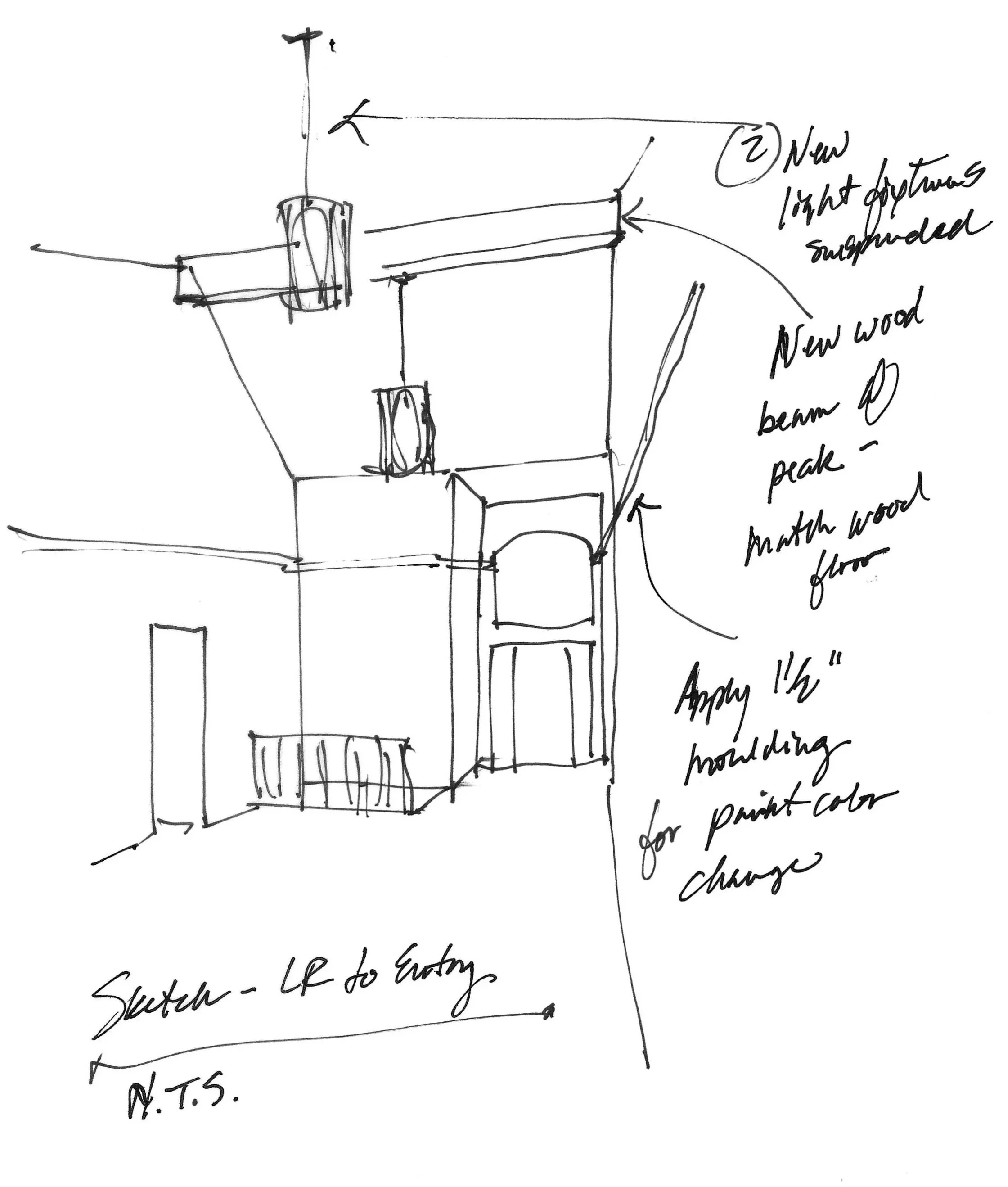
Here’s an idea of how the moulding, pendants and beam will appear, looking back toward the front door.
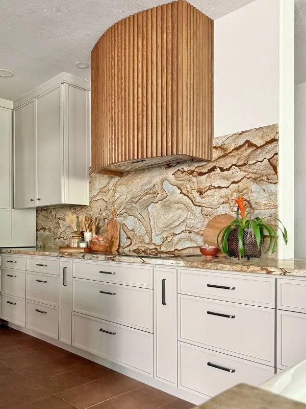
Side note: Tambour paneling can be really expensive. Nice to use in a smaller accent area or around a kitchen island, but on a full wall, even at half the height, it would be money not well spent here, IMO.
In this project, below, we only used the tambour on the hood, even though I had first presented it to go in a few other places as well. It was just a big expense.
2. Furniture placement
I did two layouts starting with her idea of putting the tv and cabinetry on the big, long wall.
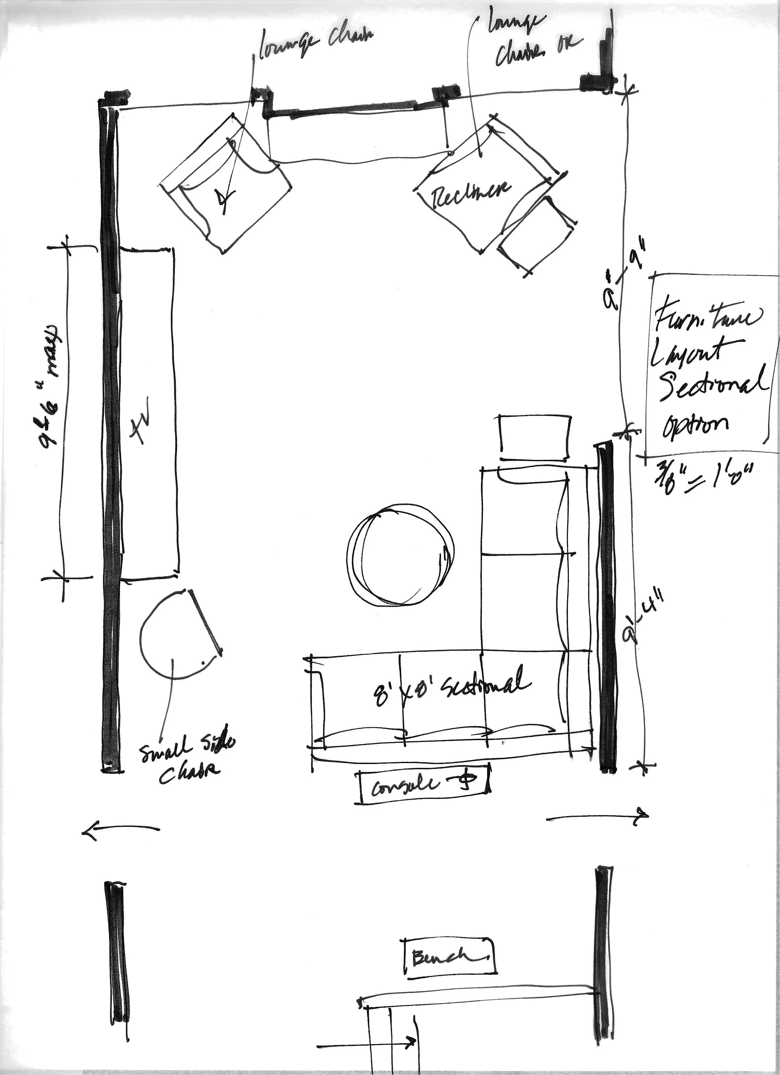
The seating just feels really spread out to me and you have to leave a path through the room. That opening to the kitchen area is so wide, right in front of the tv.
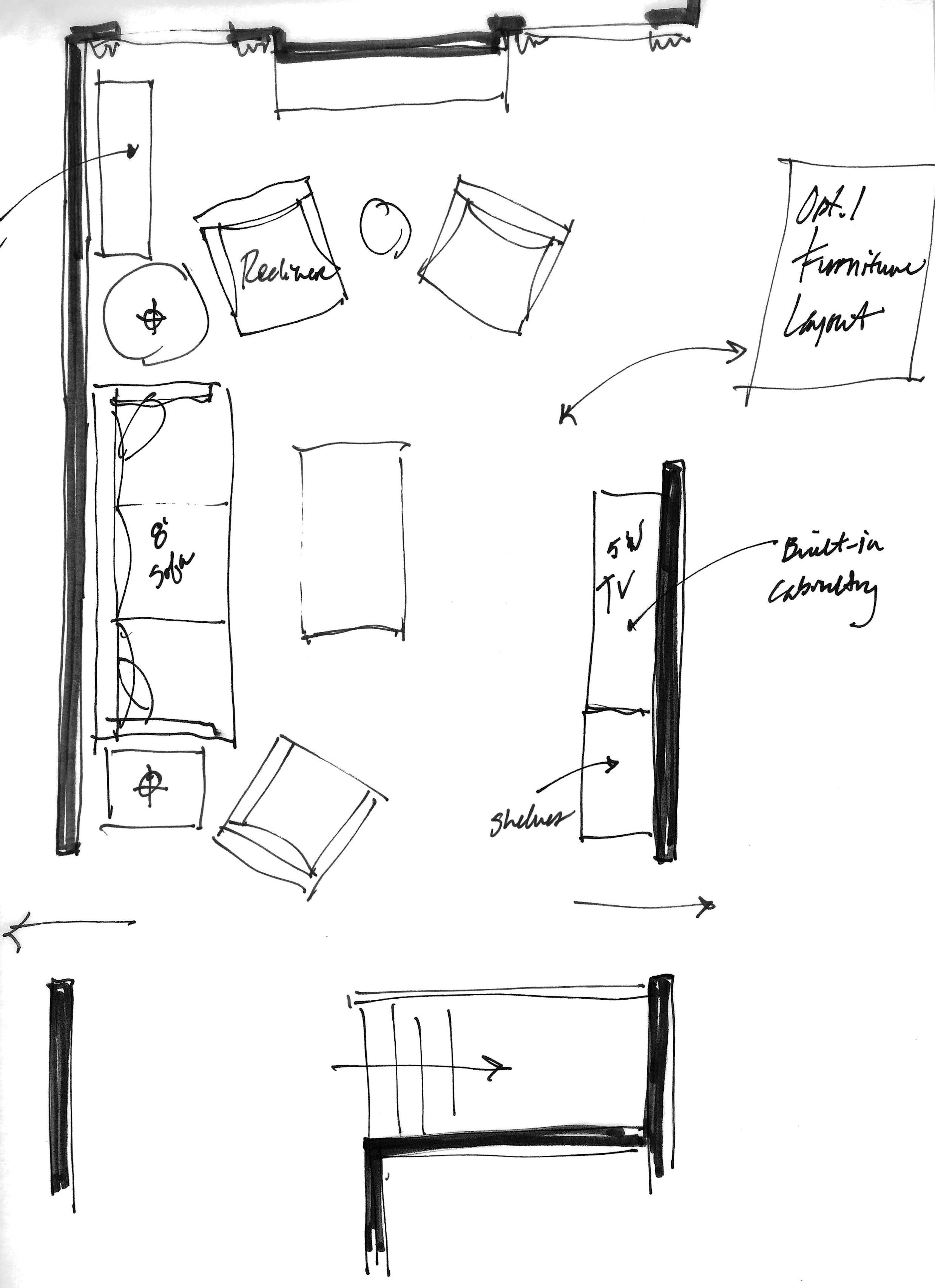
I like this option below better, where the tv cabinet is on the shorter wall.
I don't mind the chairs being in front of the fireplace to bring them in to the seating group. With a bookcase over there in the corner and dressed windows, I think two chairs in front help keep the seating group together and gives you a better use of the room.
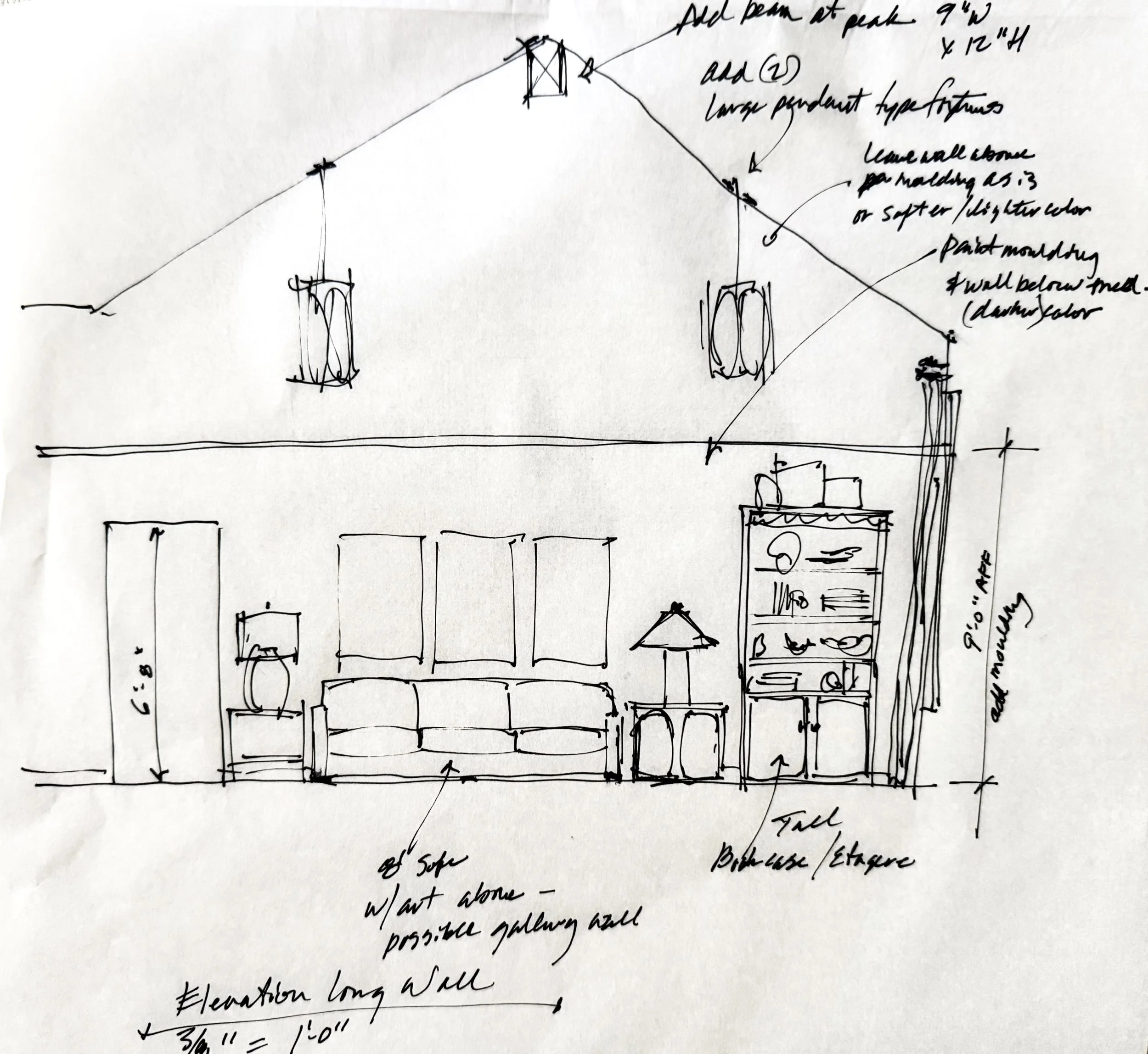
I did an elevation sketch of the long wall with the moulding at 9', the two pendants, beam and then the scale of the furniture in the space.
(Sorry for the leaning wall there, it is a free hand sketch!)
3. Flooring
I would do my very best to find more of that flooring and fill in with that.
Call some flooring companies to come out and see if they can match it. Try to get the spec from the previous owner or builder. As long as you have the same width board, same thickness and species, you can possibly refinish the new to match. I think that is the best investment, I wouldn't try to inset tile in here or anything like that.
If you can't find it or just don't want to invest in the wood floor, then I'd go with LVP that matches the wood. That would be the least expensive investment, besides carpet. Then if you want to redo all of the flooring at some point in the future, then you haven't invested too heavily in tile or with a material that would be hard to get up. LVP is floated so it is easier to demo.
Example project - Exhaust all efforts to find flooring
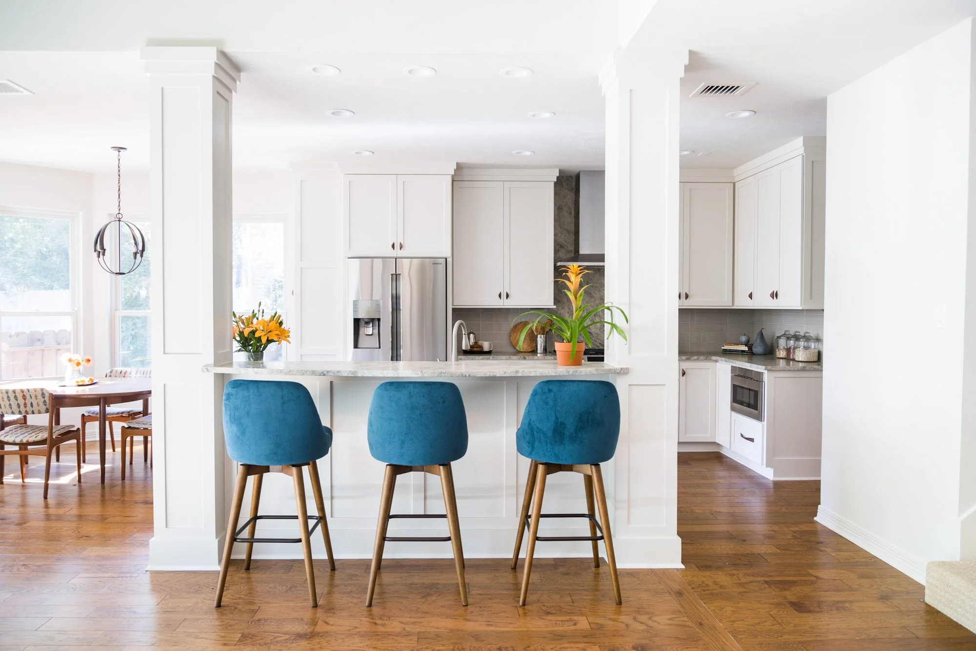
In this project, below, that I worked on some years ago, the homeowner did a deep dive search in our area for flooring that would match her existing. She had slate, only in the living room area, much like they have carpet in this condo. We really wanted wood flooring like what existed in the entry and the kitchen to run throughout the open plan space, for a consistent look.
She found a good match.
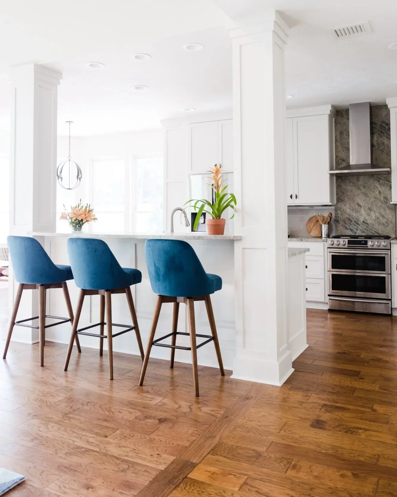
Although the boards were slightly wider, the color and species were spot on. We did a single board perpindicular to the rest to make an intentional break in the board layout so we could switch to the slightly wider board. It looked so much better than a different flooring, even though there was a break in the pattern at that one point.
The boards on the right side of the photo and in the kitchen/breakfast room were original, the new boards, slightly wider, were beyond the single perpindicular board on the living room side of the bar.
The width only mattered on one side of the installation. At the other end of the bar, they just butted right up to the existing flooring.
If you are ever in a situation where you want to divide up your flooring, PLEASE don’t pick an open plan room. Your future self will thank you!
Pick a room like a study, kitchen, or some space that is more closed off by framed openings or doors. Keep open plan spaces all one type of flooring if at all possible. (Your future realtor and buyer will thank you too!)
More Info on These Design Topics
I have several other blogposts on some of these subjects that I’ve written in the past. Referring to them might be helpful!


Okay, maybe I’m giving myself way too much credit here, BUT….. I do know these work. If you don’t believe me, take a peek at the empty shell I received from the rendering team BEFORE I started designing this large living room in the Seasonal Living Virtual Designer Showhouse.