

Some of the most often asked questions about design projects, online, are often about paint colors. Today, I’m sharing some of my fave colors and how I chose them.
You might be surprised at which one has been the all time most asked for color of the bunch!
I’m linking up with 5 other design bloggers who are sharing their favorites too, so there are lots of tried and true favorites mentioned here to help you pick the perfect paint color for your home. :-)
Perfect White - SW Alabaster
This kitchen, below, is all painted in Sherwin Williams Alabaster. That’s walls, ceiling and cabinetry.
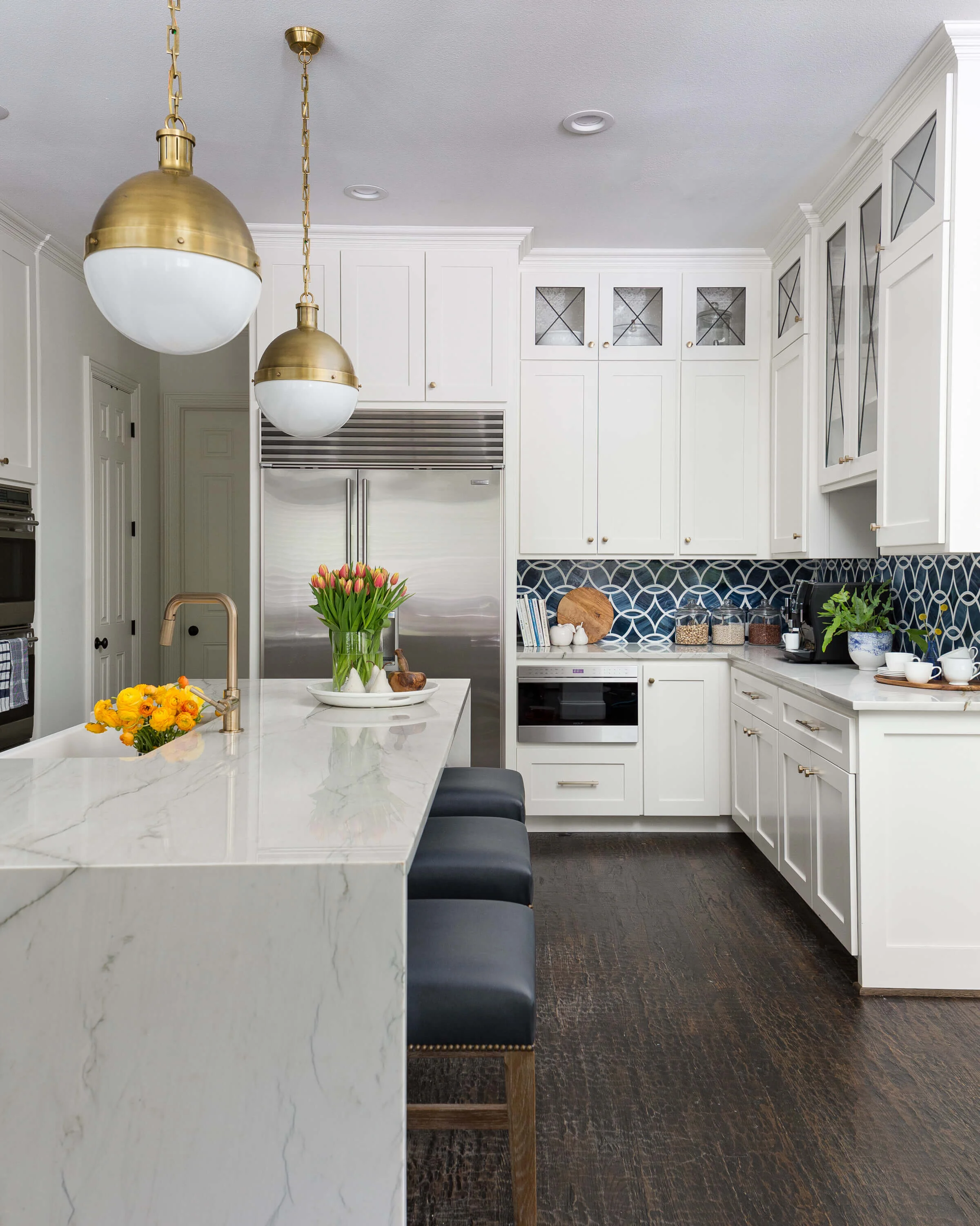
AFTER - White kitchen painted in Sherwin Williams Alabaster, a soft white. Carla Aston, Designer | Colleen Scott, Photographer
Here’s why SW Alabaster was the perfect choice.
The whole house had warm toned beige color and the cabinetry and trim were on the yellow side. The homeowner wanted a crisp white look however, we had one big problem.
The shutters throughout the house were a warm toned white that blended with the existing trim color.
While the job included painting all the trim, etc., painting all the shutters would have been an even bigger investment.
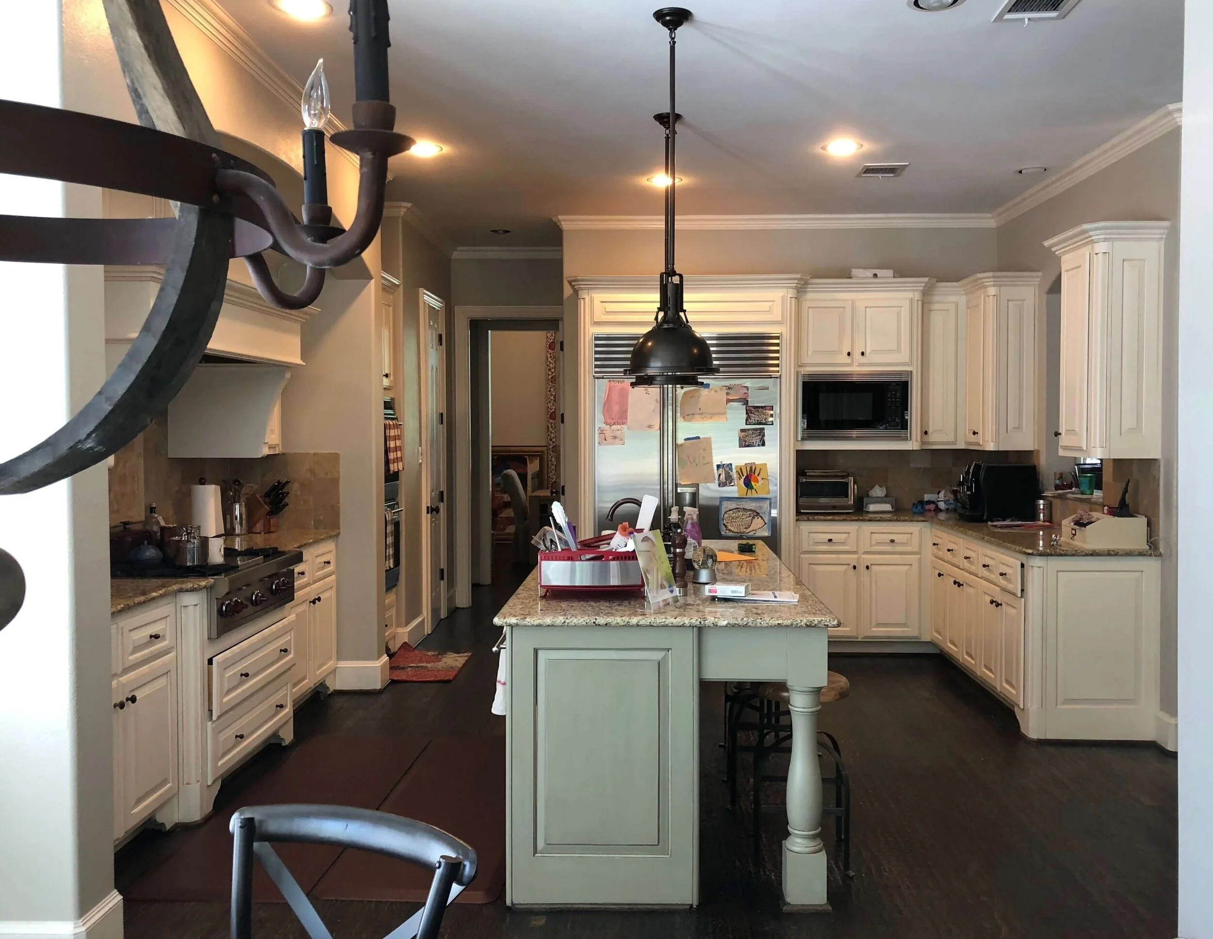
BEFORE - Warm toned kitchen before remodel. The homeowner wanted a white kitchen for a crisp, fresh look.
So, while we had considered going with Sherwin Williams Extra White, that combination really pronounced the slight warm tone color of the shutters.
SW Alabaster was still a whiter look, but blended much better with the shutters, eliminating the need to paint them.
See more of the before and afters of this kitchen remodel here.
My Perfect White - SW Aesthetic White
I often use SW Aesthetic White when I want to paint walls, ceilings, and trim one color, as it is a little muted and doesn’t scream bright white.
It doesn’t go too yellow and has more of a slight taupe gray tint that feels very neutral.
I recommended it in this recent consultation and I’ve used it in my own home all in the open spaces and on my kitchen cabinets.
My own kitchen remodel, using SW Aesthetic White as the white paint color throughout. Carla Aston, Designer | Tori Aston, Photographer
I’ve written about some other beautiful whites I’ve used on projects in this post on my favorite white paint colors.
Perfect Gray - SW Mindful Gray
I’ve often used SW Mindful Gray as a good medium gray. It doesn’t get too light or dark and definitely reads as a gray.
It was used in this kitchen on the cabinets and trim.
SW Mindful Gray is a nice mid-tone gray that works well with lots of whites. Carla Aston, Designer
I’ve written about more of my favorite grays right here.
Soft Blue Green Grays
Do you need the perfect bedroom color? To me, a soft blue-gray or blue-green is so soothing and relaxing in a bedroom. This one, below, was Benjamin Moore Pewter and it turned out just lovely and calm.

I have more favorite blue-green-gray tones perfect for bedrooms, dining rooms or anywhere really, in this post.
Best Blue Paint Colors
The blues are so popular these days, and there are so many good ones to choose from. I love the bolder ones that we’ve used in some of my clients’ spaces recently.
This blue mudroom bench, in Benjamin Moore, Newburyport Blue, looks great alongside its two-toned, blue and white kitchen.

This mud room bench looks great in a sharp blue paint color accented with brass hardware. Carla Aston, Designer | Colleen Scott, Photographer
I also used BM Newburyport Blue in this music room on the walls. Doesn’t it work perfectly with the Stark navy Antilocarpa rug?

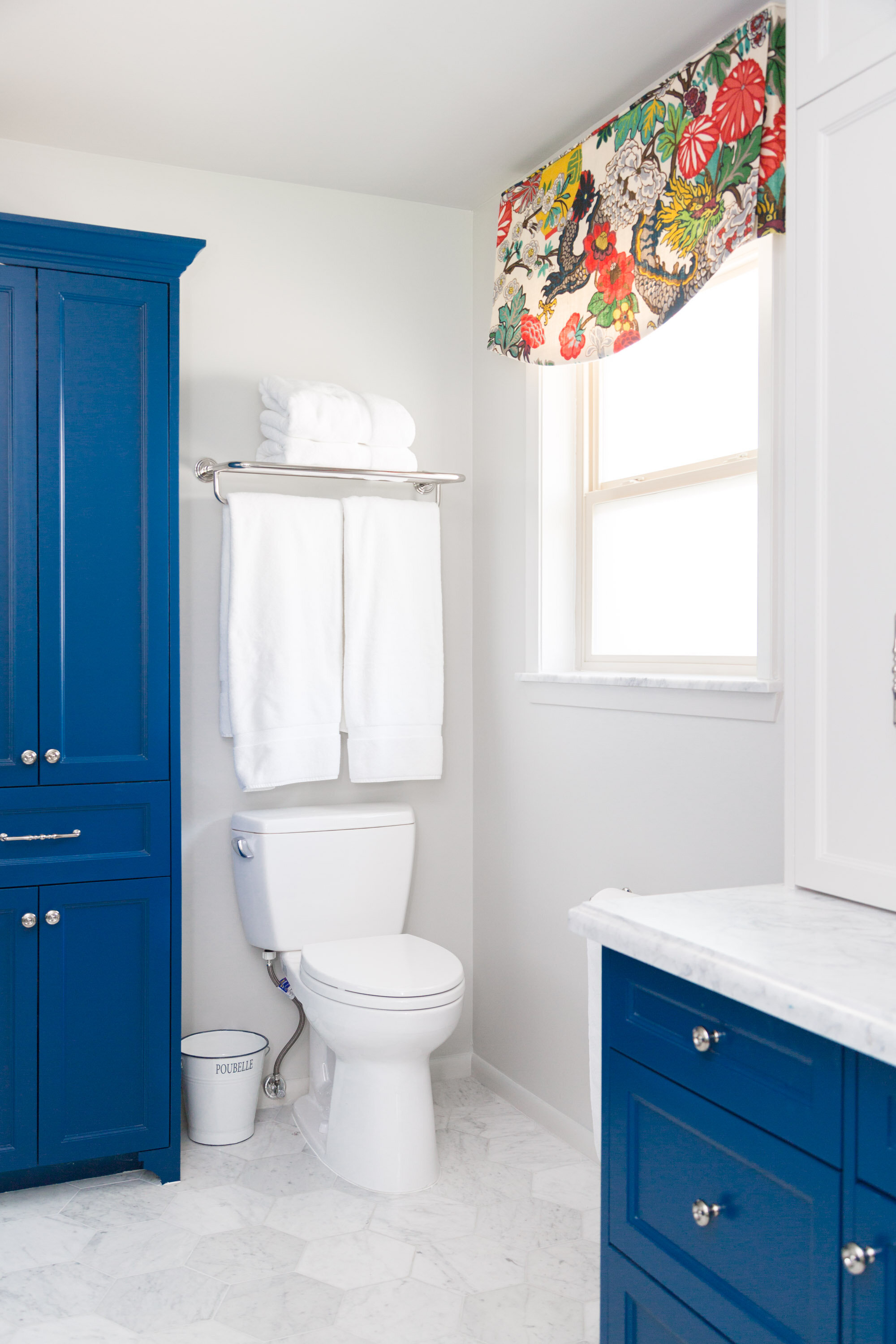
Here’s another beautiful blue, used on this bathroom’s cabinetry, Sherwin Williams, Loyal Blue.
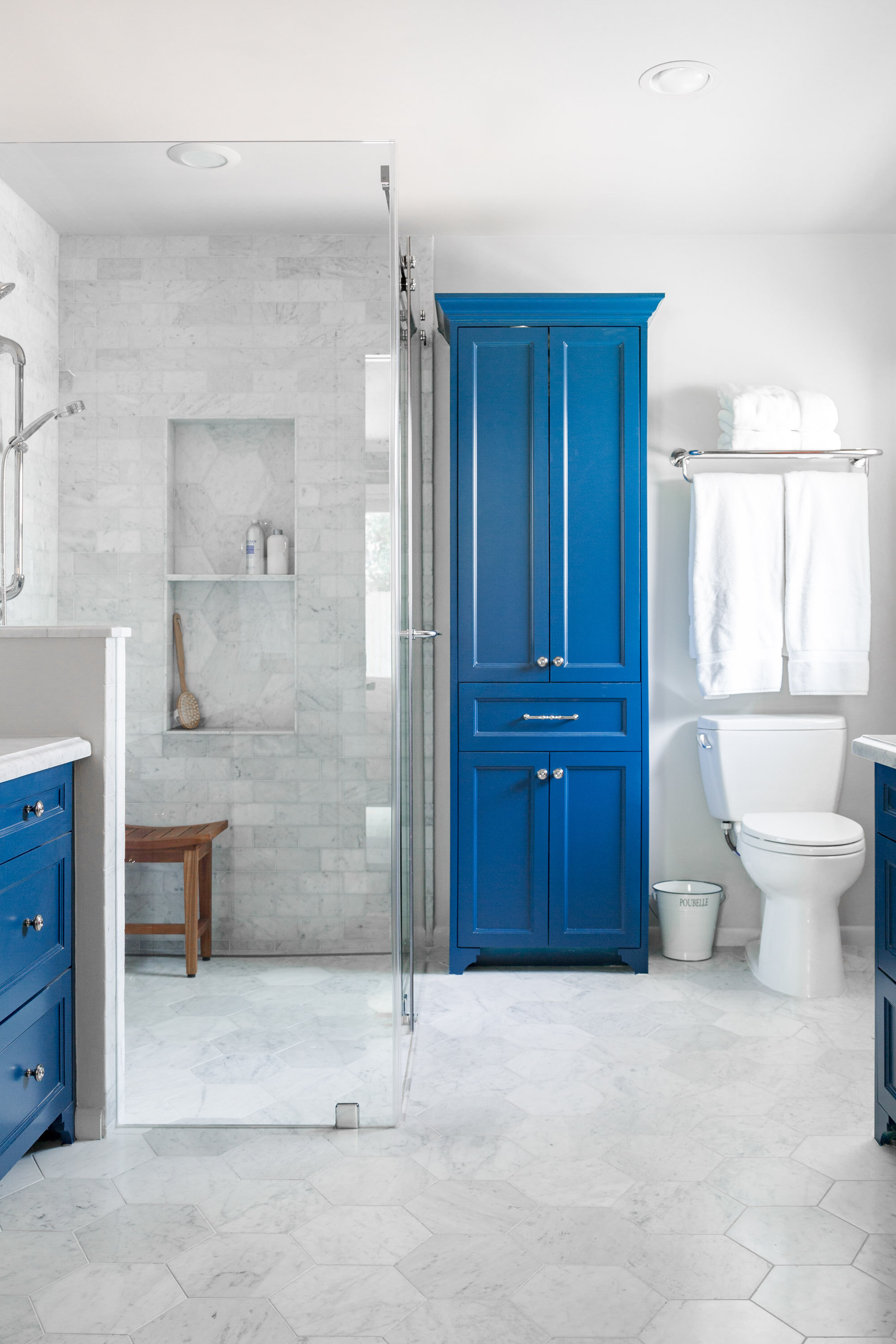
Colorful blue cabinets add some punch in this white marble bathroom. Carla Aston, Designer | Tori Aston, Photographer
It was chosen to work with the color in this homeowner’s favorite fabric for her bedroom, Chiang Mai from Schumacher.
We used it in the bedroom and as a valance in the bathroom.

I have another primary bath where we painted the closet barn door in a vivid blue, BM New York State Of Mind.
There are other blues in the house, but we chose this one that was a little brighter for this space. It’s the only blue in this room with some beautiful stained oak cabinetry, so we went in with some punch on the glass paneled barn door.

This bold blue barn door stands out as a colorful accent in the overall neutral bathroom. Carla Aston, Designer
One more blue that I particularly love that I’ve used on two different projects is SW Slate Tile. It’s a great blue/gray that goes more neutral but provides some nice contrast and color too.
I used it here on the kitchen island.

In this primary bath, below, we painted the vanities this color.
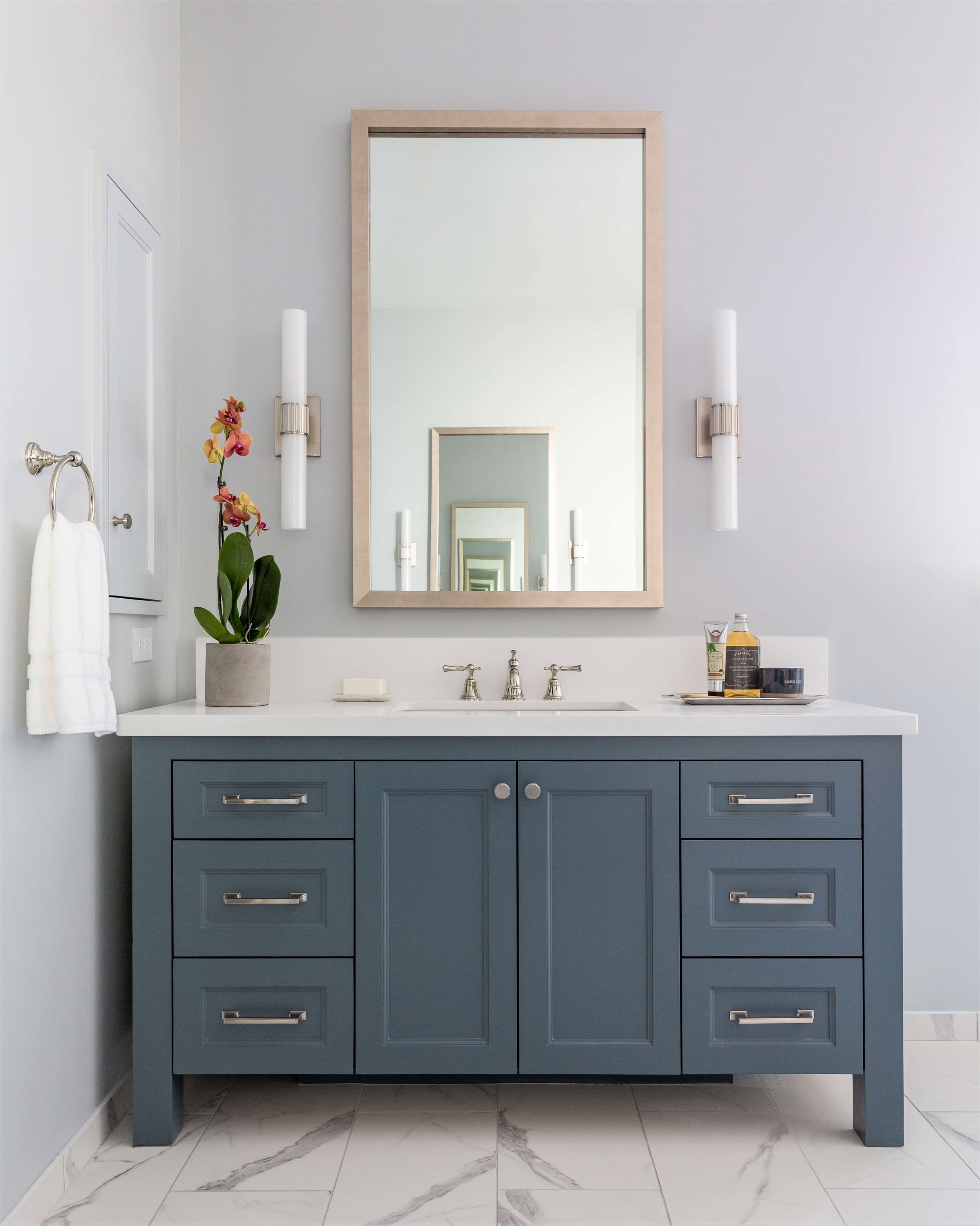
Bathroom vanities in this primary bath were painted SW Slate Tile. carlaaston.com
So Design Lovers, do you want to know which color I’ve probably been asked about the most over the years?
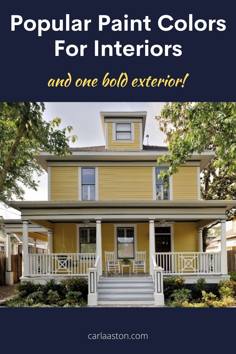
It’s this home’s exterior. People are most curious about the yellow color on this over-100-year-old home that I worked on over 10 years ago. :-)

This yellow painted four square house with white trim and porch railings is the most often asked about paint color in my whole portfolio of work. Carla Aston, Designer | Miro Dvorscak, Photographer
It’s a Benjamin Moore paint, Yosemite Yellow.
I remember when we chose it, standing out in the Texas heat in the street, looking at other houses in the neighborhood, comparing how it looked in the shade and direct sun, etc.
We didn’t want school bus yellow, banana yellow, or lemon yellow.
We were after the look of a happy house, reflecting the young, vibrant growing family living within.
I think it fits the bill, don’t you?
Now check out the faves of these other design bloggers who have some of their perfect paint picks, just for you!
Selecting the perfect paint colors - All the faves from these 5 interior design bloggers!
Maison de Cinq - Sheila Irwin
Instagram: maisondecinq
Design Indulgence - Sherry Hart
Instagram: sherryhdesigns
Rough Luxe Lifestyle - Cindy Hattersley
Instagram: cindyhattersley
Classic Casual Home - Mary Ann Pickett
Instagram: maryannpickett
Most Lovely Things - Annie Diamond
Instagram: most_lovely_things