

I’m sharing a before and after today of a home that we worked on some time back.
You see, this homeowner has moved and since we didn’t really go in and do all new furniture and style the place, I never did any finished photos. It ended up being sort of a partial remodel.
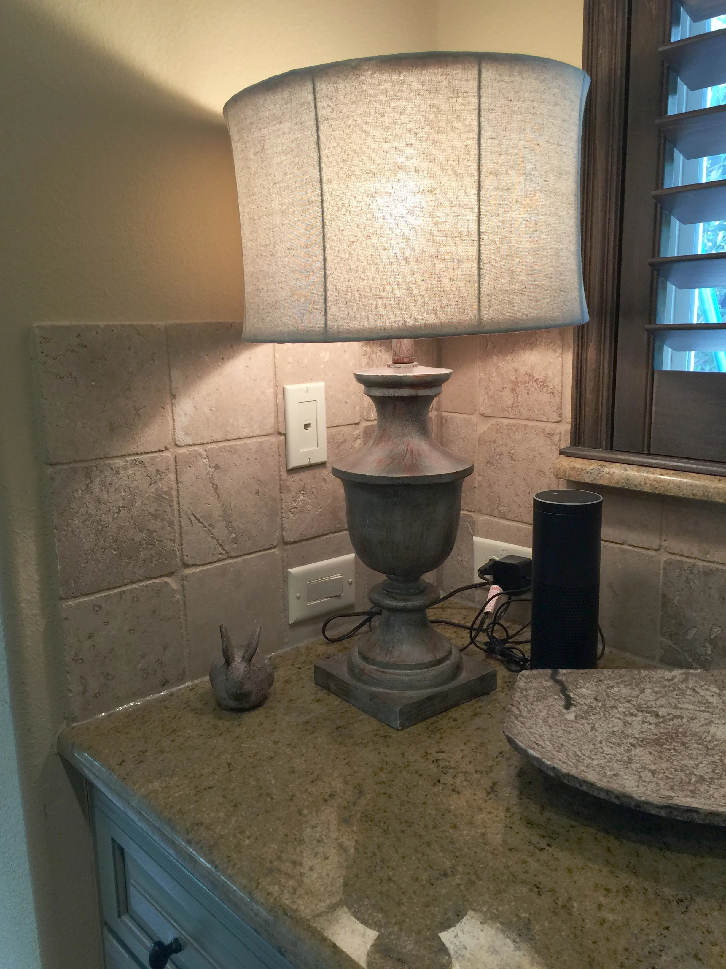
Well, I did share this one progress shot on my Instagram page. :-)
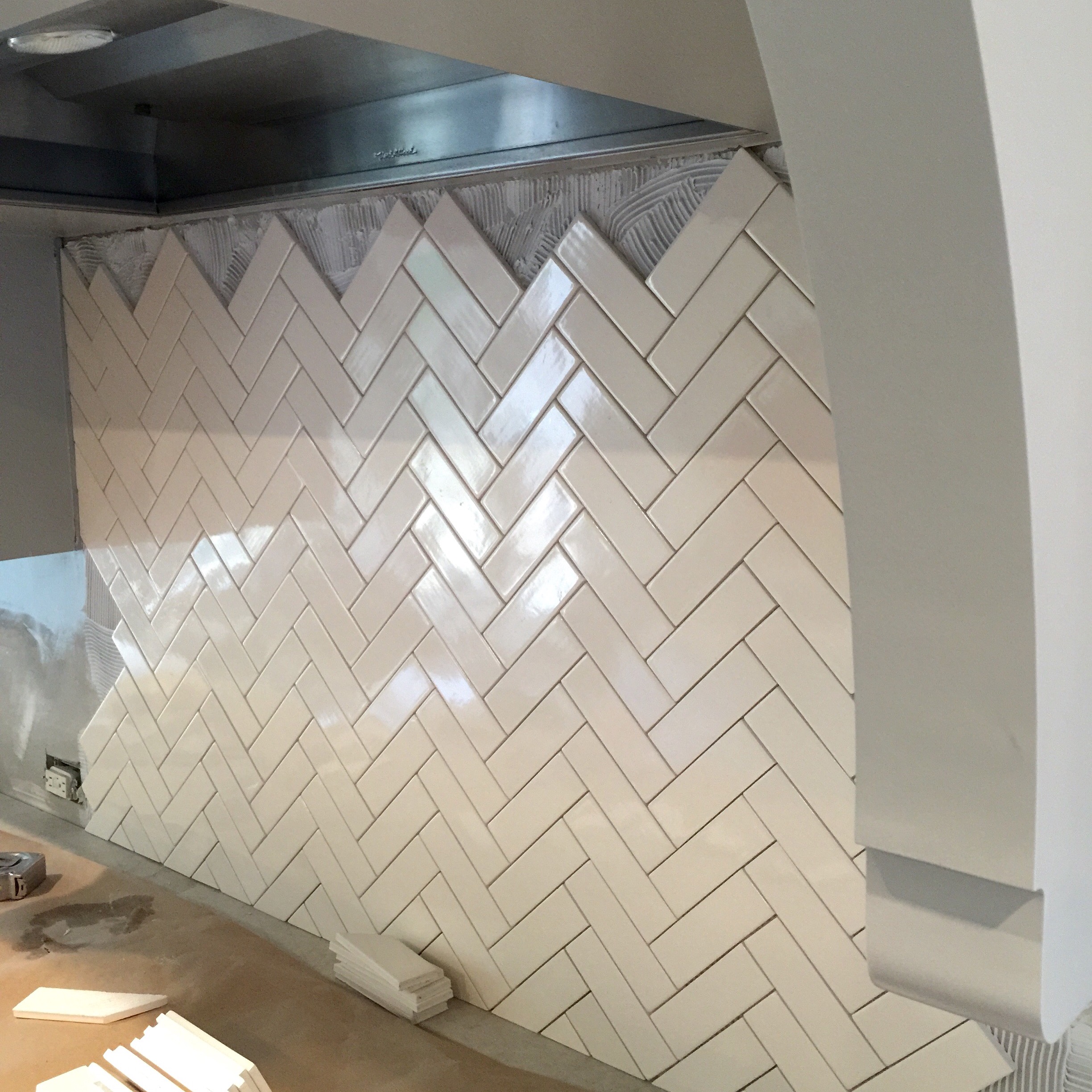
Herringbone backsplash - Carla Aston Designer
So, these final pics are real estate photos and therefore rather generic looking. I think this project really serves to show how a dark, Mediterranean style look can be updated with paint and some kitchen remodeling, so I think it's worth sharing.
Keep in mind, there isn’t much styling at all here, it’s pretty decluttered for selling the home. The tile backsplash looks sort of washed out too, which is a shame, because the herringbone pattern shows up nicely in real life.
These homeowners wanted to go lighter and more gray toned with their large home and paint was key. They contacted me because of this post I wrote awhile back, because they had so much gold and yellow color tones in their home that they were tired of. The sage green cabinets and small travertine tile used on the backsplash in the kitchen were dating the house.
Before kitchen remodel with sage green cabinets and spotty gold granite counters
Before kitchen remodel with sage green cabinets and spotty gold granite
They also wanted to change out their kitchen counters to get rid of the gold, spotty granite. They really liked the look of marble but not the maintenance, so I selected a beautiful Taj Mahal quartzite.
All of their trim paint was a creamy yellow color, kind of like a Sherwin Williams Antique White, and to keep from having to paint every piece of trim and door, we needed to work with that color. Taj Mahal does that well as it has a soft look (no spots) and mixes a gray/greige/cream color tone, if you can find the right slabs.
Luckily, I did, and then selected some grays to work with them for the kitchen cabinetry and walls. You know, you always start with the givens in a project when selecting paint colors.
Before - Gold beige walls throughout with creamy yellow white trim color
Okay, so because they didn't want to paint every piece of trim and door in the whole house and we had to work with the yellow-ish color there, I chose to paint all the walls the same exact color, to match the trim.
I know, it was a hard pill to swallow.
The homeowner didn't like that color and wanted cooler, white and gray tones in the house.
However, by blending everything altogether, the envelope of the home appears as the "white" even though it is a creamy yellow white.

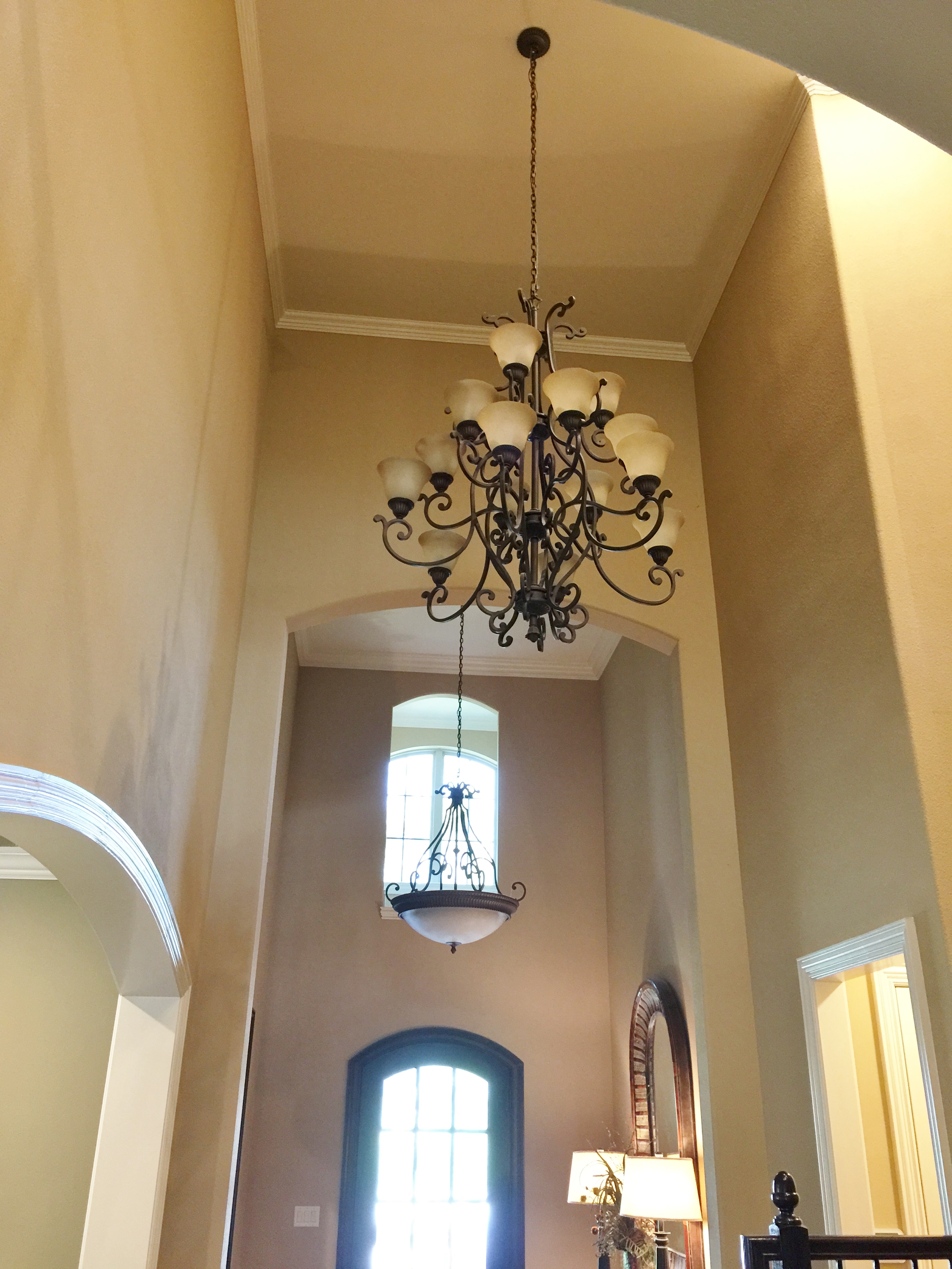
After Entry Hall - New paint transforms this space
If we had done a cool, light color on the walls, that yellowish color on the trim would have stood out like a sore thumb. It would have been accentuated and would have looked like they forgot to paint the mouldings. Get it?
I've written more about this technique in this post.
Now, when we finished painting the walls, it didn't look cool toned, except for the kitchen and dining room where we painted grays. It still looked a little yellowish. However, once the cooler tones of the furnishings were layered in, the home achieved that look. If we could have finished out with drapery treatments, rugs, and more furnishings, it would have really come together as this lovely mix with a cooler-toned vibe.
The other result from painting walls and trim the same color, is that the beautiful hand scraped wood flooring stands out more. There's more contrast created. Now, the busy white-ish lines (of moulding) running around the space, don't clutter up the visual field. The walls and trim actually look whiter because of the higher contrast created.
So, back to the kitchen.
I noticed that the wall mounted microwave sort of felt heavy over there in the corner and seemed to put the kitchen wall elevation off-balance. I recommended they move it below the counter by using a microwave drawer, which we had installed in the butler’s pantry. It turned out to be the perfect location.

Before kitchen remodel - wall mount microwave on right to be moved below counter

Before Butler's pantry with gold granite, travertine backsplash and sage green cabinets

After - updated Butler's pantry with gray cabinets, Taj Mahal quartzite, herringbone tile backsplash and undercounter microwave drawer. - Carla Aston Designer
Before kitchen remodel with side backsplash
While we were at it, we got rid of those unnecessary side backsplashes too! We cooled things down even more by adding in some polished nickel cabinet pulls to replace the dark bronze.
I wanted the back wall to feel lighter and more open…..again, the tile doesn’t show up like it does in real life, but you get the idea. :-)
Here’s the sketch, below, that I did back then for the homeowner, to show them how that would look.

Design sketch of kitchen remodel concept | Carla Aston Designer
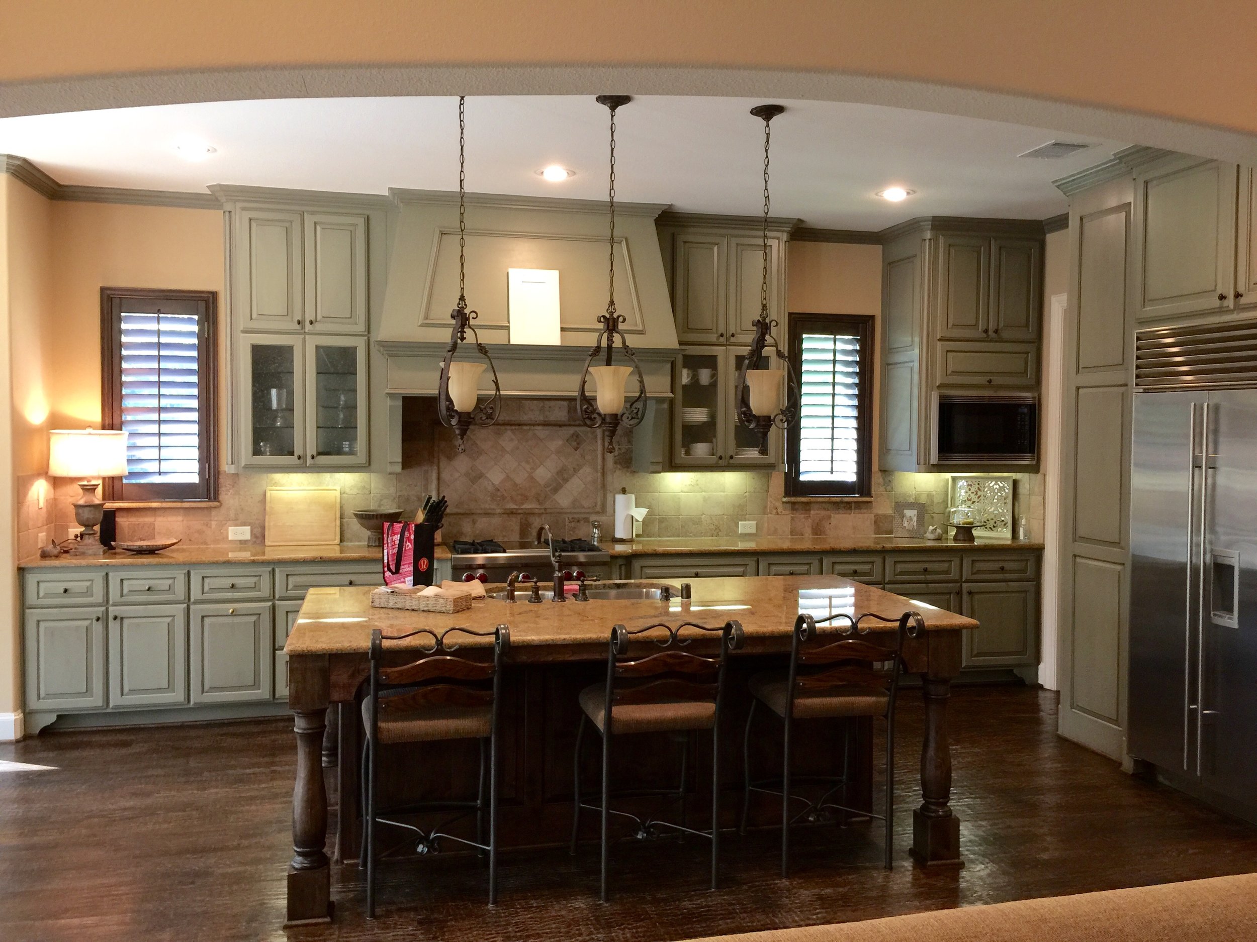
And here’s the new, lighter, brighter kitchen.

After kitchen remodel with Taj Mahal quartzite, herringbone backsplash, and gray cabinets | Carla Aston Designer

After kitchen remodel with new Taj Mahal countertops, herringbone backsplash, gray cabinets - Carla Aston Designer
Now, since we didn’t complete everything here, I wanted to share what we proposed for the lighting. You can see some light fixtures were changed out, but they don’t make a significant design statement, with the exception of the entry hall fixture perhaps.
The thoughts and design behind the lighting selections were that the dark iron look was needed to tie the spaces into the style of the house. After all, we don’t want to ignore the architecture completely, just clean it up. I feel it needs the gravitas of the dark finishes (not a lot of curly iron and gold glass shades like they had before, but a dark, more linear, simple style) to add a bit of detail and delineation.


Here are few more Before and After pics of the lighter, brighter, less gold-toned house.


Before Breakfast Room

After Breakfast Room | Carla Aston Designer

Before Dining Room

After Dining Room with gray walls and creamy color trim | Carla Aston Designer

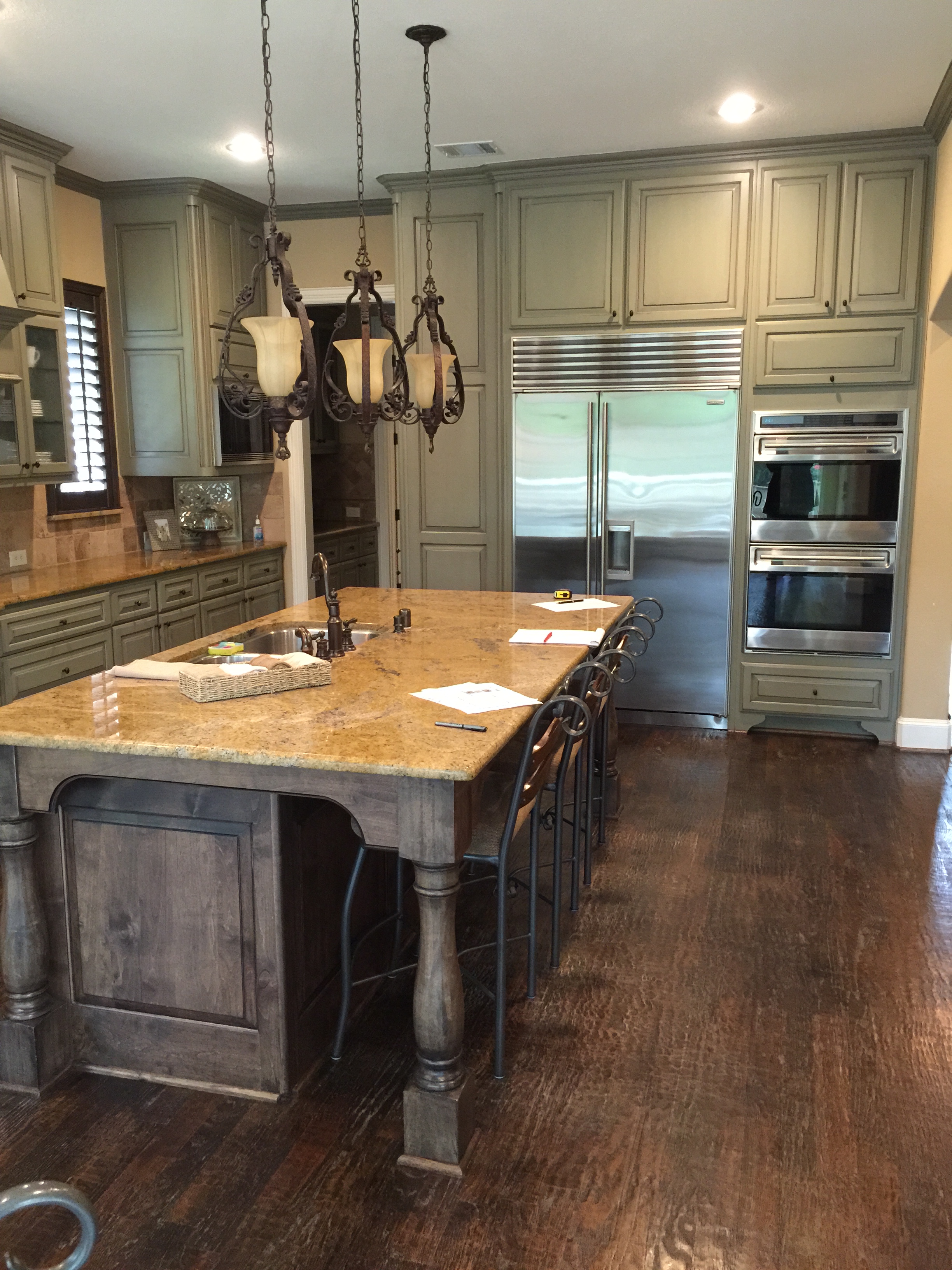
Before kitchen to family room view

After Remodel - kitchen to family room view | Carla Aston Designer
My blog may contain affiliate links. Any purchases, at no additional charge to you, are most appreciated and make this blog possible. :-)

Need help getting your own paint colors right? I have a handy guide for you, right here.