This creative homeowner stretched her budget with consignment finds and deals sought out online, after our design consultation this past summer.
She made strong investments that added value to her home….. wood flooring, a new tile backsplash and paint, then scoped out some great deals to get other items she wanted.
All she needed was a little direction and affirmation, to help her get going.
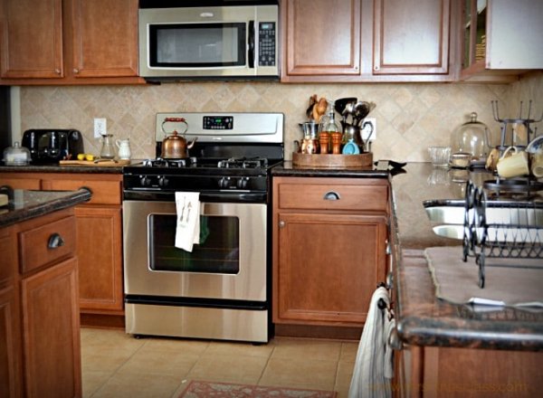
This was her kitchen, which was the main problem for her. It just didn’t reflect the light, bright feeling she wanted.
BEFORE - This homeowner was looking for a lighter, brighter kitchen without all the brown / beige color tones.
She wanted to do a lot, but needed to put the money where it mattered most so she could replace some of her furnishings too.
Kitchen Updates
One of the first things she mentioned was changing the countertops.
They were a granite with flecks of black and reddish brown. Countertops take up a large part of a budget sometimes.
In looking at her kitchen, I felt there was a way to keep those and spend on other items in the kitchen that were bothering me more than the counters, the beige tile floor and travertine backsplash.
I also was on board with her wanting to paint her kitchen cabinets a white. That would do a lot to lighten and brighten the room.
While I don’t love granite counters that have a spotty pattern, since these were so dark, I thought they would read as black in a white kitchen.
Black counters are nice and actually rather popular these days, and that would save her money to spend elsewhere.
I have black/brown counters in my kitchen, although mine have a leather finish and don’t have any real color variation.
If you’re going with new black or very dark counters these days, go with a honed or leather type finish, and do a straight edge. The polished finish and bullnose edge details telegraph the age of installation, but these are subtle nuances and something I thought she could forego at this point.
Backsplash and White Paint Color
We discussed a simple white backsplash tile to blend with the cabinet color. Subway tile can be easy on the budget too, so that worked out great.
With the high back to the range and a microwave hood, you couldn’t really appreciate a patterned backsplash in this instance.
Blending the backsplash color with the upper cabinetry also elongates the cabinetry, visually. We discussed painting the walls the same color as the cabinets too, again, to blend all that above the countertop, to make the kitchen feel more open and light.
Here’s how her kitchen turned out!
Looks like a new kitchen, right?
We talked about one day doing a new countertop on the island, but the perimeter is just fine the way it is.
She loves blue and wanted a blue island. A white countertop of either a quartz or marble will look really fresh and can easily be done later on.
These are my iPhone pics, so you might not be able to tell much, but the pulls are copper, one of her favorite elements and accent colors for her kitchen.
She ran the dark wood floor, that she had in the adjacent living areas, into the kitchen and it makes the house feel so much more cohesive. It’s all open plan, so a single flooring material really helps unify these spaces.
Her breakfast room, beyond (to the left of the fridge), was outfitted with some of her own pieces from family members and a few trendy items found in local shops.
Breakfast room with a new boho style runner, the homeowner’s inherited milk glass candle holders, and a carved wood bowl purchased locally.
Dining Room Is Now The Study
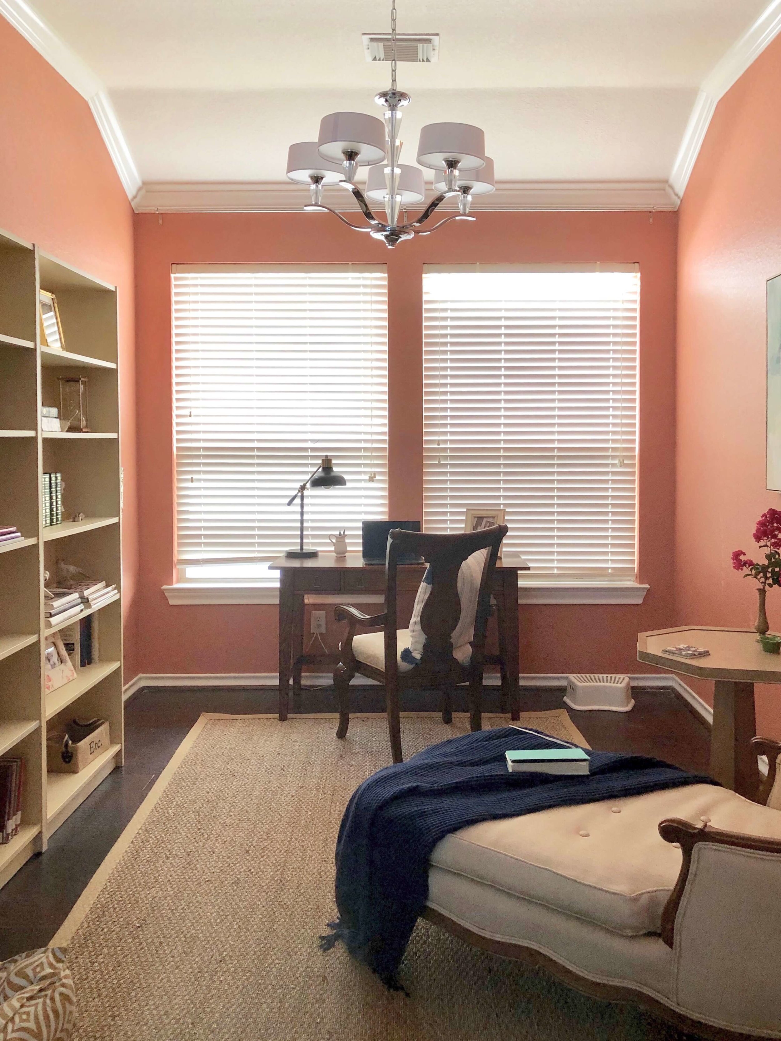
This pic below was her dining room that she had turned into her study.
When I was there for the consultation, I saw she could really change the light fixture to get the yellow cast out of the room. It was too low to walk under too.
BEFORE - Former dining room used as a study. Design recommendations included a new light fixture in a cooler tone, a seagrass rug, and some draperies on that back wall to soften the windows and create a pretty backdrop.
Adding in a cooler toned fixture, hung closer to the ceiling, would make the terra cotta color feel less like an earth tone scheme and relate to the copper accents in the kitchen. Something less curly, with cleaner lines, would be a good idea too.
I also felt a simple seagrass rug might work well to soften the space and help the mix of furnishings here. Seagrass rugs are great for budgets and add a natural element in to a room.
We discussed draperies along the back wall in a soft white, even some sheers would be nice to filter in light and provide a nice backdrop here.
She got a deal on this light fixture, added the seagrass rug, and will eventually do some drapery panels in this room.
She found this octagonal light wood table, that paired with her inherited heirloom chaise, in a local shop on sale.
Living Room Gets A Redo Too
Her living room had lots of brown leather and big rolled arm furniture.
She liked light grays, complimented with navy blue and terra cotta for furnishings. This room really didn’t reflect her style or anything she liked.
BEFORE - Living room with dark leather upholstery
We talked about some light gray fabric upholstery pieces with a collection of pillows in colors she loved to add in the accents.
I recommended she remove the drapery here, it just wasn’t doing the room any favors since there is a slope that would get in the way of taking the drapery up, above the arch.
Ideally, some plantation style shutters would work well here. Privacy is needed, as neighbor’s windows are near.
Shutters are actually easy to manipulate to get privacy and still get some light. I thought a wall of the wide horizontal slats would actually be nice and finished looking, with no need to deck it out with fabric.
A new, soft rug with some beautiful, quality chairs bought at a consignment store, help furnish this room.
The lamps were good, but new, bigger lampshades would make a better statement and help balance the seating group.
Shopping Consignment Stores And Keeping An Eye Out For Deals
To replace all these furnishings, she had to get creative with where she found her furniture. Shopping consignment stores and Facebook selling groups, she found some pieces she really loved that were nice quality.
I was so excited to see how she filled out this room with a really comfortable and more up to date look that reflects her style.
A simple, clean-lined sofa and these quality lounge chairs in gray fabrics provide a nice base for pillows and a rug in the homeowner’s preferred palette.
There were other things we discussed too, while I was there on the consultation. A tv cabinet, that I didn’t get a pic of when I went back, but is now the perfect size for the space, directly across from the seating group.
She previously had a small electric fireplace that was rather old and didn’t look very realistic. She loved a fireplace and wanted to add something of better quality.
A new electric fireplace was ordered and she had it installed in this corner of the room. The cast stone type surround she sourced, ended up being just perfect!
An electric fireplace looks so real with this cast stone mantel.
Save this on Pinterest to refer back to later!
It was so nice to get to drop by this week and see her results myself.
This homeowner is located near me, in The Woodlands, TX and I would love for you to visit her beautiful website as she owns a professional organizing business!
She wrote about her kitchen project and our consultation on her own blog right here, Mrs. Hines’ Class.
(I have to say, her pics are better than mine!)
Are you in The Woodlands, TX area and need an in-person consultation? There’s more info to be found at this link, DESIGNED w/a Consultation.


