I’m sharing a few bits of my recent online interior design Q and A consultations with you today. You never know, you might be having some similar design dilemmas in your home, so reviewing these might give you a few ideas too. :-)
One of these concerns a tv or media cabinet, another concerns a window shade design, and the last one concerns the tile layout in a bathroom.
My blog may contain affiliate links. Any purchases, at no additional charge to you, are most appreciated and make this blog possible. :-)
Design Dilemma #1
Here’s the first one, pictured below, that concerned a tv cabinet.
The homeowner had a tv area in their family room and a wide, rather dated cabinet for their tv. They wanted some direction on what to replace it with.
Their sectional sofa and other seating were to stay. They were going to get rid of the vertical blinds too, so some idea for a window treatment was needed also.
You might be able to see that the sofa needed the pathway behind it to get into the kitchen on the other side of that island, so a different furniture arrangement was not really possible.
Existing family room needing a new tv cabinet and window treatment. See what was advised for this family room design. #designconsultation #interiordesignadvice
TV Cabinet Recommendation
I felt like the sofa/tv cabinet corner felt a little crowded back in that far corner.
Any kind of cabinet I looked at would present about the same problem because of how the niche for the cabinet was off center of the tv wall.
So, trying not to present too costly of ideas, I thought the best bet would be to add a furred out sheetrock wall space to match the one on the right side of the cabinet.
The tv could be pushed more to center on that wall then, rather than shift toward the corner like it is now. They could even possibly get a bigger tv, which most people like to do at some point.
Window Treatment Recommendation
Of course, getting rid of the vertical blinds is a good choice and since they needed window coverings that would give privacy here, I suggested a simple drapery with a single, slim rod and rings that would traverse.
Mounted higher and wider, it gives more prominence to the window there and provides a nice, soft backdrop for the seating group.
Design sketch showing recommendation for tv wall and window treatment. #designconsultation #interiorsketch #designsketch
All in all, this is a simpler, more cleaned up appearance and the sectional no longer looks crowded into the corner.
I really like the plain walls back in that corner, with the floor lamp featured there, and then the stacked art can move to the other side of the window treatment.
That bigger art piece was a tad overwhelming with the dark, heavy frame and accentuated the void of furniture there, for the footpath to the kitchen.
They could, of course, build in a tv cabinet in that niche then, with a space for speakers in cabinetry above the tv.
The main thing is to center the tv on the wall and clean up visual clutter in the corner.
Design Dilemma #2
This dilemma concerns window treatments.
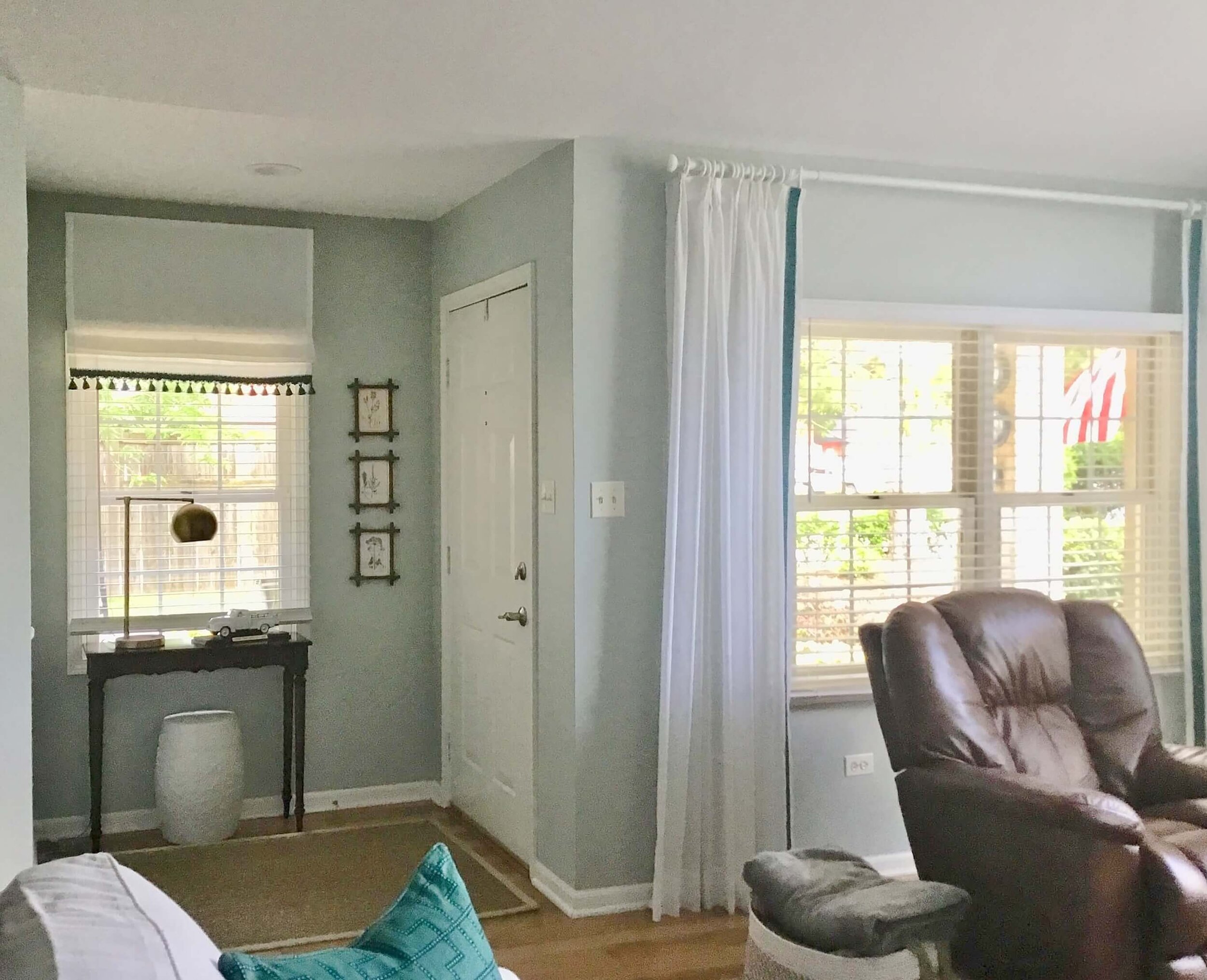
The homeowner had contacted me with a pic of their room and was unsatisfied with how her Roman shade was looking in the entry niche there.
Here was the BEFORE pic.
BEFORE - Roman shade was placed a little high and coverage on sides was not ideal. #windowtreatment #designconsultation #romanshade
She had hung the shade at the same height as the drapery, but wanted to know if that was necessary, as it felt awkward.
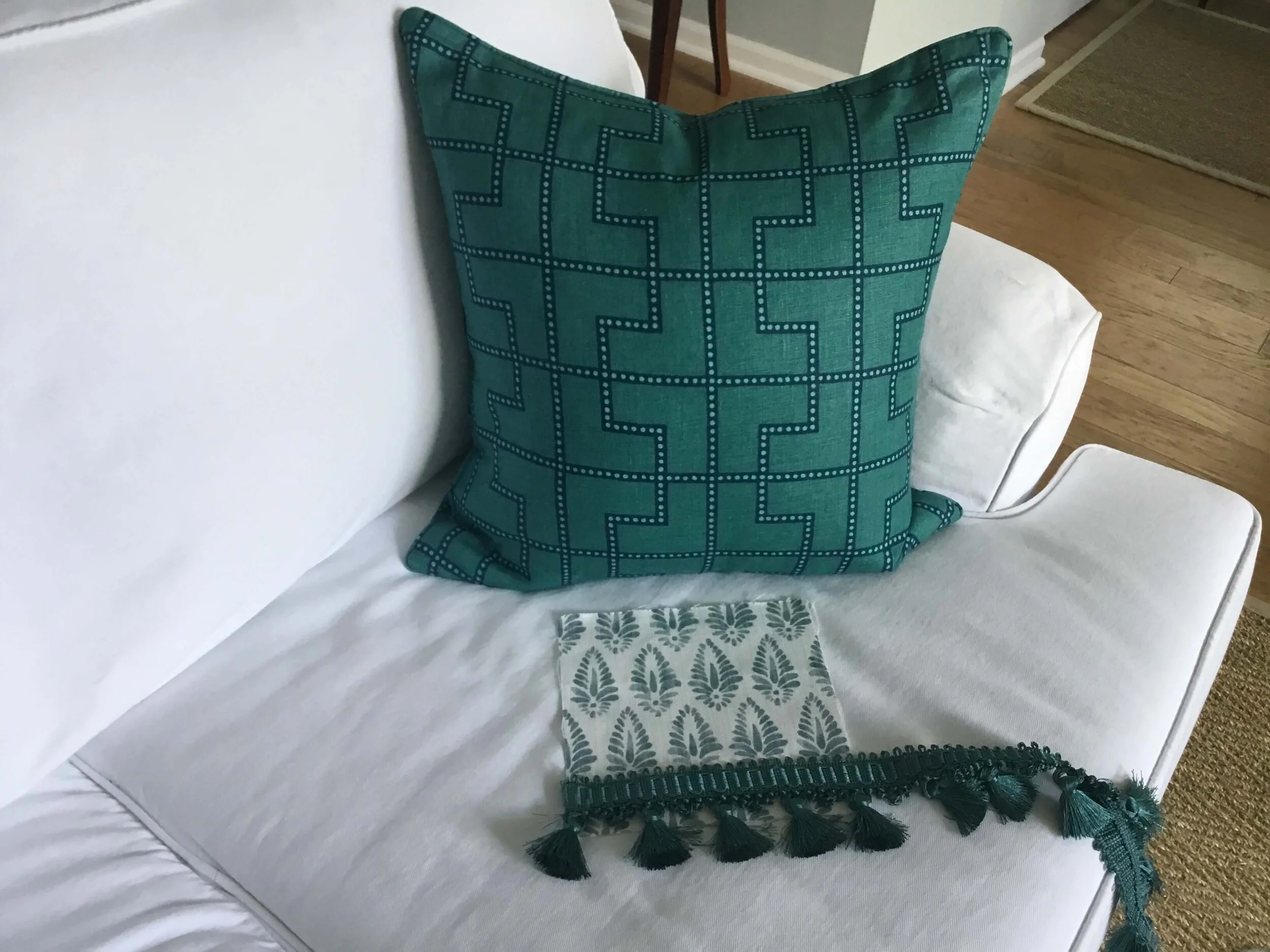
She also wanted to know if the fabrics should match as she really wanted to use some pattern there instead.
She was proposing this fabric and trim for a new shade and was asking for feedback.
This patterned fabric and trim would make a nice Roman shade in the entry way of this home. #romanshade #windowtreatment
I loved that fabric and trim and felt they would be perfect in that entry niche. I also told her not to mount the shade so high and to even make the shade slightly wider than the window trim, in this outside mount type installation.
A flat valance at the top that had a return on the side of the shade would also create a more finished and professional look.
The homeowner did a great job on the Roman shade with the new patterned fabric and trim. It is scaled better for this smaller space and covers the window appropriately. #romanshade #windowtreatment #coastaldecor
Didn’t she do a great job? She recently sent me this completed pic.
I love the shade with the patterned fabric and it looks much more appropriately sized for the space and the window.
It adds so much to this nice alcove.
Design Dilemma #3
This last design dilemma I’m sharing today concerns the tile layout on the floor and walls of this bathroom, below.
The homeowner wanted to know if her ideas for the flooring were okay and where to stop and start the tile around the tub area.
BEFORE REMODEL - This bathroom was going to be remodeled with a new tile floor, clear glass shower enclosure and different tile around the tub. What would work best here? #designconsultation #bathroomdesign #bathroomtile
Here were their parameters and concerns:
This homeowner was keeping the tub, but getting a new floor and wanted to know about the tile for the tub face and surrounding the tub area.
They were considering keeping the dark tile surround in the shower and they loved a black slate look for the floor with a herringbone pattern.
They were going to do a new clear glass shower enclosure and the chandelier would stay.
They were going to paint too, so the chartreuse color was going away.
She showed me pics of bathrooms she liked which included lots of white marble tile installations.
First of all, I loved the idea of the black slate in a herringbone pattern. You don’t ever have to talk me into black slate. :-)
Here’s a 6 x 24 from Home Depot.
However, if they went with a black floor, then keeping that dark tile in the shower would be too much dark tile, I thought.
While it is okay there now, with the black and white tile floor, with the added flooring in all black, it would feel like a cave in that shower.
Plus, when they changed out the glass enclosure to a clear version, that dark shower tile would be even more visible and pronounced.
It would also cause the new tile to go around the tub area to be more noticeable that it was new and different, therefore making for a less cohesive and rather chopped up design.
I always try to encourage homeowners to go for an end result that feels intentionally designed as a whole, above all else.
Here was my solution.
Here’s what I thought would work best for the tile and installation of tile in this area of the bathroom. Covering the wall of shower and tub in the same tile and taking the floor tile into the shower stall would make for a more cohesive and intentional design. #designsketch #designconsultation #bathroomdesign #bathroomtile
I like the idea of the marble look porcelain tiles, many vendors have those now. They have a nice look of marble but are much more easy to care for.
I suggested a 12 x 24” tile size, laid in a brick pattern, to contrast with a smaller size and busier pattern that the herringbone slate would bring to the floor.
I also thought covering that whole shower and walls around the tub with the same materials would be a way to blend the look of that space, open it up, and make it feel more cohesive in design.
It would be a good idea to change out this shower floor with tile to match the floor of the bathroom to help make this bathroom feel less chopped up and visually flow together. #showerfloor #bathroomshower
Shower Floor Change
While she had wanted to leave the shower floor, as it was a white, simple tile, running the black tile into the shower, in a 2 x 2 mesh mount that would match the slate herringbone, would create a more unified look.
It would serve to visually open up that part of the bathroom.
(I share more about that type of scenario and installation with the curb material here.)
This would be a bigger spend overall on the job, with basically a new shower, but one that would be a good investment overall and a look that would feel more intentional and well-designed, in my opinion.
Painting the walls and ceiling a white, to match the wall tile. would give that space a taller, more elegant look and the chandelier would stand out beautifully. :-)
Do YOU need a second pair of eyes on a design dilemma in your home? My Designed in a Click Q and A service is what that is all about. :-)


