This boring bookcase wall was part of my monthly subscriber Q and A on Instagram this past weekend. The homeowner wanted to know how to update it so that it didn’t feel like a cluttered catch-all.
You can see that some doors would be great on the lower section of this bookcase, they just never were done, although that was intended.
The homeowner was changing this room up to be lighter and brighter and was going to paint the room a shade of white. She mostly had books, not much decor to use on the shelves.
Here were my suggestions for designing this bookcase.
1) Paint the bookcase.
I would definitely get rid of this dark, espresso wood color. It is overpowering here, since she is going white on the walls. If she was going for a dark, moody library look, then it would be fine in espresso, with the walls in a dark color as well, but this is not what I would recommend for a light and bright look.
I would go with a greige or taupe color, definitely not white, but something that has a softer neutral tone. White makes for a really cluttered look if you are putting small stacks of books and darker objects in a bookcase, as there is a lot of contrast created. A subtle color tone just creates a more “designed” look.
This blogpost highlights how we went with a taupe color in the bookcase interior in this bookshelf styling project. It was a big difference! (You can see the all-white bookcase before pic at the link.)
2) Add the cabinet doors.
Add the cabinet doors that are missing on the lower sections of the bookcases and add some nice cabinet pulls. You can do a backplate to make a knob seem more subtantial on the door.
It looks like there is some equipment that might need ventilation. Something like a wire mesh, caning, or even just some holes drilled in a pattern can be done in the panel of the doors to create airflow and add some interest.
Here is an example of a cabinet in a tv room in one of my remodel projects, that turned out well with just four holes drilled in each door.
3) Remove one shelf in each section of bookcase.
The more shelves there are, the more dusting and stuff you have to collect and maintain. Builders often provide more shelves than you actually need. Many times the heights on the individual shelves are very limiting then with what you can put in them. Give yourself more room by deleting a shelf. With this bookcase, I’d space the remaining four equally apart.
Sometimes I like a little more height on the top shelf or the bottom, but here we are going for a library type look and she won’t be including much decor, so equal spacing works well.
You can that is exactly what we did in a past bookshelf styling. The bookshelves look fuller and we were able to get more creative with the styling. It was less stuff to collect for the shelves too, which was a big win!
Before and After Bookshelf Styling - Carla Aston, Designer | Tori Aston, Photgrapher
4) Add Storage Baskets
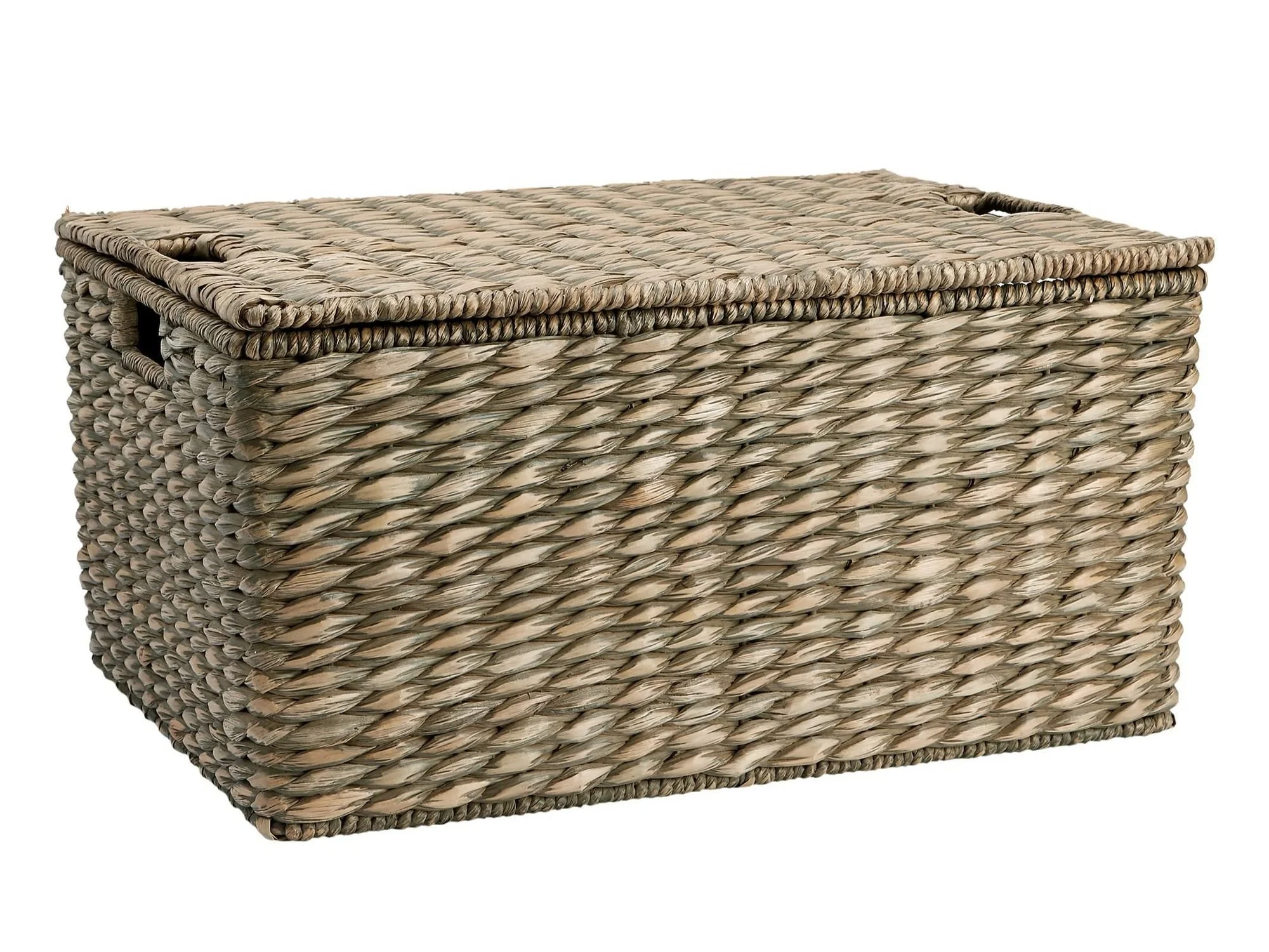
I can see this is a busy home office and everyone needs plenty of storage there. To cut down on visible clutter, try some storage baskets on the bottom shelves all the way across. It will be a nice textural element and help hide some things like office supplies or projects in progress.
They can have a lid too!
5) Filling the Shelves
Now, we’re ready to fill the shelves.
She has mostly books, so I would spread them out among the shelves, stacking some standing up and some lying horizontally with the spines showing.
This would be a good place to add in family pictures in frames, as it is not right out in the living room, so they can be more personal photos. Don’t go overboard, but it would be a nice way to fill in a bit more on these shelves.
One trick to stretch your books around the shelves is to center a group of books on a shelf and use bookends on each side. It makes the books more noticeable and adds importance.
My sketch with tips for designing this bookcase.
MORE HELP for decorating your shelves!
Lastly, if she is looking to add some decor here without spending much money, I have two posts below to help give her some ideas. I also have a list of what NOT to do when styling shelves. :-)
This blogpost was thoughtfully written by me, Carla Aston, and not by AI, ghostwriters, or guest posters.


I’m sharing 7 key things I DON’T do when styling bookshelves as a quick and easy reference if you are considering styling up your home. Come and see what is on my list of “DON’TS”….