I’m sharing 7 key things I don’t do when styling bookshelves as a quick and easy reference. If you are styling up some shelves of your own you might want to save this post!
I know bookshelf styling is very personal, so feel free to do what you want in your home, but I think most designers feel the same about these “don’ts” from what I’ve seen, especially in their own homes. :-)
1) Stagger the shelving erratically.
This is one of my pet peeves, when people haphazardly install the shelving at different heights across a bookcase.
Line these shelves up all the way across before you start loading in books and objects.
I really like shelving to be the same height all the way across a wall of shelving. It just looks jumbled and rather a mess if it is staggered.
I don’t prefer a staggered shelf look like this when styling shelves.
I would not stagger the shelves like in this image, but would line them all the way across at the same height. If you need a space with a taller height, then repeat that all the way across the bookshelf. The lowest section or the highest section is sometimes the best place to have the tallest space.
I always suggest adjustable shelving and don’t mind seeing a taller opening to allow for taller items of decor. Make it consistent though, horizontally, across the bookcase for a balanced and harmonious look.
In this bookshelf styling, we removed one shelf in each section and aligned the shelves remaining, all the way across the built-in. carlaaston.com
Check out the before pics and the process of the bookshelf wall above, here.
2) Space items out one by one on a shelf.
Do you see how these items are spaced out on the top shelf of these bookcases here below?
I would never space things out on a shelf like these on the top shelf here. I always prefer grouping them together.
This is something I’d never do when styling bookshelves.
I always group things together, in odd numbers usually. Or if there are items with varied height and type, then I’d maybe do two.
3) Fail to use organic material.
I love adding in organic elements like shells, pinecones, driftwood or plant material.
This adds texture and interest to any bookshelf styling.
Organic materials like shells, pinecones, airplants, etc. can warm up a bookcase and add texture. carlaaston.com
Organic, textural materials provide a warmth to this bookshelf styling. carlaaston.com
Some coral, a large seed pod and a sprig of eucalyptus add texture and interest to this bookshelf styling. carlaaston.com
4) Use only new decorative items.
Using only new decorative pieces tends to look like a showroom or furniture store. Bookshelves are perfect places to add personality in your home, so I would not neglect to do that by adding in favorite books, collections or art.
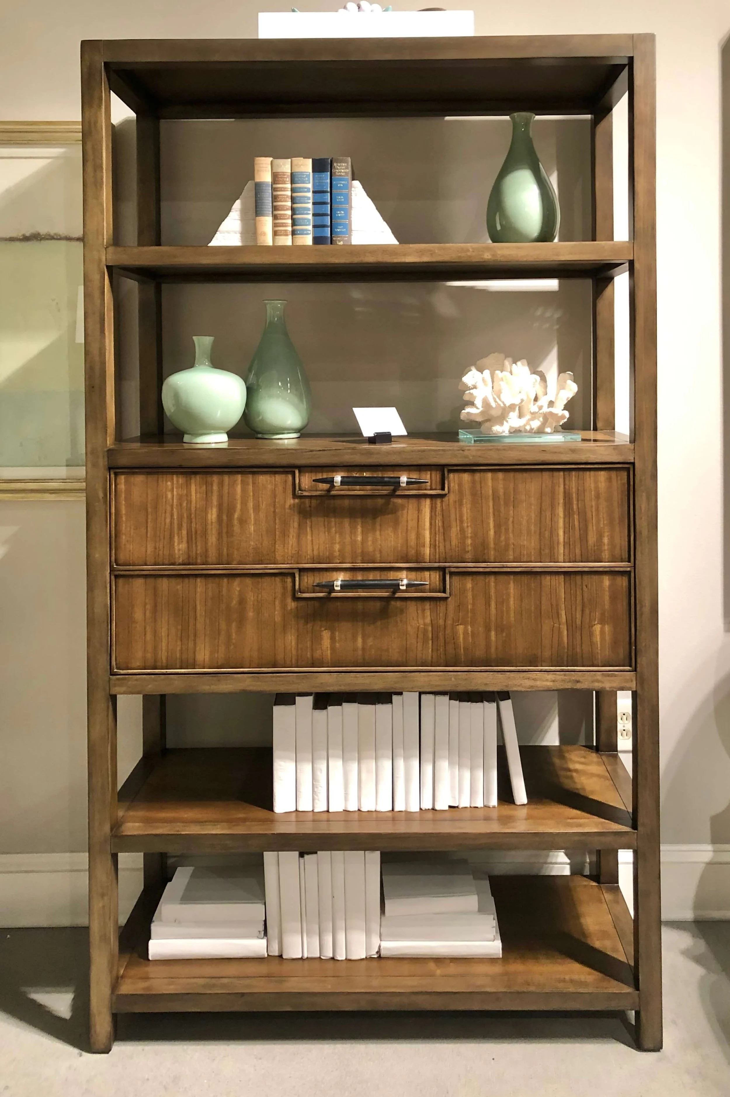
See this shelving below? Yes, it is a showroom, so make sure your bookshelves not look like this in your home.
Including only new decorative pieces in a bookcase can feel rather like a “furniture store” or “showroom”.
Here’s a nice mix of new decorative items with books, organics and small memorobilia that the client owned, on these home office floating shelves.
I even included two new modern picture frames for her to use for some family photos.
A home office bookshelf styling with a nice mix of books and decorative objects.
5) Primarily use only family photos on shelving.
I see this a lot in my consultations with new homeowners especially. The bookshelves have lots of family photos and not much else.
This Q&A on bookshelf styling, shown below, had about half the items as framed photos.
Including books and other decorative items in this bookcase would help balance all the framed family photos in this bookcase.
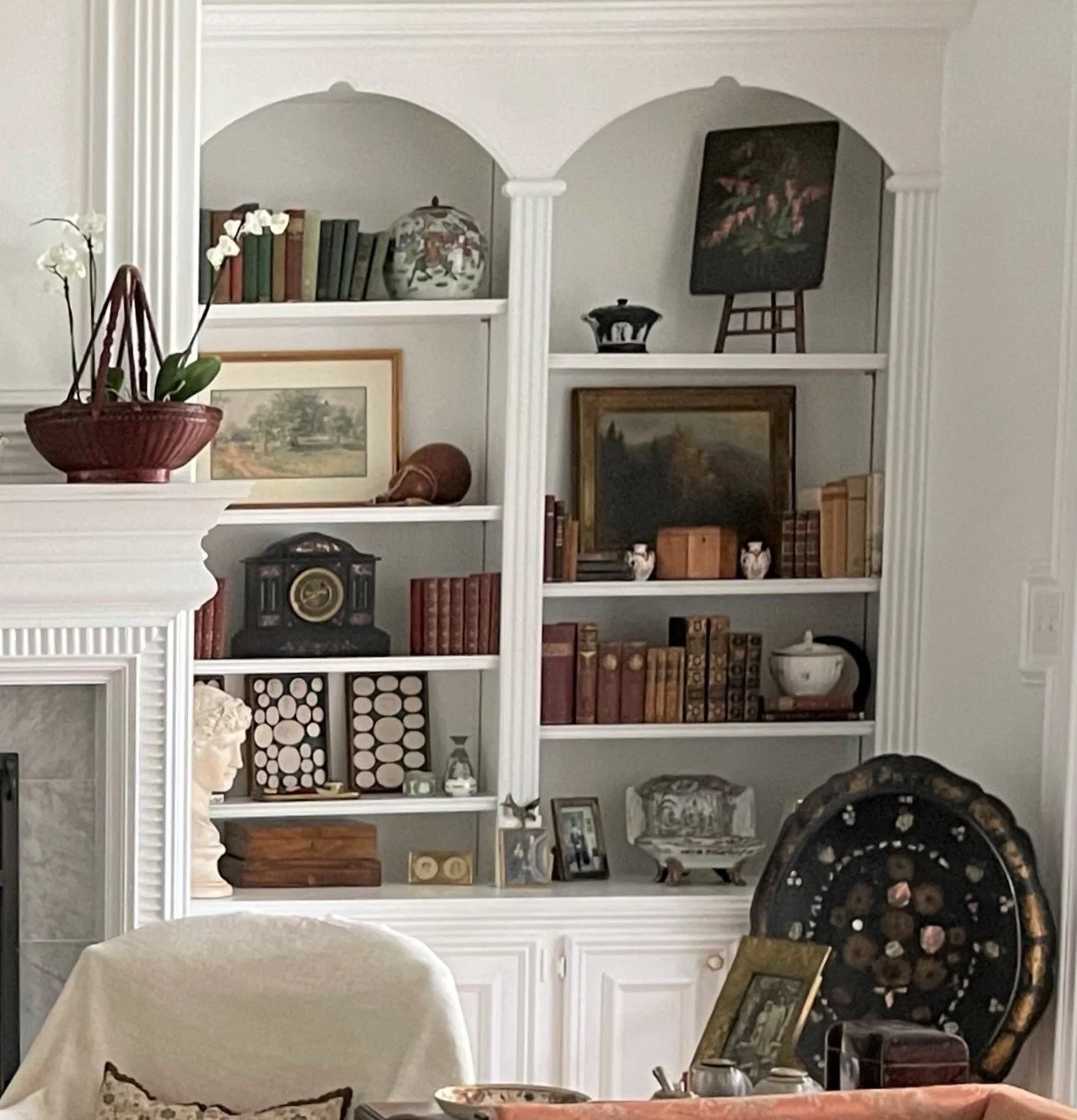
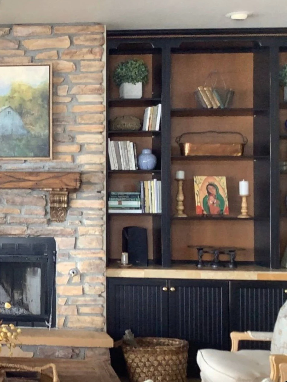
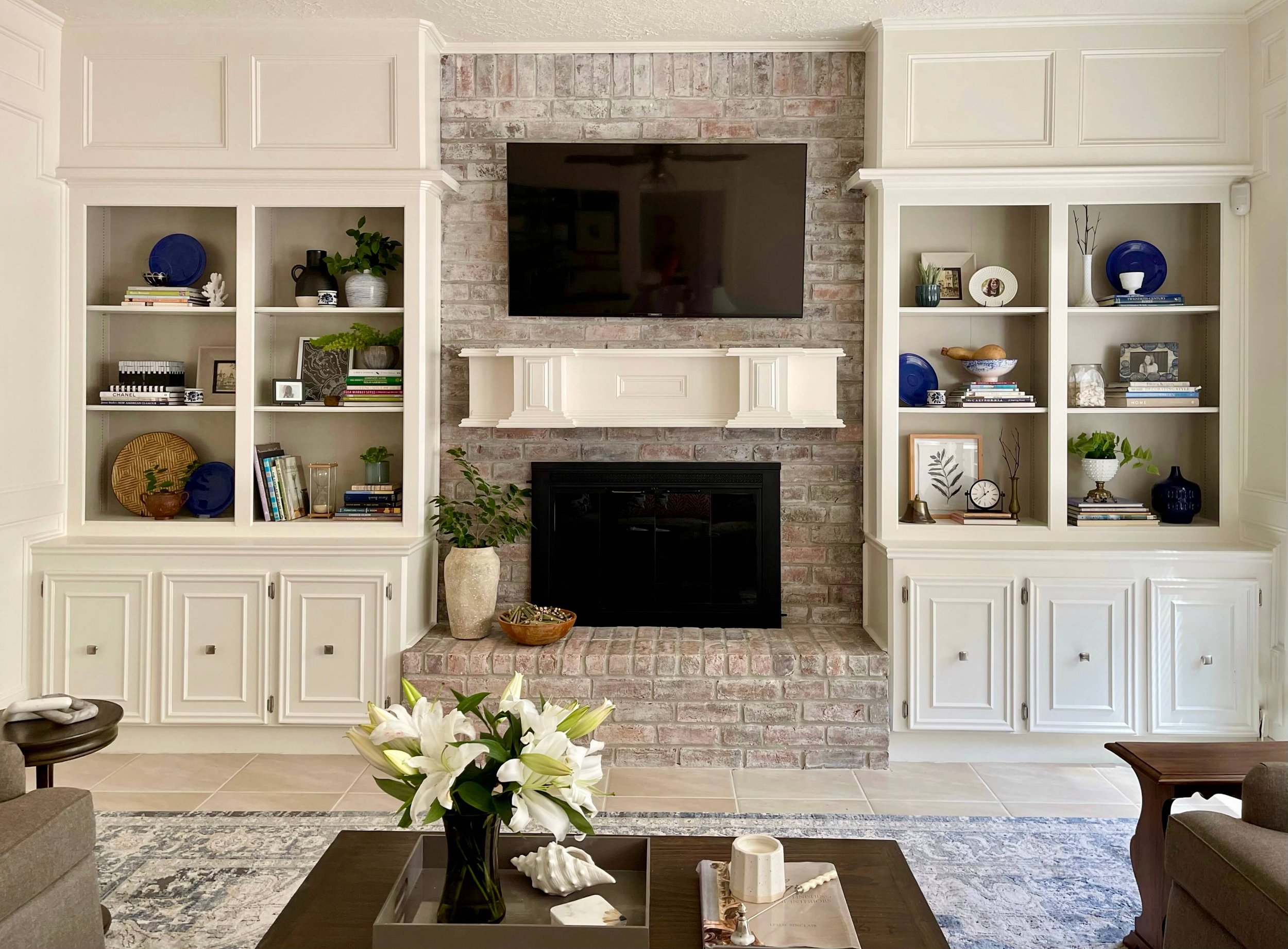
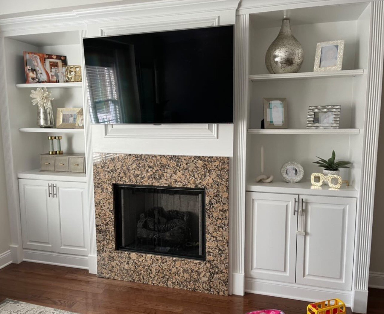
I have two great blogposts to helping you decorate your bookshelves with items you may already have here. You will be surprised at what you can find in your home that would make good styling items!
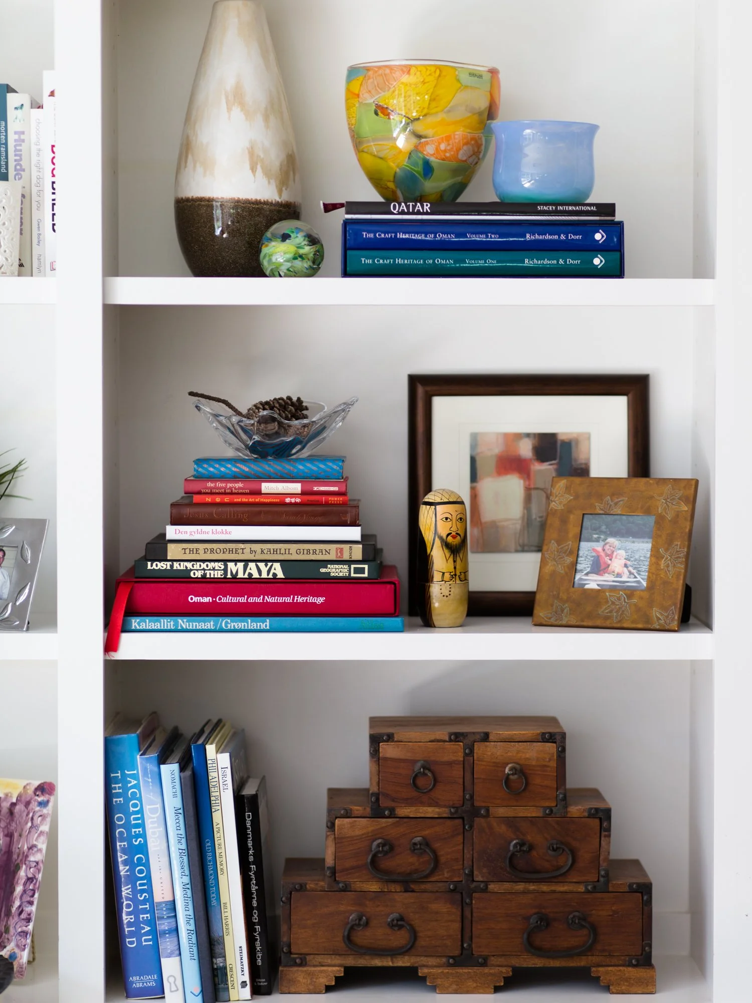
I love the mix of items on these bookshelves, books, vases, a wood box and only one framed family photo. It creates a nice balance with a minimal number of family photos.
These bookshelves has a nice mix of items along with one framed photo.
In this hotel’s library bar, vintage photos were interspersed with books and a few objects. I think it is a nice look for a library bar and these shelves have just the right number of photos without being too many.
I think using only family photos can tend to look like a memorial service. Mix books and other items into your shelving to create a more interesting display.
6) Use only books on bookshelves.
Speaking of a library, using only books can look a little monotonous. Not a bad vibe if you are doing a library or study, but it might not be what you want for your living room or family room.
A library filled solidly with old books.
There are quite a few books in this bookshelf I styled in a Showhouse home office, but I also tucked in ceramics, a photo frame and some mercury glass for a little bling.
A showhouse home office filled with beloved books, ceramics and mercury glass. A few floral buds were added to the glasses for showhouse viewings.
Even if your bookshelves are stuffed with books, you can do things like hang a small piece of art on the front face of a shelf or pop in small items on top of a stack of books.
Here’s an interesting library wall with art hanging from the shelves at a showroom at High Point Market.
I didn’t have much left to use for styling in this home’s bookcase, below, as it was mostly packed up for moving.
I selected the best looking books but also added in some decorative boxes and small sculpture.
Bookshelves wtih books, decorative and antique boxes and some small sculpture.
7) Cover the books in a single color.
Unless I was designing a showroom or store, I would not cover my books, like these below.
You see this a lot at markets and furniture shows, but I would not recommend it if I was styling bookshelves for a client.
I would not cover books like this when styling shelves.
I just think the reason to display books at all is to have a glimpse into the interests of the people in the home. I do love a beautifully styled shelf, but I’d never cover up the spines!
See more bookshelf styling posts below and give a fresh look to your interior decor, just by restyling them!
This blogpost was thoughtfully written by me, Carla Aston, and not by AI, ghostwriters, or guest posters.










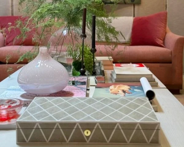


Don’t have anything to decorate with? You may have more than you think!