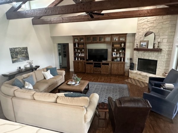
This homeowner has a big sectional that was purchased before moving into this home and now she is thinking it is just too big. That issue and the big plain wall opposite the windows/fireplace, had her questioning the decor in this living room.
My blog contains affiliate links. Any purchases, at no additional charge to you, render me a small percentage, are most appreciated and make this blog possible. :-)
Photos of this Large Living Room
My Recommendations
She mentioned that she couldn’t relocate the sectional sofa. I typically like to put sectionals where the corner isn’t right at the entrance to the room.
Here, the corner is boxing in the seating group as you enter from the front door.
However, I know that many times people with an open plan house like this, you might enter from the other side more conveniently. That is the case here, as the kitchen/dining area is open to this room.
She also has 3 boys, so she does need a lot of seating here.
Her husband likes the recliner, so that must stay too.
I know big sectionals like this are a chunk of money, so let’s try to use it and adjust some other things to make it feel more intentional, although it wouldn't have been my first choice.
I don’t think we can flip the sectional as I think that would be too crowded with one end down by the fireplace, in front of the windows.
1) There is Too Much Seating.
I think there are too many lounge chairs down there by the windows. I'd move one of the blue ones out, since your husband likes the recliner. Then I'd make space for a path to get in and out of the seating group between the recliner and the sofa.
2) Shift the sectional.
I would scoot the sectional in closer to the fireplace and tv cabinet, because the U shape of seating just feels so big and wide.
3) Exchange one of the big lounge chairs with a smaller, more upright, arm chair.
You could add a smaller armchair, just as an accent or some overflow seating, by the fireplace in front of the cabinetry in the corner there. The light wood and fabric in this chair contrasts with the dark cabinetry.
Sketch showing layout of chairs at the fireplace.
4) Use your existing console behind the sofa.
I like the idea of the console you have positioned behind the sectional, as I think it needs to break up that big expanse of the back of the sectional.
5) A bigger rug would help tie the seating group together.
I think you need a bigger rug and I'd go for some carpet that you can cut to fit this space better. Angle it at the fireplace, fitting just under the front legs of the chairs and the sectional on both lengths.
You can get rolled goods like this from a local flooring store and have it cut to fit your space. This one has a subtle, 4 1/2” diamond pattern. I like going lighter than what you have, with the rug here. Here’s a post about having rolled carpet goods cut to fit the size of the room.>>> What to do With a Rug That Won’t Fit
6) Big, blank wall
I wish that closet door wasn’t there, interrupting that wall. We need to center something on the wall to the right of the door and then add something to the left of the door to balance it out.
You need dark colors over here to balance the dark wood elsewhere in the room.
I like this console and I would double it, two of them side by side to get a 10' length overall. I like the wood top, it feels rustic like your wood in the beams, etc.
That is a good way to get an extra long console, to butt two identical consoles together to make one.
I would do a pair of art pieces over the consoles, side by side, hung about 6" apart and about 9" above the console. I like this size of 48" tall x 36" wide in these and I like the color here. It relates to the dark wood tones. I do prefer framed art, I like the gilded frame here.
Something like these, above, in size and color, would work well in my opinion.
I would use two lamps on each end to fill out the wall space. This lamp is big and I like the linen textural shade. I just used these on a job with a similar double console/big wall situation and they beefed up the overall look nicely. You could do a smaller sized lamp if you wish since the art is rather large.
Then I'd do a couple of smaller, vertical art pieces to fit in the wall space beside the white closet door.
Elevation Sketch of big wall with furnishings.
As always, please map it out on your wall before making purchases to verify. These sessions are designed to give you some ideas so you can go out and do this on your own. :-)
If you want to take care of your own decorating but need a designer’s eye for some guidance or a fresh idea or two, try my Subscriber group on Instagram. My next Instagram Q&A will be Nov 4th.
My Designed in a Click sessions will be open again in November too.
This blogpost was thoughtfully written by me, Carla Aston, and not by AI, ghostwriters, or guest posters.


