Just when you think designers and influencers haven’t published enough about bookshelf styling, here I come again with more tips and examples after my weekend of Instagram Q and A. :-)
I’m pretty worn out from all the problem solving done this past weekend. I had more submissions than ever before, over 60! I didn’t even get to publish all of them, some I just responded to directly because I feel like I wore out my followers too. :-)
It sort of felt like speed dating!
I will be sharing a few more here on my blog that I thought would be good for more explanation and I’m starting with one today on bookshelf styling. :-)
Traditional bookcase for styling
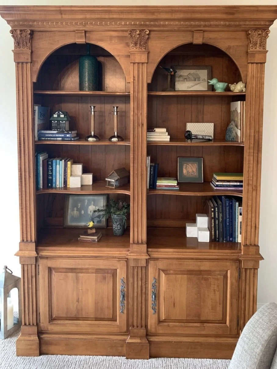
I was sent this pic of a traditional Hooker Furniture bookcase and asked about how to style this to look a bit more fresh.
The main problem I saw was that it felt rather spare or empty, yet it had plenty of objects and books to make it work nicely.
Right away I could see some moves that could be done to make these shelves look more inviting and full.
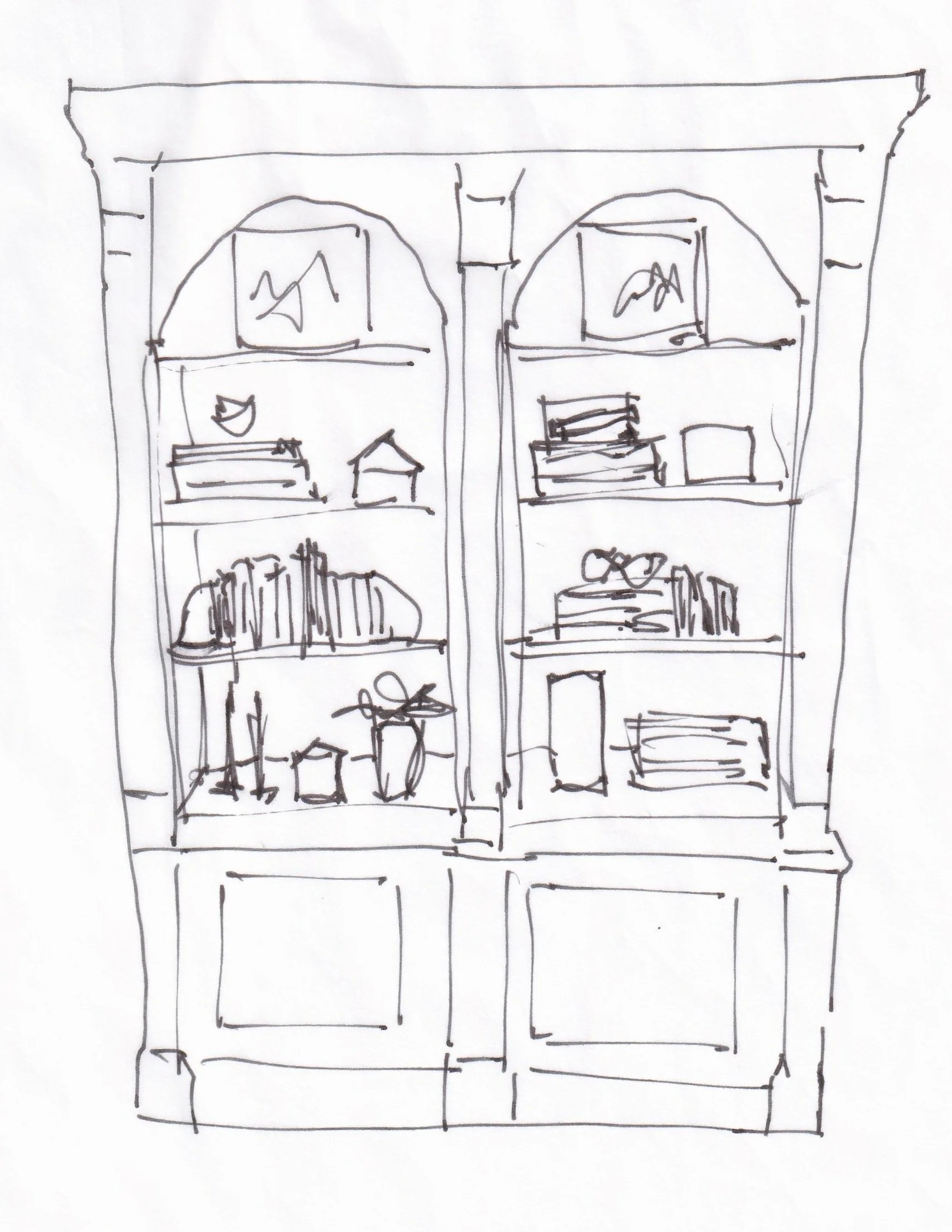
So here’s how I’d style this bookcase.
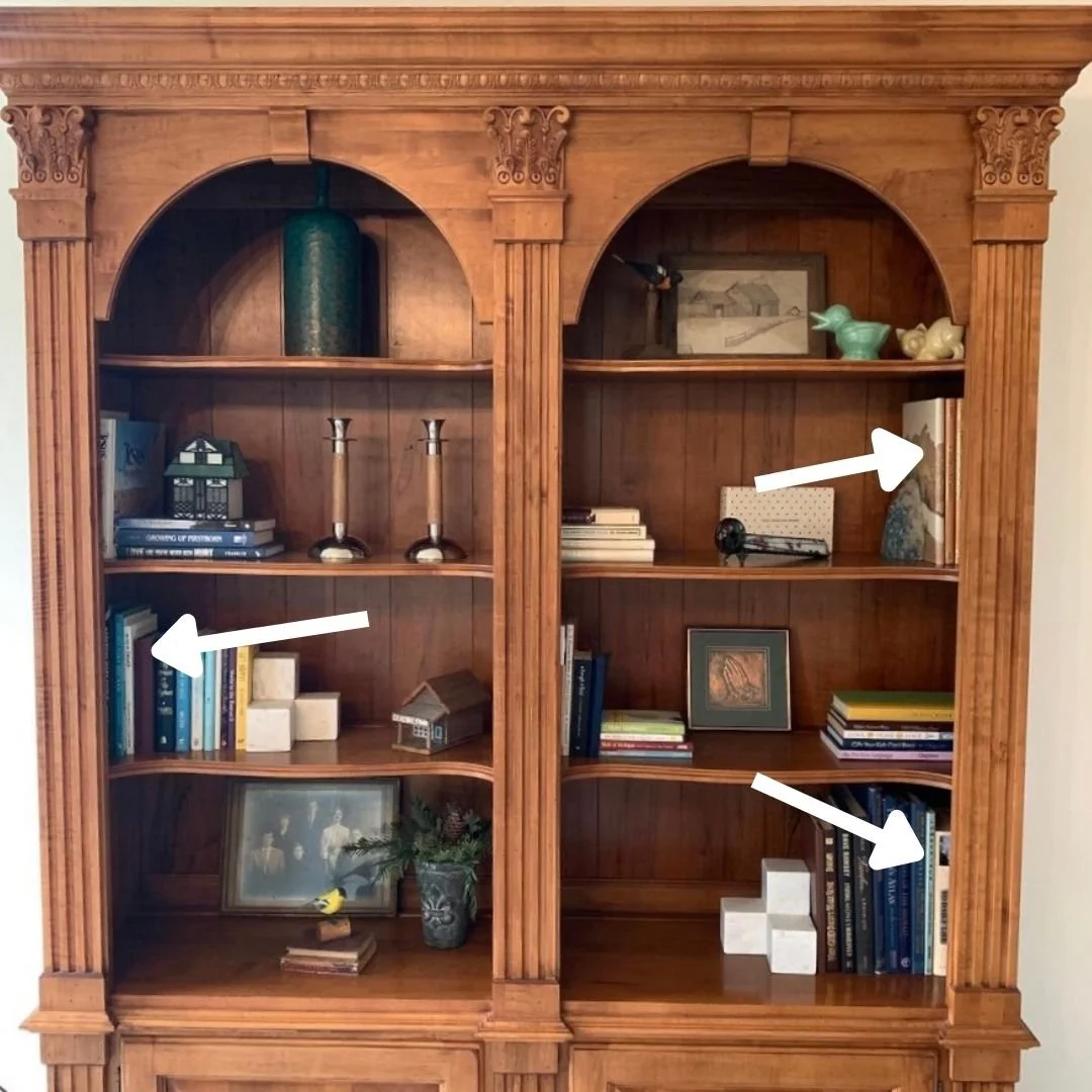
1. Move the books from the corners.
This bookcase happens to have a wide face frame or trim moulding around the sides. The books, tucked at the sides of the shelves, are somewhat hidden. It just makes this bookcase seem a little empty with the books pushed over that far.
In this case, I would treat these shelves the way I sometimes treat furniture in a room, pull everything away from the walls. :-)
If we center the books and objects more, there will be a fuller look.
2. Stack books horizontally as well as vertically.
There are some books stacked on their sides in this bookcase, but I think we could do more. I love doing this when styling, especially with tall books. Then you can top the stack with small decorative items like the little decorative birds here.
3. Use large items singly on the top shelf.
Since the top shelf is arched here and we are trying to spread the objects out where the shelving looks more filled, then I would keep only one single large item on the top. The arch takes up visual space there anyway and you typically want the more detailed objects lower so you can see those better.
I like using the two framed pieces here, the old photo and art. They are brighter objects in the mix of things, have a similar look, and will stand out nicely up there.
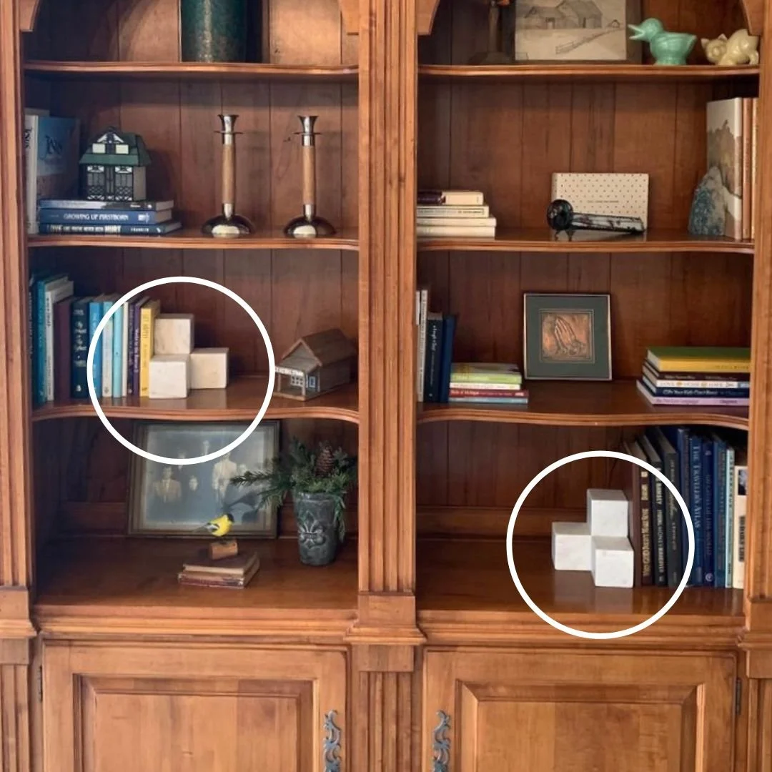
4. Delete things that distract or don’t work well.
I recommended the white square bookends move elsewhere for this bookcase. They are too modern and too white for the style and aesthetic of the furniture and other objects. They just distract the eye a bit.
5. Leave large items for the bottom shelf too.
Typically that bottom shelf can be deeper, like it is here, or maybe taller. Like the top shelf, the bottom would benefit from some of the bigger objects too. Here I selected the turquoise vase, the candlesticks, the plant and then stacked the tall books that were in the corner of that shelf.
6. Add in small to mid-size objects after the larger items are done.
I added in the little houses and box to mix things up some and fill out the rest. Once you get the bigger items in, you can fill in pretty easily.
I think it would be easy to fill in more books or objects as they are collected but right now, it feels finished and done! :-)
Bookcases beside fireplace
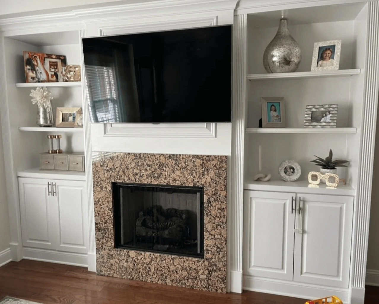
This bookshelf wall came from my Instagram Q and A back in January. This homeowner wanted some advice for styling these shelves.
I took this as she wanted to know what to look for if she were shopping for some items for these shelves, because they are a little spare.
I’m going to walk through a few tips that I shared back then.
1. Remove the large vase on that top shelf.
It’s just too big for these shelves and looks crowded in up there. It’s better to wait until you have the right object than to decorate with things that don’t work.
2. Find another place for that large red colored frame in the top corner.
It’s sort of like the bookends I noted above, with everything very light colored here, it rather stands out. I would move it elsewhere. In general, I like to cluster smaller picture frames in odd numbers and varying sizes.
I would relocate these two items elsewhere for this bookshelf styling. carlaaston.com
3. Add in books, lighter colored spines if a light toned look is desired.
Used book stores, Facebook Marketplace, estate sales or auctions, flea markets, even your parents! Most baby boomers are wanting to give away some of their stash and lighten up around their homes these days. I’ll be they would love to share some of theirs!
I recommend that if you are in a “collecting” season of life, rather than the “down-sizing” season, then start buying a pretty picture book from each place you visit on vacation. I’ve done that and really enjoy those books about countries and cities I’ve visited.
I bought both of my kids a coffee table book on Oregon for Christmas this year since we all took a family trip there last fall. I included some printed pics of our time there and wrote the date in the book with a little note.
4. Add in vases, boxes, shells, trinkets, small sculpture, children’s art, almost anything works!
As long as they are artfully arranged, objects can appear much grander than they really are! And I have two blogpost linked below that share how to find objects for bookshelves around your home.
If you haven’t yet, you should follow me on Instagram so you will know when I do another weekend Q&A over there in my Subscriber group. And if you perused any of the questions and answers yet, I’ve stored them in two Highlights folders there, Styling Tips 2 and Styling Tips 3, so have a look.
Want more bookshelf styling tips?
I’ve got a few links below.
I’m looking for a few bookshelf styling projects to do, in person, in my local area, The Woodlands, TX, to then publish here on my blog.
If YOU want a free bookshelf redo for your home, much like the first one above, email me with your bookshelf photo for consideration!
If you have really tall bookshelves or I think I need a helper, you would have to pay a small sum for that, but my time would be free. :-)
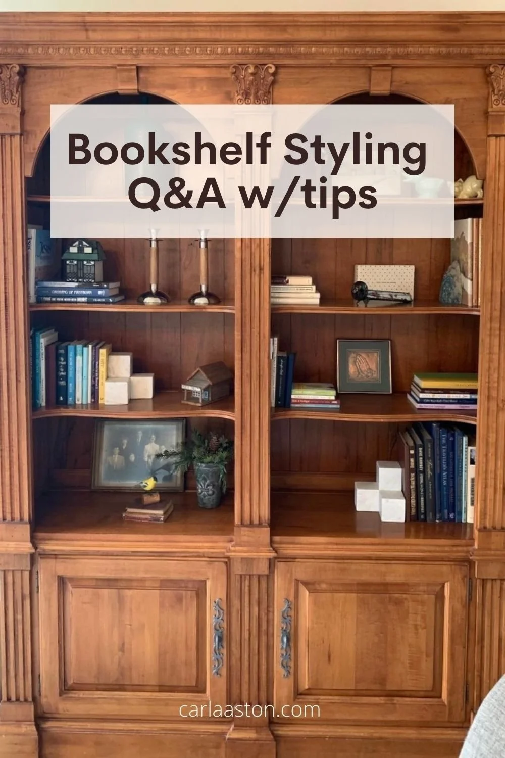
Pin this to Pinterest to save for later!




I have 7 main categories of home decor that I go to for styling at the end of a project.
These make great gifts at this time of year too! Come and see some of my faves….