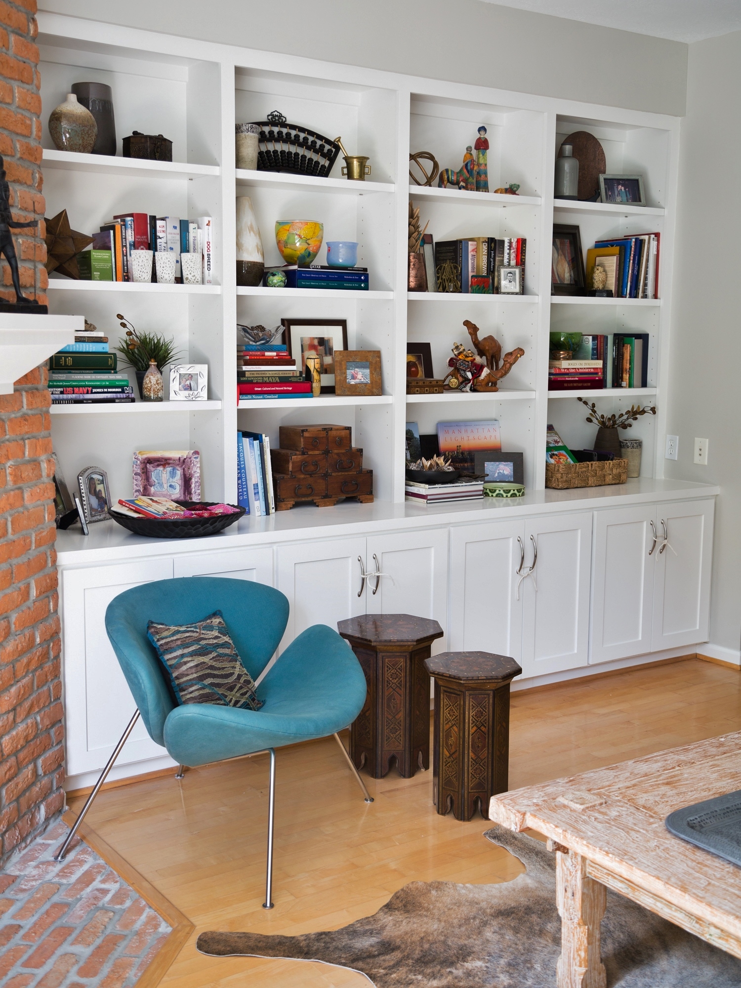
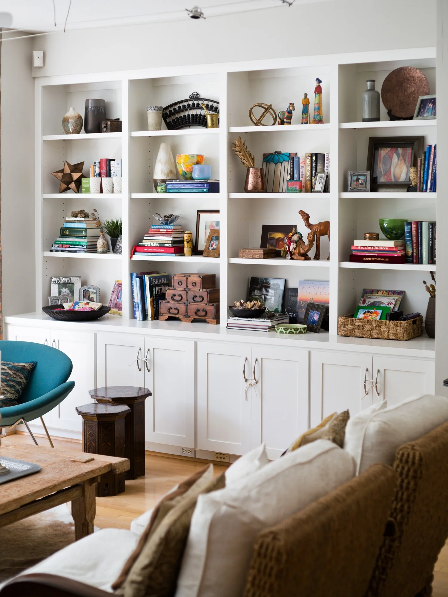
This bookshelf styling was one I did several years ago, locally, in partnership with At Home stores. The principles and advice I used here are so strong, I thought I’d reshare it today, as I am currently preparing for another one of these in my area. Look for that one coming up in June on my blog!
I feel so lucky. I just could not have gotten a better entry with this homeowner’s pic of her bookshelves — the one that was submitted to this free giveaway offer I did at the beginning of the month.
Why These Shelves Were Chosen
First of all, there was a substantial amount of shelves to work with, which is something I wanted to see in an entry.
I wanted there to be big impact in the room and on the homeowner, but not be an overwhelming task for us to do in a three hour period.
Also, it looked like she had some good stuff to work with: plenty of books (I like books in bookshelves ;-) and some nice collectibles that appeared to have meaning and story behind them.
I wanted to have the bookcases reflect the homeowner with some of their items, but wanted to fill in with some nice selections from At Home, so that the wall felt styled and looked complete and attractive.
Some ways I felt I could improve her bookshelf styling
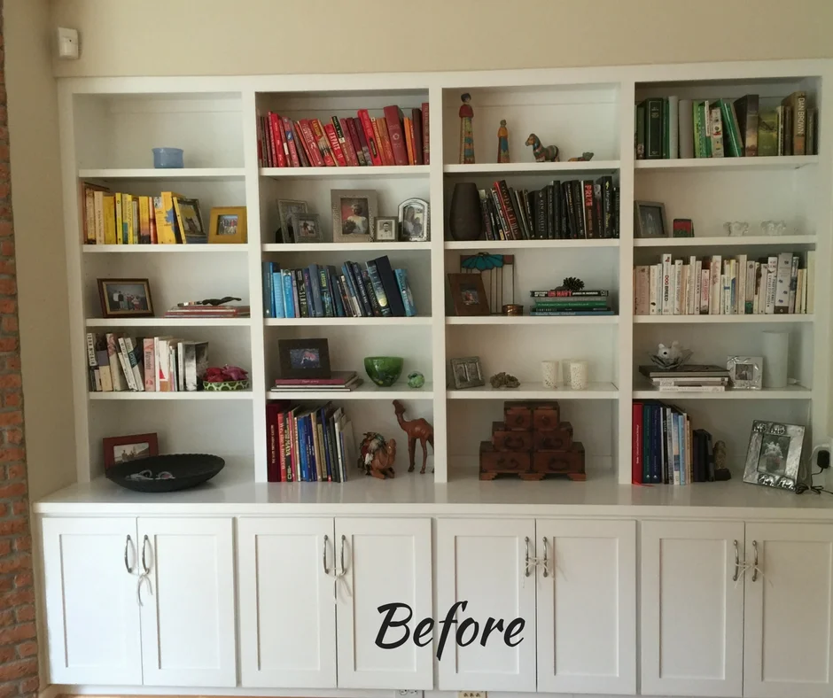
I saw she had done some color blocking with her books. That can work nicely sometimes, but I thought there probably wasn’t enough of the books for that to be effective.
AND, because it looked like she had some nice picture books in there mixed with some paperbacks, I felt it sort of discounted the quality of the beautiful hardcover picture books that, in fact, they had actually collected throughout their travels and during time spent living overseas.
Homeowner's living room with clean, simple, yet natural style
As it happened, their lives somewhat mirrored my own, as I, too, have spent time living abroad.
A Scandinavian style element is evident in their furniture selections, objects, and even in the cleaner architectural style of the home. Such a great place to start!
Because there is such a nice earthiness in the living space, I felt this bookshelf unit appeared very white and plain and didn’t really tie into the space, visually. I wanted to add that quality with the objects we installed.
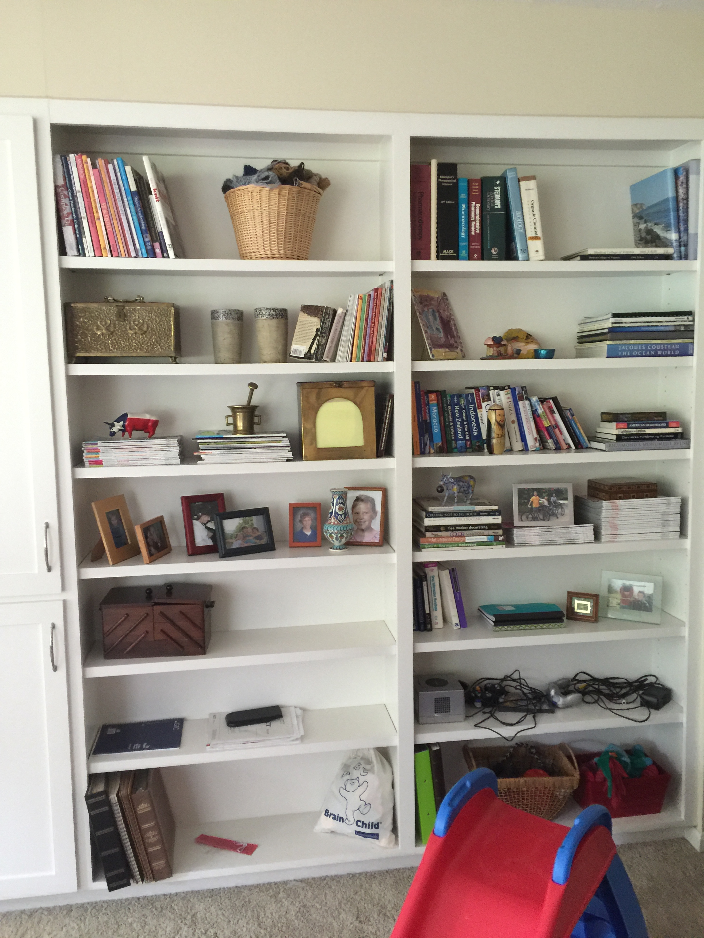
Here are some before shots:
Before Bookshelf Styling
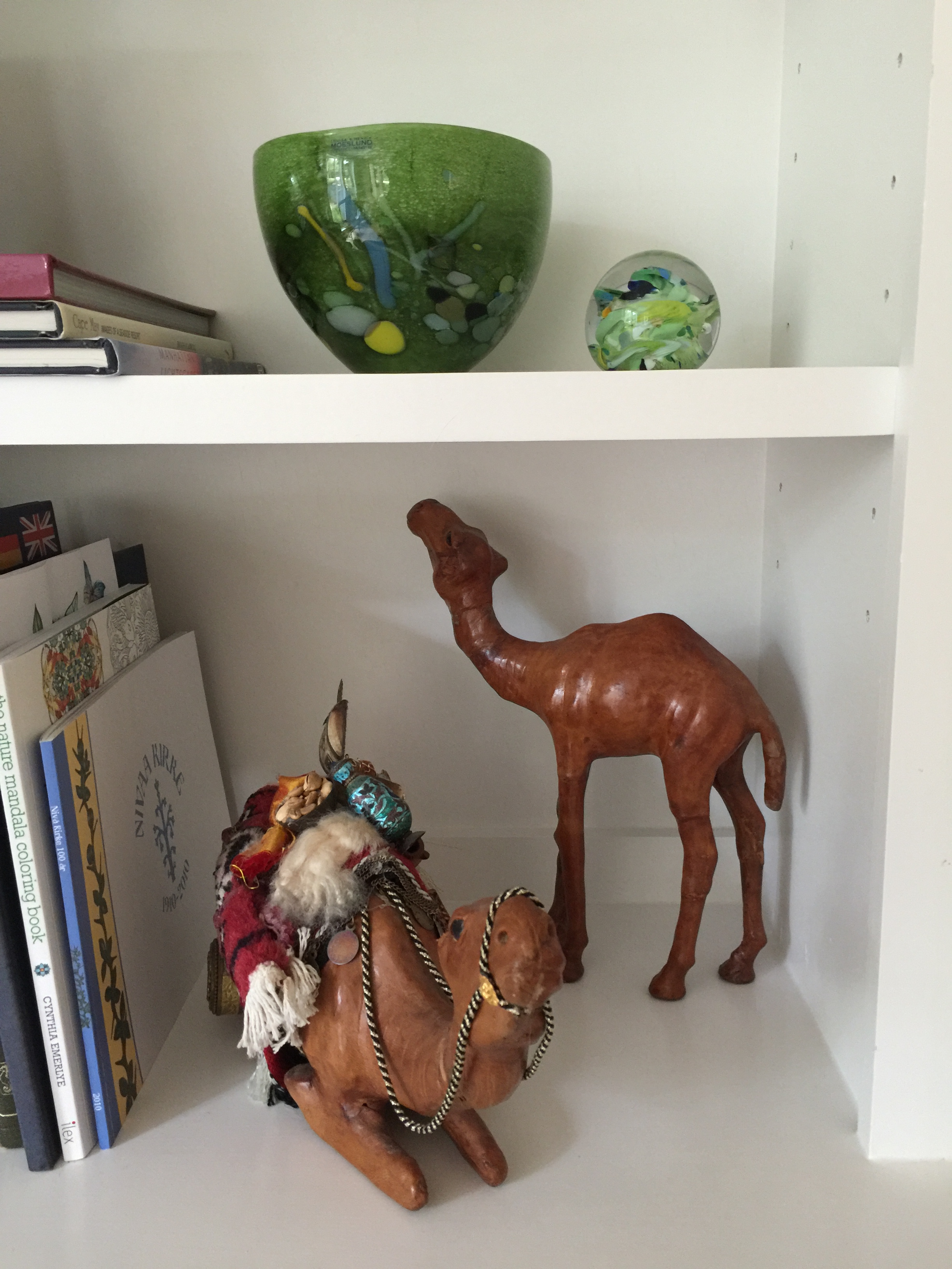
Homeowner's special items to include in styling
Before Bookshelf Styling
What we looked for when we shopped for these bookshelves
I felt like the bookshelves were a bit too horizontal or, designed only for books. This was a living room, not a library. Plus, even with the paperbacks, there just wasn’t enough to make it all about the books.
Although I like books in bookshelves, I felt like we could add in some more objects to create interest and accent the beautiful picture books I thought I could see in the image.
When I went shopping, I wanted to look for items that weren’t “visual attractions” themselves, but more like support pieces.
I wanted them to have an earthy quality, nothing too bright and colorful. I knew I needed some taller items, and I liked the hint of metallic, although not polished brightness, but an aged look.
Our full At Home shopping cart!
Here's some of what we bought for the bookshelf styling
Here’s where we began with the styling
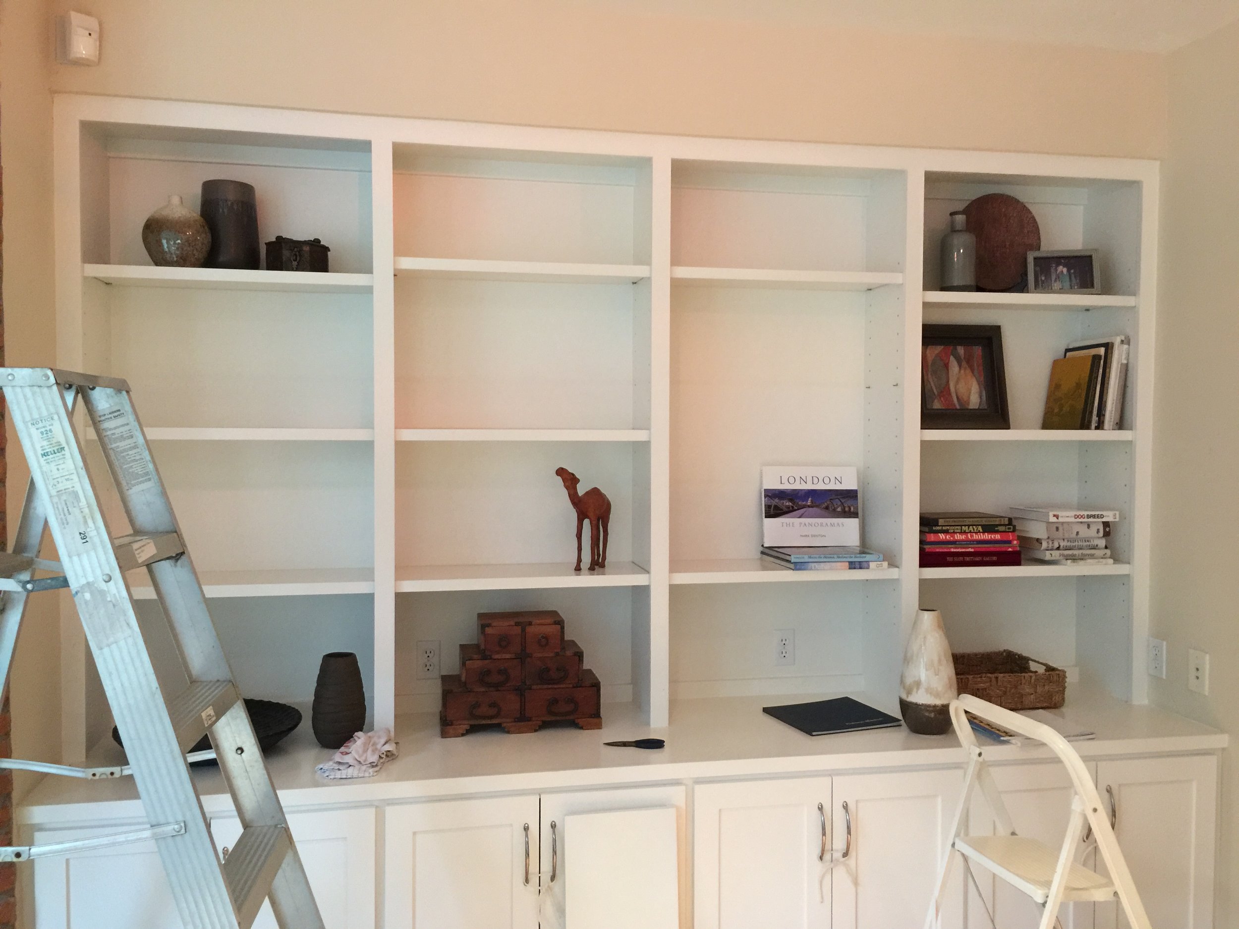
We arrived and began dismantling the bookcases.
I knew that to get rid of the horizontal nature of these shelves, and to create more verticality in the wall, I needed to lose one of the shelves in each section and space the others out accordingly.
I wanted some taller objects within the shelves, and we needed more space for them. That was the first thing we did.
Here are some pics of our work, in-progress:
Selecting the books
Then we picked through the books, eliminating almost all the paperbacks. Luckily, we had a great set of bookshelves in another room, more of a library/computer room where we could put those.
(We’ll show you those shelves also down below.)
We mixed the colors of books as they went into the shelves, as I wanted a more collected and natural vibe for the look.
I like to place larger picture books on their sides, because the titles really are more readable and impressive, plus it helps break up the space and not look so library-ish.
(Not that that’s bad, it’s just not the purpose of these shelves. That’s actually EXACTLY what I wanted to create in the other room, though.)
I scattered the At Home objects throughout the shelving, filling in and combining some of the homeowner’s prized pieces with some of the new items.
Here are some close-up pics of the shelves:
Bookshelf styling - the gray vase, copper toned plate, and modern art piece were from At Home and filled in nicely amongst the homeowner's books and collectibles.
Bookshelf styling - The coppery Moravian star, small vase and pot of greens from At Home fill out the bookcases nicely.
Bookshelf Styling - the large two-toned vase from At Home fit in with the other, more colorful glass pieces of the homeowner's. The small framed art piece from At Home provided a nice colorful backdrop for personal momentoes.
The items we purchased at At Home are all well-priced and fit the bill perfectly for the look we were going for.
I like the little art pieces we found, they combined perfectly with the homeowner’s style: a little mod, with some red and gray colors.
That worked so nicely to add color and fill the whiteness of the shelves.
Speaking of how white the shelves looked, you will see how we added in the small wood tables in front of the bookcase that were in another room of the house. That really warms up the base cabinet area and drives home that eclectic and global mix that we are going for here.
We also kept some of their family photos.
I know many designers don’t do this, but this is a very personal styling, and I felt it was appropriate here. Some of the photos we tucked into the library bookcases in the back room.
The Reveal
As it happened, there were painters there that day painting in the kitchen.
They had draped off the area we were working in with plastic to keep the dust out, and we puttered in there all morning.
When we were done and it came time to bring the homeowner in, I had a sweet designer moment, just like on TV! We pulled up the plastic sheet, revealed the room to her, and there was that fabulous gasp and big smile.
She loved it!
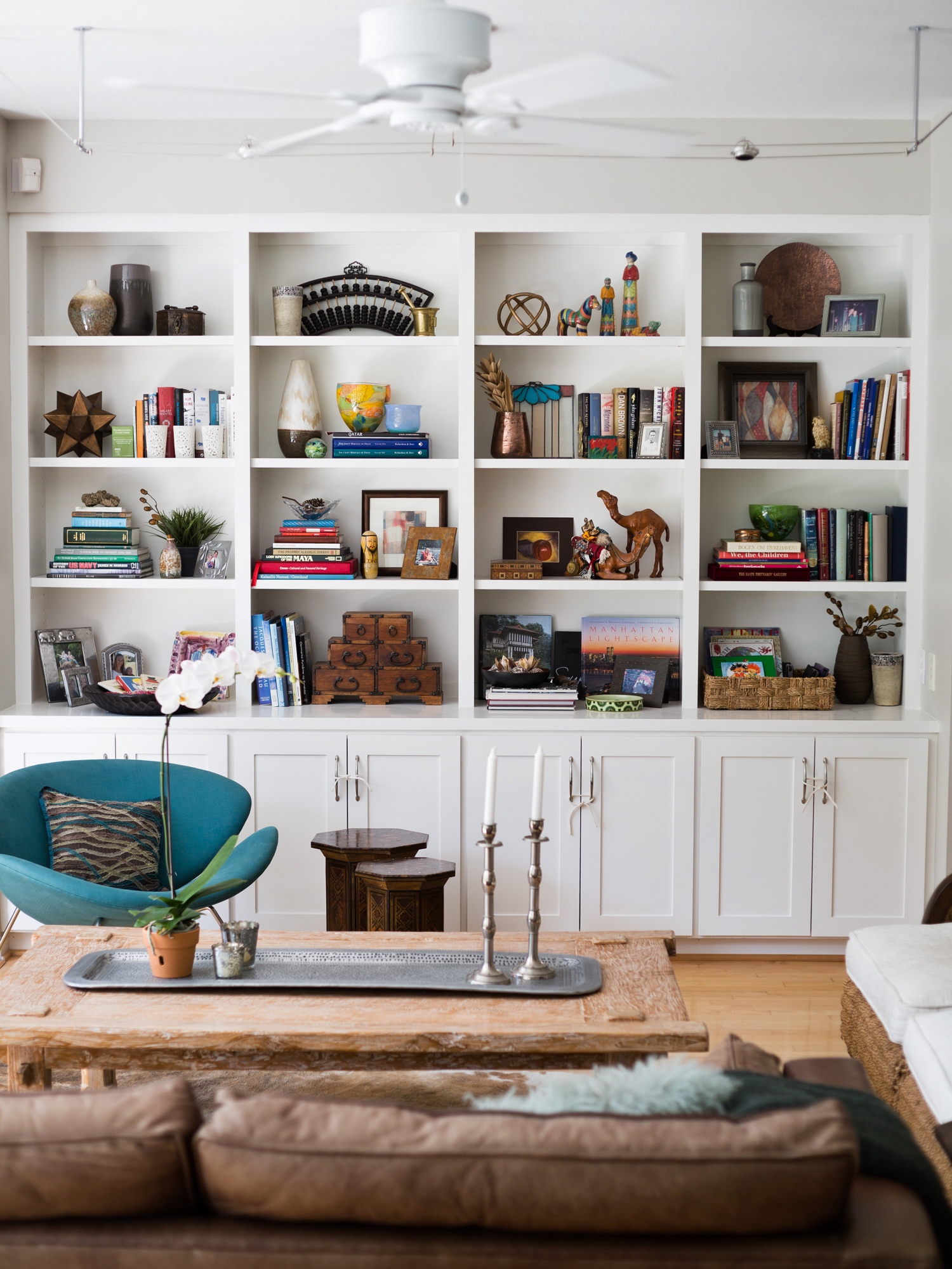
Here are the afters:
After - Bookshelf styling - Carla Aston, Designer / Tori Aston, Photographer
After - Bookshelf styling, Carla Aston - Designer, Tori Aston - Photographer
After - Bookshelf styling, Carla Aston - Designer, Tori Aston - Photographer
Bookshelf Styling - Carla Aston, Designer / Tori Aston, Photographer
Back Library Area Bookshelf Styling
Okay, now earlier I mentioned the back library area and how we moved all the paperbacks back there.
Here is the before image of those shelves:
BEFORE - bookshelf styling
And here is the after — purposefully book-ish feeling and filled with family photos and personal items:
After - Bookshelf styling in library
Do YOU need a bookshelf styling makeover in your home?
Located in the N. Houston/The Woodlands area? We would love to come and work some magic for you.
Need a quick Q&A? I can do a lot to point you in the right direction. Click below for more info.
Many thanks to At Home for sponsoring this project!

