This spacious living room needed some bookshelves and a built-in for the tv. Although the fireplace was centered in the room with a peaked ceiling, the homeowner wanted the tv off to the side.
This was one of my Designed in a Click consultations and she wanted to know how to design this wall’s cabinetry as well as how to design the mantel and clad the fireplace with the stacked stone they selected. A furniture layout and some furnishings selections rounded out this full design plan.
My blog contains affiliate links. Any purchases, at no additional charge to you, render me a small percentage, are most appreciated and make this blog possible. :-)
Before - Living room fireplace wall challenge
Before - Living room blank wall opposite fireplace
Before - Living room fireplace wall challenge - view into entry hall
They were just moving in and were about to begin a remodel. Here was the stacked stone they wanted to use on the fireplace. The tile and wood are the kitchen backsplash (slate blue color) and the warm wood floor that will going in this room.
The whole space including the baseboards will be painted Benjamin Moore White Dove. They like cool tones but also want some contrast with a pop of color.
I think this palette reflects their taste here and will look great in this home.
As I mentioned above, this is a spacious room. It has a long shape and the wall where the fireplace is measures almost 20 feet.
That makes for a long bookshelf wall.
One of the questions was if the built-in should be symmetrical or asymmetrical.
I definitely thought asymmetrical was the way to go. I really didn’t want to see such a long wall of built-ins that would sort of narrow the room even more. I wanted to keep the end down by the entry more open, like it is now.
I knew the best way to figure this out though, was to do a furniture plan.
Furniture Plan Considerations
I felt like the furniture needed to pull away from the opposite wall and float in the room.
For good tv viewing, it needed to center more closely to the tv location down by the window too.
This would also help with traffic flow through the room, not having to walk in front of the tv and it would create a more intimate conversation grouping. It would definitely feel more cozy next to the fireplace too.
Two key elements here that would make this plan work is to get rid of the raised hearth when they remodel and put the hearth on the floor. I also like addressing the opposide wall with some structure like two hefty (but thin - 11” deep) consoles.
A nice rug in a 10 x 14 size would help anchor that floating seating group too and route traffic around it.
Fireplace / TV Wall Elevation
Here are the design features of this built-in.
Do an asymmetrical layout with a 3’ wide section on the left side of the fp and a full width on the right to house the tv.
Address them with different heights, but paint them all the same color, a dark slate blue (match the tile in the kitchen) for an elevated look.
Get rid of the raised hearth and put it on the floor, run the stacked stone floor to ceiling and float a plain, straight mantel above the fireplace. Here’s how to address the edges of the stone.
Take the the 36” wide shelving all the way to the ceiling with adjustable open shelves and do a picture light in a panel at the top.
On the tv side of the built-in, build it to reach up to 6” below the ceiling at the corner. Do a false back wall and mount the tv on it with an articulating arm so it can be adjusted for viewing. Position it closest to the fireplace with cabinets on the side at the window wall. This side can all have doors since there are open shelves on the left side.
Here’s an example of another remodel I worked on with an asymmetrical placement of the tv. It rendered more useful storage and helped get the tv in a better viewing position.
Console Wall Furnishings
Now, let’s talk about furniture!
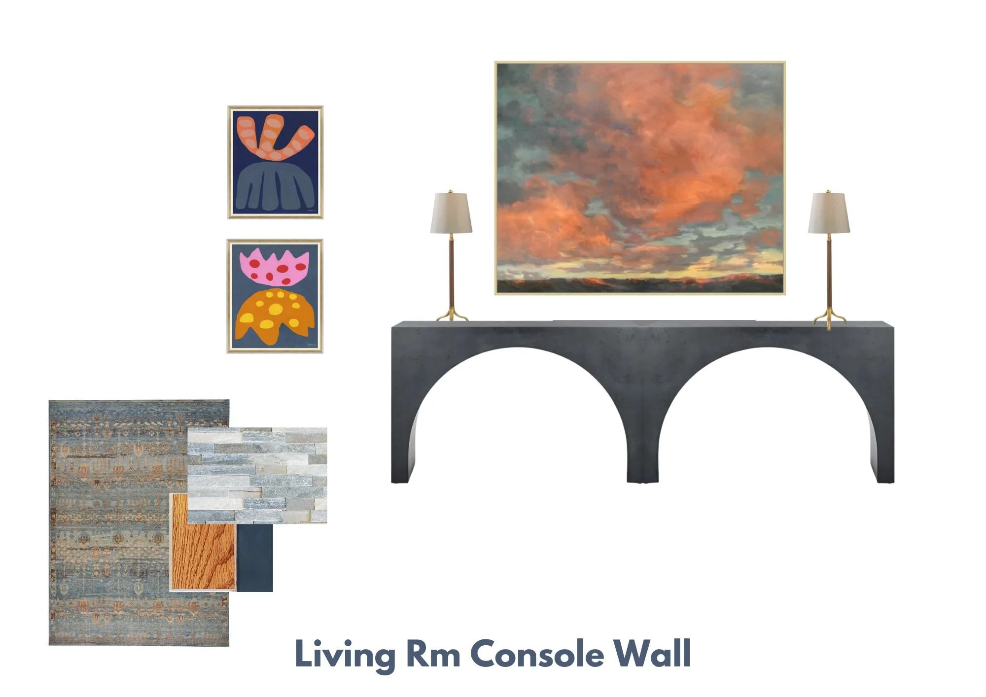
I mentioned before that a double console situation on the big blank wall is needed to add some structure to that wall. Otherwise the built-ins will feel heavy on that fireplace wall and a bit unbalanced.
Here’s the console that I think would be perfect.
These are about 4’ long and 11.8” deep. They have a clean look and the dark contrast created will add some weight to this wall.
They will need some buffet type lamps, the lamp shades should be rather small in diameter since the depth is less than 12”. I like these lamps at 31” tall. They have a little detail at the base and I like the warm finishes.
A big piece of art over the consoles with slate blue and some warm orange color like this would make a statement.
Here’s an elevation of the console wall showing how those pieces would lay out on this wall.
On the wall beside the console some smaller, vertically stacked art would be nice. These very modern pieces from Susan Hable would look vibrant and would be a good combination with the larger landscape. (Click on the images for links.)
Seating Group Furnishings
I have two options for rugs, one is a wool rather pricey option, the other polyurethane, so quite budget friendly. I like how these are primarily cool toned but have sone warm rusty orange in there too.
I’d anchor this seating group with a colorful leather sofa. They could do fabric here and leather on the chairs, but I’d put some caramel leather in here somewhere.
This gray/blue console would work great behind the sofa, so it will be visible and can have some nice decor there, seen from the entry hall. I like the cool tones of this with the warmth of the leather sofa.
I love this beefy round coffee table with the warm toned marble top. A round shape here will be nice for movement around the room.
Two of these swivel chairs would be nice over across from the tv. I like the weight that the slate blue color would give over here. These could be on legs and one could even be a recliner, but basically some comfy lounge chairs would work well.
Here’s a side table for between these chairs, along with a floor lamp. Don’t want to get a big shade here, to obscure the view out the window.
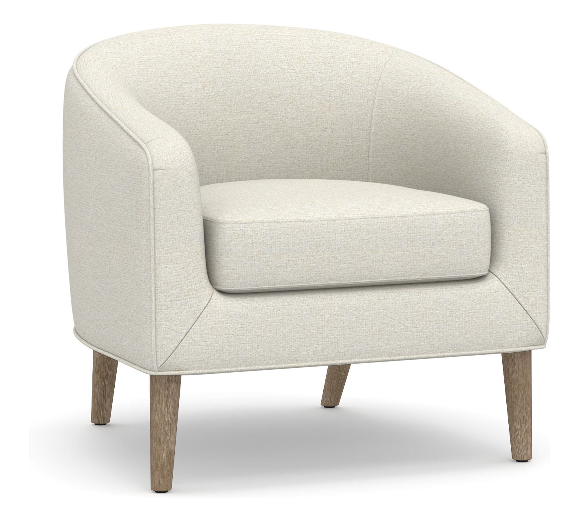
Another accent chair over by the window, this one on legs and with a low back, keeping the window in mind.
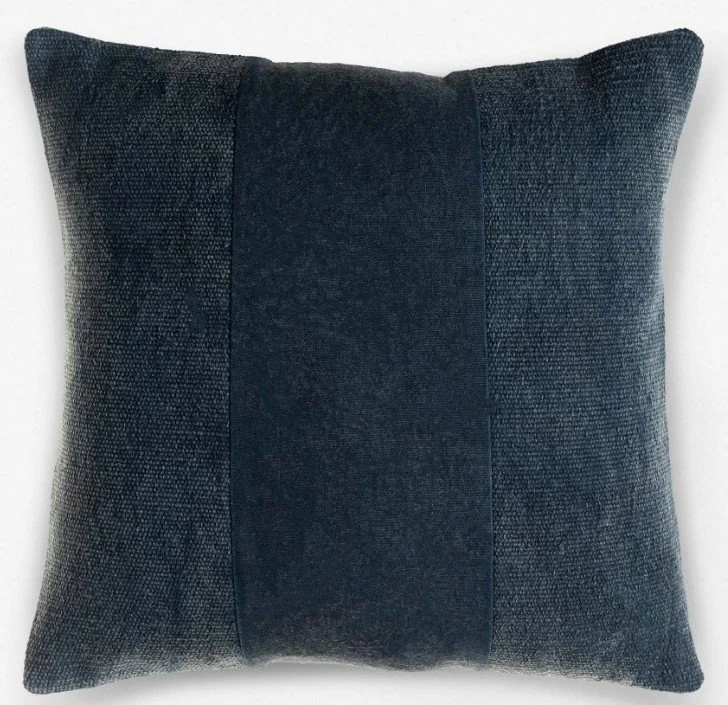
Lastly, some pillows in slate blue and a rusty orange color to spread around the room.
And here is how it all combines!
This blogpost was thoughtfully written by me, Carla Aston, and not by AI, ghostwriters, or guest posters.
Did you enjoy this post? I have more living rooms to peruse below!
Pin this post to Pinterest to save for later.


Isn’t this lounge room pretty? I just love it when people make a good start and want my help for the last layers to their spaces. Let’s finish this room out!