I’ve been to several consultations locally recently and this topic has come up. Even though everyone seems to have a white kitchen these days (if you peruse social media), many kitchens, with construction done over 15-20 years ago, do not.
They have honey oak or dark wood and that wood carries through the house often with trim, doors and darker warm paint colors to go with it. They have warm toned tile, like travertine or the ceramic version of travertine. There’s usually some warm colored spotty granite in the kitchen too.
So, you would think that these Tuscan, mediterranean, darker, warm-toned homes wouldn’t have to be remodeled now, that they would fit in the style that is new and popular these days, a more moody interior with darker woods and warm colors.
Well, not so.
There are usually some other telltale details that give it away.
Of course, nothing is ever easy, is it? :-)
I’m mentioning some of these kitchen features in this post today.
Corbel brackets
Decorative onlays
All dark finishes making for a muddy look - no contrast
Framed out tile backsplash over the cooktop/range
Dated lighting with yellowed glass shades and curly iron detailing
Dated Dark, Moody Home Interiors
I thought it would be interesting to take a look at some of the homes that I’ve consulted on that had that dark, Tuscan vibe going on. I wanted to note what I feel is dating that interior that you might overlook.
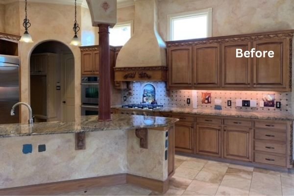
The big corbel brackets under this bar is one of the items dating this Tuscan kitchen.
This kitchen is all in with the Tuscan look.
While you might think the wall texture, the countertops, splash and maybe the wood cabinets would be the reason for change, let me point out some more dated features that contribute to this look feeling old.
The corbel brackets
These days steel brackets that don’t show under the bar countertop overhang are used. They can be integrated into the structure of the island and leave that area free for knees. I would say that the corbel bracket market is on the downturn these days. :-)
Decorative corbel brackets are not used much these days. Steel brackets that don’t show under countertops are more commonly used.
Huge corbels like these telegraph that Tuscan style from years ago.
The cabinet onlays
I love an interesting onlay, like a grid or X design on a cabinet door. These scrolled, leafy, curvy onlays, however, are definitely giving off a dated Tuscan style. You can see this one on the hood.
Scrolled onlays and carved decorative brackets under bar counters telegraph a more dated Tuscan style.
Too many dark finishes that blend together for a muddy look
This kitchen has nice, tall cabinetry, so that is good. What feels off is that the counters, backsplash and cooktop hood stone products all have undertones that don’t work together.
That’s exactly what the homeowner here wanted to do and reached out for, was some input on the counters and splash. I recommended Taj Mahal quartzite here too, as the walls here are SW Antique White, which is quite warm. Taj Mahal can have some nice warm tones and can vary a lot, so it might work well here.
A more solid color backsplash, a light one that blends with the counters, would be a nice contrast with the busier stone and dark cabinet color.
Dark wood kitchen with travertine tiles
She was going to lower the island, but a painted finish there would break up the dark wood and contrast with the stools. Some splashy pendants and cool tone antique nickel or pewter cabinet pulls, would add some contrast make this kitchen look more interesting.
In this wood cabinet kitchen, below, the cabinets blended in to the gold spotty granite counter and then into the backsplash. They had recently painted the hood and walls for a brighter look, but needed to do more in the kitchen.
This warm toned kitchen looked a bit muddy and dull to the homeowner.
They added light Taj Mahal quartzite counters and zellige tile on the backsplash that echoed the color of the walls and hood. Those wood cabinets now never looked so good! The contrast improved the look of the wood.
Remodeled, with new light counters and splash, these wood cabinets look better than ever.
This room is on one end of an open living space that is all painted a light creamy white, which looks amazing. (It has dark accents with furnishings and lighting.)
When I worked on this kitchen, I felt like this space needed to have some light finishes to contrast with all the dark and relate this kitchen to the rest of the space.
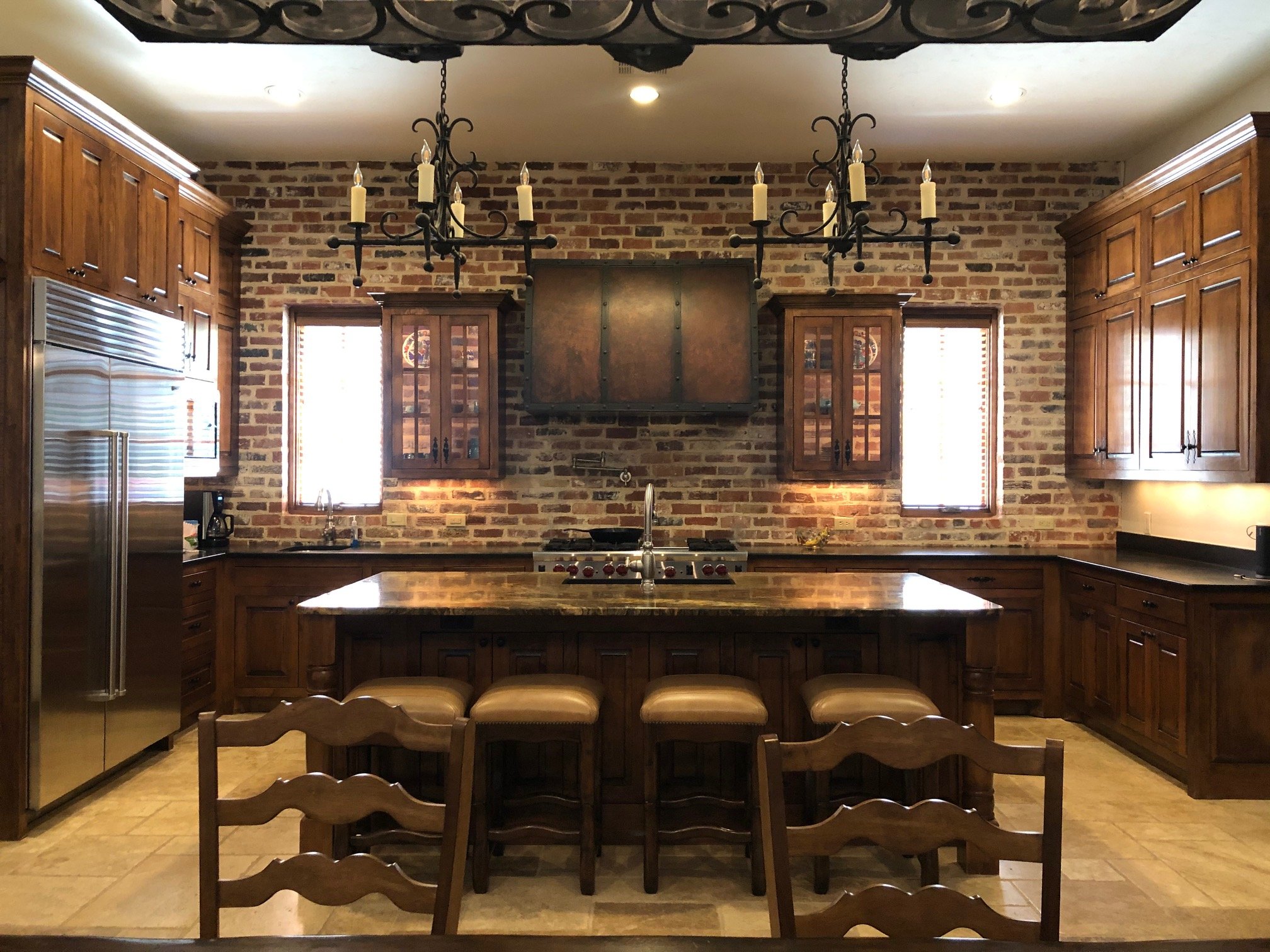
An all-dark Tuscan look kitchen
I proposed light, natural stone countertops and a curvy backsplash with a new creamy white plaster hood. That would add enough brightness to relate it to the adjacent living room. It would update the look using all the existing brick and dark wood cabinetry, so it was not a complete redo but had a fresher appeal.
Adding in some light finishes in the counter, splash and hood will freshen up this look.
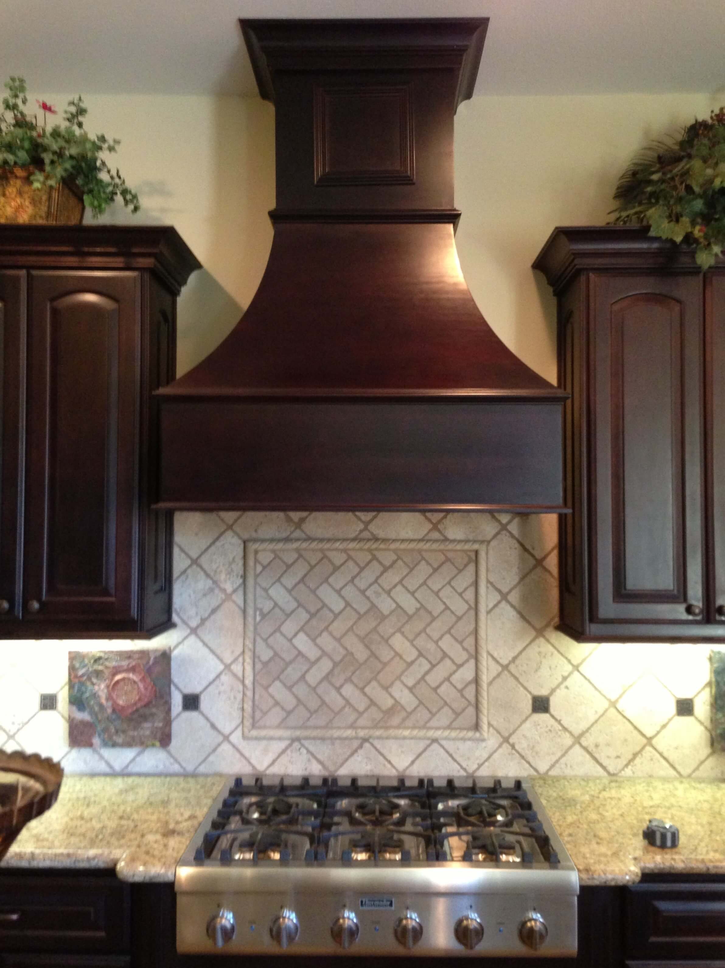
The framed out backsplash over the range or cooktop
We did a lot of framing in with tile over the cooktop or range area some years ago. It can feel dated now and with all the new beautiful tiles out these days, a more solid look or even an overall patterned tile, might be more desirable here.
It certainly makes a bigger impact.
This backsplash would be a great place to add color or some overall pattern.
Framed tile backsplash is a dated look.
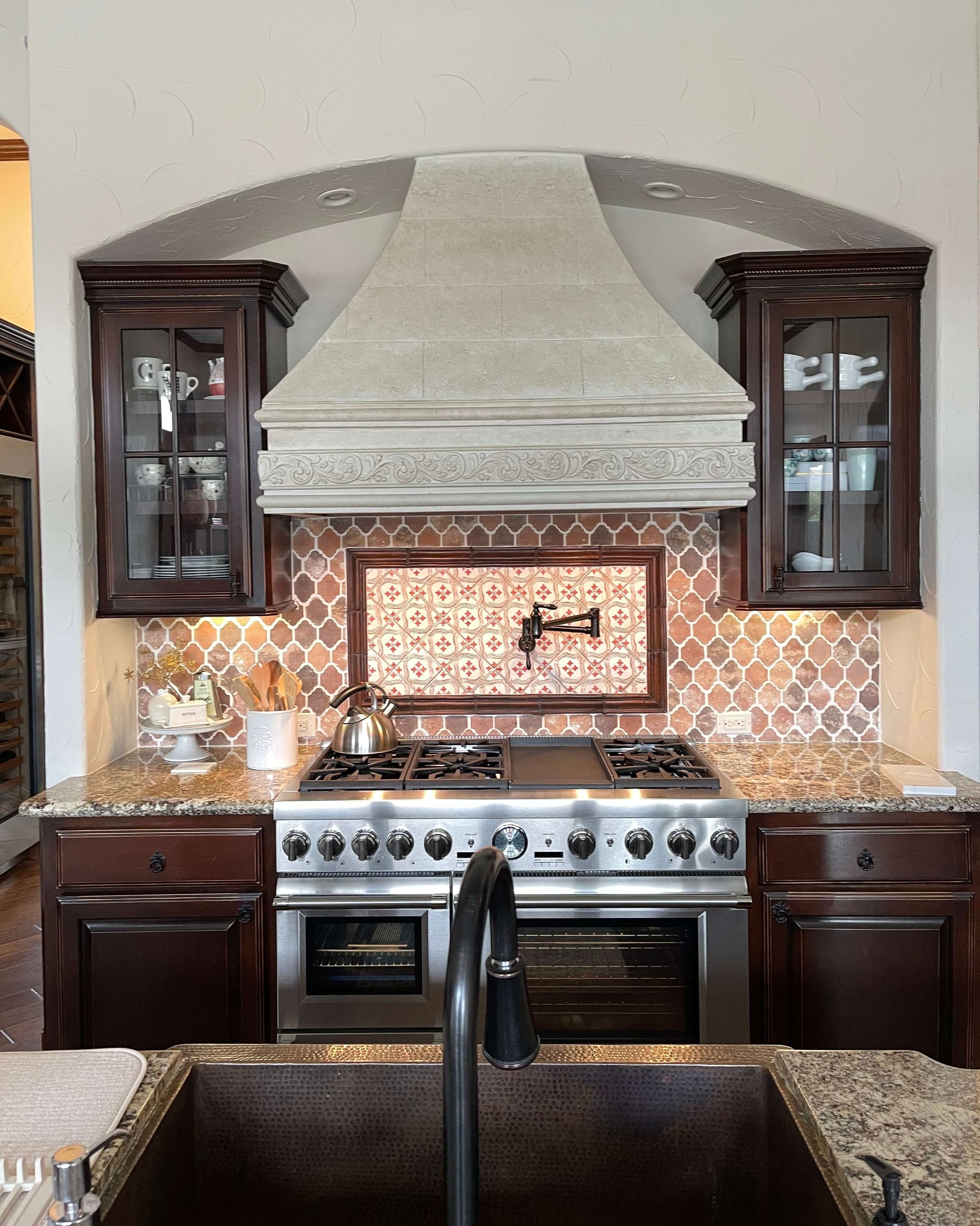
This kitchen, below, was a recent consultation I did locally. I loved the terracotta tile in the backsplash here.
The homeowner was on the right track with her design ideas, as she will be removing the two small side cabinets, replacing counters and framed backsplash and doing terracotta tile all inside that niche area, around the hood.
I can’t wait to see how it gets finished up. It will be amazing!
This framed look in the backsplash will be changed out for terracotta tile all over the niche area around the hood.
Dated Lighting W/ Yellowed Glass Shades And curly iron look
You’ve seen some of these in a few of the kitchens above. Usually these Tuscan kitchens had decorative lighting with yellowed glass shades and curly iron details.
The yellowed color of these glass shades doesn’t help the overall color of the room.
This pendant is a dated look that was changed out in this kitchen’s remodel.
A dated breakfast room chandelier
The great aspect about updating your lighting, is that unless you are moving the location of the fixture, then it doesn’t have to be a big construction job and therefore not much mess.
While you might be able to keep some of the “moodiness” of your older Tuscan kitchen, be sure to take into account all the details that might keep it dated looking, before you start to remodel.
I have a great service that can help!
My Designed in a Click service can take a look at your project via email and respond with a fresh approach or maybe just confirm exactly what you’ve been thinking. :-)
This blogpost was thoughtfully written by me, Carla Aston, and not by AI, ghostwriters, or guest posters.
More On Kitchen Updates
I have more info on dated looks that can help you determine what you want to update in your kitchen, below.
This blogpost was thoughtfully written by me, Carla Aston, and not by AI, ghostwriters, or guest posters.
Pin this image below to Pinterest to save for later and help me spread this info. Thanks!


This is a great post that can really help you figure out your priorities in a remodel. No doubt that one or two of these might have not come to mind, so this is a list to keep for when you are ready to remodel. See if you have any of these features in your present kitchen!