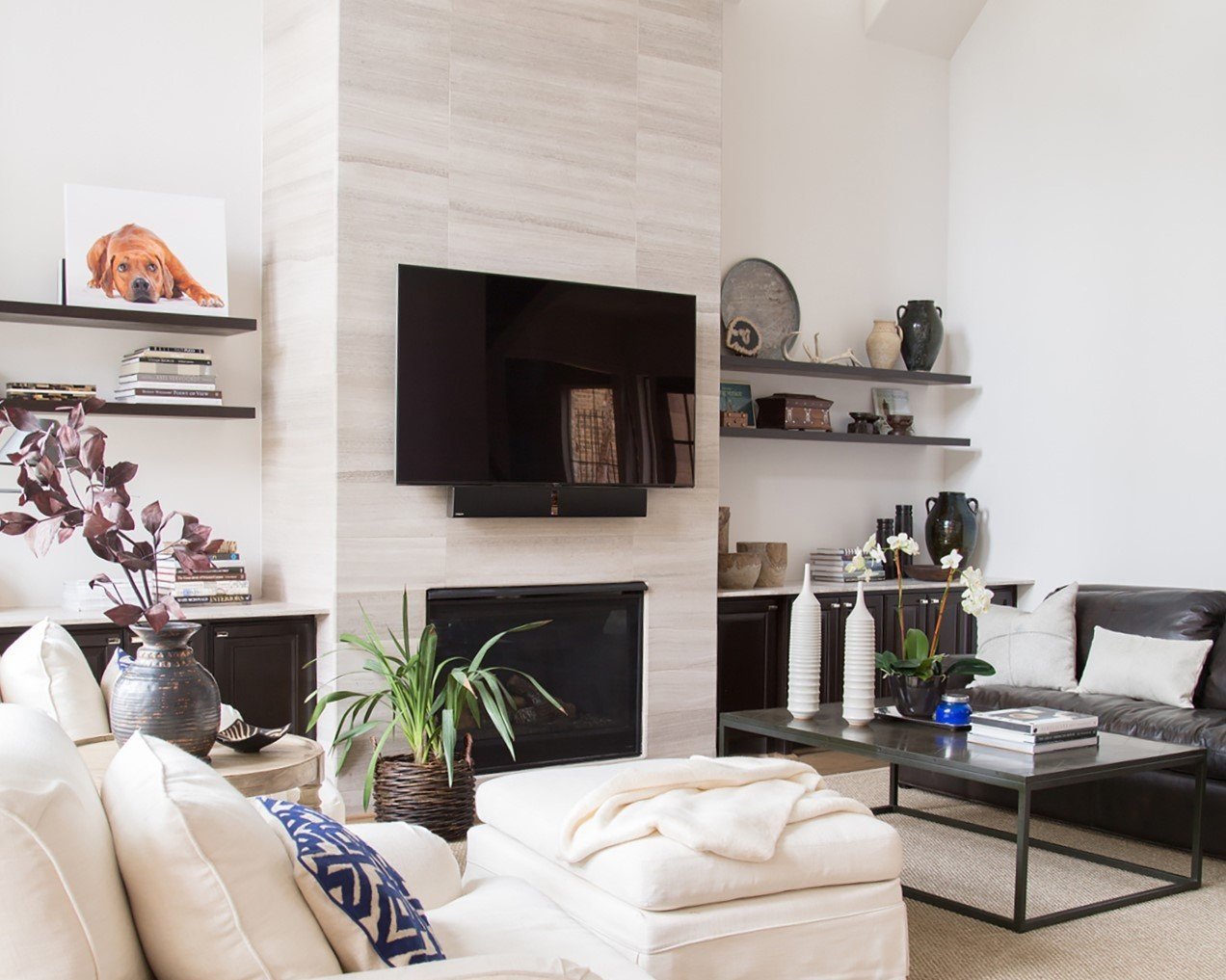
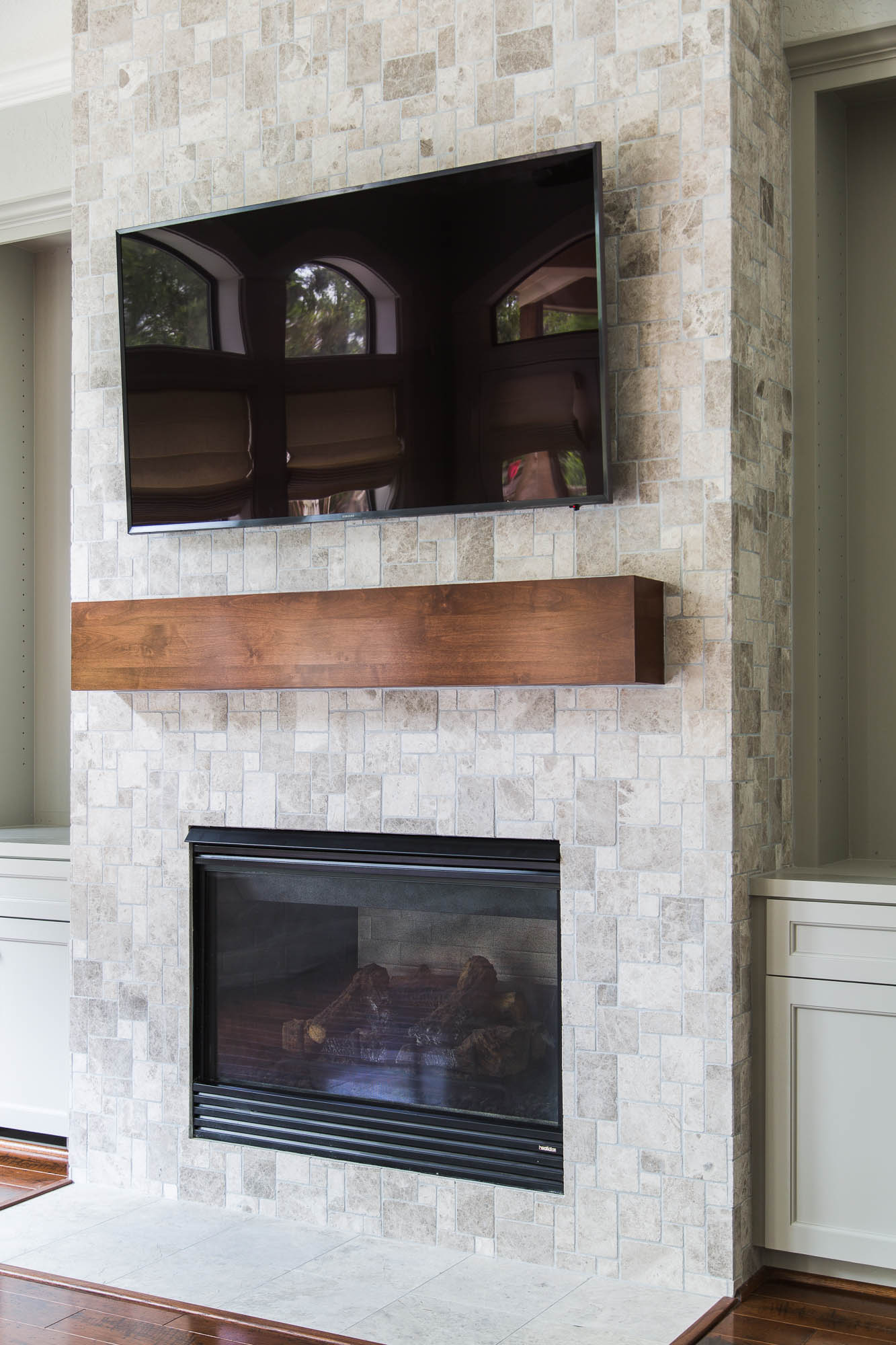
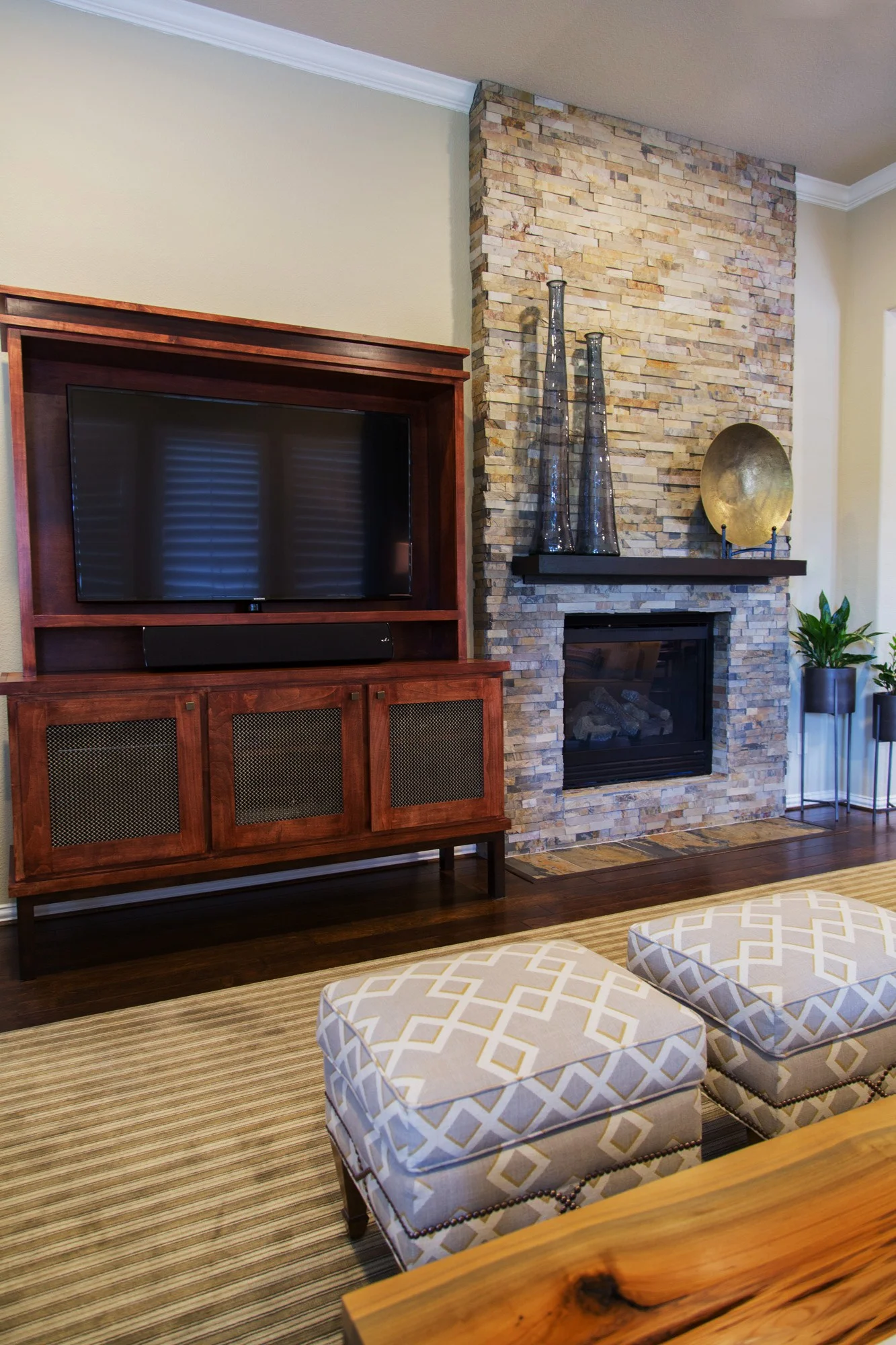
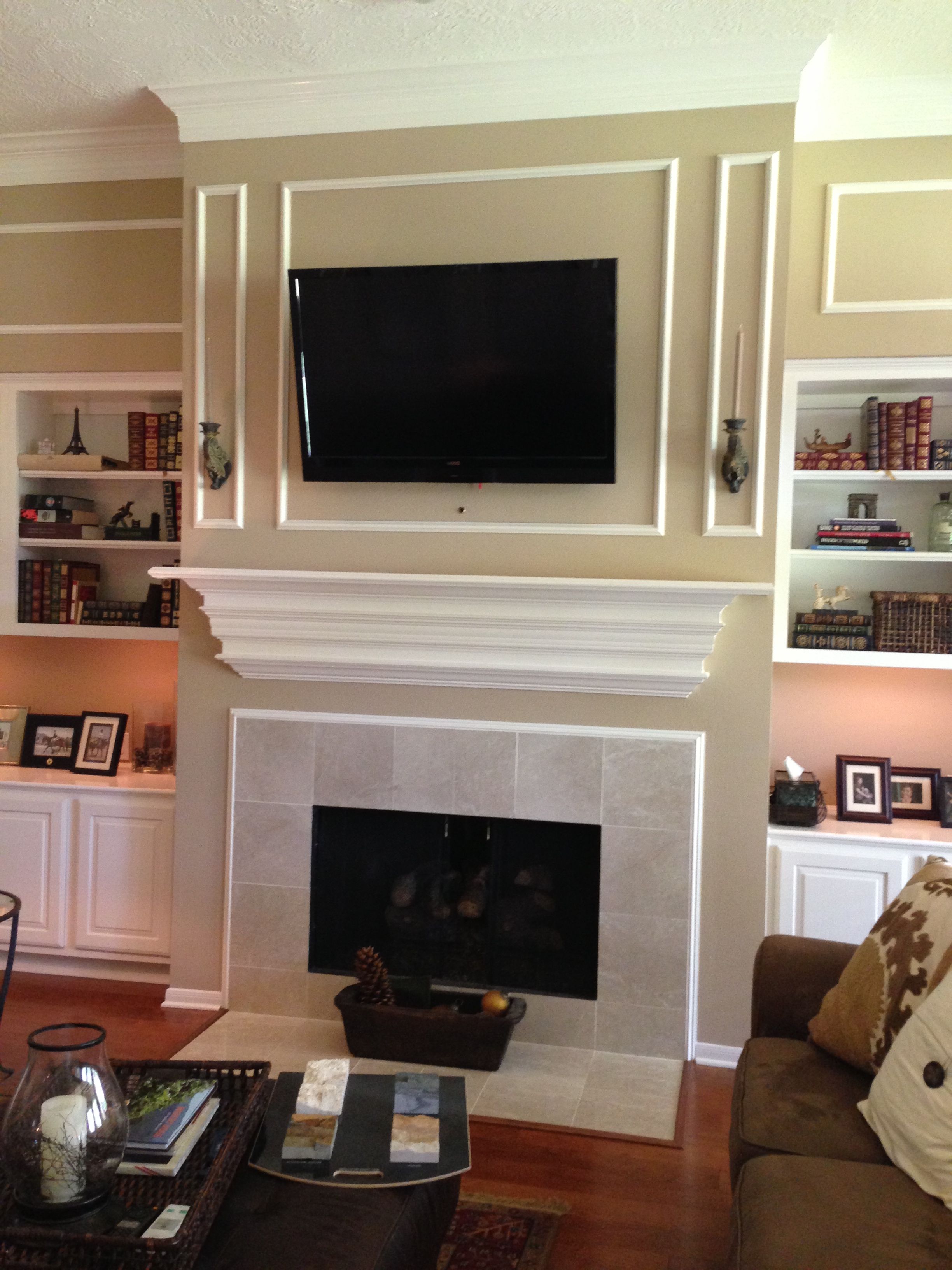
One of the most popular elements for remodeling I have found is a fireplace mantel and surround.
Whether it involves just painting the mantel and re-tiling the surround, or tearing everything off the wall and rebuilding it with a totally new look, it’s definitely a place that homeowners want to address.
After all, the fireplace wall makes such a significant design statement and, I find, can really speak to the design aesthetic in other areas of the home to help balance the design and keep a flow to the overall look.
I often use a similar or same type of stone on the fireplace that I do in a kitchen that is open to the main family room where the fireplace exists. I might use a similar color or wood finish on a mantel that is used as flooring or on the kitchen cabinets. It’s just a great place to touch the home with the overall design style and provide balance, as it’s definitely the focal point of a room.
Often, we take the finish of the fireplace all the way to the ceiling.
It just makes for a dramatic and significant change to a home.
Before:
After:
* CLICK HERE to learn more about the above project! *
Sometimes (okay, I’m finally getting to my point), when we’re removing a more typical style mantel and doing tile or stacked stone to the ceiling, or even part way up the wall, I also like to furr out from the wall, if necessary, so that the stone returns back and dies into the wall.
We do this so that the stone doesn’t appear flat or just pasted on. It’s so nice to have any material used on the face, turn the corner and die into an inside corner, if possible.
It just makes for a clean transition.
It gives the fireplace visual weight and an illusion that it is more structural and solid. It appears, and is, more expensive, but this detail creates such a more natural and better overall look. It makes it very much worth the effort and expense.
Avoid this look at your fireplace!
Here’s an example of how it was done in a builder model home that I DON’T like. Here, it appears to just be pasted to the wall and has no depth to give the fireplace a quality appearance.
Avoid this look if at all possible when designing your fireplace cladding.
Take a look at how we’ve done it here:
Stonework detail - returning the material on the sides | Small details like this make a huge difference!
This fireplace below was remodeled on one of my projects. Previously, the furr downs or soffits over the built-ins were on the same plane as the fireplace wall.
Because the homeowner was looking for a tiled or stone clad fireplace for a bigger statement, we would have run into a problem with the stone at the top of the fireplace. It would have appeared to have been pasted on and wouldn’t have the more realistic and permanent feature that a stone fireplace should have.
Before the fireplace remodel:
So, I had the contractor remove the furr downs and rebuild them further back along the wall so our stone tile could return back to the wall and give that fireplace a more solid look.
Here’s the finished product: (It’s not totally done. Later this week, we are putting in grasscloth in the cabinet backs.) (Tile corners were absolutely beautifully crafted.)
See how important and structural this fireplace now appears? It looks like the room was built around it. No?
Here is another instance where we returned the stone on the sides of the fireplace to create a heftier, more substantial look. We furred out away from the wall to achieve a more authentic stone-like look.
Before:
After:
And here is one more, where we returned the stone on the sides of the wall that existed.
Before:
After:
And that’s why you hire a designer:
For valuable tips to help your project become more worthwhile and better than you could have imagined.
OR... That’s why you read my blog. ;-)


