I’m sharing 5 furniture layouts done during some of my past Instagram Q and A’s. All of these situations are different and challenging in their own way. I orignally posted these back in 2022, but I love to go back and check these out from time to time.
Take a look at these layouts. Maybe something like these would work for you!
Top 3 Considerations for a Good Furniture Layout
These are the top considerations I follow as a approach a furniture layout.
1. Traffic flow
A major consideration to take into account is traffic flow.
2. Focal Points
Focal points are also important to consider. An amazing view, a fireplace, some architectural feature, all these are something to keep in mind when working on a furniture plan that fits the home and the needs of the people living there.
3. TV Location
There is almost always a need to ascertain where to put the tv in a family room, great room, etc. Even if people don’t watch tv much, they usually like to include it in a space that is used a lot for relaxing on a day to day basis.
Living room #1 - Small open room
This living room is open except for one wall and the tv takes that space. The homeowner didn’t know how to lay out the furniture.
That is the dining room in the nook and the piano stays in the room.
Basically it is an open space with no walls to use but it isn’t quite big enough to float a seating group. Children in the house do come in here to use the tv but the homeowner might consider removing it as there is another one elsewhere.
This open living room tucked into a nook area was a problem for the homeowner trying to arrange furniture. carlaaston.com
Traffic needs to flow between the piano and the seating group. The focal point is the tv if it stays or it could be the piano if the tv goes.
Here are my two furniture layouts. She had given me the dimensions of the 3 walls surrounding this area.
Two options, with and without the tv, work for this open living room tucked into a nook area. carlaaston.com
Option 1 keeps the tv. Including the chairs on each side of the tv softens the look of that wall and the nook area. A rug helps identify this space and softens the room.
I prefer to have a sofa table if the back of a sofa is prominent, but wasn’t sure about dimensions here so I left that as optional.
Option 2 feels more like a living room destination, I like how it would look from the stairs as shown in the pic. Swivel chairs could float in the room or even two lighter weight wood frame chairs that could be moved around if needed would work opposite the sofa.
I think this layout seems inviting and looks comfy. It is a nice contrast to all the wood in the space.
Both options take up about the same amount of room.
Living Room #2 - Long Narrow room
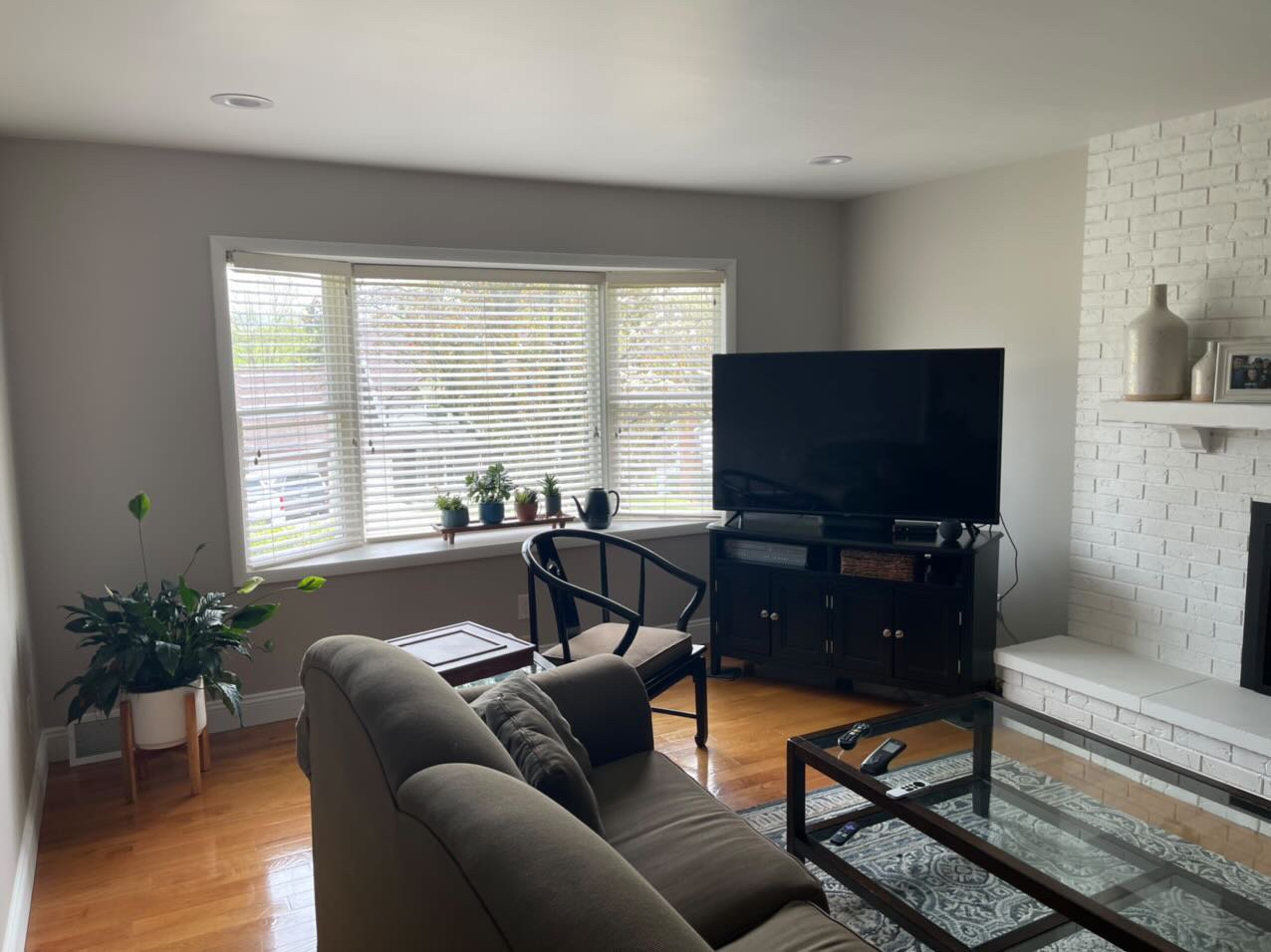
This long living room is a problem for tv watching. The homeowner was ready to put the tv above the fireplace as they didn’t like it in the corner anymore. I got the dimensions of the room from her, including the cased opening to the room, to explore options.
There’s another piano, these eat up a lot of wall space. I had one for many years, so I know that personally. :-)
Living room needing a better furniture arrangement. carlaaston.com
Living room needing a better furniture arrangement. The big tv in the corner wasn’t very good placement. carlaaston.com
End wall of living room needing a better furniture arrangement. carlaaston.com
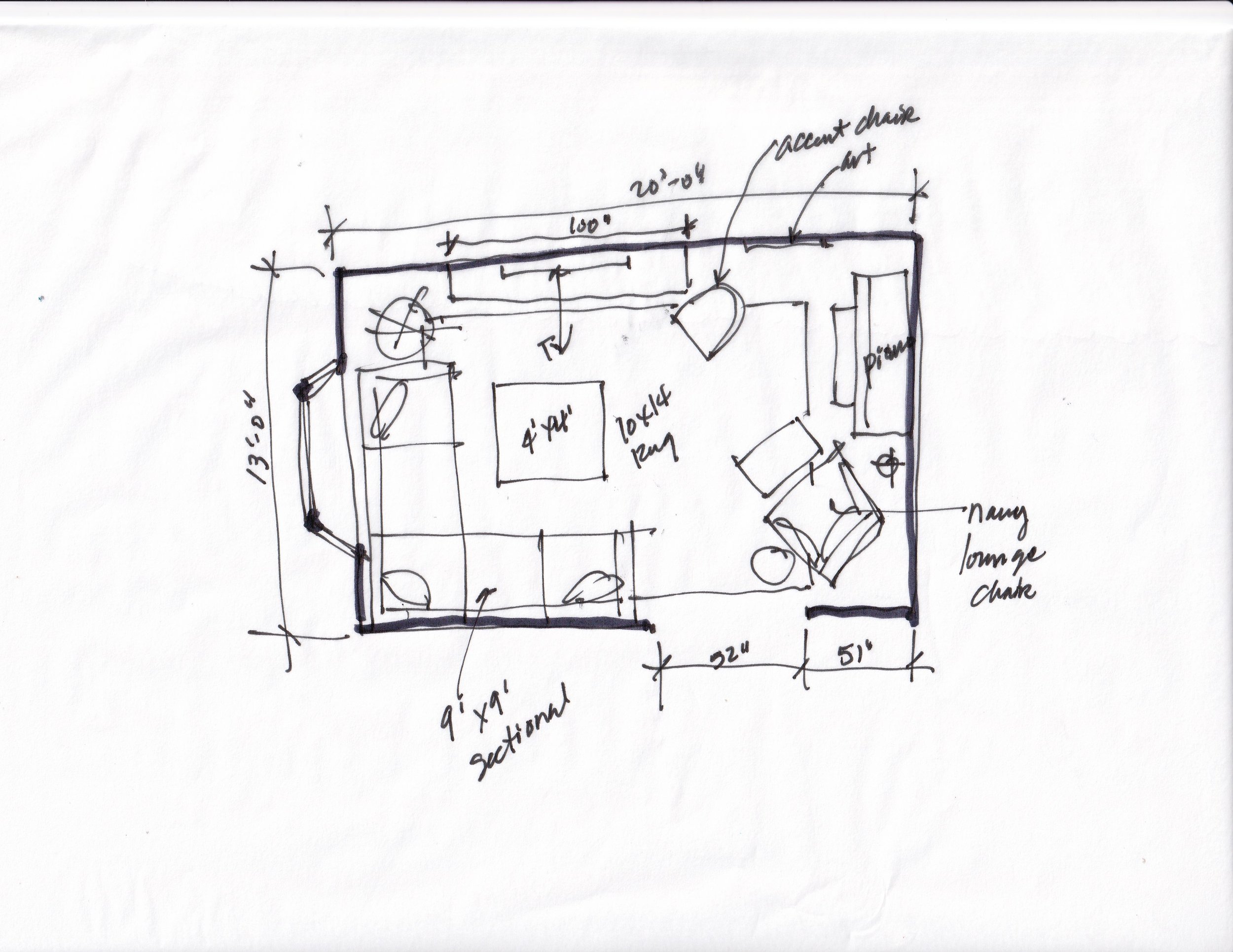
Here was what I thought was best.
I felt if the tv goes above the fireplace, then the sofa is just too close. Also, the room is really shallow anyway, so floating that sofa just eats up a lot of room.
While I don’t always love a sectional as it kind of locks you into a specific furniture arrangement, I thought here it would work best. With the window being up high enough there, the sectional would fit back in that corner, (more or less) under the window.
Floor plan sketch of the long, narrow living showing a sectional sofa. carlaaston.com
My big question was that piano wall and if that elevation would look okay. I think it works well.
The end wall of this living room is filled with the piano and the lounge chair. The round mirror reflects light from the window in this part of the room. carlaaston.com
living room #3 - big open room
Here’s another problem room for this homeowner. She loved the view and wanted to appreciate that in the space, but also thought the fireplace should have prominence as it was a major feature.
It was also a big space, open to the kitchen and dining space.
This living room has a big picture window and large fireplace. carlaaston.com
This living room is open to the dining space and kitchen. carlaaston.com
Blank wall to fill with big picture window to the right. carlaaston.com
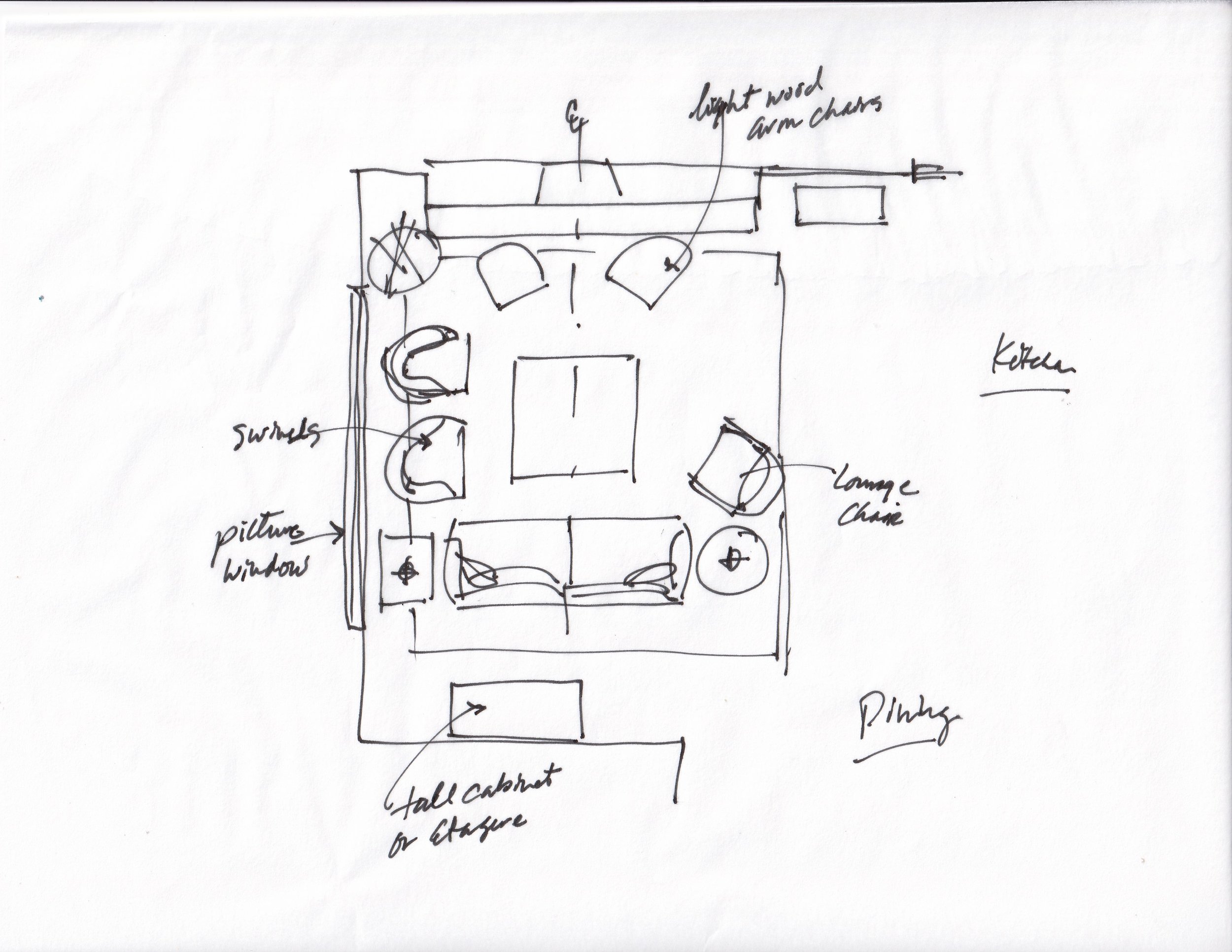
This room is large, so we can get lots of pieces in without crowding things. I’d put two swivels at the window so you could sit there and have a coffee or wine and appreciate the lovely view.
The tv over the fireplace works here and floating the grouping is good since the room is large. A tall cabinet or etagere can be used on that wall opposite the fireplace. Something with doors would be nice, to have some real presence on that wall, like on this big piece in the Pasadena Showcase House of Design this year.
A tall cabinet or armoire like this one is a nice piece of furniture to fill up a big blank wall. Pasadena Showcase House of Design
You could even do a recliner as the lounge chair or add an ottoman with that chair. Two light wood chairs would have a sculptural look in front of the fireplace and add more seating to the room.
This large living room layout has plenty of seating. carlaaston.com
Here’s an example, below, of chairs in front of a fireplace, from one of my projects.
In this home, the large kitchen is just across from this seating group. This arrangement is perfect for the family gatherings that are hosted here as it promotes conversation between the seating group and the kitchen.
Lightweight wood chairs can be used in front of the fireplace for extra seating and can easily be moved around as needed. carlaaston.com
Living rm #4 - Large room needing lots of comfy seating
This homeowner had a big living room and wanted a more creative layout. She also had big teenagers that like to watch tv here (that will be mounted over the fp), so she wanted to accommodate that. This room opens to the kitchen, there to the right.
A large great room needs a better furniture layout.
I sketched up a big curved sectional here for this space. Of course, you could do a full semi-circle here, there are several creative ways to do this. I think having some regular seating is nice, but I like the curved look in this space.
The room is certainly big enough to handle it and as some fairly new construction, it will look appropriate style-wise.
A large curved sectional works well in this large living room and looks very on trend. carlaaston.com
It made me think of these sofas seen at HPMKT this year.
Curved sectional sofa seen at Highpoint Market. carlaaston.com
Living room #5 - A vacation home with a large open room
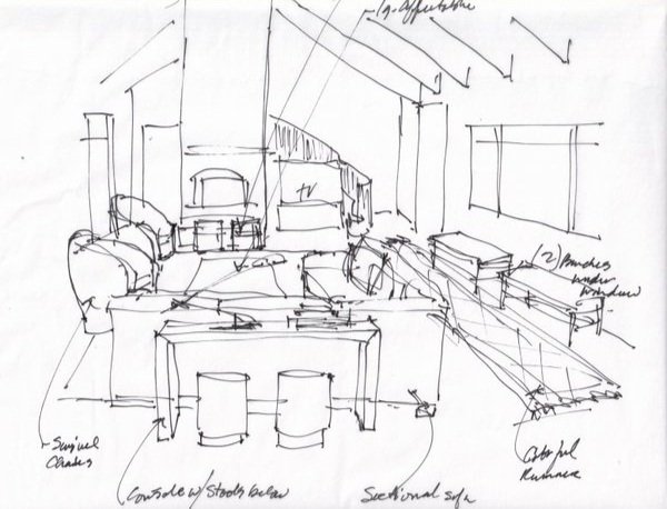
This home really intrigued me and I loved it so much I did a full sketch to show the furniture in the room. Loved the wood clad vaulted ceiling and the unique style. It has ocean views outside those French doors. :-)
Vacation home living room needing furniture layout - carlaaston.com
A tv will be right beside the fireplace. Front door is to the right, ocean view is to the left. Vacation home living room needing furniture layout - carlaaston.com
This are the adjacent spaces, opposite the fireplace wall in the living room. Vacation home living room needing furniture layout - carlaaston.com
I like the idea of a sectional here in this room, but you could arrange it with two identical sofas. There will be a tv with a low media cabinet right by the fireplace in front of the stairs. I like the idea of having the seating group focus attention at the fireplace and the view.
I did benches along the short windows with a runner in front. Two swivels that would float in the room to turn to the windows or the tv work well here. A couple of stools in front of the fireplace for extra seating or for your feet would be nice to finish things off.
Vacation home living room furniture layout sketch - carlaaston.com
These layouts were done in my Instagram Q&A a few years ago. I don’t offer these any longer, but I am opening up my email consultation service in July.
My Designed in a Click service can help you with a design challenge, whether it has to do with layout or just about anything else. Click the link to learn more and consider sending me some questions to help you design your own home.


