Just when I think I’ve seen about every bad interior design detail possible, I see something else that sort of burns my eyeballs. :-)
These are some I’ve been collecting in my files and want to share with you today, just in case your eyeballs need a little scorch too!
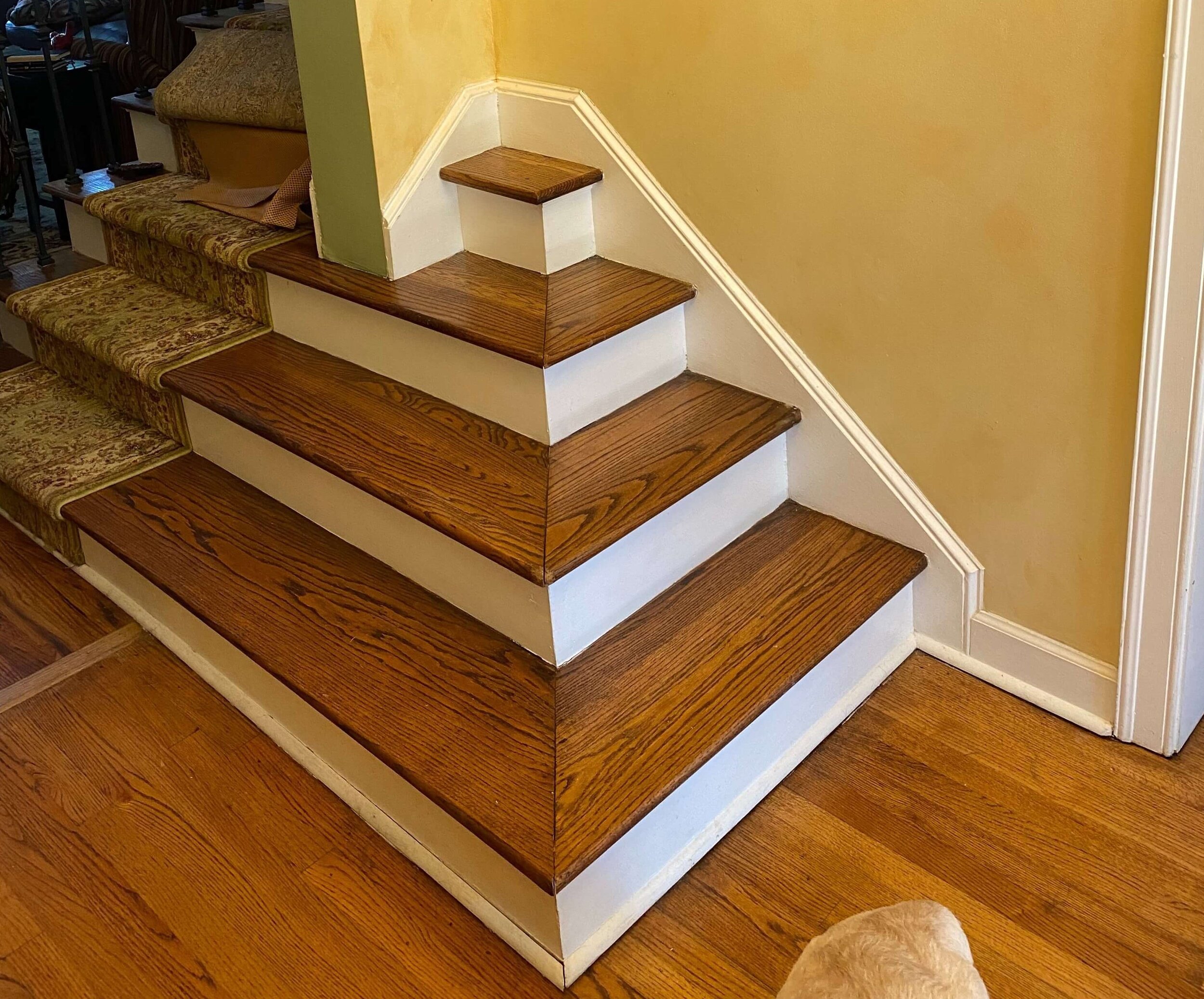
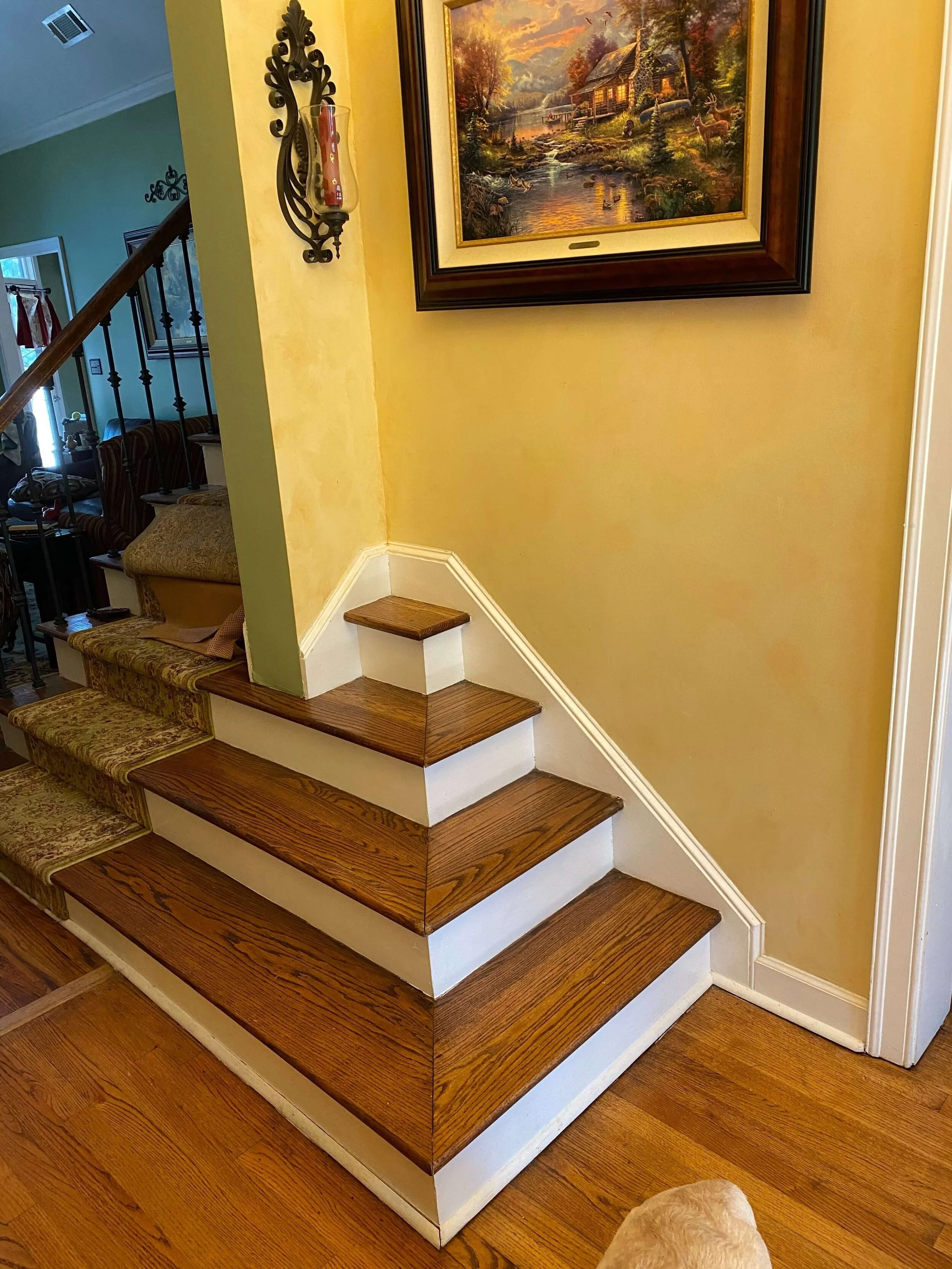
1) Bad Design Detail - Stairsteps to nowhere
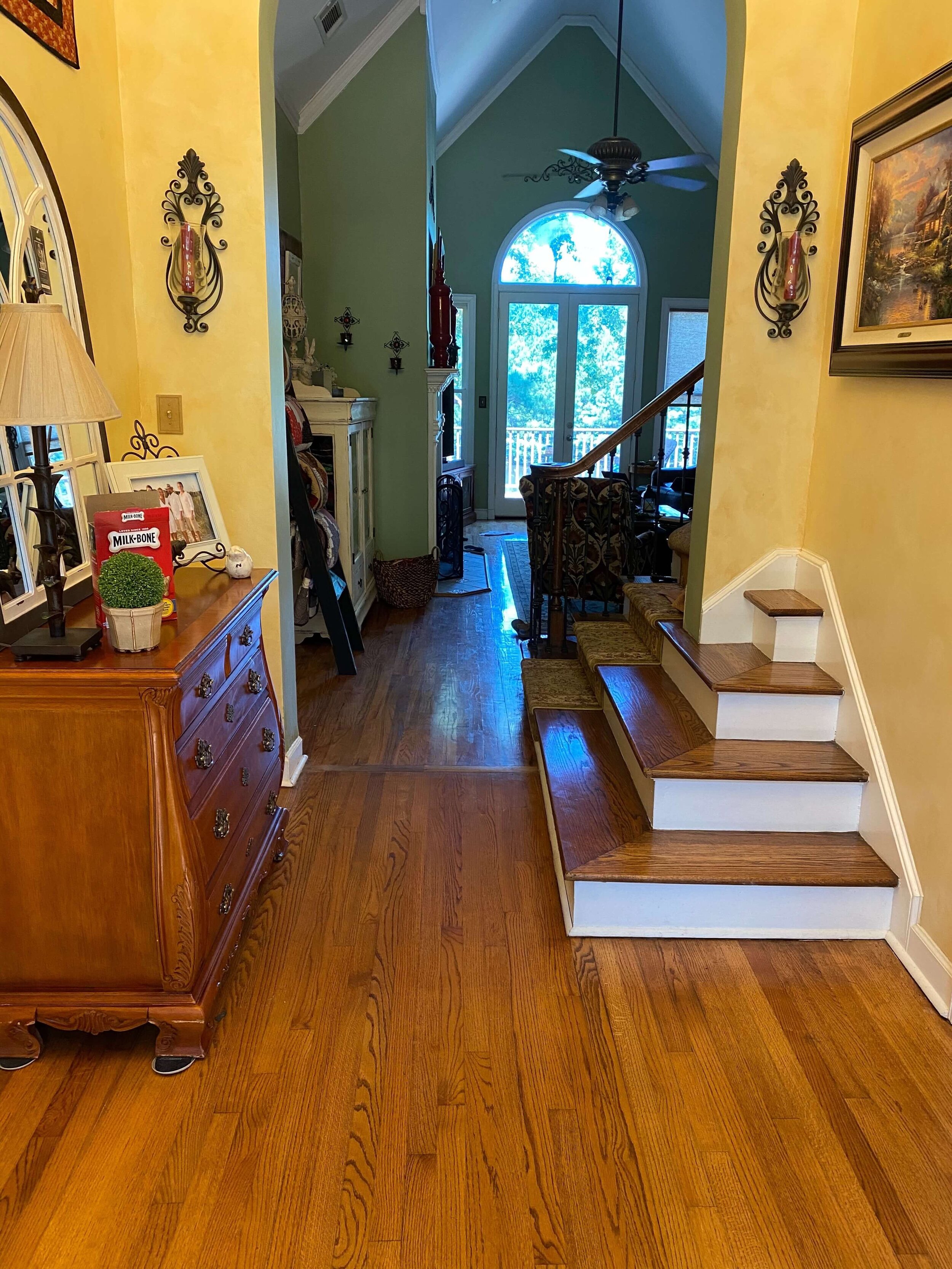
This reader recently left these images on my blog and called them a “terrible design flaw”, so she knew what she had there. She said these “steps to nowhere” could not be torn out because of structure underneath.
Bad Design Details - Stairs to nowhere in an awkward corner.
Bad Design Details - Stairs to nowhere in an awkward corner.
Not only are these pointless, but they are a definite trip hazard, especially since topped with wood flooring so that they kind of blend into the floor.
Here’s how to disguise this bad design detail:
Build a paneled box, painted white, to cover those steps. It can be used as a pedestal for some vases or a plant.
Trim back the lip on the stair tread to get it to fit as tightly as possible so that it doesn’t extend out into the entry hall more than it has to.
There might be a need to replace the chest in the entry for a more shallow console of some kind, but it would be worth it to disguise these steps.
Solution to cover up the awkward design detail of stairs in a corner leading to nowhere.
2) Bad Design Detail - kitchen Backsplash
I’ve sure seen my share of bad details when it comes to kitchen backsplashes.
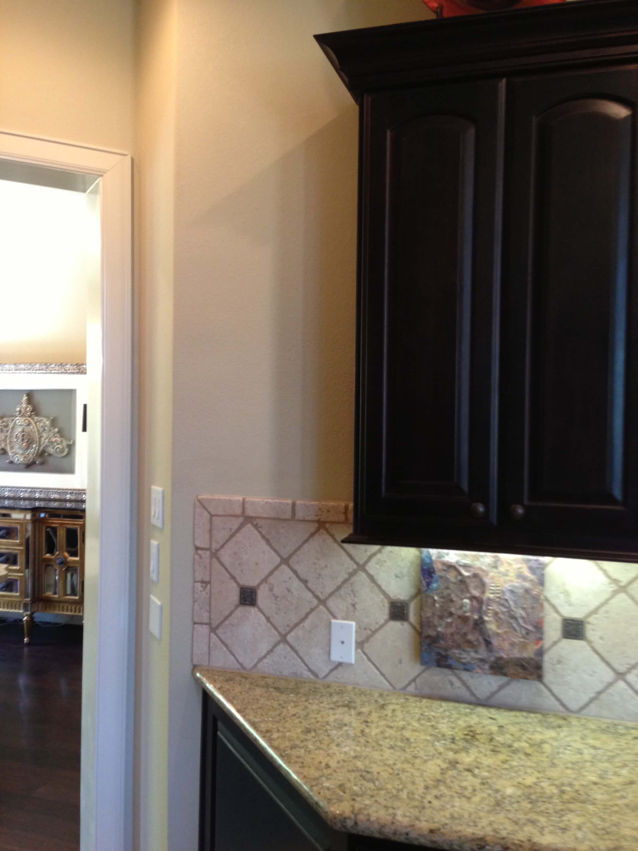
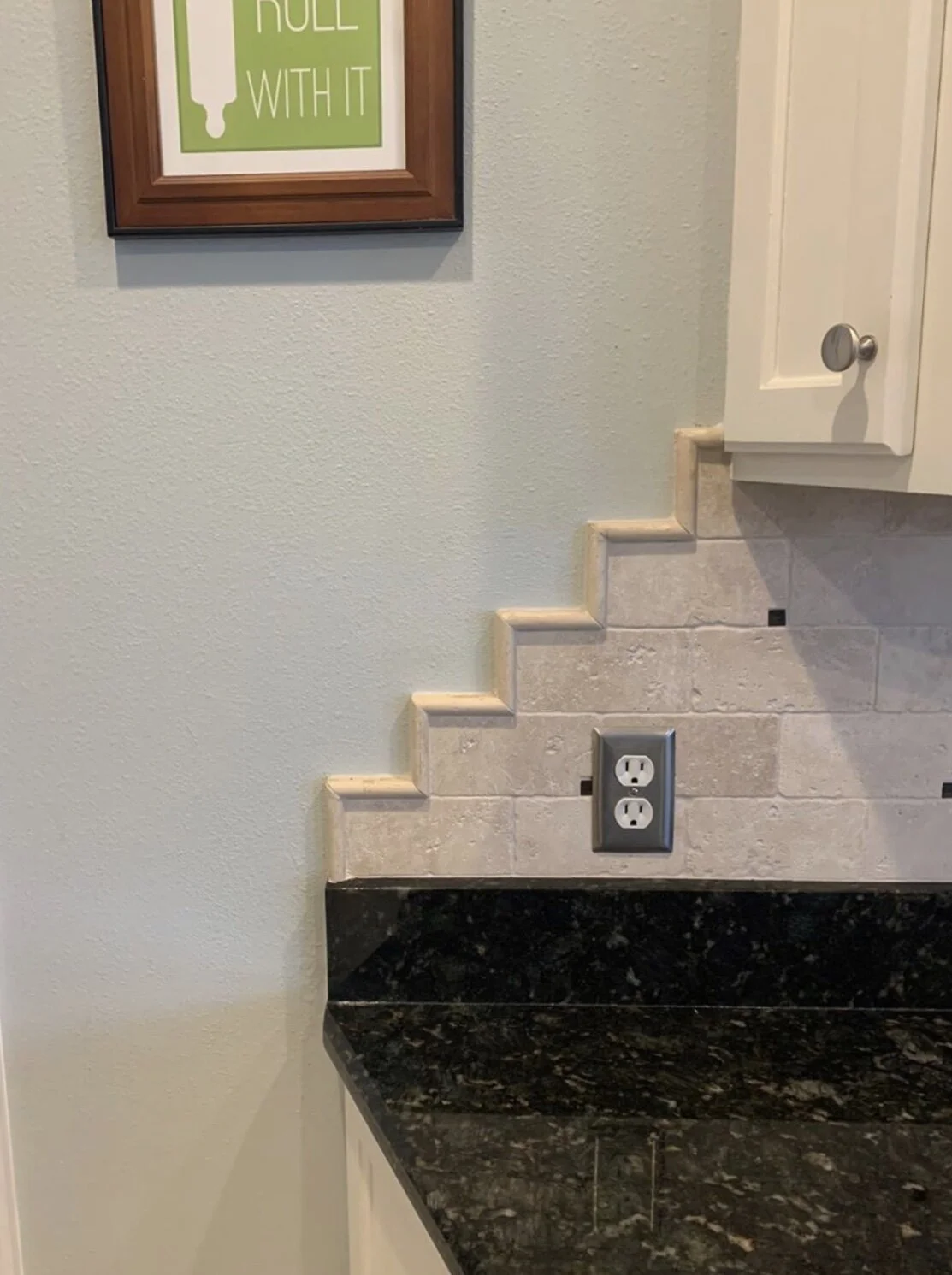
I really don’t like when they extend beyond the upper cabinets like this one, below, on one of my remodeling projects, BEFORE we remodeled.
Bad interior design backsplash detail
I always say it is best to align the backsplash with the upper cabinet, unless your upper cabinet extends beyond the lower (but that’s rather rare).
I have many, many scenarios, uploaded at the bottom of this backsplash design post, that people have sent me with regard to how to end their backsplash.
This awkward detail, below, takes the cake! The home’s former owner really went out of their way to devise this scheme, and even edged it with a pencil rail tile.
Bad interior design backsplash detail
Bad interior design backsplash detail
Not only did they not need to take the tile backsplash that far to the end, but they put tile on top of a slab backsplash, which I’m not really a fan of unless it is a really short slab piece.
They actually even went out of their way to make the outlets stand out more on the backsplash, using stainless steel, rather than blend in. An almond color would have blended much better.
Fortunately, the current homeowner was tearing all this out and starting over, so she didn’t have to live with this design flaw.
3) Bad Design Detail - Trip Hazard in main traffic flow area
This bad design detail was in another one of my projects, years ago, a small house that was updated for a young bachelor’s first home.
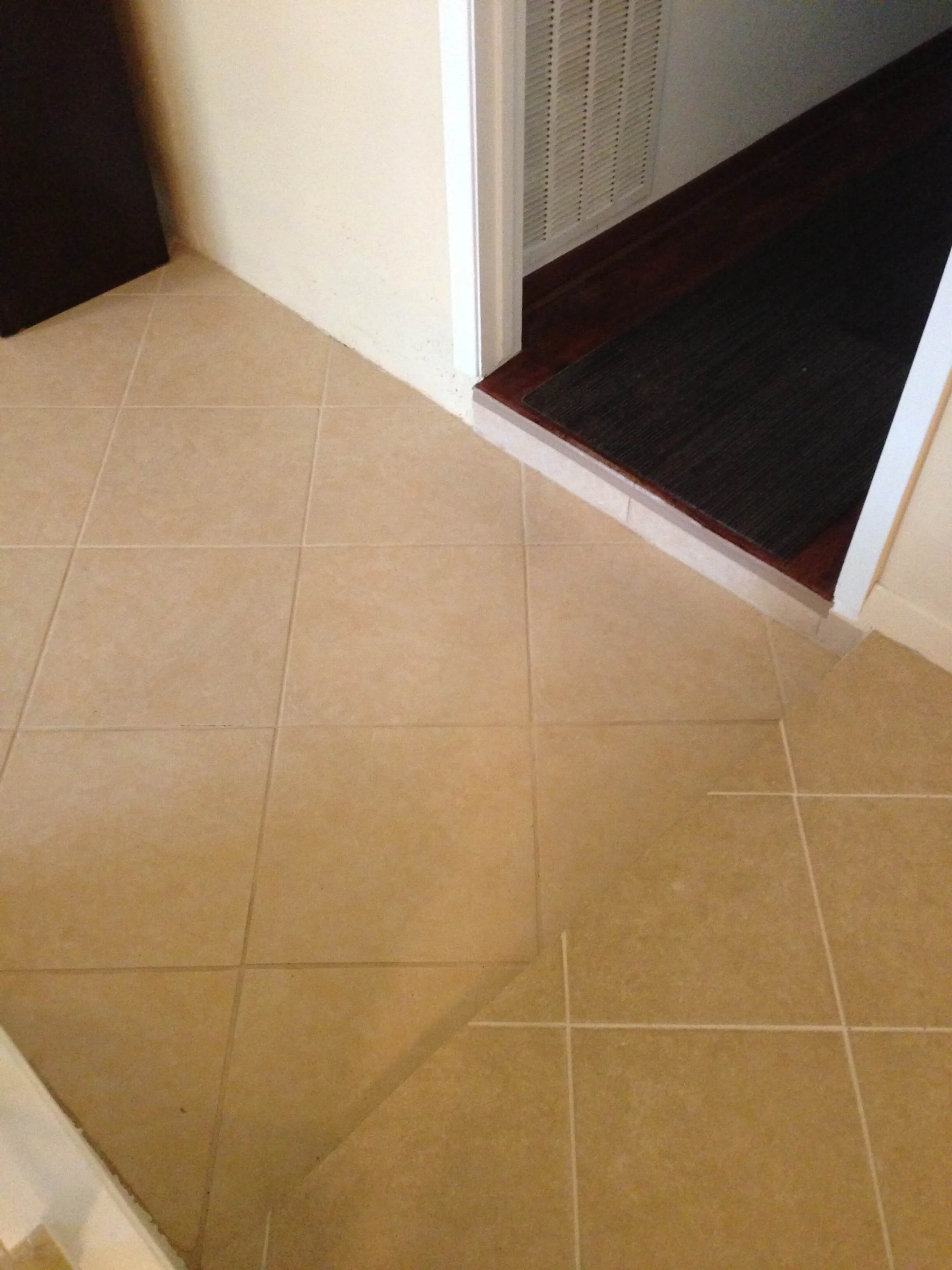
The tiny step down from the kitchen and entry to the living room was just enough to trip you up, not really visible. Then, if you wanted to go down the hallway to the bedrooms, you had to immediately turn and step up again.
You’d be stepping up and down a tiny smidge all the time, to walk from kitchen and front door to the hallway and bedrooms. I’m sure I’d be tripped up if I lived here long!
If they wanted to make this work properly, with a sunken living room, then they should have made the step down PAST the hallway entrance. (duh) That wouldn’t have been as bad.
Bad Design Detail - This sunken living room step down is a trip hazard and inconvenient right at the door to the bedrooms’ hall. To head to the kitchen from the bedroom, you have to step down and then step back up again immediately.
Here’s the little short railing that divided the dining room from the sunken living room.
We ended up filling in that sunken living room and made this small house all one level. It became so much easier to live in, safer too! See the finished kitchen remodel here!
Filling in the sunken living room made for a safer and more accessible home overall as well as making the space feel bigger and more open.
4) Bad Design Detail - Oddly Shaped Kitchen Island
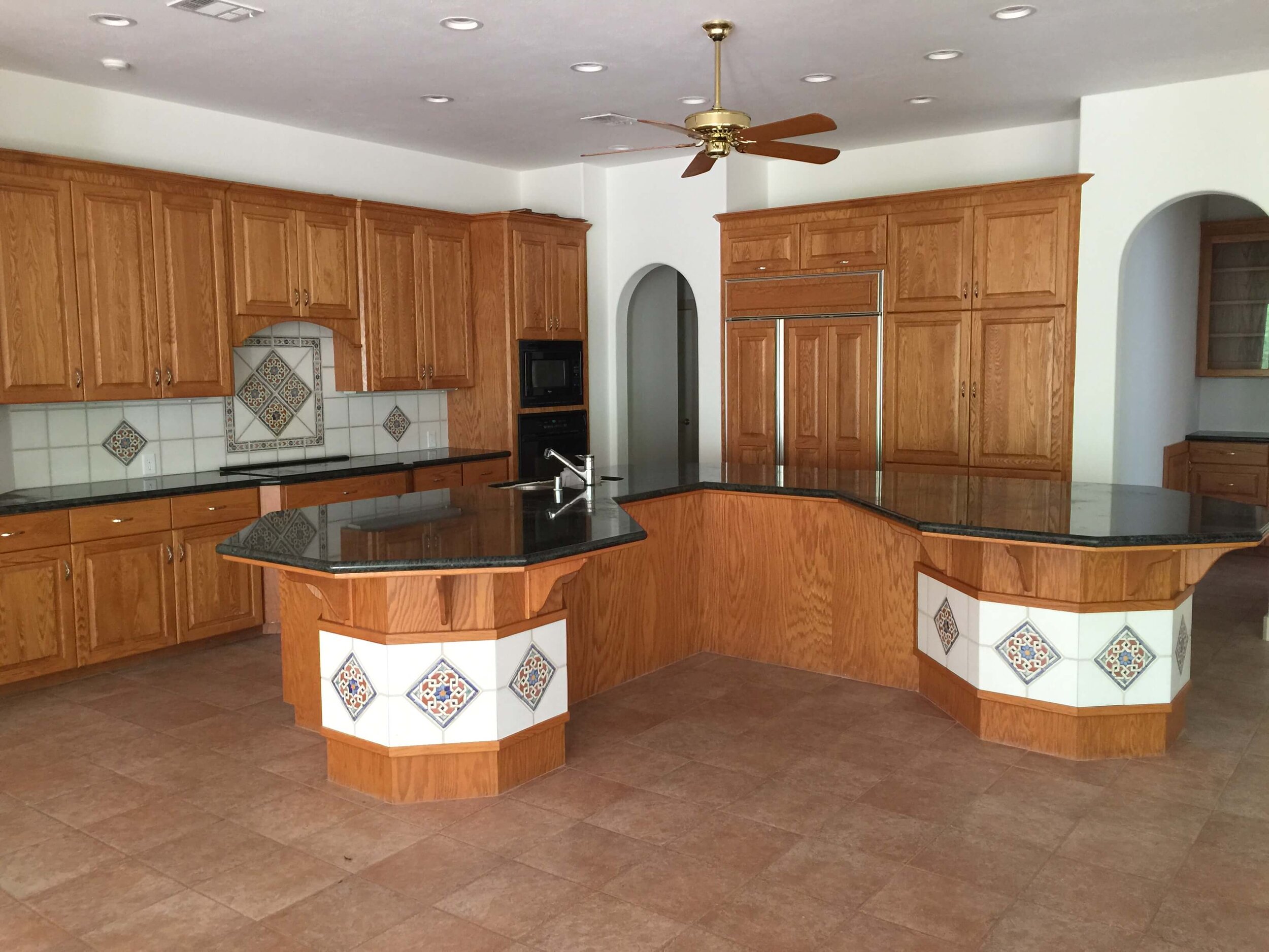
If you’ve read my blog for awhile you would know how much I despise oddly shaped kitchen islands. I’m just not a fan of contrived shapes and wonky levels.
Here is a really unusual one from one of my remodels in it’s “before” state. It actually makes this kitchen small by pushing the back areas close to the perimeter and then has the largest serving bar I’ve ever seen!
The tile on the face is an odd detail too. I’m so glad this island is out of this house!
I’m happy to say this kitchen has had a major transformation and I’ll be sharing new photos soon.
5) Bad Design Detail - built-in Tub Surround
I’m sharing two of these here today. One was done many years ago, so we can forgive the builder for that detail a bit. :-/
The other one was in a new home and that builder should have known better. Luckily my client did, and wanted it addressed before she moved in to get a much better look in her bathroom.
Now, don’t get me wrong, there are lots of beautiful ways to frame in and then build a surround for a tub so that it sort of feels like a free-standing one, but still has a deck to sit on. There are plenty of beautiful bathrooms designed by professional designers who have achieved that lovely look.
These, however, are ones where you wish they’d just gone for a free standing tub and called it a day.
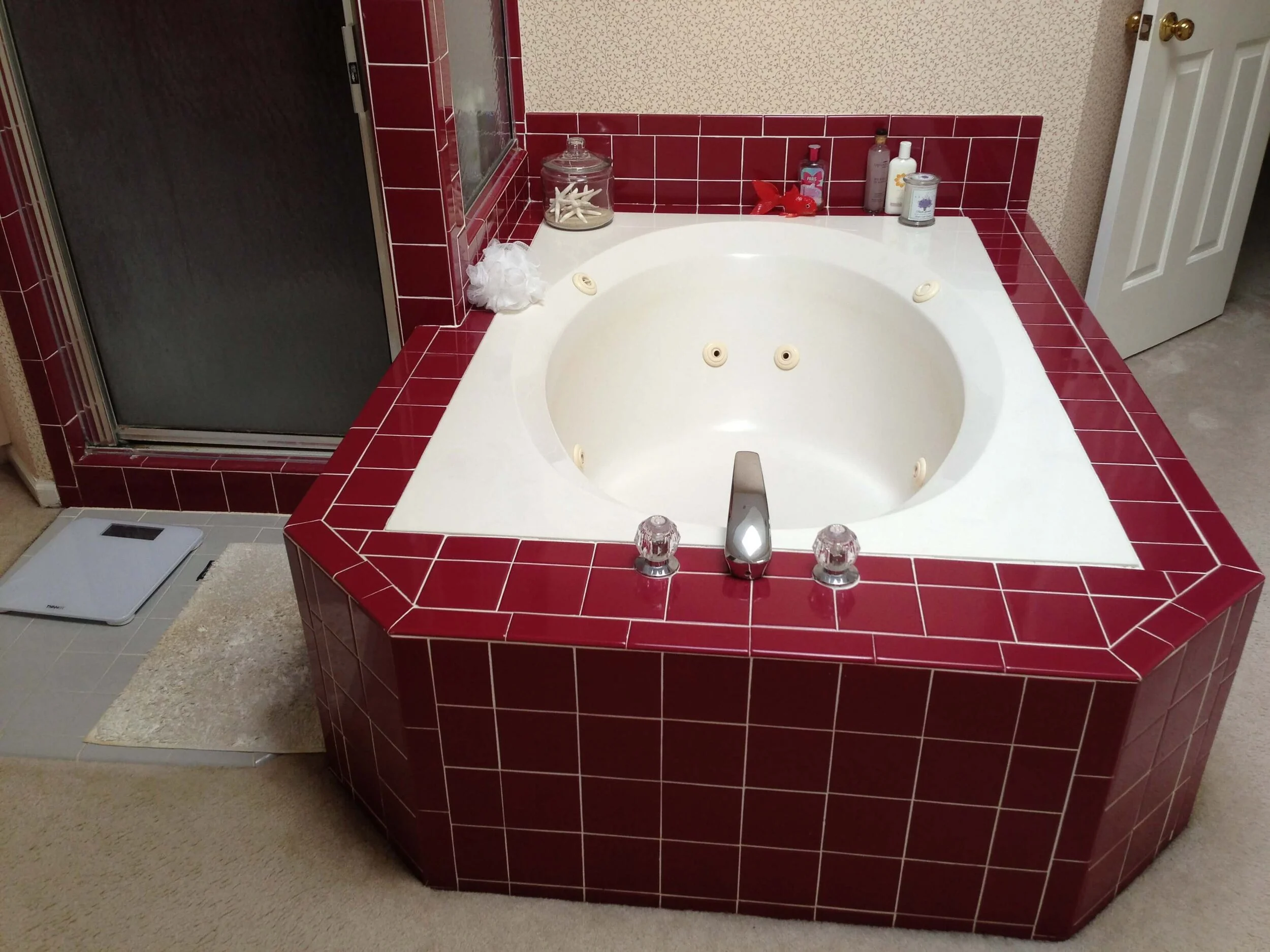
This peninsula was jutting out in a “before” bathroom remodel project that I worked on some years ago. I think the maroon tile sort of calls attention to the awkward placement here, right?
Trust me, if you love a tub with a deck, there is a better way to design this. :-)
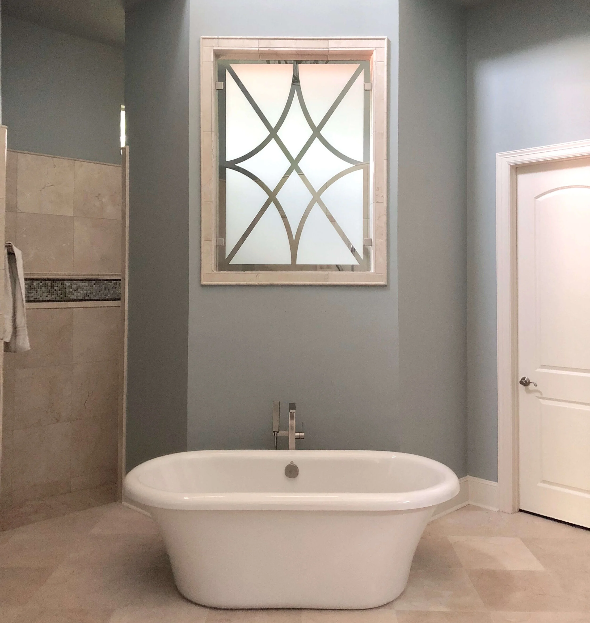
My client was on board for going with a free-standing tub though and we ended up with a much more elegant situation.
Here’s another one of these “before” pics of an awkward looking tub situation where my client wanted this taken care of before they moved in. Yay! Yes!
Honestly though, this bathroom is screaming for a free-standing tub, isn’t it? That backsplash!
Such a shame.
And here was the finished look with a new tub and some window film added to the glass window above to bring in a little design feature.
Don’t worry, if this is your first visit to my blog, I don’t always publish the before shots or the bad details. I publish an awful lot of “pretty” too.
PART 2 of Bad Details >>> Bad Details 2 - Interior Design Detail Mistakes You Won’t Want to Make
Don’t let bad details happen to you!!
Use me as your resource to help you design good details into your project!
I’ve got slots open for the upcoming month, so schedule your email consultation today!

