Today, I’ve got a Part 2 version of some bad interior design details that I’m hoping you won’t have in your home.
After all, if you have a question about decor or design, all you have to do is ask me in an Instagram Q&A or in a Designed in a Click consultation. :-)
I’ve been collecting a few images as I stay in Airbnbs, hotels, and then when I see projects before they will be remodeled. I’m sharing a few here today.
Low countertops at the kitchen island
Touch latch hardware in the kitchen
More bad backsplash ending details
Messy curtains and upholstery
Inappropriately used light fixture
Wallpaper stopping on wall with no finished edge detail
1) Low bars at the island in the kitchen
Maybe if you have young children and they are too little for stools, this might work well for you, but I can’t imagine any adult thinking this would be a great place to sit and converse with the cook or eat.
It truly feels like you are a student in a classroom and you have been put at the front of the room for talking so the teacher can stand over you and give you the evil eye.
Right?
This was an island in a house where I designed the remodel and we deleted this island, stat!
Kitchen before renovation - Low bar at the cooktop island gives the effect of a cooking show or maybe class time, sitting in front of the teacher’s desk.
I’m not talking about extended T-shape islands where the table top extends out from the island. I’m talking about a low table top lined up in front of the island.
I can’t imagine why you would want to do this in a new house. Just no. It’s awkward.
Home tour, Las Vegas - Unless you have young kids I don’t see the need for a low tabletop attached to an island.
2) Touch latch hardware in kitchen
Hmmm, any cook knows that you might end up touching a surface in your kitchen with sticky fingers at some point. Yes, your surfaces all need to be easy to clean and maintain.
However, unless you just want your cabinets or appliances to look like a fingerprint gallery all the time, why oh why would you do touch latch hardware in kitchen?
I stayed at an Airbnb where these glossy kitchen cabinets didn’t stay glossy long.
Touch latch kitchen cabinets doors show fingerprints. Especially if they are glossy!
This touch latch refrigerator panel was getting a constant wipe down at a showhouse I attended at KBIS one year. Can you imagine what it would look like at the end of a day with kids in the house?
Believe me, as a boomer with just me and my husband at home, we would not be able to keep this looking good for a day.
Home tour - Las Vegas
And guess what happens if you press too hard when you go to clean the surface? Right. The door opens. (Can you feel my eyeroll?)
See what happens if you lean up against something touch-latch in the kitchen? IT POPS OPEN!
Bad Details - Touch latch hardware in a kitchen isn’t a good idea if you plan to touch the lower cabinets when you cook.
3) More bad backsplash ending details
I’ve written lots of blogposts about this topic and even have a backsplash design guide if you need one to help you design your backsplash.
These below were obviously just not given any thought as to how they would end. So sad!! I mean, TRY, please. :-\
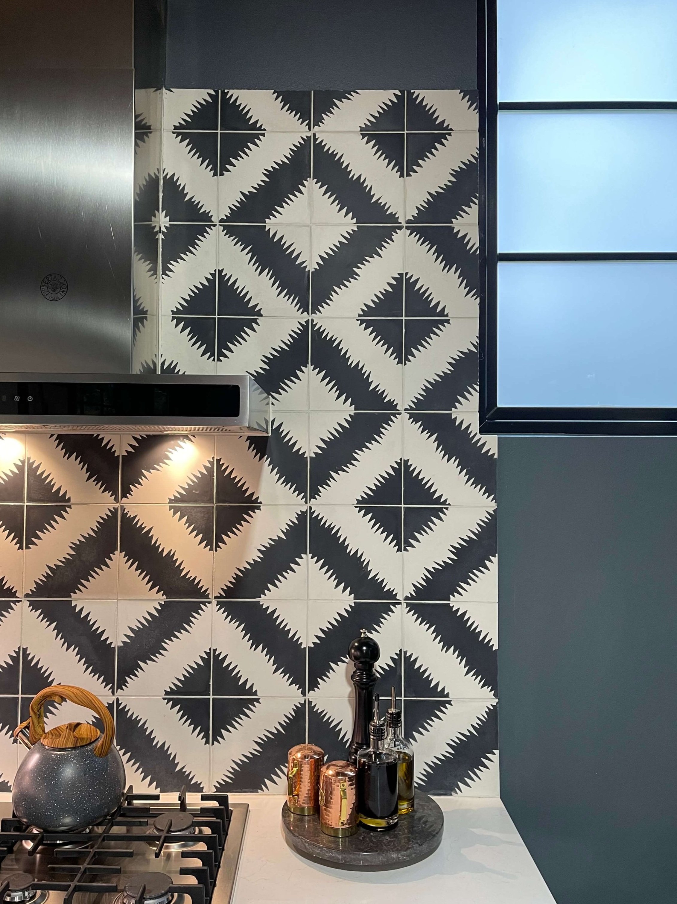
Bad Details - Check out how this fun, bold backsplash ends at the window. Whoopsies! (From an Airbnb I stayed in.)
More backsplash ending problems (on top of the dated backsplash material here too). This was a before pic of one of my projects, it was all torn out. Gleefully.
Problems:
The backsplash goes beyond the upper cabinets
The edges are unfinished
Bad Details - Backsplash goes beyond upper cabinets and has unfinished edges
Bad Details - Backsplash goes beyond upper cabinets and has unfinished edges
Talk about unfinished edges……I’m not a fan of this type of installation. It looks very DIY, like that you didn’t have a tile saw.
Unfinished end of tile backsplash
4) Messy drapery and sofas
If you’re going to spend the money on new soft goods like drapery and upholstery, then get something that isn’t going to look like an unmade bed the first time people use it after it gets styled or fluffed.
These rod pocket style curtains are inexpensive, but they are hard to open and close and require lots of handling to make them look good.
If you need to open and close your drapery, don’t have them drag the floor either. They need to clear the floor and have a little space below to operate smoothly.
Bad details - hanging curtains too low and then using a rod pocket at the top makes for a difficult operation and keeps them from looking particularly tidy.
Rod pocket curtains hang loosely and look a little sloppy.
I shared this example in my post about how to design for boomers but it bears repeating. Low, squishy sofas are hard to get out of and look messy as soon as you get up. Ask anyone with the RH cloud sofa. Everyone I’ve known that has one says they are a big pain to maintain!
Low, deep sofas with down cushions look untidy and are hard to maintain.
5) inAppropriate Light Fixture For the Space
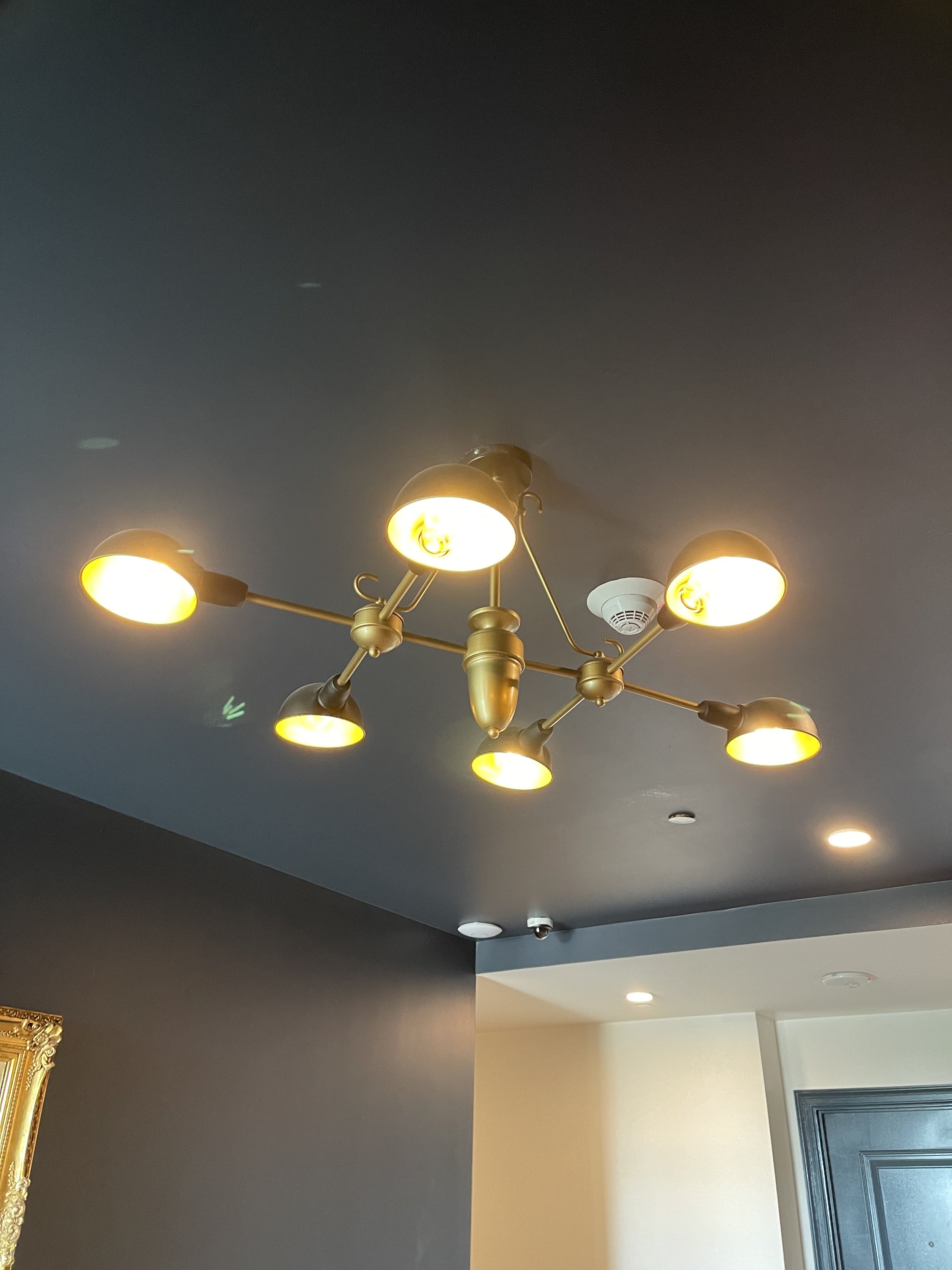
This light fixture was located at the ceiling in an elevator lobby in a hotel. All you can see is up into the bulb part of the fixture really.
This type of fixture would be best used where there needs to be direct light over a surface, like a kitchen island or a table. It would hang lower then and you would see the sides of the fixture rather than just up into the bottom of it.
This light fixture isn’t the best selection for a ceiling mount in an elevator lobby as you are just looking up into the light bulbs.
6) Wallpaper transition to painted wall
Here’s a detail that really bugs me, having wallpaper just stop on the wall without ending it on an inside corner.
Here, there is a wall space that has the etagere on it, but on each side is a little hall that goes to each bedroom. The wallpaper was applied just to that wall surface on the face.
I don’t like it ending at the outside corner there (I always prefer to end it on an inside corner). However, I really don’t like it above the opening to the bedrooms. where the wallcovering just stops on the surface and then the paint starts.
The wallpaper transition here is a bit awkward at the top.
I’m not really sure the wallpaper adds much here anyway. The brass etagere would have looked smashing against the dark blue-green wall. And I would have painted those little hallway ceilings the blue-green color too, btw.
Did you miss Part 1 of Bad Interior Design Details? I’m sharing it below.
Don’t let bad details happen to you!!
I’ve got slots open for the next month to help you prepare for your project in the new year.
Pin this image below to Pinterest to save for reference so YOU won’t make any of these bad design detail mistakes.


I’m back with more bad details, this time from some model homes I toured recently. :-)