

As a designer who has been designing remodels in older production builder homes and dated custom homes over the years, I got curious about what production builders are putting into their homes these days.
I started visiting model homes recently to check some out.
Here’s some that I found typical, but are rather less-than-desirable.
Mind you, I have a particular eye and designing for optimum function is always my priority, so these finds might not matter to you or to most people.
(I did find some good features trending that I liked as well, BTW.)
The two biggest problems I see in the interiors (I’m not looking inside the walls) are with cabinets and tile installations. Another problem are all the little windows up high that sometimes just don’t make sense.
And hey, I’m looking at their models here, so I hope this is where they are putting their best foot forward.
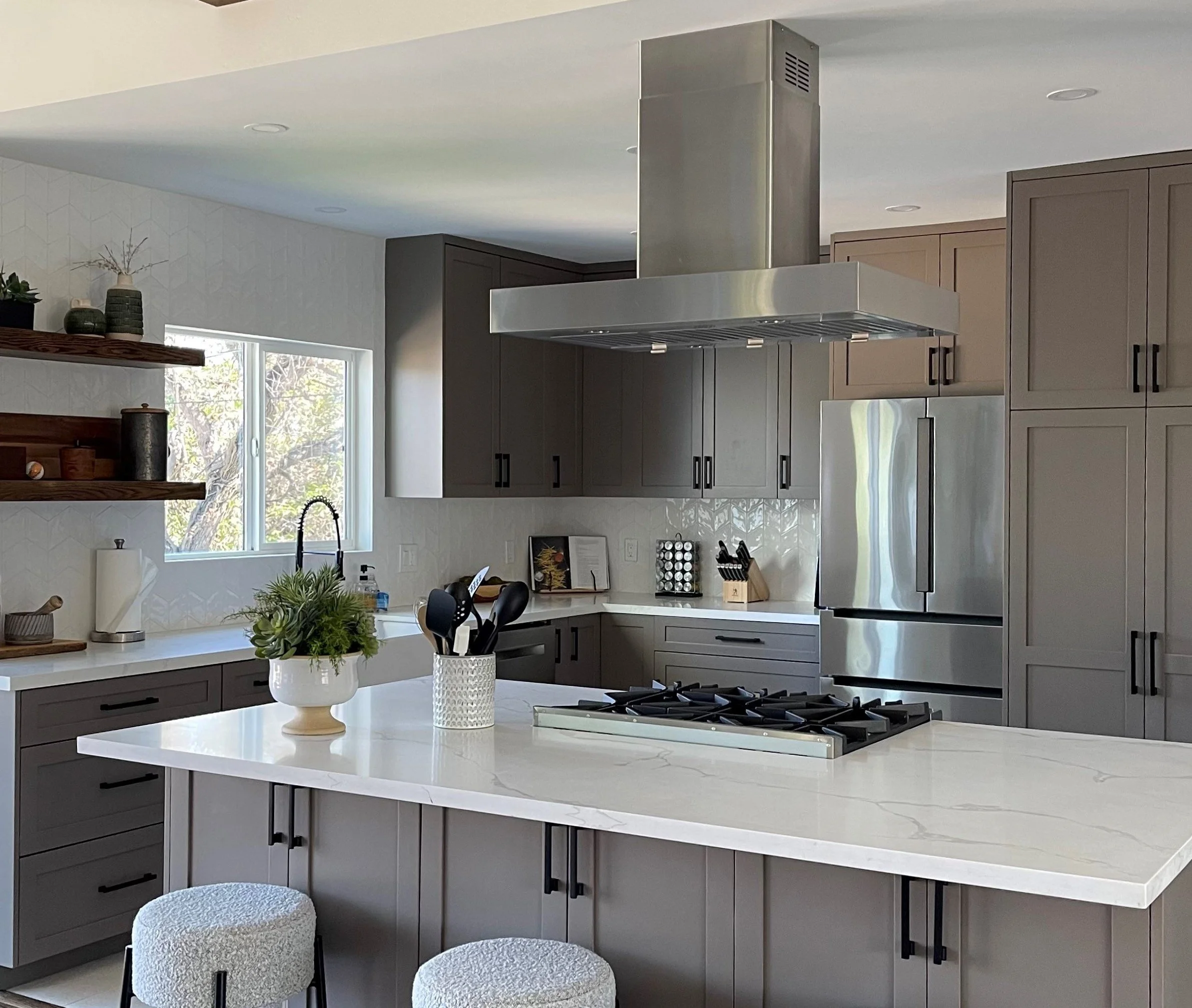
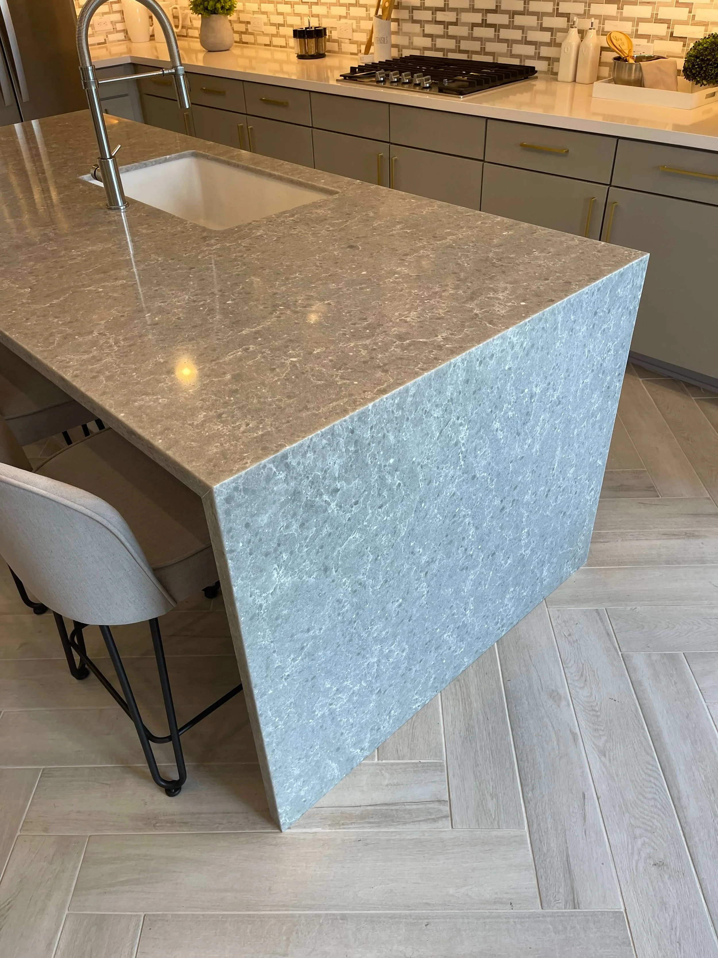
1) Cabinets
None of the builder model homes I went to do a full overlay cabinet or frameless cabinet, which is what I prefer. Not sure if that is ever offered as an option, but even in the higher end models, the typical cabinet (which is what is installed there) is not what I would call an upgrade.
Here’s an example of typical cabinet I’ve seen in model homes so I assume this is the main offering of quality they have. See all the gaps between the doors/drawers?
They’re huge. And they have slab drawers instead of paneled. They also don’t panel the cabinet island ends either.

Standard cabinetry in this bar with big gaps / reveals between doors and drawers.
I mean, it isn’t bad, but it isn’t luxury either. It’s also just more nooks and crannies to wipe down and clean.
While we have to do doors and drawers like this with some of my remodels due to budget constraints or if we are working with existing cabinetry, it is my preference to have a cleaner appearance overall that will uplevel the cabinetry look.
See this pic below. That sink section with the two doors below is one box. Because these aren’t full overlay, there is the big stile in the middle of the cabinet. When you open the two doors, it is still there. If you have this all over your kitchen, especially, it makes it harder to get things in and out of your cabinets.

Standard cabinetry with no side paneling and slab drawers.
See this kitchen from the Airbnb we stayed in recently. It had frameless cabinets, which looked great!
It is such a clean look and you don’t have a face frame. These really give you maximum use of your cabinetry and present a flush look without all those chunky reveals that standard cabinetry has.
Frameless cabinets present a flush look for a neat and tidy appearance.
Here’s an example, below, of full overlay cabinetry from one of my remodel projects. No big gaps between doors!

TV wall cabinetry with full overlay doors. Carla Aston, Designer
2) Tile Installations
They may have great installers and I’m not saying the install itself is bad, it is the way they sort of cheap out with the details that just ruins it for me.
Of course, I showed my husband these pics and he said “What’s wrong with it?”
HAHAHAHa! I guess he’s their customer then. I’m sure I am little pickier than a normal consumer of new construction homes. (But I’m just trying to educate you to get you the best end result out there.:-)
Unnecessary side backsplashes and unfinished tile edges.
First of all, I don’t like the way they always add a side backsplash, even if one isn’t needed. (If there is no water or cooking grease to be splashed there, why put one?)
I don’t like that tile edges are unfinished or just covered with grout.

This is bad backsplash detail all the way around. It looks unfinished and like an afterthought the way it was installed. A better idea would be to do just a slab backsplash here or no side splash at all.
These pics below are of a built-in at a breakfast area where the cabinets and splash continued down the wall from the kitchen.
(Facepalm)
Okay, I like the built-in cabinet, that is nice in a breakfast room. But why is the backsplash needed? There is no water here at all. I’m not even sure why you need a countertop out of quartz, it could be like a stained wood. Then it would have a bit of a different look from the kitchen and feel more like a buffet console or something.
The side backsplash and the way they just chopped the top edge across there…..I’m not liking it.

Ugh. No thank you.

Not sure why a backsplash is even needed here at a breakfast room with no water or splashing going on.
Tile not taken to the ceiling at tub or shower areas.
I’m not a fan of tile is not taken to the ceiling around a shower or bathtub unless the ceiling is exceptionally high or there is some intentional design for it to be so.

Tile not taken to the ceiling in a bathroom makes the shower feel short and not luxurious.

This bathroom has 2 strikes against it, speckled granite and a short tile surround with unfinished edges.
I do like this bathroom’s tile installation in one model, pictured below, with tile to the ceiling. (See how much better that looks!) They actually mitered the tile to create a finish for the edges!

This tile installation at the shower is nice, with a finished edge and running to the ceiling.
Tile applied flatly to a fireplace wall.
Sometimes tile is just applied on top of the wall at fireplaces, like it is just pasted on.
I like this tile, below, but I really hate how they just applied it to the wall and then used Schluter strips on the side.
This fireplace element should have some dimension. Even if they furred this area out only 2”, it would help so much! Then they would need to wrap the tile around the sides to die into the back wall (with a finished, mitered or bullnosed outside corner, preferrably).
This just looks so cheap. I’d rather them just apply a simple mantel that had legs around this fp box and call it a day.
I have a blogpost about this concept showing examples here >>> Your Fireplace Wall’s Finish - Consider This Important Detail With Tile or Stone Cladding

Tile applied directly on the wall at a fireplace just looks unfinished and has no depth.

This is not an upgraded look for a fireplace wall.

This is an example of a marble tile clad fireplace on one of my jobs where there was depth with the fireplace section furred out from the wall. The marble tile had a nice detail with a softened edge and the tile turning back to the flat wall.
No shampoo niches - typical standard soapdish look
Sad to say, after touring about 15 model homes, I only saw one shampoo niche and it was small and not detailed nicely. Most primary bath showers have a piece of tile cut and fit in at an angle like this for soap and shampoo.
If you scroll back up to some pics above, they had the angled tile piece shelf too.

The angled cut tile shelf is pretty standard in production builder home showers.
They also are still installing the pre-made soap dishes. These are cheaper and much easier to install than a shampoo niche, so I understand why they do them.

In tub areas, you might get the ceramic soap dish insert still as a standard feature in a production builder home.
Last and definitely not least…..the kitchen backsplash gone too far.
If you have read my blog I don’t even have to say this because I’ve said it so many times before.
Align your tile backsplash with the upper cabinet NOT the countertop. You won’t get the backsplash hanging in mid-air and it will look a lot more finished. :-)

Sigh. I know, not a big deal to many, but this wouldn’t happen in high end, custom homes. It’s not hard to just stop this at the upper cabinets for a more finished look.

Align with upper cabinets for a cleaner, more intentional look. Do not align like this, with the countertop.
3) Windows
I don’t understand the obsession with little windows. They don’t bring in that much light, I imagine the exterior looks a little odd with these penetrations and frankly, they often just mess up an interior wall so you can’t hang art or window treatments there appropriately.
Also, the neighbors in two story houses have a direct view into your home!
These little windows are off-center and the wall looks rather peculiar, frankly.
I know this is a money situation below. (Taller windows and sliders are more expensive.) I would rather have a slider that was two feet taller.
Do we really need to have a view of the patio ceiling?
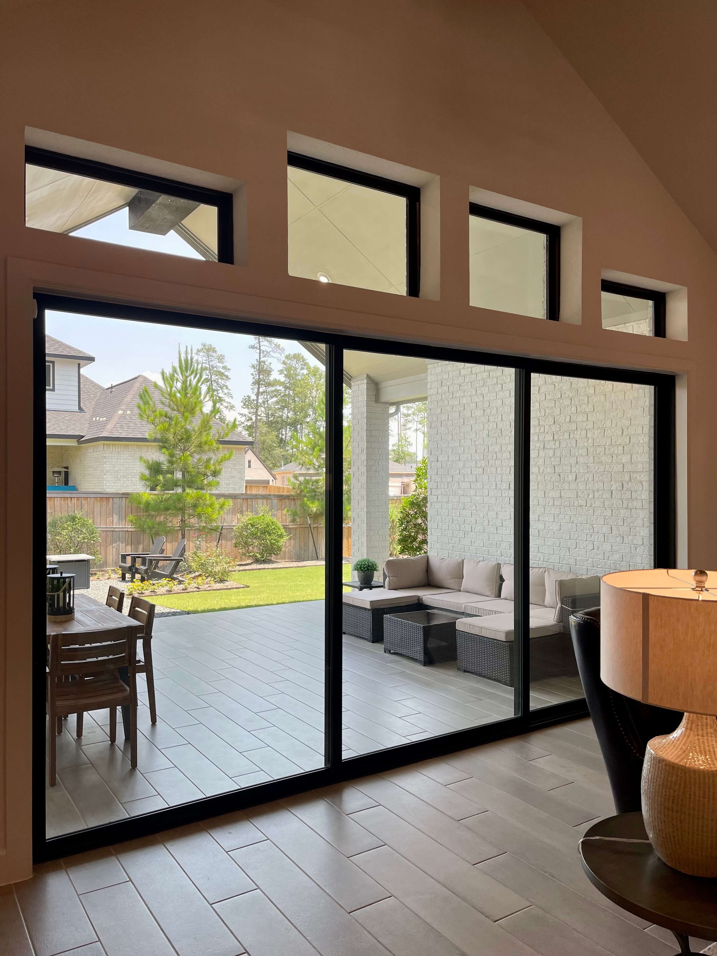
Would rather just have a slider that is 2 foot taller than all those little windows above.
Would have been nice to have a taller slider that aligned with the top of the other wall’s windows.
I would rather see fewer, bigger windows and doors rather than many little windows above more standard sized windows and doors.
If you don’t think builders do a lot of weird small high windows in sometimes random places, spend a day with a window treatment person. They often complain, “What was the builder thinking!”
4 Few Random Whoopsies!
I’ve got a few extra, random bad details here I want to include.
A shoe moulding at a waterfall side of a kitchen island sort of defeats the purpose of a clean lined look like this. I’m guessing there was a gap where the flooring didn’t completely meet the side panel here OR the shoe moulding person just went trucking around the cabinets and no one told him to not do the slab part of island.
It was almost very good!

Shoe moulding at the bottom of a waterfall kitchen island end panel? No.
Here’s a successful waterfall kitchen island with no shoe mould and no outlet penetrating the side panel.
Too bad the quartz is kind of “meh” (ahem….ugly). A waterfall side panel is best for use with a slab that has some pretty veining. Then, it highlights the stone.
This install looks good with no shoe moulding and no outlet penetrating the slab on the side.
The year 2000 called and wants its tray ceiling back! This is not doing it for buyers in this day and age, in my opinion.
I understand tray ceilings can be helpful in construction and allow a higher ceiling in a room, however, the striped look and double step is really dated looking to me. And they are always in the primary bedroom it seems!
An option…..do a raised ceiling area as big as possible (without the angled corners) and install some beams or coffers there. That is a timeless look that will last and feel really upgraded.

Tray ceilings were so popular in the early 2000’s. This is not a detail anyone wants to include in a remodel these days, mostly they want to make them look more updated.
If you’re a builder and don’t know that a chandelier that hangs this low over a tub is not right with most codes or isn’t a good idea, then I don’t know what to say. If you can stand up inside the tub water and grab it, then you should not have it.

Don’t hang a big chandelier over a tub where someone could reach up and grab it if they are standing in the tub, please. This is not good building practice.
I don’t see anything wrong with using a gray 12 x 24 tile like this, except for the fact that they used white grout. It makes a gray tile of this shape and size feel institutional, like in a school or maybe a public shower. (I can’t help but think “cinder block”).
I know the blue tile and the tub, the size of the shower, etc., make it upgraded, but a gray grout that matched the tile would have put more focus on the blue accent tile wall.

Do gray grout instead of white with this type of rectangular tile. This feels institutional instead of special or custom.
With production builder homes, you really don’t have much control over any of these details, I’m sorry to say. And new homes are so scarce now, they really do have the upper hand.
In one home I toured, they had only one home left to build in the subdivision and it was 5 months out from starting. Everything had been selected already and you had to take it as is. (Crying emoji!)
I mean, that’s what production building is all about, they aren’t building a custom home. They don’t have time factored in to upgrade any details like this, typically.
I’m just writing this hoping some of them might change a few things at some point on down the road and to hopefully make new home buyers aware. :-)
These were the posts I refer to above all about details. Take note if you are considering a new build or remodeling!


This blogpost was thoughtfully written by me, Carla Aston, and not by AI, ghostwriters, or guest posters.
One of the most popular elements for remodeling I have found is a fireplace mantel and surround. If you are planning to clad your fireplace wall element in tile or stone, this tip is crucial to make it look intentional and well designed.