I get questions about a kitchen range hood wall often when people start to remodel or design their new kitchen.
Whether it is about the hood, the cabinets next to it or the backsplash under and around it, there seems to be some general information I repeat often.
When I start seeing repetition like that in questions and answers, then I know it is time to write a blogpost on the topic and add it to my library here. :-)
After all, the range and hood are often focal points of a kitchen. They are like the fireplace or hearth of the kitchen and deserve some prominence. If a cooktop is on the island, then usually we are looking for a minimal look. If the range or cooktop w/ a hood is on a wall, then the more important that feature becomes to the design of the kitchen.
Design Tip 1 - When to do a statement range hood?
If you have plenty of cabinetry for your storage and can make a bigger statement with space on the hood wall, then doing a statement hood can really be an impressive design feature.
When the hood wall is located to be seen from multiple vantage points or adjacent rooms then this can really give your kitchen and home a more custom feel. It can echo the look and materials of other features of your home like the fireplace so that it sort of helps establish your home’s style.
This custom hood was in an open kitchen with family room and breakfast room in the same space. Carla Aston, Designer | Colleen Scott, Photographer
This custom hood was in an open kitchen with family room and breakfast room in the same space. Carla Aston, Designer | Colleen Scott, Photographer
I’m not sure I’d call this hood a statement, but it is contrasting and breaks up the wall. I love how it relates to the family room fireplace wall directly across. It’s a feature that ties the big open space together.
This wood paneled hood relates to the fireplace wall on the opposite side of the room. Carla Aston, Designer | Colleen Scott, Photographer
The wood paneled look on this fireplace is similar in design and color to the range hood on the opposite side of the space. Carla Aston Designer
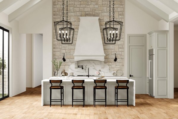
This cast stone statement hood in a Texas hill country home is a true focal point. This wall reflects the fireplace wall that has a stone face and then a cast stone mantel.
I designed shorter versions of this hood first, but the height of this space really dictated a large dominating hood.
Statement hood in kitchen with vaulted ceilings. Carla Aston, Designer
This hood replaced a small hood with cabinets on each side. The slate material and black dentil detail make a distinct style statement in this kitchen.
Large statement hood in shaker style kitchen. Carla Aston, Designer | Tori Aston, Photographer
Design Tip 2 - When to do a stainless Manufactured range hood?
If you have a statement tile or busy slab backsplash that you want to run the ceiling, then you don’t necessarily want the hood to fight with it. In that case, using a manufactured stainless hood or a more simple style of hood is a good solution.
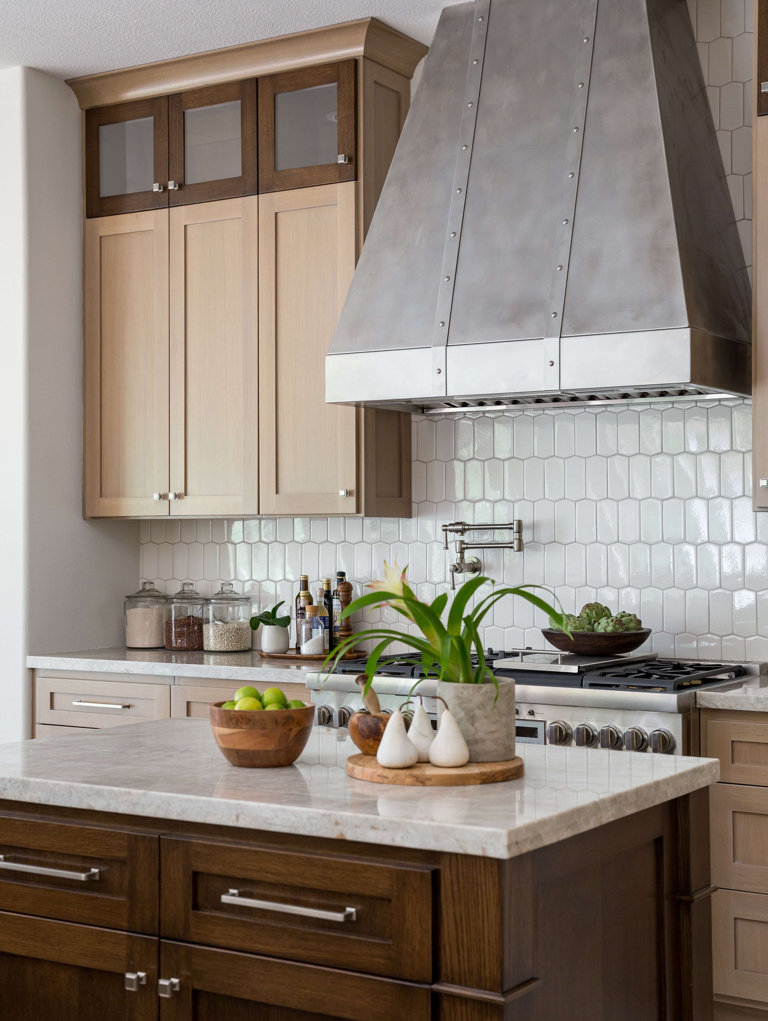
Stainless hood does not take away from the real statement here, the bold tile backsplash. Carla Aston, Designer | Colleen Scott, Photographer
This matte glass tile in a herringbone pattern is a look we didn’t want to compete with. A more minimal hood was also desired by this client. Carla Aston, Designer | Colleen Scott, Photographer
This special slab material makes a great, linear statement behind the minimal stainless hood. Carla Aston, Designer | Tori Aston, Photographer
This stainless hood gives a clean look leaving the backsplash to shine as the contrasting design element. Carla Aston, Designer | Colleen Scott, Photographer
Design Tip 3 - When should your backsplash tile go to the ceiling at the range hood?
Ahhhhh, this is something I get asked all the time when people are doing remodels.
They all want to take the tile up to the ceiling at the hood but, guess what?
If you don’t have a place to end the tile on each side, like the inside corner of a tall upper cabinet, then I would not recommend it go all the way up.
In other words, if your cabinets on each side don’t go to the ceiling too or there is not a wall the tile can butt into, etc., then don’t do it.
Then you would have to run the tile over the cabinets at the top which is wasteful and unnecessary in my opinion OR you would just stop it where the cabinets start. Just stopping it on the wall there looks unfinished and not well thought out. The tile will just look like it is pasted on the wall up there.
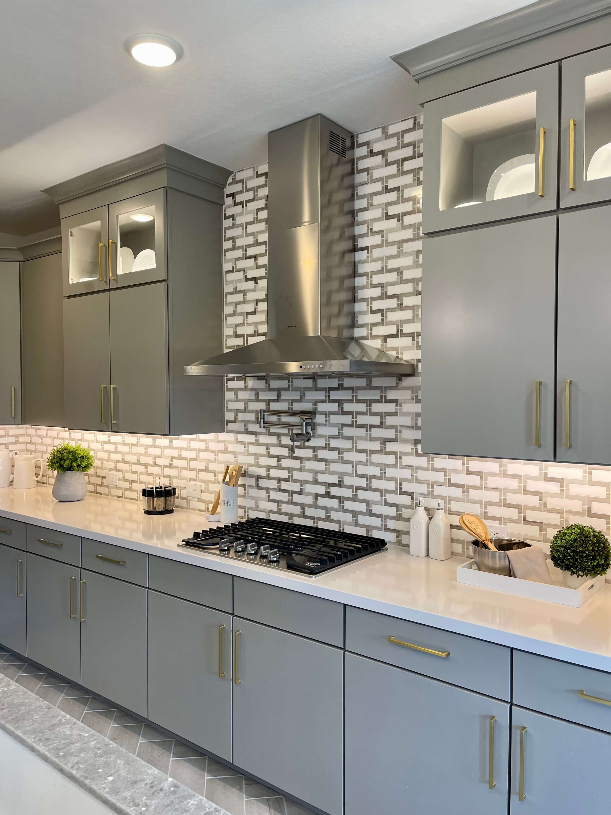
We took the tile to ceiling here with a stainless, minimal hood because the tile could stop at the upper cabinets on each side. Carla Aston, Designer | Tori Aston, Photographer
This hood was existing and we added the top level of cabinets above the existing uppers to go to the ceiling too. That enabled us to take the mosaic tile all the way up. Carla Aston, Designer | Tori Aston, Photographer
Here’s a situation I saw in a builder model home recently. I would handle the splash just this way if I had cabinets and a hood like this. I’d stop the splash at the bottom of the hood.
No need to go up the sides and then where will it go? Above the cabinets in that deep niche? Nope.
Would have been nice if they had done cabinets to the ceiling though. Then I for sure would have done a lighter looking stainless hood for some contrast here and taken the backsplash tile all the way up.
Builder model home stopping backsplash at bottom of hood.
Stop backsplash at bottom of hood if you don’t have cabinets to the ceiling.
Yes, go to the ceiling with your backsplash tile if you have cabinets to the ceiling on both sides.
See how this builder did lower cabinets with two sections of cabinets to the ceiling at the hood?
This a good way to address the tile/hood wall.
Tile to the ceiling at the hood if you have cabinets to the ceiling on both sides.
If you will have a whole wall with no cabinets on each side, then in that case, I’d tile the whole wall. You can do a statement hood then and the whole wall is a more open look.
Design Tip 4 - When to use a range hood made to match the cabinets?
If you have a smaller kitchen or it would be better if the wall was less broken up, then I would recommend designing the hood out of the same material as the adjacent cabinetry. You can butt the cabinets right next to the hood for more storage capacity and it is a more consistent and monolithic appearance.
In this builder home model, below, the hood is the same wood as the cabinetry. I like how this looks because it matches the other side wall. Since there are other things going on like beams, a big waterfall island and lighting, the simplicity of this wall works.
Also, both sections are within niches of the same size. If the cabinets had been applied on the wall, then I feel like the hood would need to be taller and more significant, breaking out of that horizontal line.
Builder model home - kitchen with hood to match cabinetry
This project, below, was one of my Designed in a Click consultations. This home had been flooded in a bad storm and they needed a new kitchen.
In the old kitchen (pictured), I felt that the gas cooktop (which had no venthood) was poorly located on the window wall, especially since it was right beside the sink. Imagine if those window treatment cords dipped into a flame?
Designed in a Click consultation for kitchen layout | carlaaston.com
In the new layout I presented, I centered the sink at the window and moved the cooking area to the side wall. I suggested a range instead of the cooktop, so she could save having to do the wall ovens and then move the fridge down the wall too. :-)
I felt like the hood should be made of cabinetry here and I liked the idea of all that blending together visually. The window was such a stong visual draw, I thought a hood that would interrupt that run of cabinets on the wall would create a busier look.
Kitchen design sketch - Designed in a Click consultation w/new location for range and hood.
Design Tip 5 - When to use cabinet doors on a hood and when not to
I understand, you want to use every inch of storage in your space. But really, is the storage inside the hood cabinet that handy or really usable?
I typically don’t like to see cabinet doors on a hood that matches the kitchen upper cabinets. I would prefer it to just be a simple removable panel.
If you must have cabinet doors up there, then do a touch-latch type mechanism so you don’t have to see cabinet pulls up there. That will disguise the “doors” a little and make them look more like panels.
Every production builder out there, it seems, is putting doors up there. You really want your home to look a little more custom than what their cabinet vendors offer as standard.
Builder model home - I feel like they could have gotten a full cabinetry-look wall here with just a more well-designed hood. I don’t love this hood with more cabinet doors.
This one isn’t bad, below, but if they’d done touch latch hardware instead of the pulls, I think it would have felt more like paneled custom hood.
(I would have taken it all to the ceiling though and not done glass fronts. This kitchen needed storage as these were the only uppers.)
Builder model home - Use touch latch hardware on doors above a hood if you have to have them. We all know it is a big piece of ductwork in there and you aren’t really storing anything in there anyway.
This hood below is in a HUGE kitchen with TONS of upper cabinets. They don’t need storage at the hood.
In my opinion, this kitchen called for a statement hood and even less upper cabinets on each side. I especially don’t like the doors here though.
Bar pulls are my LEAST favorite cabinet pull. And I mostly choose knobs for cabinet doors anyway, they are less costly than pulls.
Builder model home kitchen hood has doors in the hood. Not such a great looking detail in this big kitchen with lots of cabinetry.
Builder model home with cabinet doors on venthood.
Look at all those upper cabinets. And they wrap around on the sides too. Why would you need more uppers where the hood is? A better option design-wise is a statement hood that contrasts with the white to make that back wall a better looking focal point.
At the very least, if you still wanted a hood made from cabinetry, make the hood taller than the rest of the cabinets and do the black finish that is on the bottom cabinets instead of white.
But I digress…..
When do I think cabinet doors are okay to use above a range hood?
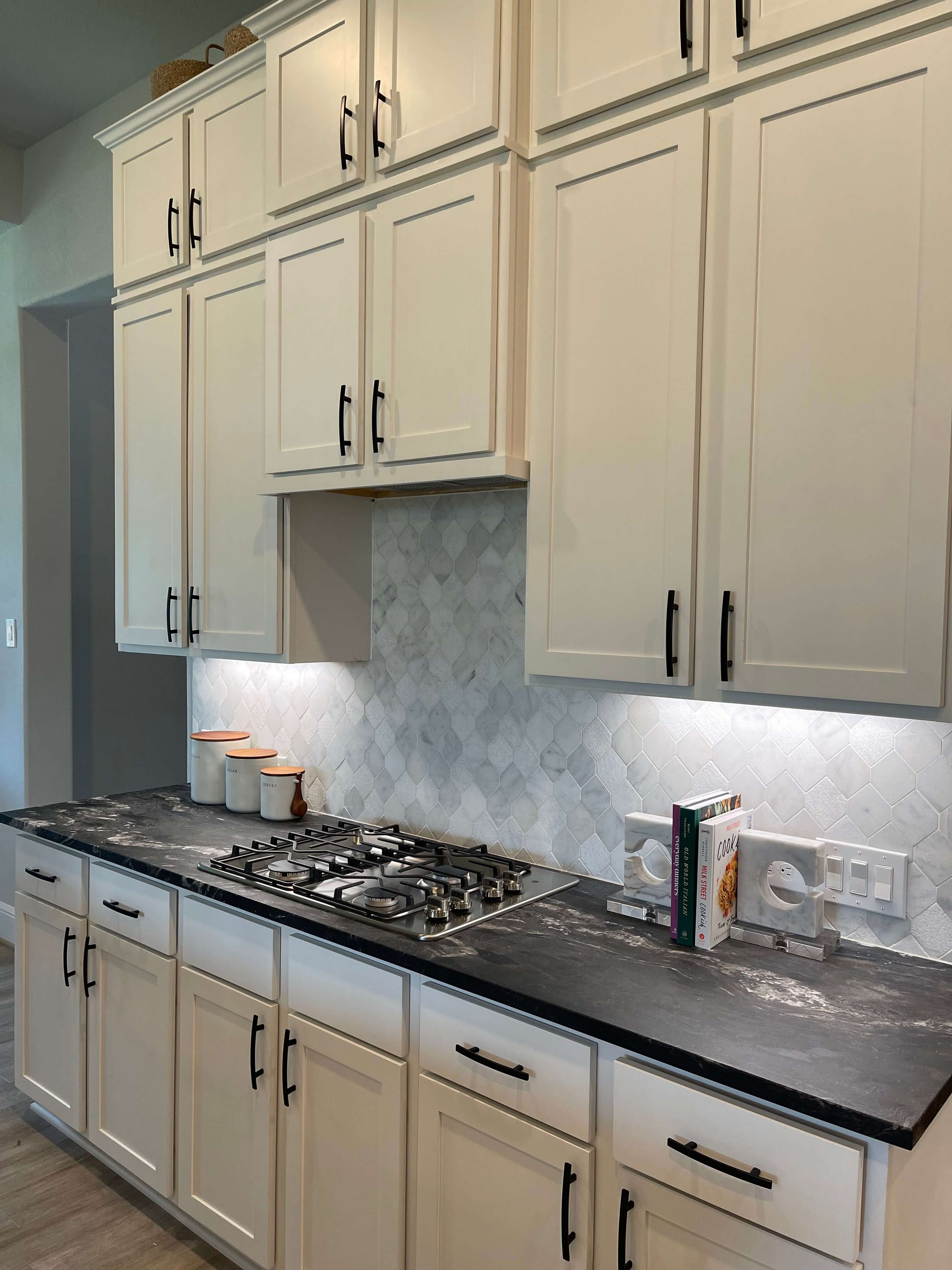
One of the situations where this doesn’t apply (in my book) is when you have a smaller kitchen and have a hood that fits under the upper cabinet.
In this case, it is fine to have doors there, as you want to just carry that wall of cabinets across the wall. This way there is less interruption and it is a simpler look.
A big, wide window took up lots of wall space in this smaller kitchen. I didn’t want a big hood to fight with that as a focal point plus the little bit of extra storage was appreciated.
In this kitchen there was a big wide window and and we needed as much storage as possible. Doing a minimal look on the hood was appropriate for this kitchen. Carla Aston, Designer
A minimal, uncluttered look was desired here at this cooking area. New cabinets to the ceiling and a backsplash that blended in to the cabs as well as a small, undercabinet hood made for a clean-lined style
If there is a venting microwave directly above the cooktop, then that would be another reason to use doors. In this situation, I feel like we just want the cabinets to feel like they flow over the microwave. We don’t want to call attention there at all.
Often, the vent is ductless, or recirculates the air after filtering, back into the space, not outside. Therefore, no ductwork is in the cabinet above.
Here’s a partical kitchen redo I did for my son and DIL. There was no other place to put a microwave drawer (my preference) at all, without getting new lower cabinets, which we were trying to keep from doing. This is in a 3 story townhouse, so a common location in this type of housing.
Doors are fine in a situation where there is a microwave with ductless vent above the cooking area.
The cabinet above the microwave is valuable storage if there is no ducting and the vent is recirculating.
Of course, you can apply these guidelines and still have a quandry as there are so many different architectural situations to deal with sometimes, especially in remodels.
I think these are good basics though, to help guide you if you are planning your kitchen yourself!
Check out more kitchen design posts that feature how to choose or design certain items for your kitchen. If you are remodeling or designing a new build, you will want to check these out to help you choose items for your home.
This blogpost was thoughtfully written by me, Carla Aston, and not by AI, ghostwriters, or guest posters.





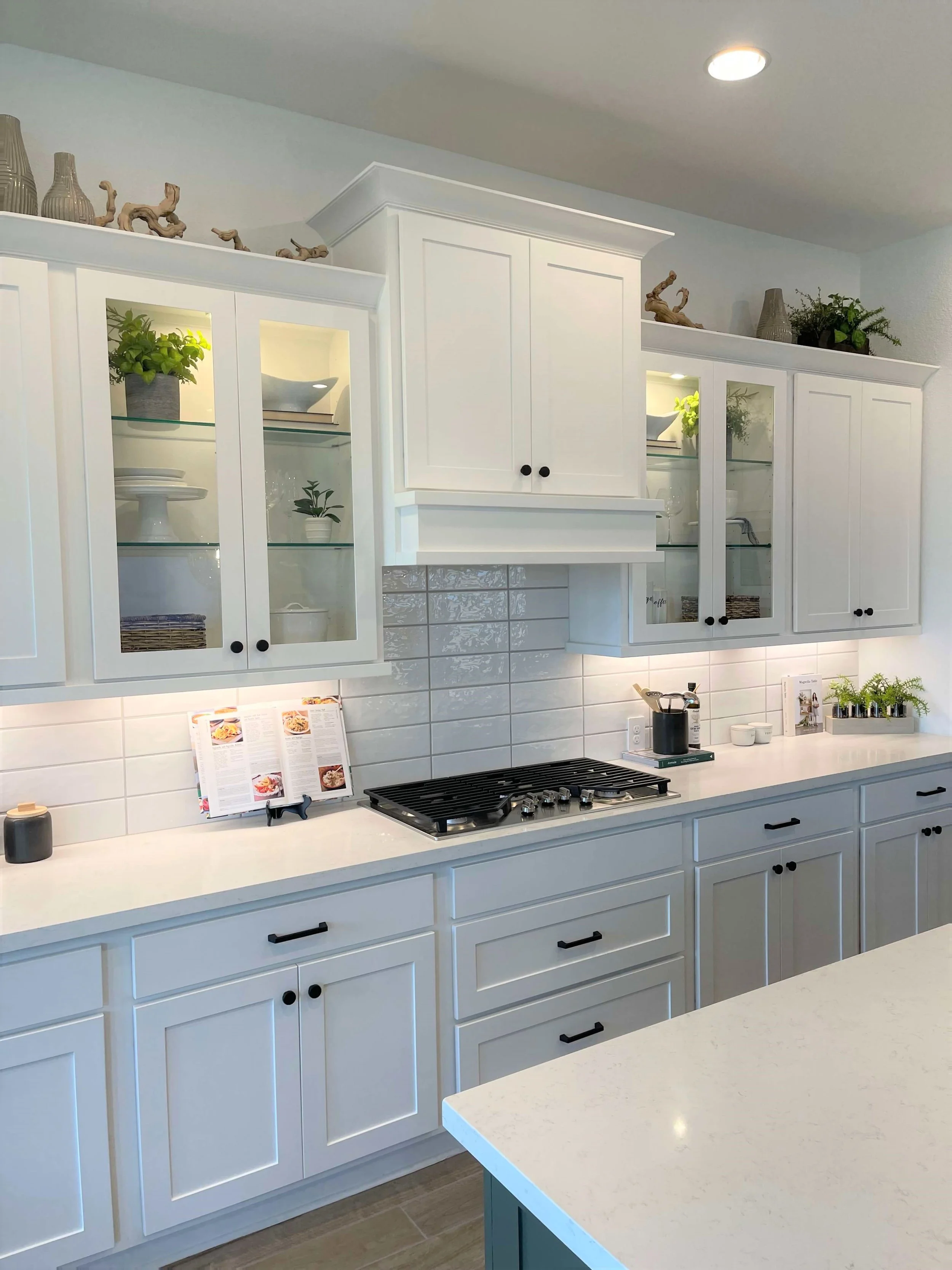
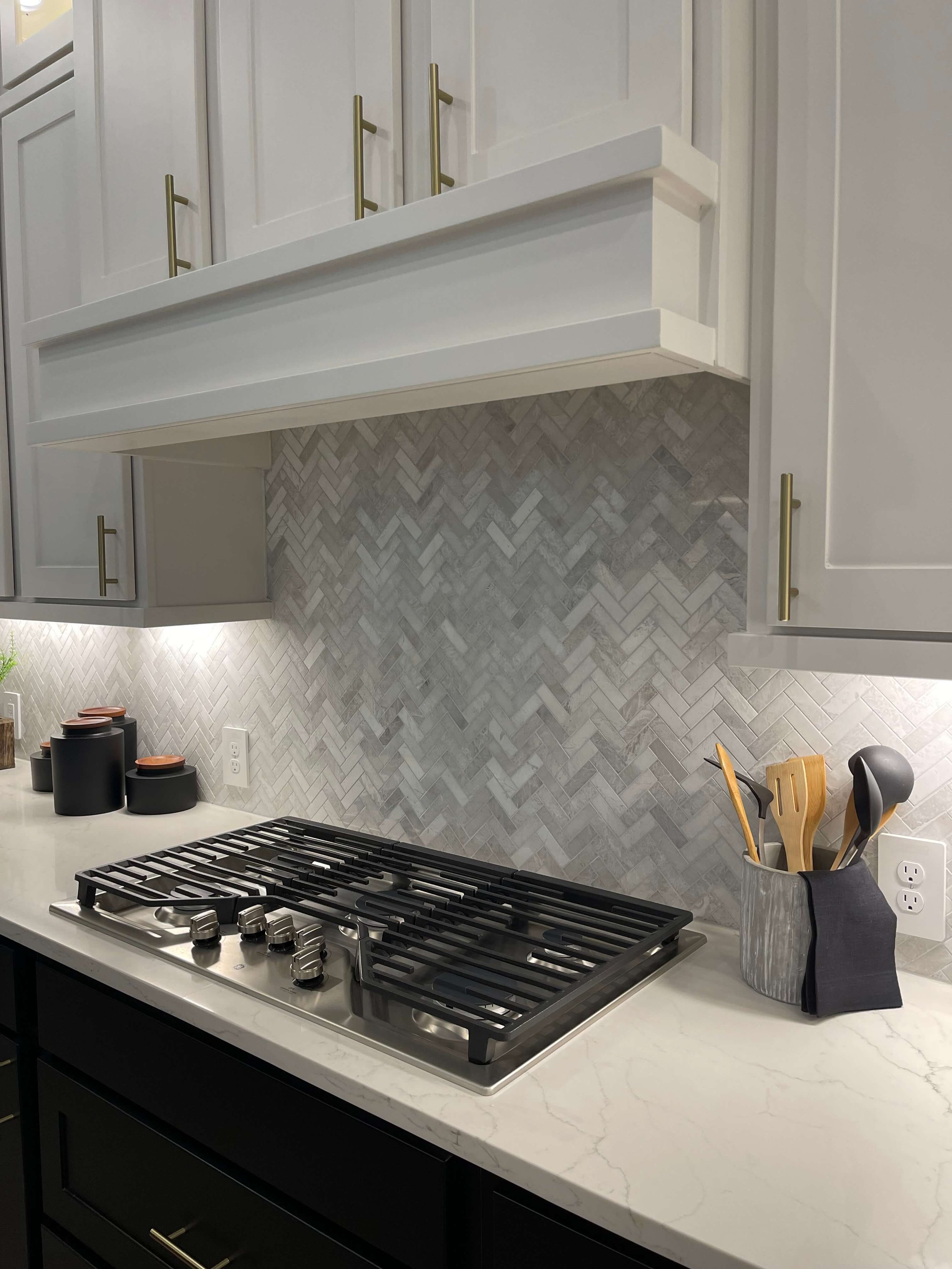


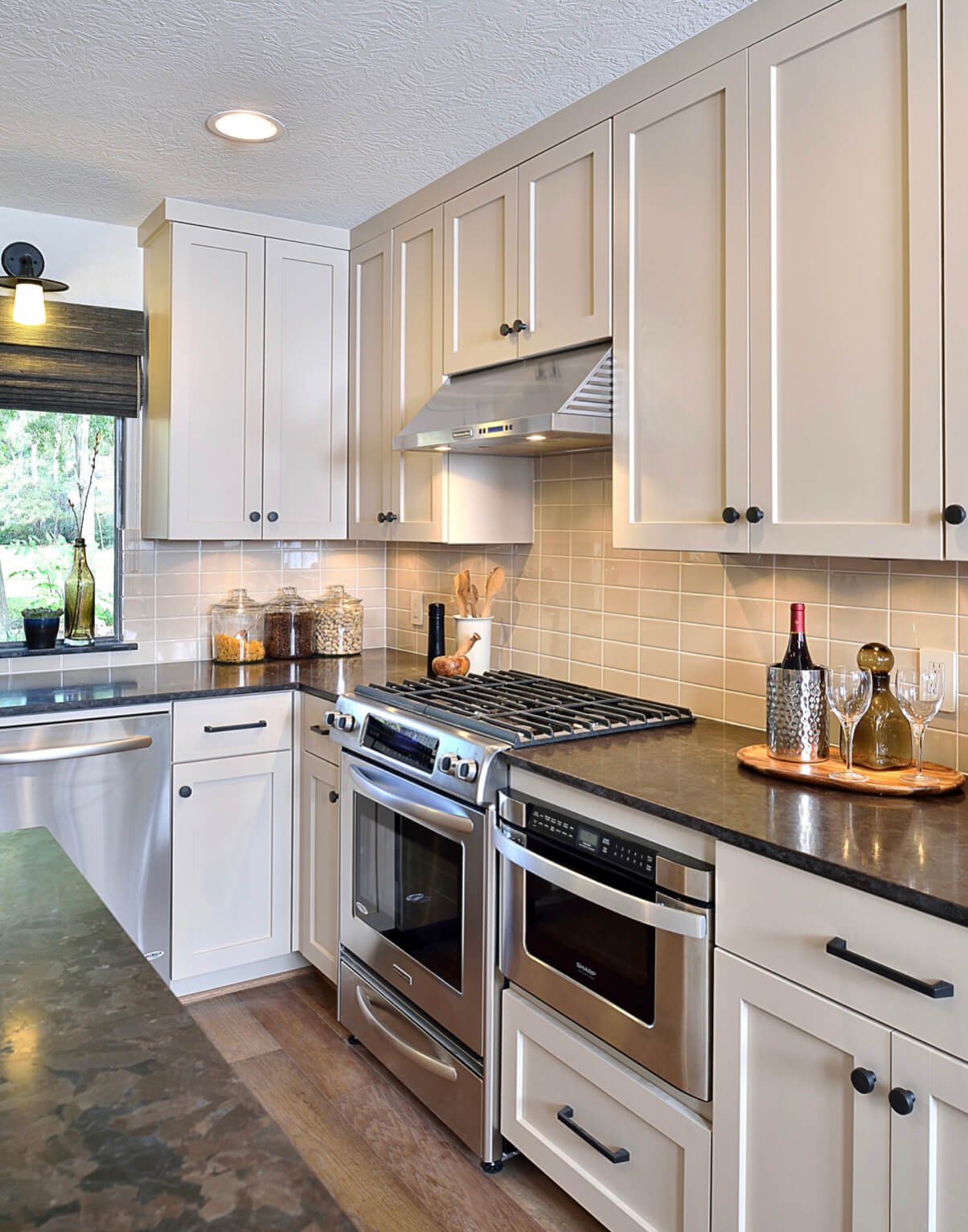
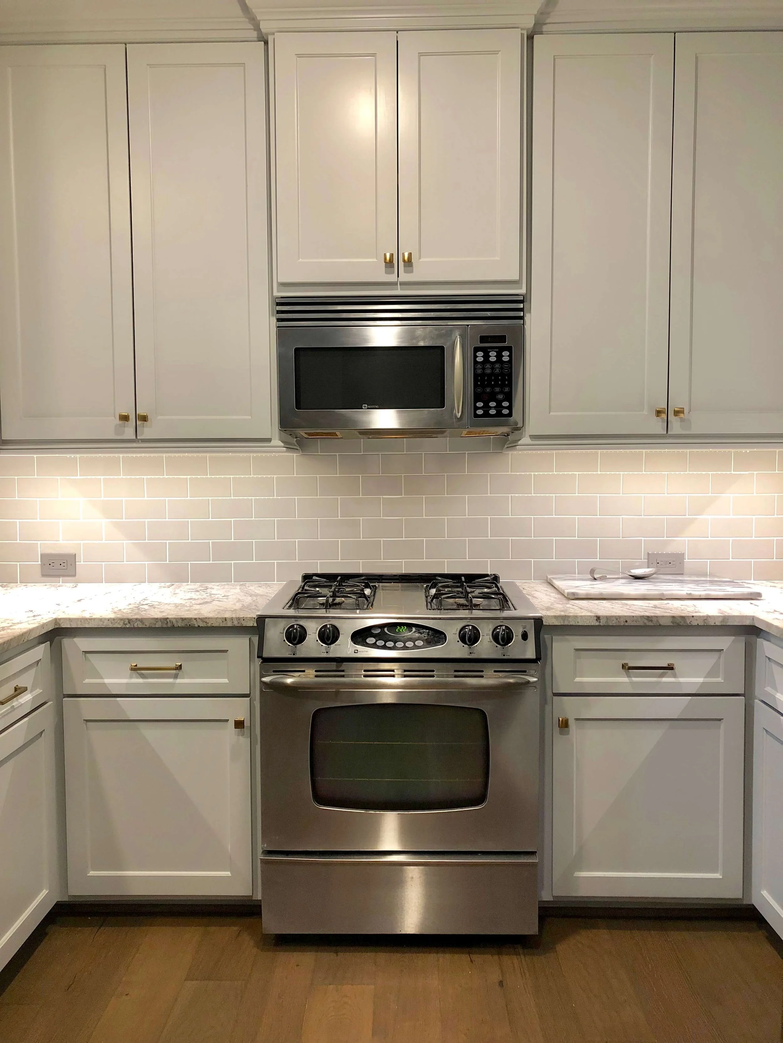


Today I’m sharing a few ways that you can take some rather plain kitchen elevations and up-level the look by adding some interesting features. You won’t want to miss this post if you are considering a kitchen redo in the near future…….