I’m sooooo excited to share this living and dining room makeover today, where the warm tones were minimized and fresh, light cooler colors transformed these spaces!
This was one of my full service projects, where I had worked on the primary bathroom remodel and then the kitchen remodel, and things sort of grew from there. :-)
One thing that had been bothering my client about her home is the overall warm, creamy color palette. The paint was very beige and all the trim, and there was a lot in this house, was really warm toned.
While we repainted trim and doors in the kitchen, family room and primary bath, we didn’t want to go to that trouble and expense throughout the other open spaces.
So, we minimized that by painting the walls in these two rooms a lovely cool blue-green color, which made the trim feel a little more white, by contrast. I share more about this color concept in this post, which you can come back and peruse after you see these gorgeous pics!
Dining Room Makeover
The first thing we did was address the dining room. I developed an overall scheme for this room with new furnishings.
Before pic of the dining room:
Before pic - Dining Room
At first my client considered keeping some furniture, but the furniture was quite traditionally styled and warm toned and just didn’t flow well with the new look we were doing in the kitchen. They definitely wanted a more transitional, clean-lined look.
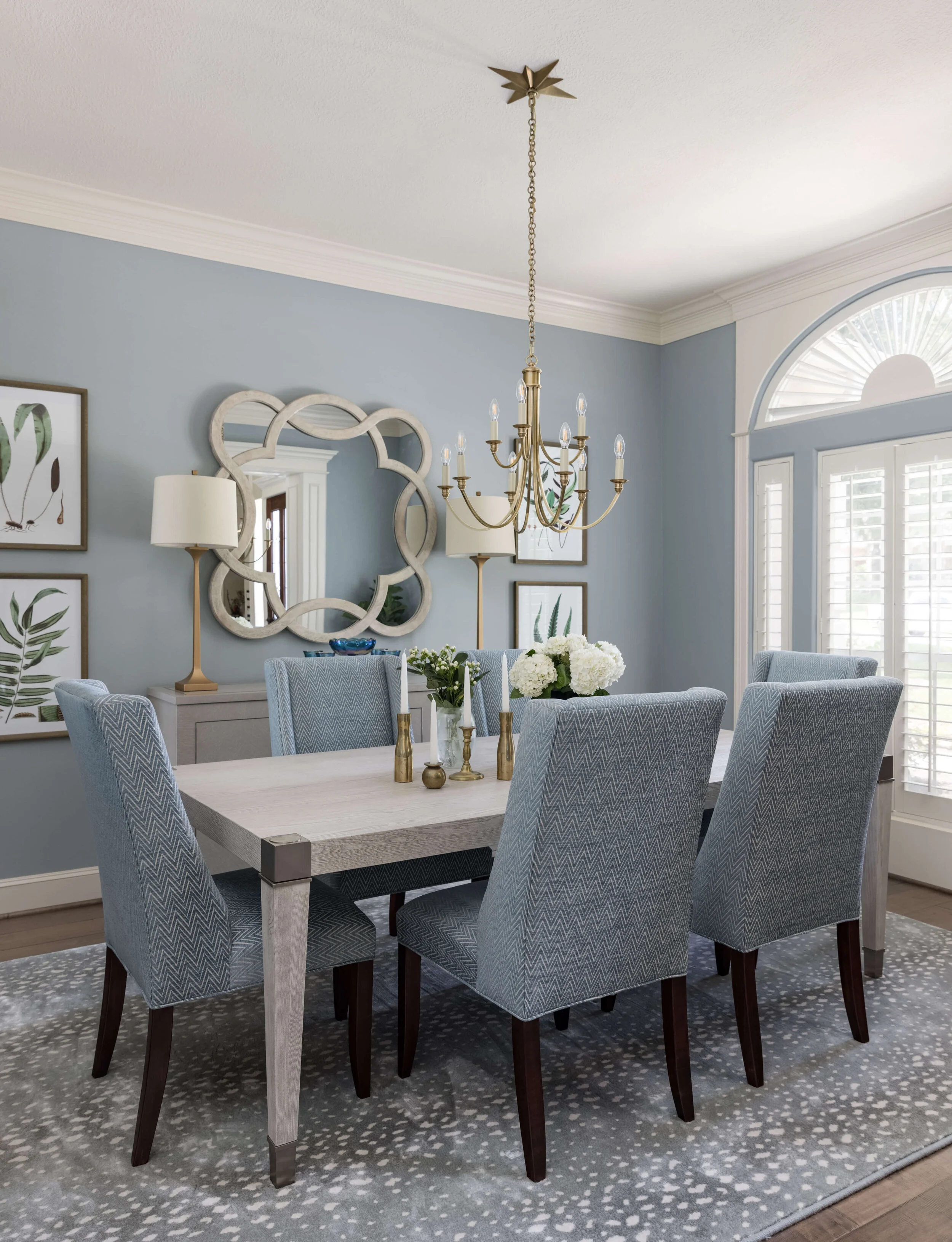
Here was my design plan for the dining room, designed to lighten and brighten and bring in some cool tones.
Moodboard proposed for new dining room in cool, coastal palette | carlaaston.com
This client’s home office is directly across from the dining room and I wanted her to have a beautiful vista as she passed by this room every day, so addressing that long wall was really important.
Options To Save With The Design Plan
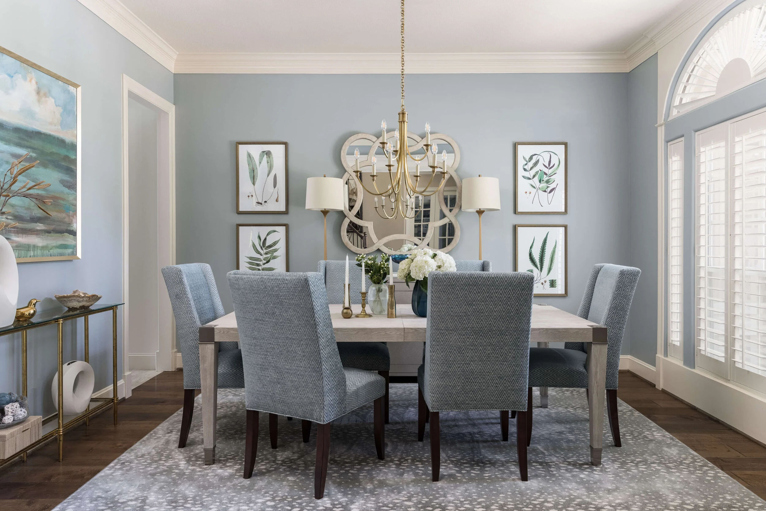
We opted for paint instead of grasscloth wallcovering, to save so we could spread the budget out elsewhere in the house. And those lovely alabaster lamps were out of stock and unavailable, so I had to reselect. We reused an existing brassy console she had in another part of the house, but otherwise, it turned out exactly as planned!
PROJECT REVEAL - Living Room and Dining Room Makeover in a Cool, Coastal Palette | Carla Aston, Designer | Colleen Scott, Photographer
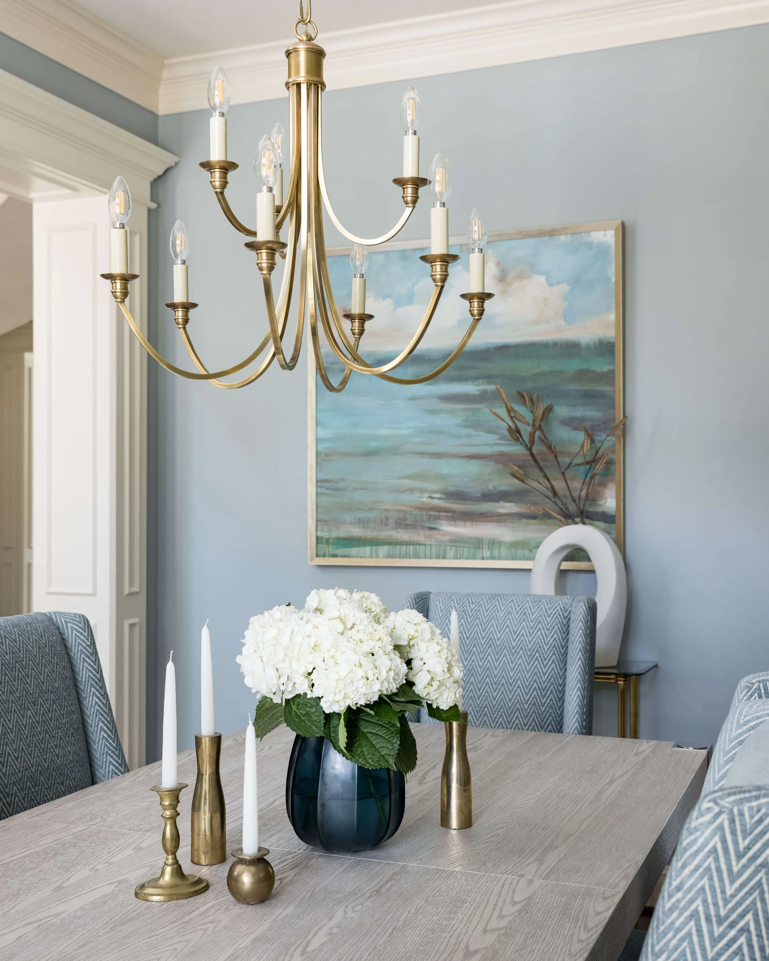
I love the way the white background of the botanical prints brighten up the room and the curvy shape of the chandelier echoes the mirror. It does make for a lovely view from the home office and at the entry to the home.
PROJECT REVEAL - Living Room and Dining Room Makeover in a Cool, Coastal Palette | Carla Aston, Designer | Colleen Scott, Photographer
We did a shapely white marble tray on the console that featured my client’s mother’s colorful glassware. I thought that was such a sweet touch and the perfect color accent for this room.
PROJECT REVEAL - Living Room and Dining Room Makeover in a Cool, Coastal Palette | Carla Aston, Designer | Colleen Scott, Photographer
Brassy, gilded finishes add brightness and elevate the look of this room.
PROJECT REVEAL - Living Room and Dining Room Makeover in a Cool, Coastal Palette | Carla Aston, Designer | Colleen Scott, Photographer
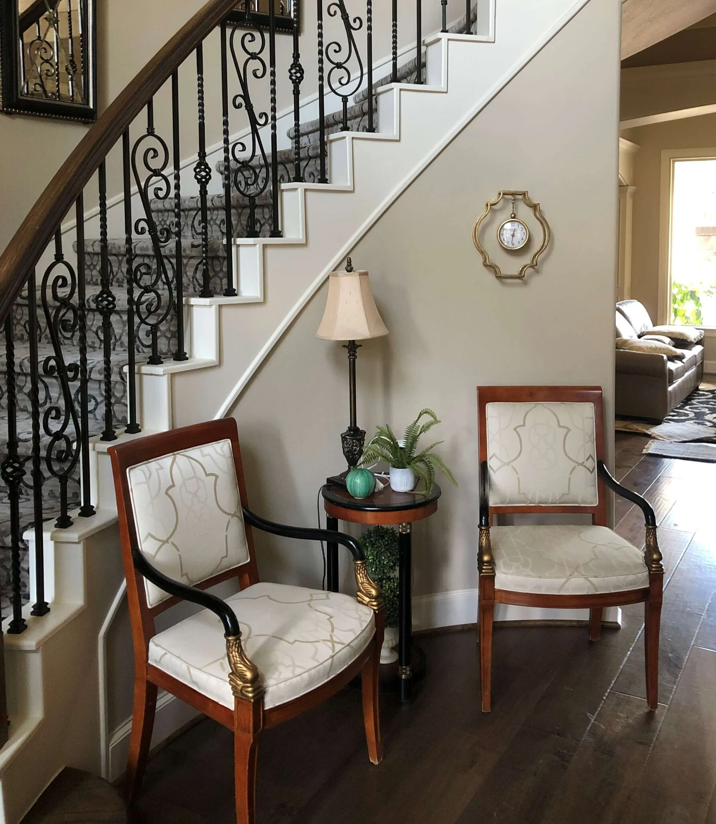
Entry Hall Update
While we were at it, we updated the furnishing in the entry hall too a bit. My client previously had two extra dining chairs there, which worked out great, so we did the same thing again with the new chairs.
Entry Hall Before - The extra dining chairs were used here, convenient for the dining room and for seating in the foyer. carlaaston.com
With a pretty, new table in a light finish with some new accessories and it ties in nicely with the adjacent spaces.
I love how the color on the dining chairs brought the cool color palette over to this warmer toned space.
PROJECT REVEAL - Living Room and Dining Room Makeover in a Cool, Coastal Palette | Carla Aston, Designer | Colleen Scott, Photographer
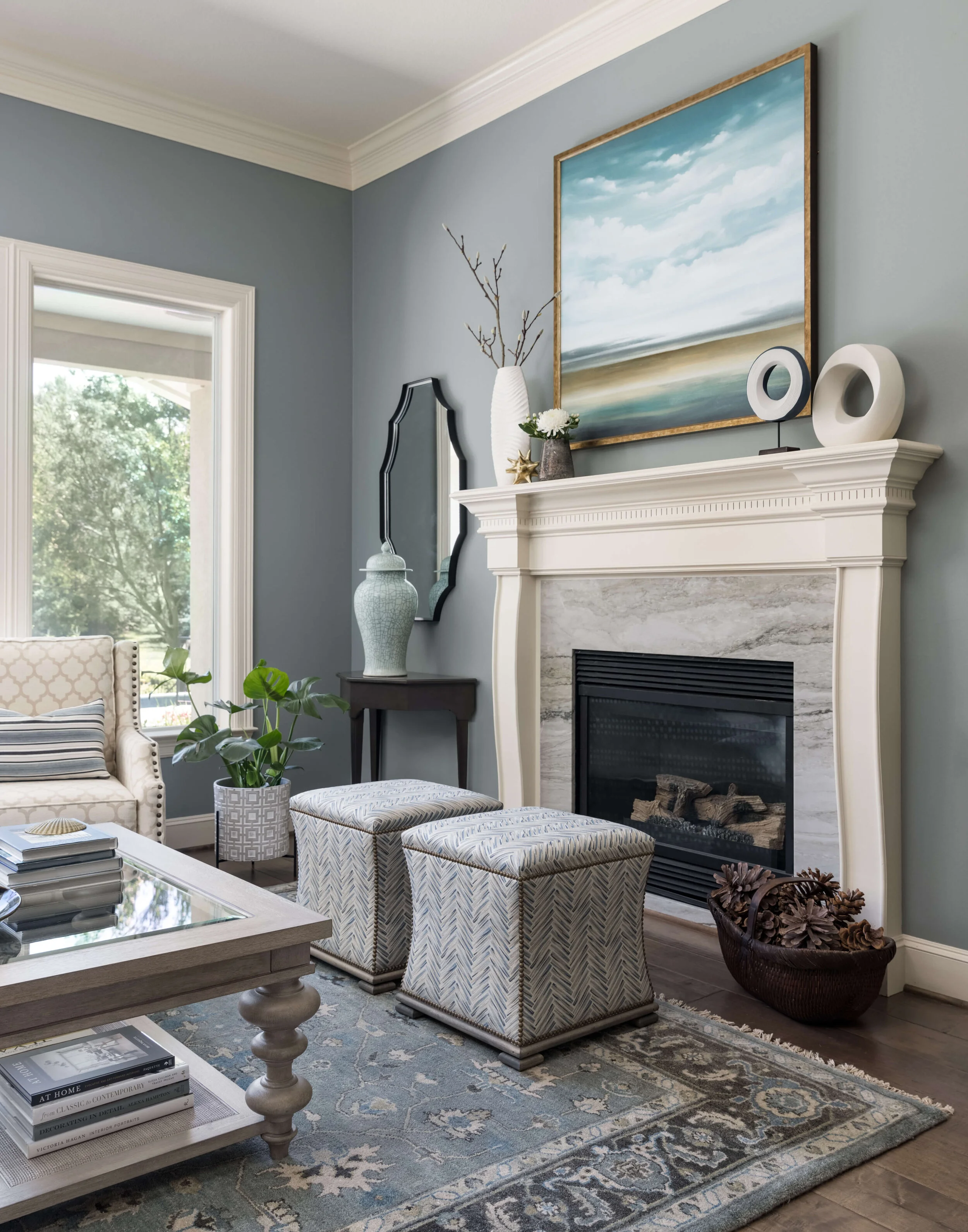
Living Room Makeover
The furnishings changes in this room were all about the rug, tables, accessories, paint and pillows. We kept the existing sofa and chairs and reused them here.
Here was the room before, after we had done the new paint color. It made a big change, but just was not enough! carlaaston.com
Here’s a pro tip - While it is hard to make any pillow sit up nicely on a leather sofa (things tend to slip and slide), it is easier to have down pillows sit up properly. We definitely went with 22” square down pillows with the update, to keep those sitting up nicely.
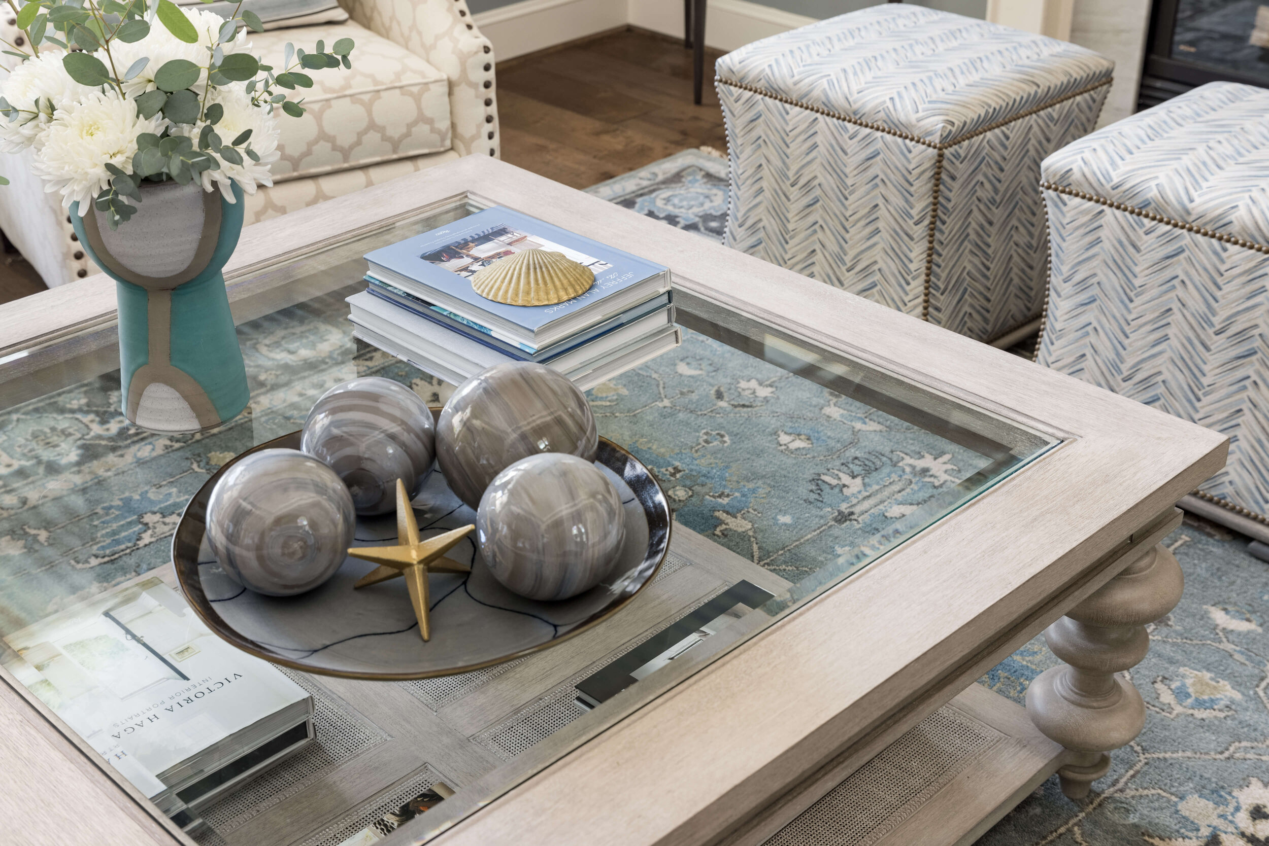
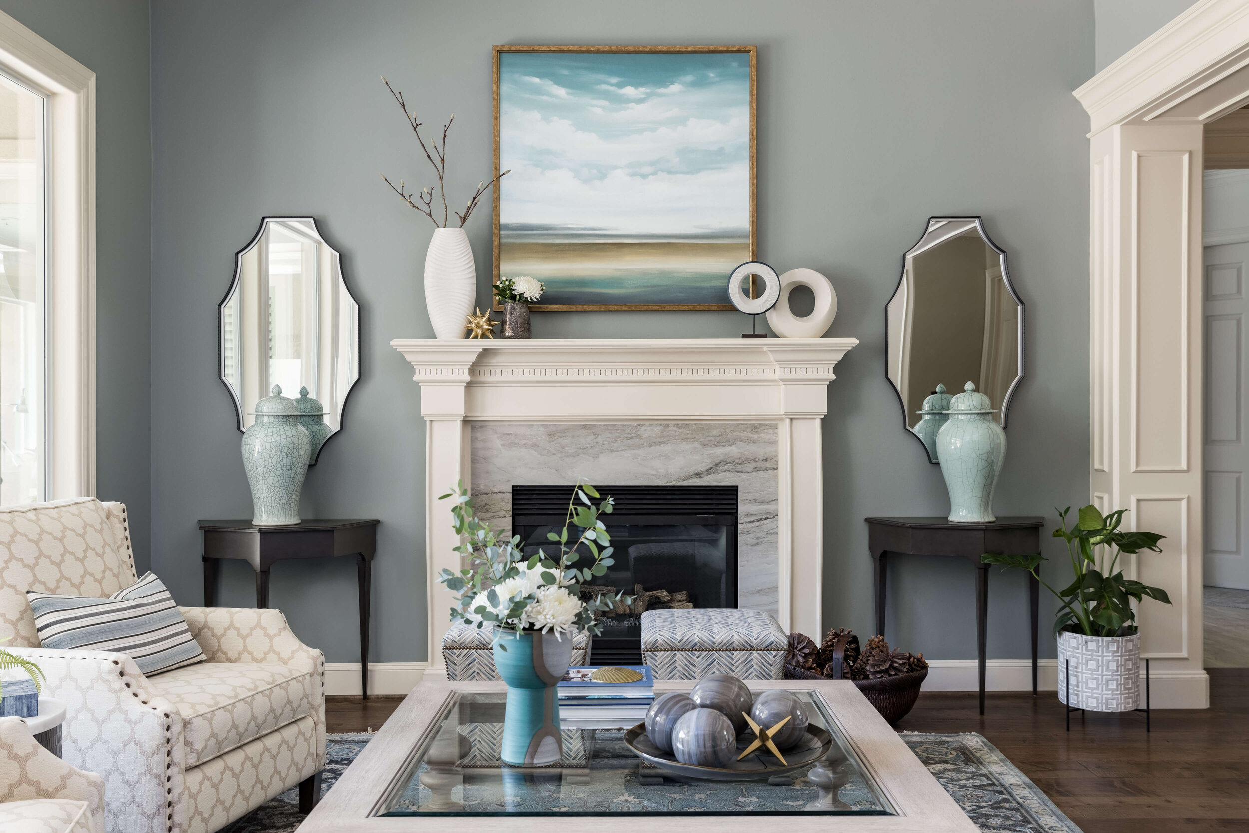
One of the biggest changes that we could make here was with the rug and the coffee table. I’m so glad we were able to go further though, with those nice consoles at the fireplace, new art and decorative accessories. Love the new stools too, in a beautiful fabric, that were custom made.
PROJECT REVEAL - Living Room and Dining Room Makeover in a Cool, Coastal Palette | Carla Aston, Designer | Colleen Scott, Photographer
I really love how the shapely mirrors work flanking the fireplace too, with the art above. They actually reflect the light much better from the windows and the art brings a nice mix of color and softness to the room.
We also changed out the fireplace surround material with leftover slab material we had from the kitchen. It worked out great and made such a nice upgrade!
PROJECT REVEAL - Living Room and Dining Room Makeover in a Cool, Coastal Palette | Carla Aston, Designer | Colleen Scott, Photographer
PROJECT REVEAL - Living Room and Dining Room Makeover in a Cool, Coastal Palette | Carla Aston, Designer | Colleen Scott, Photographer
PROJECT REVEAL - Living Room and Dining Room Makeover in a Cool, Coastal Palette | Carla Aston, Designer | Colleen Scott, Photographer
This room had a bit of an architectural change as well as furnishings and fireplace surround. The low arches around this room were removed and the openings taken up as high as possible without too much structural work, to get a more open feel.
Here was the sketch I did to show that change. It made a big difference in how this space feels more open and less boxed in. It’s rather hard to tell from the after photos, but you can see in one of the wide images, how the arches were removed.
Sketch showing how arches would be removed and new mouldings applied to the existing structure. carlaaston.com
The framing around the room was modified and raised, to have no arches. It gave the room a more open and inviting feel. Carla Aston, Designer | Colleen Scott, Photographer
I’m really happy with how this project turned out and can’t wait to share the family room and breakfast room next week.
Make sure you’re subscribed to my blog (at the bottom of this post) to get that update as well as lots of tips and inspiration for making your home shine. :-)
PROJECT REVEAL - Living Room and Dining Room Makeover in a Cool, Coastal Palette | Carla Aston, Designer | Colleen Scott, Photographer
Okay, I know you’re going to ask, so here are the paint colors. :-)
Walls in Dining Room: Benjamin Moore, Boothbay Gray
Walls in Living Room: Benjamin Moore, Puritan Gray
Photographer: Colleen Scott
Contractor: CA Design Build

