I’ve got a new project reveal today, a kitchen remodel with a dramatic improvement made to its layout and function. There are some nice new finishes and special touches too, of course!
Here’s how it started:
One of the main objectives of this kitchen remodel was to improve the functionality and layout. The island / bar section was really too far away from the other countertop on the wall, and all the work in the kitchen hovered between sink and cooktop, which were basically side by side.
It made having this large open space, rather pointless and crowded that work area constantly.
On top of that, there was a single arched opening (leftover from a partial remodel by a previous homeowner) sort of in the middle of the hallway in the back corner of the kitchen. It wasted a lot of square footage that could be better used in the space.
Overall, this kitchen was a warm creamy color that the homeowner wanted to lighten and brighten too. A blue contrasting color in the mix was also desired.
“Before” Kitchen Remodel Pics
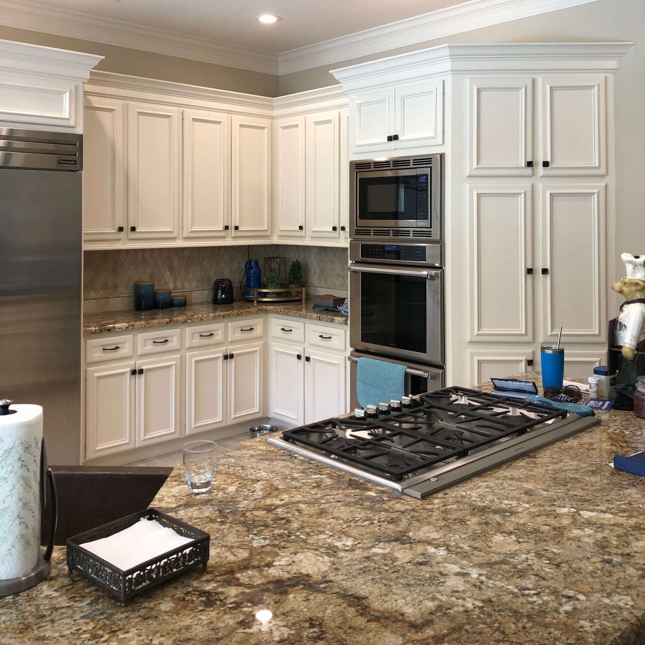
Kitchen Before Remodel - This kitchen appears large but the functionality could definitely be improved. The arched area there served no purpose and needed to go.
Kitchen Before Remodel - The island in this kitchen is a rather long way from the back wall countertop. The sink is right next to the cooktop too, so while the kitchen feels large, there isn’t much usable countertop over in the cooking and sink area.
Kitchen Before Remodel - The arch that divided this hallway served no real purpose and the homeowner wanted it removed. This opened up more space to use to enlarge the back wall of the kitchen and the pantry. This corner of the countertop, by the cooktop, became a drop zone as it was so close to the back door. It made cooking in this area crowded.
Kitchen Before Remodel - Here’s the kitchen sink and cooktop right next to each other on the island. You can see the pantry door there in the top, left corner. The pantry was adequate, under the stairs, but who doesn’t need a bigger pantry?
Here’s how the kitchen layout changed.
After the arch came down (with proper support put in place), that back wall was lengthened a bit so that a new professional look range could be installed.
The oven tower cabinet was not needed since the range had two ovens.
More counter space on the back wall was achieved for better function, even the L shaped corner became more usable as the oven cabinet didn’t sort of block that area any more.
A new island was designed to become the central focus of the kitchen, keeping good working distances between perimeter and island.
The island function improved with wide drawers added, and on the back side, opposite the range, the sink, dishwasher and trash drawer location there, make for a super functional space.
The pantry was expanded about 20” out into the space, taking advantage of the extra open space that the arched opening took up previously. An additional full height cabinet was installed beside the pantry for small appliances and serveware.
See some in-progress shots below.
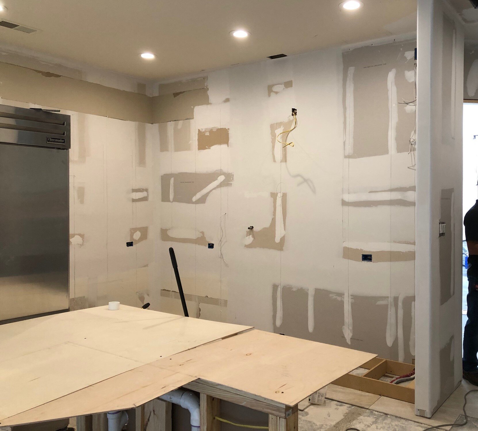
The wall was widened here by about a foot, but it was a big help in making it a better length for placement of the range here.
IN PROGRESS - The pantry was expanded about 20” out into the kitchen space. A new full height cabinet was added beside it for serveware and small appliances. That outlet was relocated inside the pantry.
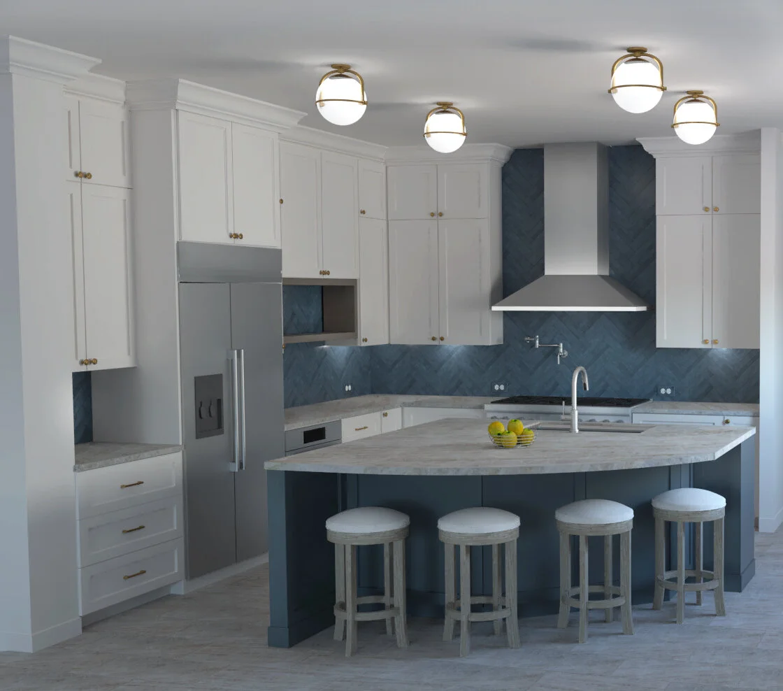
The rendering done for the proposed kitchen, by Staci Nugent.
Special Features Were Added To this kitchen’s design
A barn door was installed for ease of use and access to more shelving in the pantry on all three walls.
The cabinets were taken to the ceiling to incorporate the maximum amount of storage in the space and add the feeling of spaciousness.
The contrasting dark blue color breaks up the space nicely and brings a bold look to this kitchen.
A special wood book shelf was detailed into the cabinetry to add some warmth and break up the all-white upper cabinet look.
The butler’s pantry received an upgrade too with new door/drawer fronts and finishes.
Brassy features like the cabinet pulls and the (4) ceiling mounted light fixtures also add warmth.
And here’s the end result!
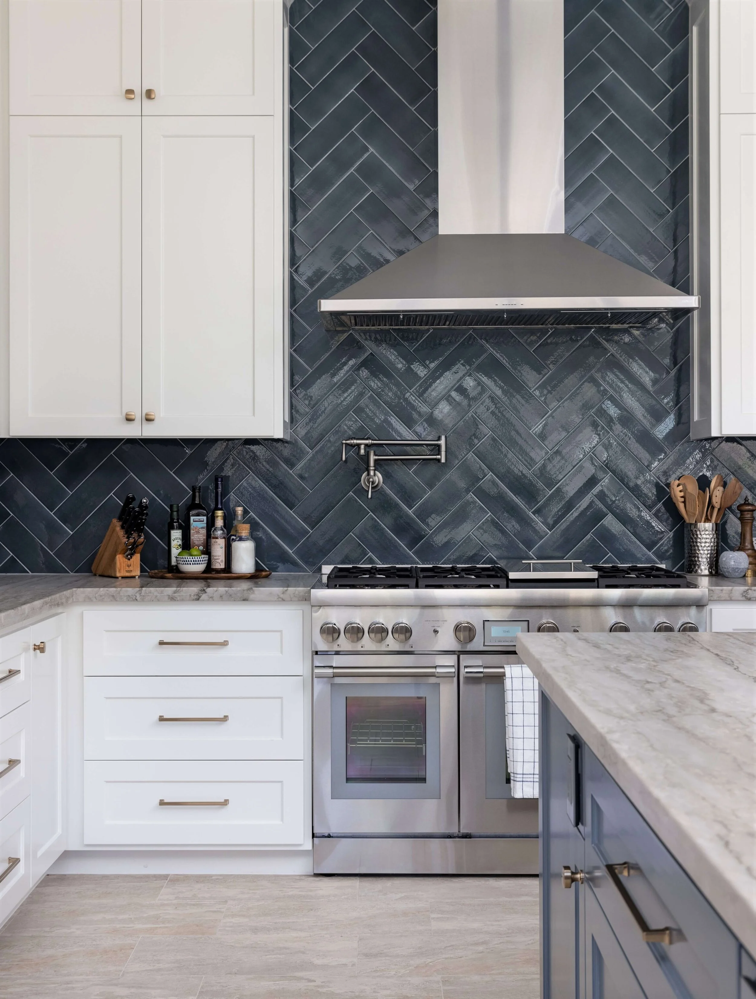
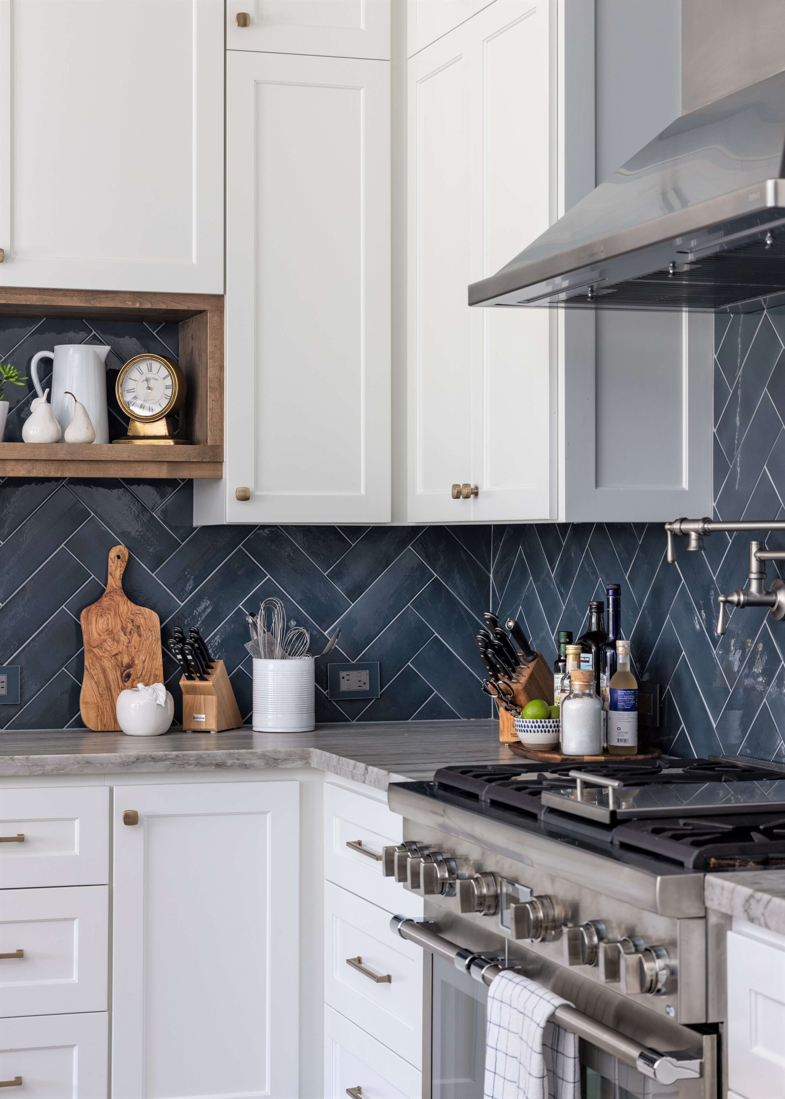
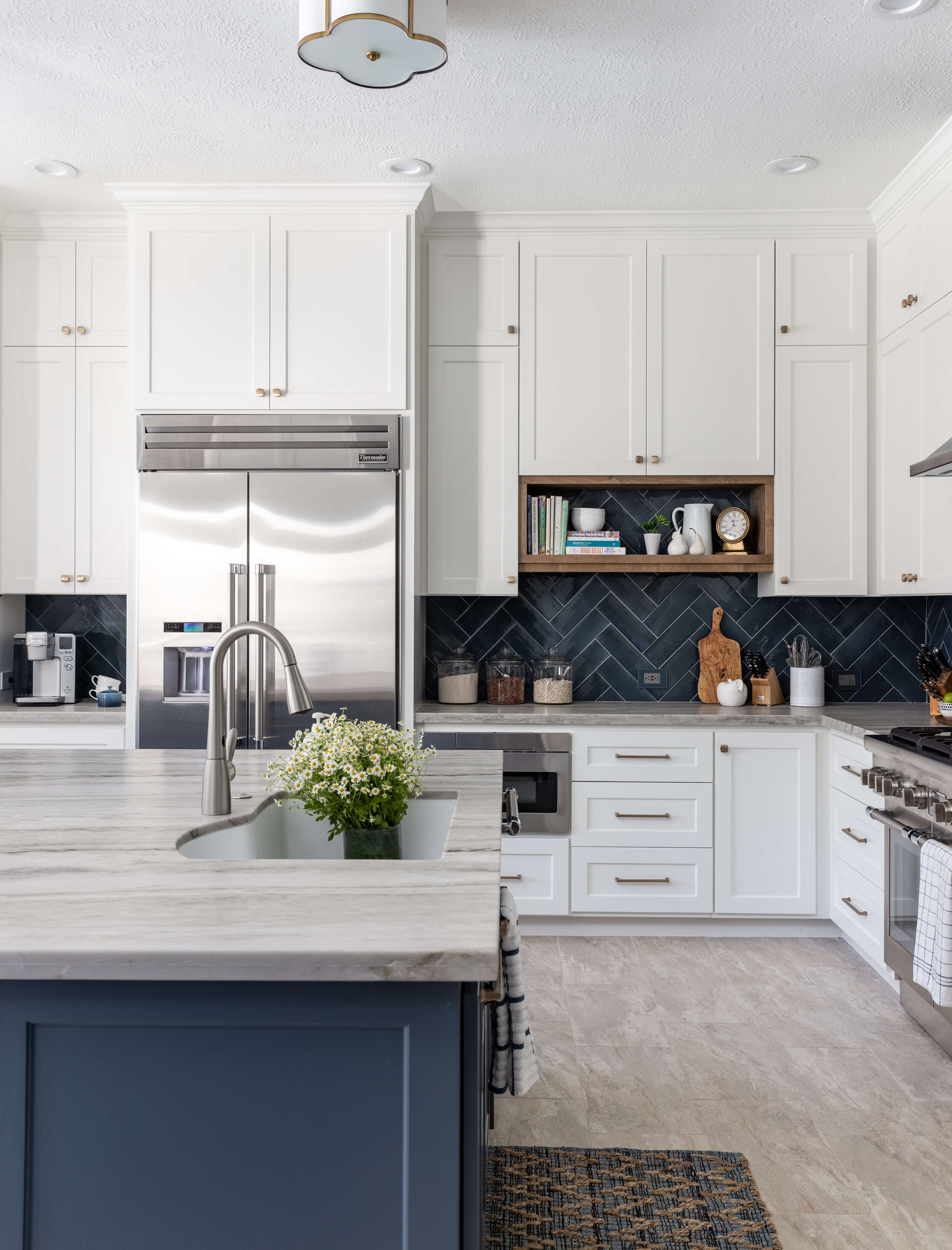
White cabinetry, painted SW Alabaster, combined with a bold blue herringbone tile backsplash, provides a dramatic contrast. A leathered quartzite is a medium gray tone with some variation. It feels good to the touch.
Thermador’s Pro Harmony range gives a sleek, pro appearance in this kitchen as does Zephyr’s Siena Pro Wall venthood, above.
The floor tile was kept in this remodel, patching in where needed with the change in footprint.
The L-shaped perimeter countertop now provides plenty of worksurface at the cooking area and the island is not so far away so that the work zone is much more usable.
A Dramatically Improved Layout For This Full Kitchen Remodel! [Before and After] Designer, Carla Aston | Photographer, Colleen Scott
Sleek appliances from Thermador and Zephyr gleam in front of the rich color of the navy blue backsplash. Designer, Carla Aston | Photographer, Colleen Scott
The bold blue herringbone tile backsplash makes a beautiful statement in this kitchen makeover. Note the Legrand Adorne outlets, with covers painted to match the tile. Designer, Carla Aston | Photographer, Colleen Scott
Here’s the opposite wall of the kitchen, with the barn door to the newly expanded pantry and the new full height cabinetry just beside. The butler’s pantry is in the hall, on the way to the dining room.
The blue kitchen island has wide drawers and tall doors on each side to store cutting boards and cookie sheets.
Electrical outlets were Legrand Adorne, with covers painted to match.
A Dramatically Improved Layout For This Full Kitchen Remodel! [Before and After] - The barn door slides over the pantry entry. Designer, Carla Aston | Photographer, Colleen Scott
The barn door at the pantry makes for easy access to ingredients while cooking. The touchless faucet is a much requested item in kitchen design these days and is so convenient.
Expanded pantry with the barn door | Designer, Carla Aston | Photographer, Colleen Scott
Shallow shelves in the pantry were built for better organization. Designer, Carla Aston | Photographer, Colleen Scott
I love the touch of warmth we were able to inject in this kitchen with a wood shelf. It makes for the perfect place to stash favorite dishes and cookbooks. Designer, Carla Aston | Photographer, Colleen Scott
The butler’s pantry received new doors, paint, new glass panels, cabinet pulls, countertop and splash.
The existing butler’s pantry received a facelift. Designer, Carla Aston | Photographer, Colleen Scott
The existing butler’s pantry received a facelift. Designer, Carla Aston | Photographer, Colleen Scott
Since this kitchen had a tile floor that we were keeping, not a wood floor like a lot of kitchens these days, I thought it was important to add a few touches of wood like the wood open shelf and the wood on the counterstools. Those two finishes match, in this case, because there aren’t a lot of wood finishes in this room and I wanted to make a significant statement with the wood tone.
A Dramatically Improved Layout For This Full Kitchen Remodel! [Before and After] Designer, Carla Aston | Photographer, Colleen Scott
Here’s the link to the primary bathroom remodel we did in this home too. Subscribe to my email list below so you don’t miss more of my remodels and projects as well as design tips and inspiration!
A big thanks to the other pros on this job!
Contractor - Shaun Bain, Gus Bruna, Curb Appeals
Photographer - Colleen Scott
Sketch Up drawings and renderings - Staci Nugent
And of course, to my trusting clients! :-)





![A Dramatically Improved Layout For This Full Kitchen Remodel! [Before and After] Designer, Carla Aston | Photographer, Colleen Scott](https://images.squarespace-cdn.com/content/v1/4fcf5c8684aef9ce6e0a44b0/1612466124483-FAICIEPEHQ2TR6QJAOTP/blue+and+white+kitchen+remodel)
![A Dramatically Improved Layout For This Full Kitchen Remodel! [Before and After] - The barn door slides over the pantry entry. Designer, Carla Aston | Photographer, Colleen Scott](https://images.squarespace-cdn.com/content/v1/4fcf5c8684aef9ce6e0a44b0/1612467622249-1GMKUKLWHW24LUW0IY5B/Kitchen+island+with+stools)




![A Dramatically Improved Layout For This Full Kitchen Remodel! [Before and After] Designer, Carla Aston | Photographer, Colleen Scott](https://images.squarespace-cdn.com/content/v1/4fcf5c8684aef9ce6e0a44b0/1612478891407-AULS9S0RJ98ZA58B5V5N/blue+and+white+kitchen+remodel)