Ugh. Painting. I hate living in a house where painting is going on.
Luckily this time, it will only be a few days.
We had a little water leak from the A/C line upstairs down into our closet recently and we have sheetrock damage in the ceiling and wall of my closet. All has been cut out, dried out and is ready to be patched, but I thought....while we were at it, I'd make a slightly bigger job for the painter so this job would become a little more desirable. :-)
Plus, I've been wanting to paint my dining room for EVER, but never could decide on a color.
I used to love this taupe color, Pratt and Lambert Pebble. I've used it for years, but I'm tired of colors with any beige in them. I reverted to Sherwin Williams Accessible Beige about 10 years back as a go-to taupe, and I put that in my home office.
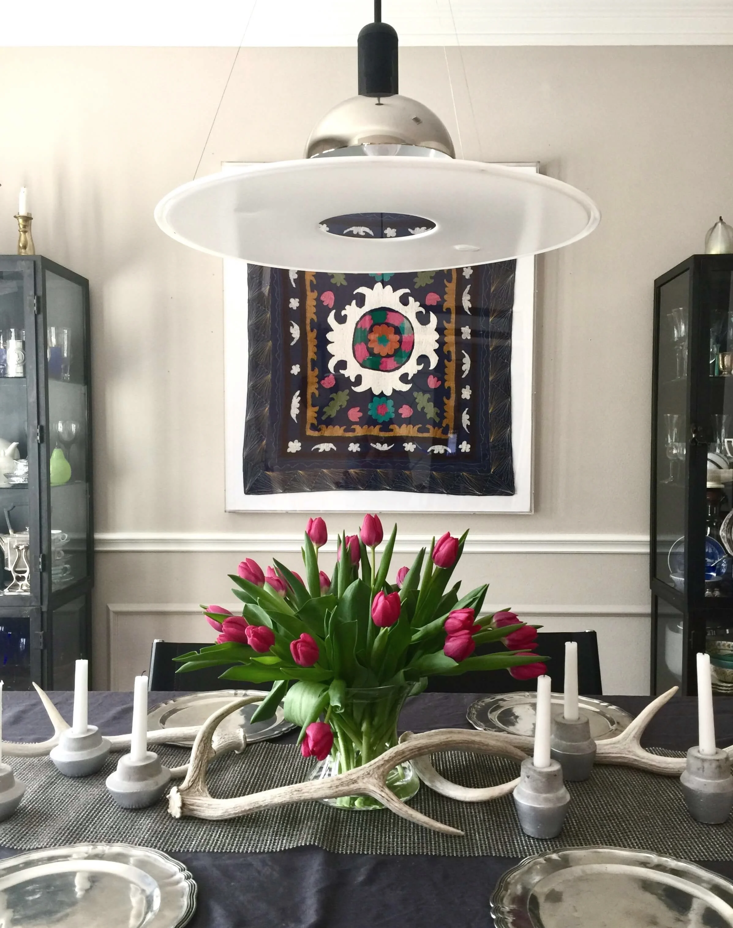
It is almost identical to the P&L Pebble. Here it is in my dining room now.
The way the sun is coming in here, the paint color looks warmer on this day. This is in the spring. I actually get more light in this space in the winter and the color appears a bit cooler because of the reflection of the trees. #diningroomideas #tabletop
I love it in my home office, I like neutrals. But I wanted my dining room to have some drama and be a little special, especially since I got my Suzani finally hung on the wall.
I seriously considered Benjamin Moore's Shadow a few years ago when I designed the windows at Memorial Antiques and Interiors. I loved that color and since I normally do neutrals in my own house, I was excited about a color that was sort of dark and moody with a hint of unexpected color for me.
I also strongly considered going dark in here because this room is dark anyway. It's front windows are covered with shade from our tall trees and it can look dark in that room no matter what the season.
I'm forever a fan of going the direction that the room is already leaning and not trying to force something that really doesn't belong....square peg - round hole, you know.
So I thought I would lean into that darkness by going dark with the paint color.
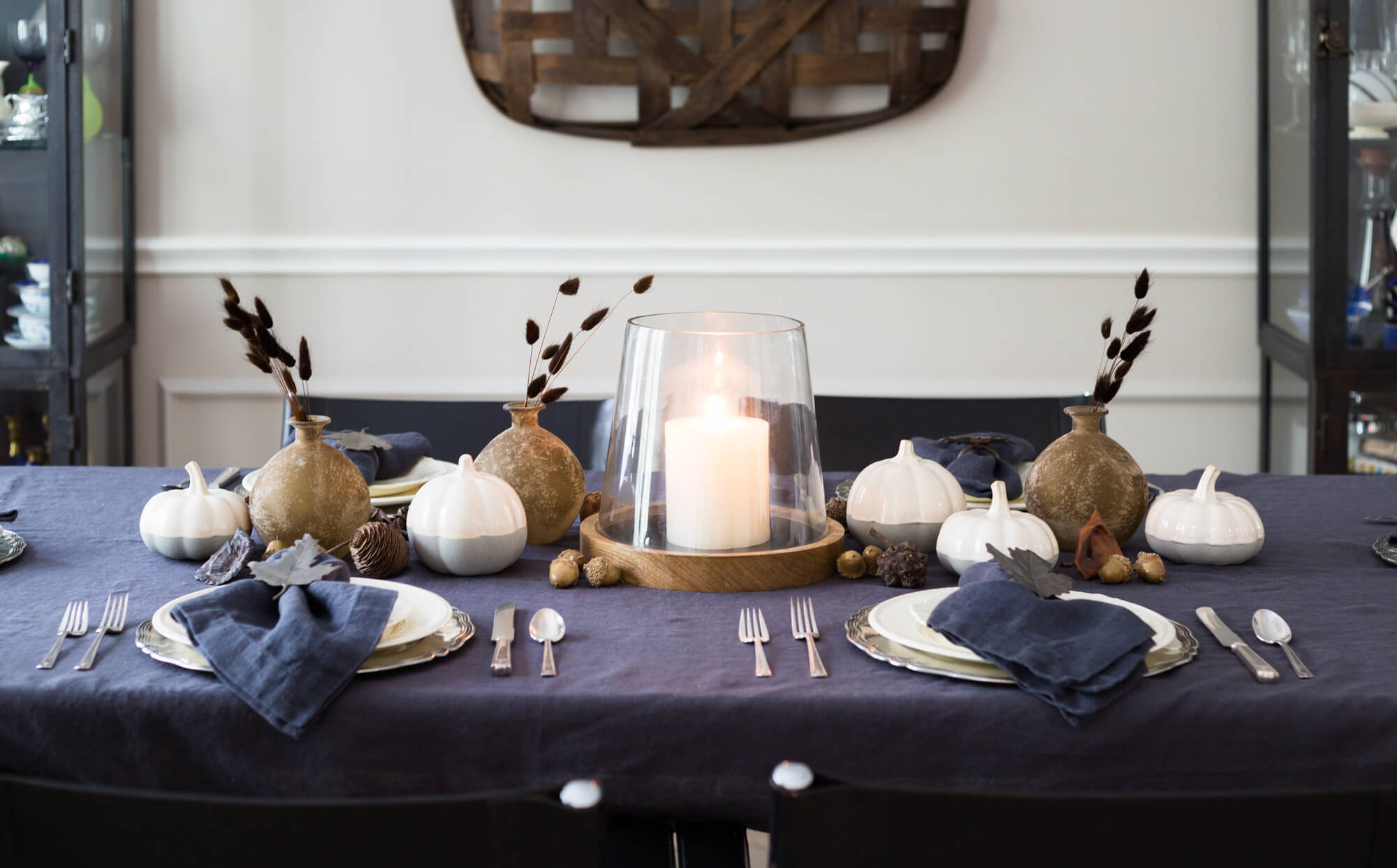
The problem is that I often photograph my table settings, like at holidays, etc. I always want to use natural light when shooting and going dark on the walls would really challenge the look of any table settings I wanted to do.
I feel like its dark now and that is not what I'm liking about my photos when I see them and try to work with them.
Believe me when I say, we lighten most of these photos up because they are normally quite dark.
I also have these two metal cabinets in my dining room, chock full of glassware and dinnerware. I actually love them. I like the industrial vibe they have and how they look a bit unexpected in a dining room situation.
However, they are dark, almost black. And if I painted my walls dark, then the cabinets wouldn't stand out, the items within would. Which could be nice, but with all my stuff in those cabinets????? It could look busy and crazy very fast.
So, I decided I wanted some contrast with the cabinets themselves.
I decided to go white.
My House Interior Is Painted White
My whole house, with the exception of the bedrooms, is white. I chose Sherwin Williams Aesthetic White years ago for all my walls, trim, and ceilings and I still love it. I have Sherwin Williams Black Fox as the color of my doors and fireplace.
I like Aesthetic White because it is toned down, not a bright-bright white. It goes more taupe than yellow too, unlike some other popular whites.
When it is used all by itself, without any other white around, it looks bright white. Especially when contrasted with a dark color like Black Fox.
I'm such a fan of walls and mouldings the same color, especially when it comes to whites. It just helps clean up the envelope and make things less visually busy in a room.
With my dining room, I could use less busy. Right? :-)
So, here we are end of summer, school year approaching and BOOM. Holidays are on their way, folks!
We do Thanksgiving here almost every year and I wanted the dining room to be ready to entertain.
The Painter Is Coming!
I called a new painter I've been wanting to try out. (I like to try out contractors on my own house before using them with clients.) He's scheduled for first of September and I can't wait!
White dining room, here we come! I'll be sharing my after photos later next month.
Did You Note That Design Process?
The thought process described above pretty accurately displays the process involved in selecting just about anything for a project.
That's why I am sharing this today. You can see there is a lot to this and since most of my clients don't follow along the process with me all day, then they don't sometimes know how I arrive at the products and combinations I present.
You can see, there is.....
.....a process of elimination,
.....a process of "if this, then that",
.....a process of comparison,
.....a process of resolution and decision.
That's why I shared this post today. To demonstrate all the behind-the-scenes thought process involved in selecting even just one item for a room. :-)
Need help with your paint color selections? I’ve got a guidebook for that. :-)


