There is nothing that gets my attention in an inbox more than a comment like this.
“Love your blog, you have some really wonderful ideas that are so helpful!”
If I was a cat I’d be purring. A dog….my tail would be wagging and I’d be looking up adoringly into your eyes. :-)
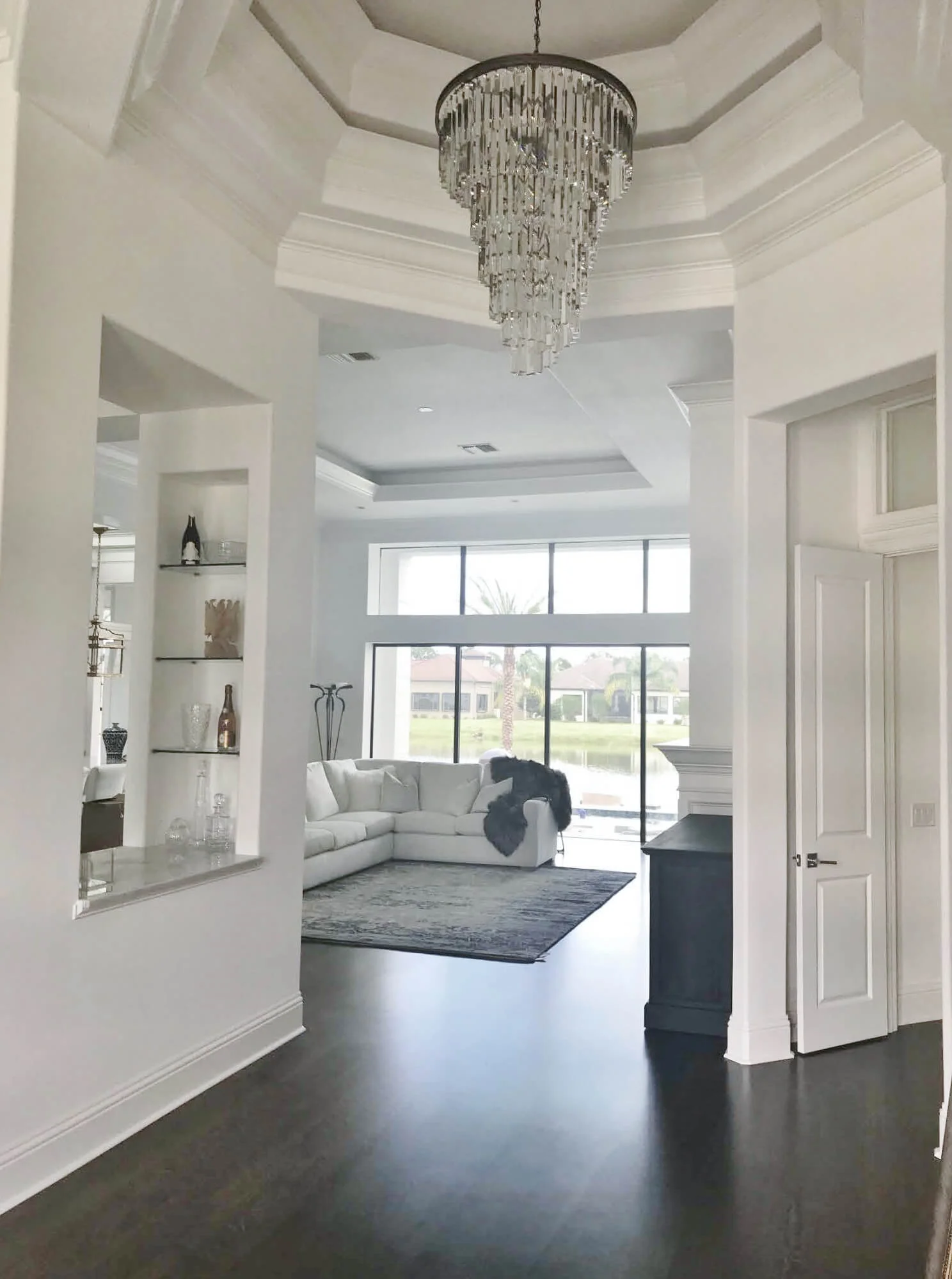
But I was really pleased when I saw this gorgeous home in the attached pics for this Designed in a Click Q&A consultation email.
My blog may contain affiliate links. Any purchases, at no additional charge to you, earn me a small percentage, are most appreciated, and make this blog possible. :-)
This homeowner had a brand new (beautiful!!!) home and was starting to furnish it. She had been reading my blog to get some tips and had a few questions moving forward.
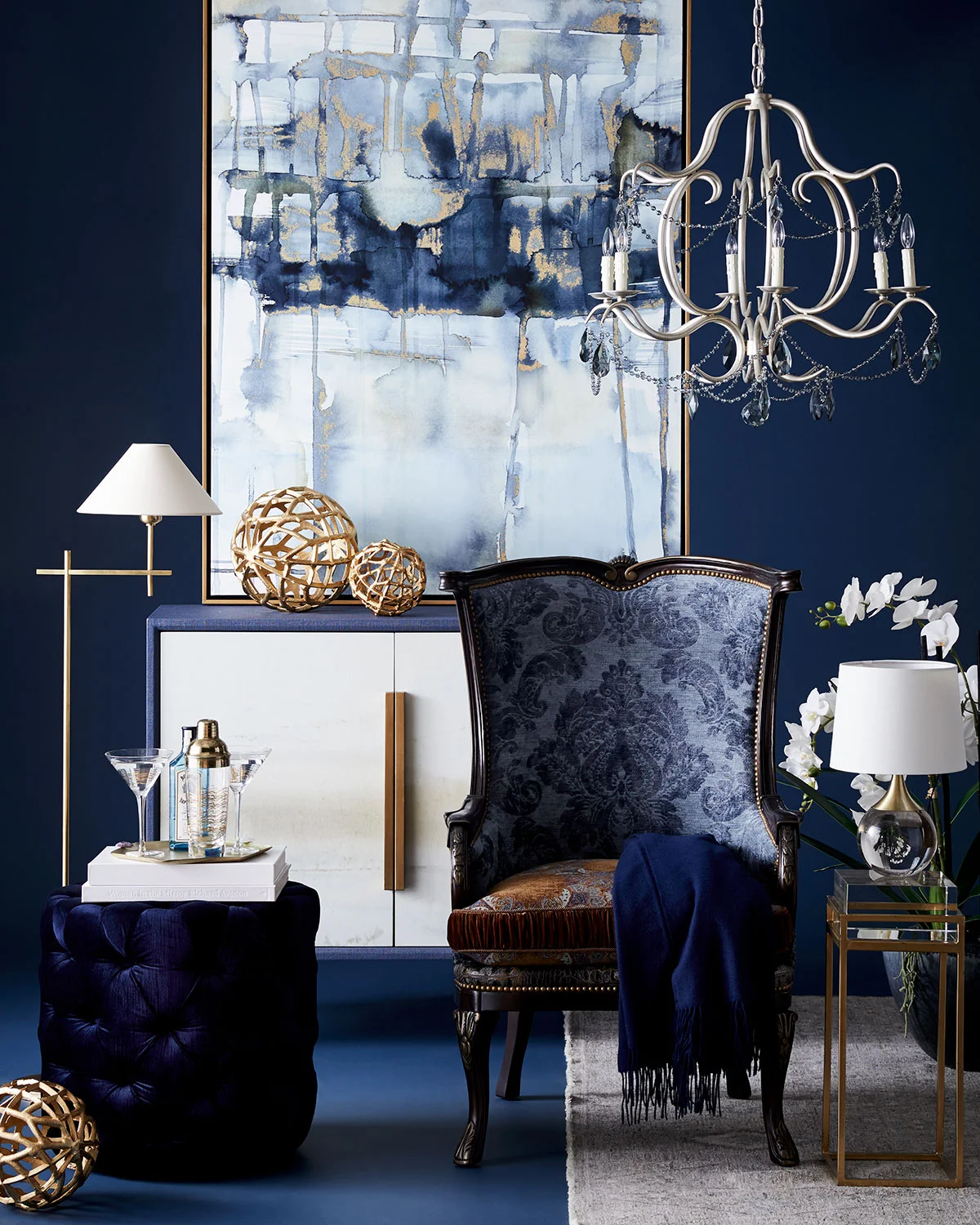
Here was an inspiration pic she loved.
High contrast, navy and white with brass accents for dining room inspiration
Her main concern was the dining room
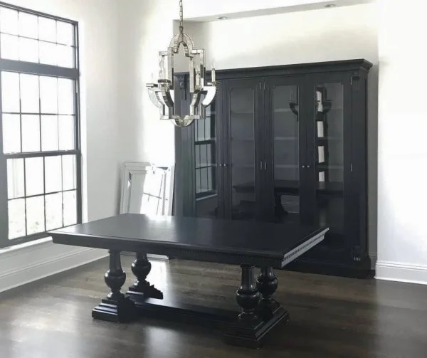
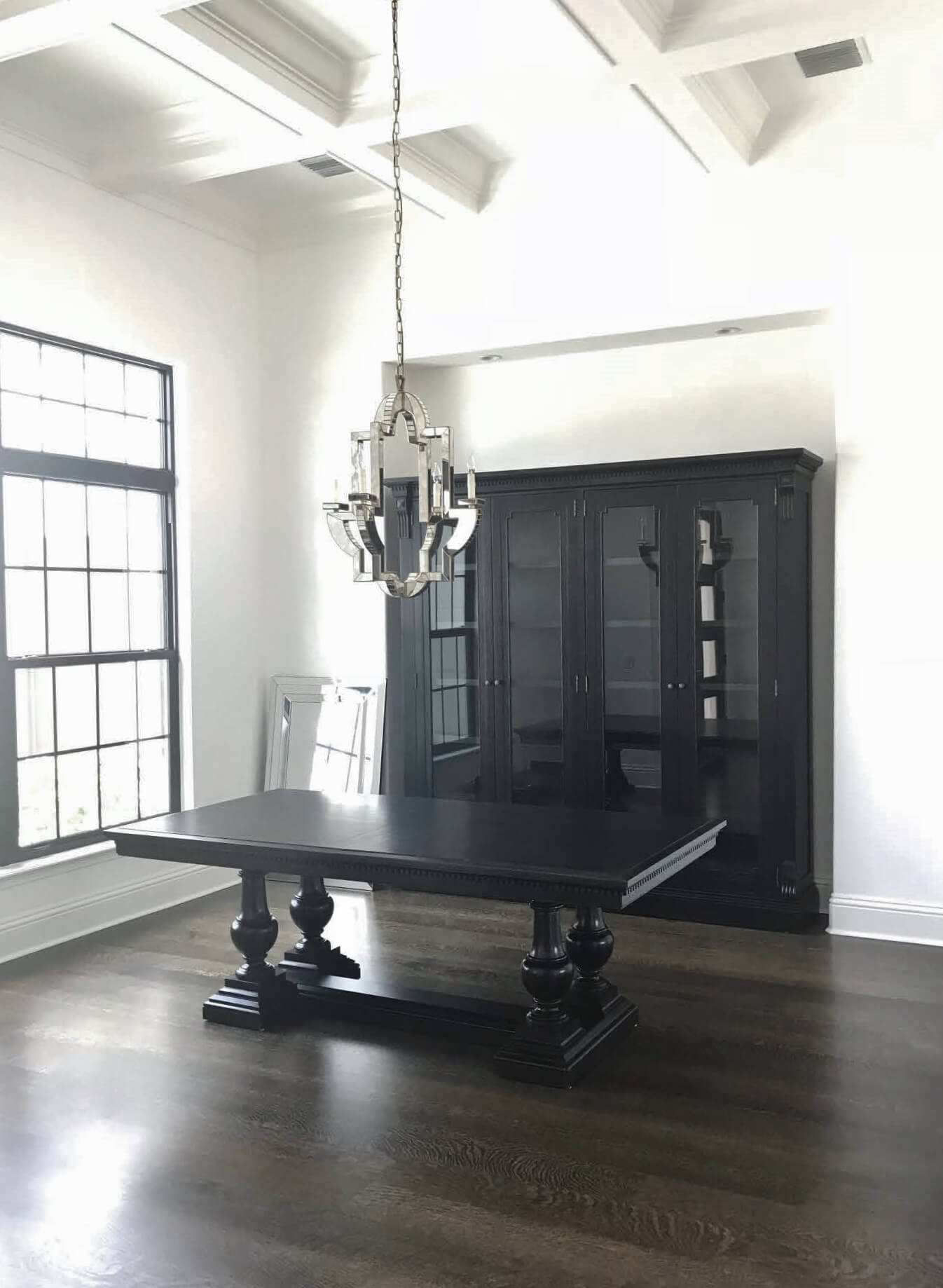
She said she knew a matched set of furniture wasn’t a good idea, but needed some tall storage for dishes and decor items she had collected on travels. She also had this 10' high niche and wanted a piece of furniture for that space.
She had purchased a black table with a matching cabinet from RH and was wondering if it was appropriate and what she should do with the gap that the cabinet left above. She thought about wallpaper or paint, perhaps, in the niche.
She also was still in the time window of doing a return and wondered if maybe she’d made a mistake and should return it all and start over.
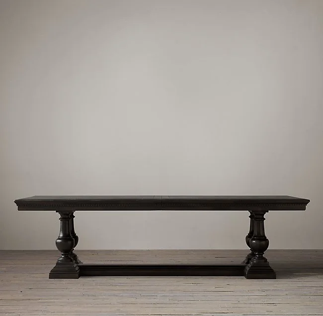
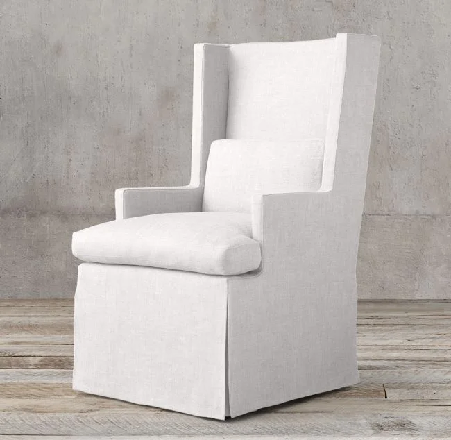
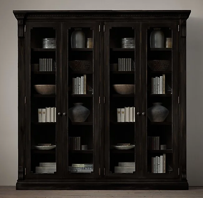
Here are the RH items she had purchased.
Dining table in black finish
Upholstered white dining chairs in indoor/outdoor fabric
Large cabinet for dining room niche
She was also asking about other furnishings like a rug and drapery and wanted to confirm that the console she wanted to purchase for her entry hall across from the dining room worked.
What Works in this dining room
I like the black table and white chairs together. The white, skirted chairs feel modern but add some softness to the room. They keep the table from blending into the floor visually, if she wants to wait on a rug for now.
Fully skirted chairs like this go a long way to fill a dining room which can often feel a little empty and “leggy” with furniture.
They create a nice mass together and I think, repeat the look of her kitchen and family room with the white upholstery and high contrast created with the dark wood floors.
What isn't working in this dining room
Dining room with large niche for cabinet
So, with the dining table and chairs getting a check, the problem then showed up as the cabinet in the niche.
I felt it was too big and overbearing, just too black overall. Because it filled the niche width, it felt squeezed in. I would not recommend putting wallcovering on the back wall there if she kept that cabinet, as you wouldn’t even really see it, with most of the wall being covered up.
Obviously, this homeowner has some style and likes to keep on trend with design. I felt like a different cabinet would mix things up a bit. She could create a dynamic, eye-catching wall there, right off her entry hall, to show some personality and make a creative style statement.
I proposed this Bernhardt cabinet that is a little more contemporary and sleek, has a white interior that creates some brightness, and actually repeats the front door's boxy window design.
It felt more in scale with the niche (it's only about 7" shorter than RH) and would enable her to add some large scale pattern in a wallcovering behind the piece. Both together, the wallcovering and the cabinet, would create a wonderful backdrop for her more simple and sculptural table and chairs.
I suggested a wallcovering along the lines of Kelly Wearstler’s Channels wallpaper, that would add a bold pattern and fill that niche with some style.
I kind of liked the idea of staying with black and white and then she could add colorful blues in dinnerware and tabletop items, drapery fabrics, rug, even a bold blue wall color for the other walls, as she wanted.
A quick, scaled sketch will confirm size of dining room cabinet
I liked that this cabinet had room to breathe and didn’t feel too crowded. I did a very quick scaled sketch, so she could see how it would fit.
Fantastic! No? (Not my sketch, :-) but the concept.)
She could even do some bulbous, white ginger jars on top, something simply shaped, to just soften and top that cabinet.
She also asked about this piece as a possible entry hall console.
I felt like this was a good choice, adding in a little warmth in the brassy trim. I also like that the mirrored finish reflects the glam look of the entry chandelier and the mirrored chandelier in the dining room.
She could even do some brassy or gilded drapery hardware in the dining room, to speak to that finish in the entry.
It's all shaping up nicely! Can’t wait to see the after pics. :-)
If YOU need a little Q&A for your interior space, check out my Designed in a Click service. It can be just the right amount of advice when you are doing the design and implementation and need a little help. :-)

