Recently, I designed the shop windows for an antique market in Houston and I’m excited to share some of the pics and the process with you today.
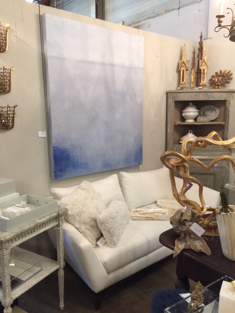
Memorial Antiques and Interiors is a Houston shopping institution, full of a mix of all kinds of furniture, art, lighting, and many other found objects. There are a total of 50+ dealers, each with individual booths, all carrying their own unique collection of items.
I believe some of these dealers show at Round Top or in other areas, but the very wonderful thing about this place is that it’s open year round and it’s conveniently located right on a major freeway in Houston with plenty of parking.
It’s really the one place you know can go buy furniture off the floor and take it with you in your car. (That’s very important this time of year….btw, they have dining tables and chairs!)
It’s also full of unique, one of a kind items….vintage, antique, refinished, repurposed…..just exactly what a home with a collected, personal vibe needs.
Memorial Antiques and Interiors, Houston - MAI
designing the windows with antiques and home decor
So, I was so excited when they called me to design the windows of Building 2 for the month of November. They typically ask a local designer each month to come in and I think it’s such a great way to share the love and collaborate with local business. I’m always open to opportunities like this, much like the vignette I created at Simpson’s Galleries back in September.
They said I could paint the back walls the color of my choice. Now, I’ve been to MAI and realized that they do have a lot of light colored furniture. That’s really what I was looking to showcase and I gave them my fave color of the moment (the color I think will be Pantone’s Color of the Year in 2017), Hunter Green.
However, they asked for a reselect. I noticed the previous window had been a dark brown color, so maybe they were tired of dark earth tones. ??? Anyway, designers are all about the pivot.
So, I did. I visited the shop and toured the spaces, looking for what I might choose for the windows and what might inspire me.
I found this.
Art was the choice for one of the windows
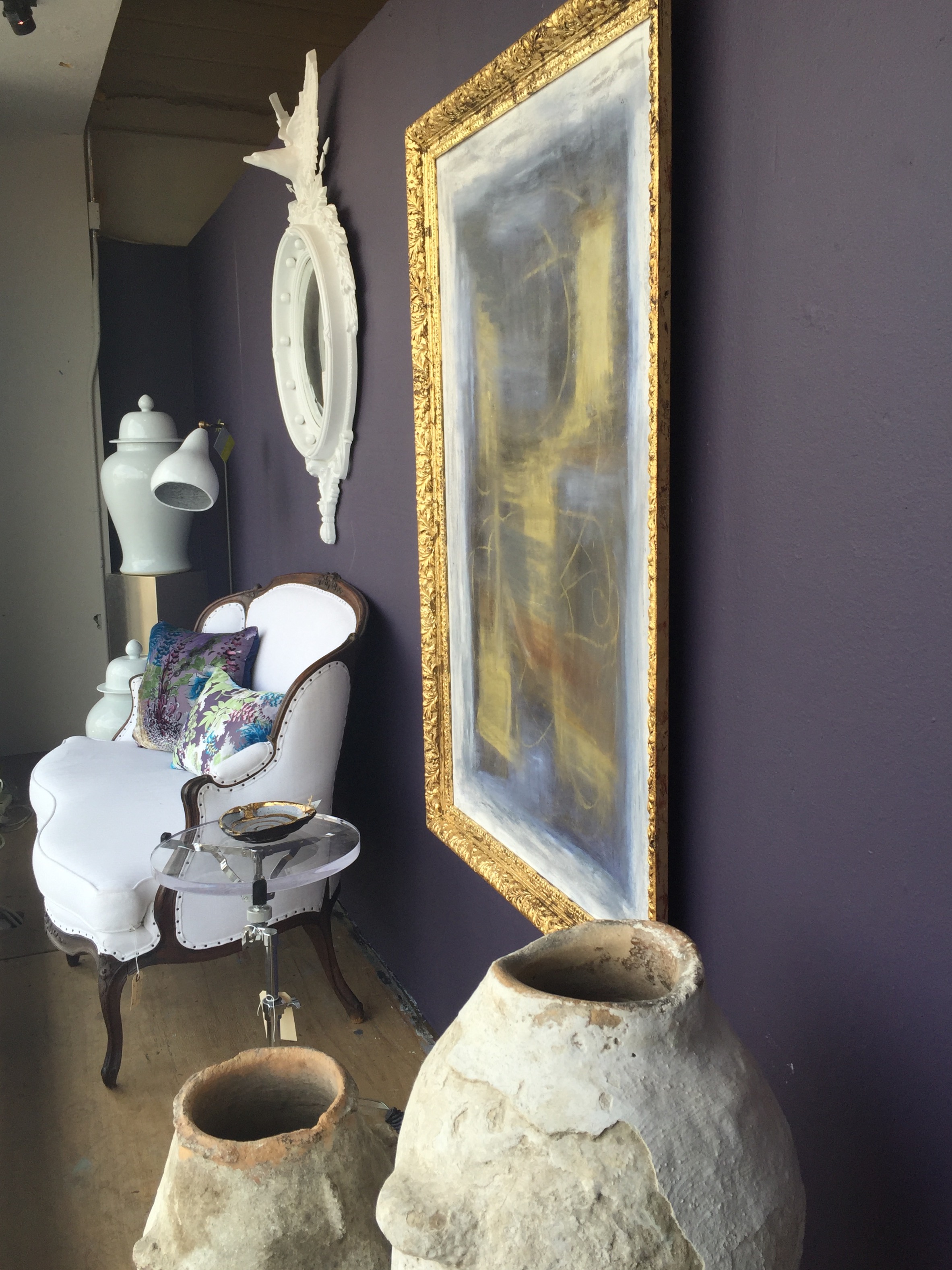
Purple and gold art in gilded frame - the inspiration piece for the home decor shop windows
Yes, this painting with it’s gold frame, would be perfect in one of the windows. However, I needed a dark, rich color for the background and the one that came to mind was Benjamin Moore’s Color of the Year 2017 that had just been announced in the last month, Shadow.
I love a color that’s sort of there and not there, a little hard to pinpoint, a color that looks one shade in daylight and takes on another look altogether at night. I love seeing nuances, depth and richness in a color. Benjamin Moore Shadow has just those qualities.
Benjamin Moore Color of the Year 2017, Shadow
I called my office and had that color pulled from our decks. I felt like that would be the perfect backdrop for that painting and all the light furniture I saw that I wanted to use. When I got back to my office I knew it was perfect. Luckily, MAI approved and had the walls painted for me.
I sent some sketches of my concept for the windows, along with some selections of pieces prior to my arrival. I was building a story in my mind….one that would eventually end up here. :-)
All good interiors are basically a story. Right?
Sketch of home decor shop window layout
Sketch of home decor shop window layout
I wanted to show how that delicious, deep, rich, on-trend color would work with a lovely, traditional interior and then also in one that was a bit more eclectic.
I felt both would speak to the content and offerings of MAI, showcase their products and diversity, and would show how something as trendy as a current color choice on the wall, can feel at home in two different scenarios.
Adjusting decor for window’s depth
We had to make some adjustments to some of my selections, the windows were only 34” deep and the mid-century sofa I wanted to use on the eclectic side was just too deep.
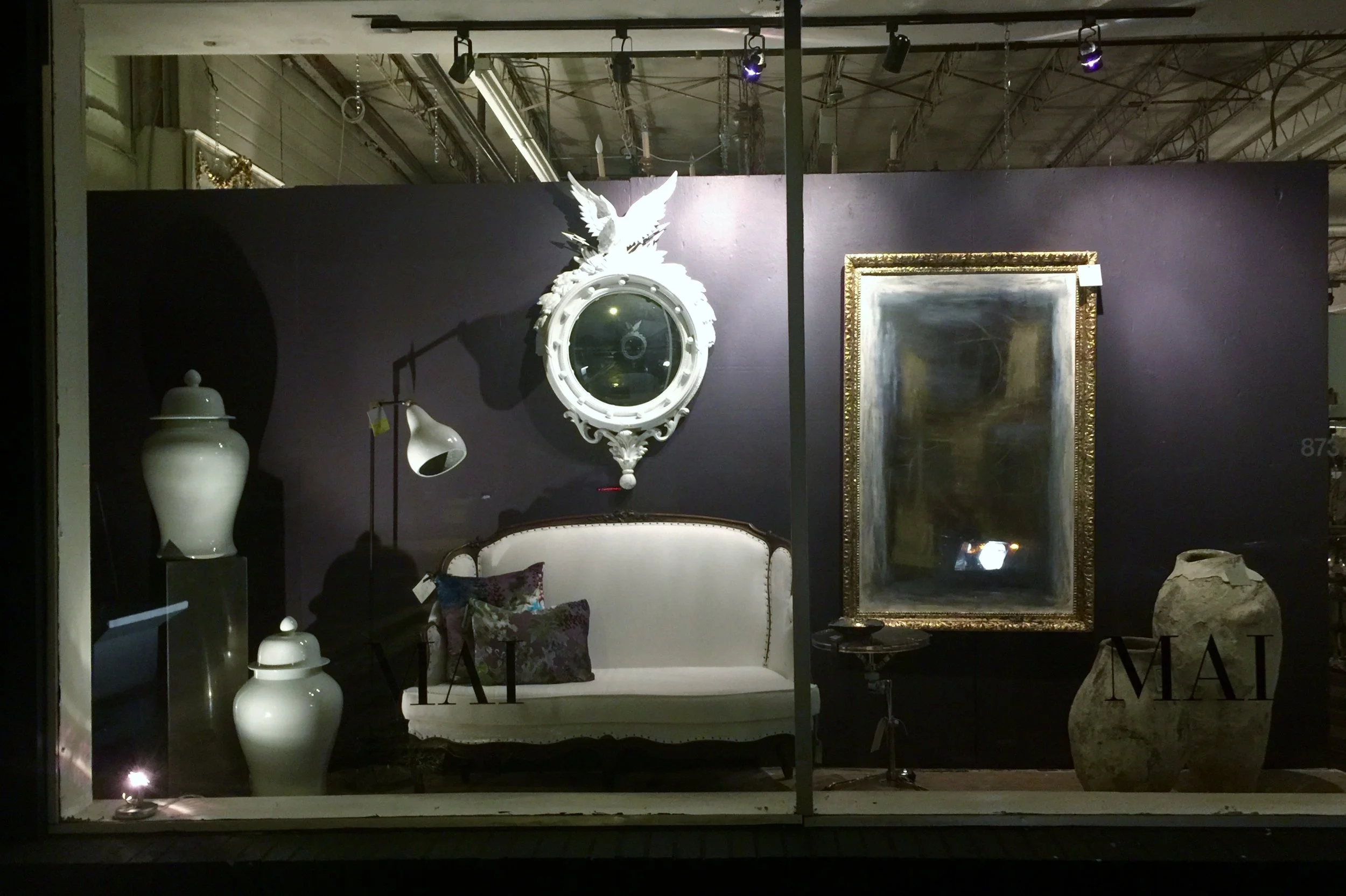
Instead we found that curvy settee upholstered in white and a gorgeous convex white Federal style mirror to contrast with our sexy wall color. The crusty urns provided some nice texture and I love the acrylic table top with a chrome drum stand base.
Home decor antiques shop window - Designed by Carla Aston
Home decor antiques shop window - Designed by Carla Aston
Home decor antiques shop window - Designed by Carla Aston
Night view of home furnishings decor window display - MAI, Houston, windows designed by Carla Aston
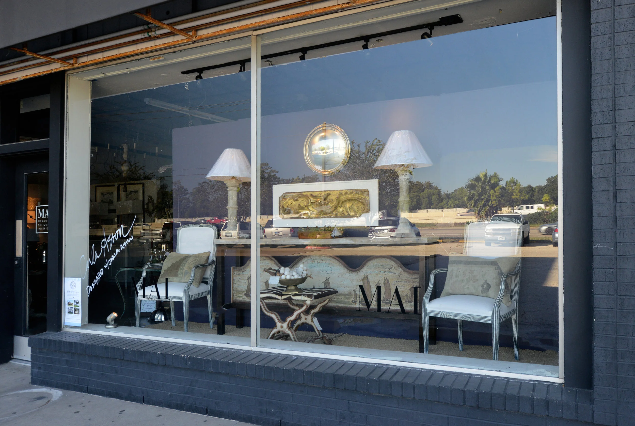
For the trad window side, I went with a long console that would anchor this window. I loved the Belgian artifact incorporated into the base, the painted ships, perfect for a vertical visual in this space.
This window has patina and texture in a symmetrical layout, and I brightened it up with the white touches in the framing, chair upholstery, and the gilding here and there.
MAI home furnishings window display - Designer: Carla Aston, Photographer: Miro Dvorscak
MAI home furnishings and antiques window display - Designer: Carla Aston
I got to sign the window when I finished! What a sweet moment. MAI Houston window display
(BTW, that first purple tinted pillow above sold before I finished the window! It was perfect!)
Benjamin Moore’s, Shadow paint color is a stunning backdrop. Right? Now, you can see for yourself how you can incorporate a trendy color with almost any kind of interior.
Sadly, for me, the painting sold the first week. (I wanted it!) :-) That’s how things go there, if you see something you love, you gotta grab it. It might be gone when you go back!
If you’re in the Houston area, head down to MAI and take a look. (And just imagine that painting in the window!) :-)


