The interior design challenge of a fireplace / tv wall is REAL, folks. I get these questions a lot!
This one came in through a Designed in a Click consultation. It concerned a long, blank wall in a new construction home and where to place the fireplace and tv on it.
Now, normally, you don’t get to decide where you can put the fireplace in a new construction home unless you are going custom. This home is in Florida, however, and there is no fireplace in the plan. This will be an electric fireplace that the homeowners are adding.
Here’s the floor plan she sent me.
See that long wall in the “Gathering Room”? That’s the wall in question.
She also wanted to know how to lay out furniture in this space. I really needed to figure that out at the same time I was designing the long wall anyway.
You can see the little room labeled PPC there off the main room? That’s for a little desk or workspace. This homeowner decided to make it into a wine room and want to cut that angled wall back to make a smaller space.
I loved that idea and went with that for the new layout.
Design Plan - Option 1
Because we need two clear pathways from the foyer to the kitchen and then from the kitchen to the Owner’s Suite, the furniture needed to be floated in the room.
If you’ll look back at the plan, there is a coffered type ceiling. You can see it is off-center to the wall.
I just felt this wall and room needed an asymmetrical layout.
A sectional sofa and two swivel chairs work well in this furniture layout. An asymmetrical location for the fireplace works with this layout. Carla Aston, Designer
The wall elevation ended up working out like this, below. I added a minimal, horizontal look tv cabinet and some floating shelves.
Fireplace / TV Wall Elevation
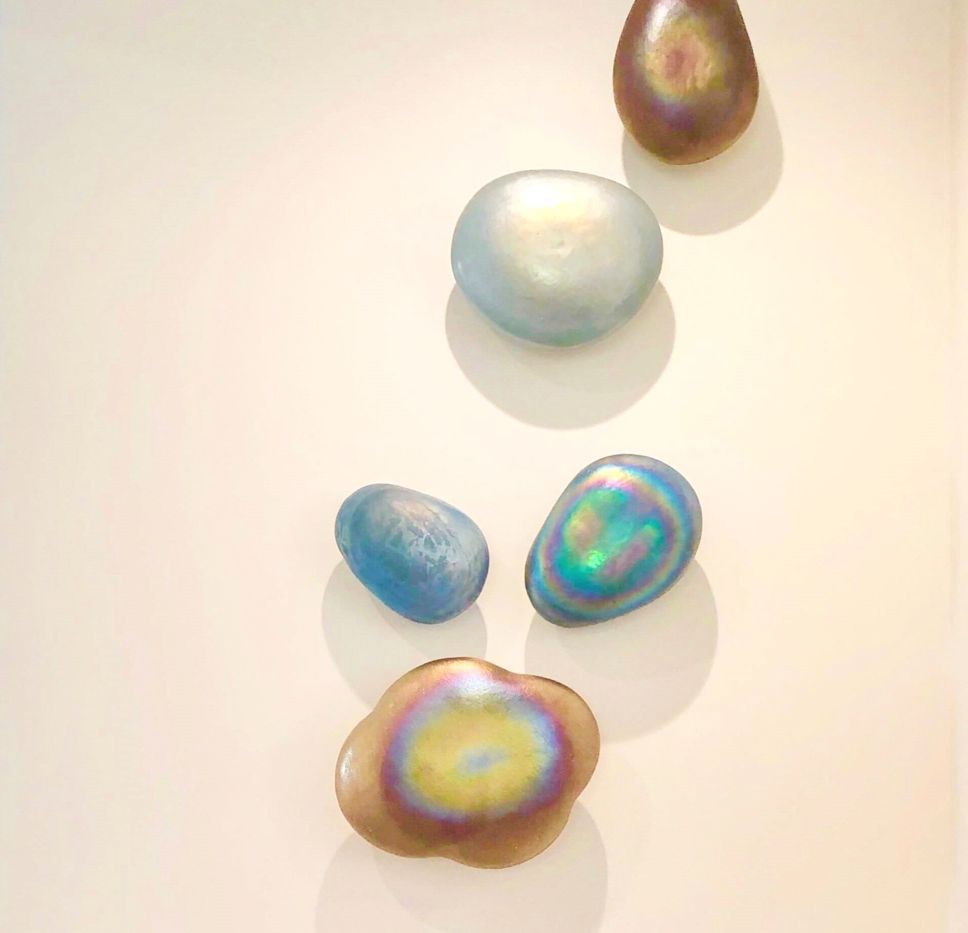
I like the idea of a tiled fireplace there, front and sides, with no mantel. She doesn’t have to do art, but if she did, I like the idea of something scattered like some of these below.
The art in the alcove could be a tall, narrow mirror or some stacked, vertical pieces.
As a far as materials, I think the cabinet and shelves could be a wood tone, like a walnut, and there could be wallcovering like a grasscloth or just a contrasting paint. It depends on the kitchen across the way, the tile selected and overall style desired, but she can add finishing layers in as she wanted.
Design Plan - Option 2
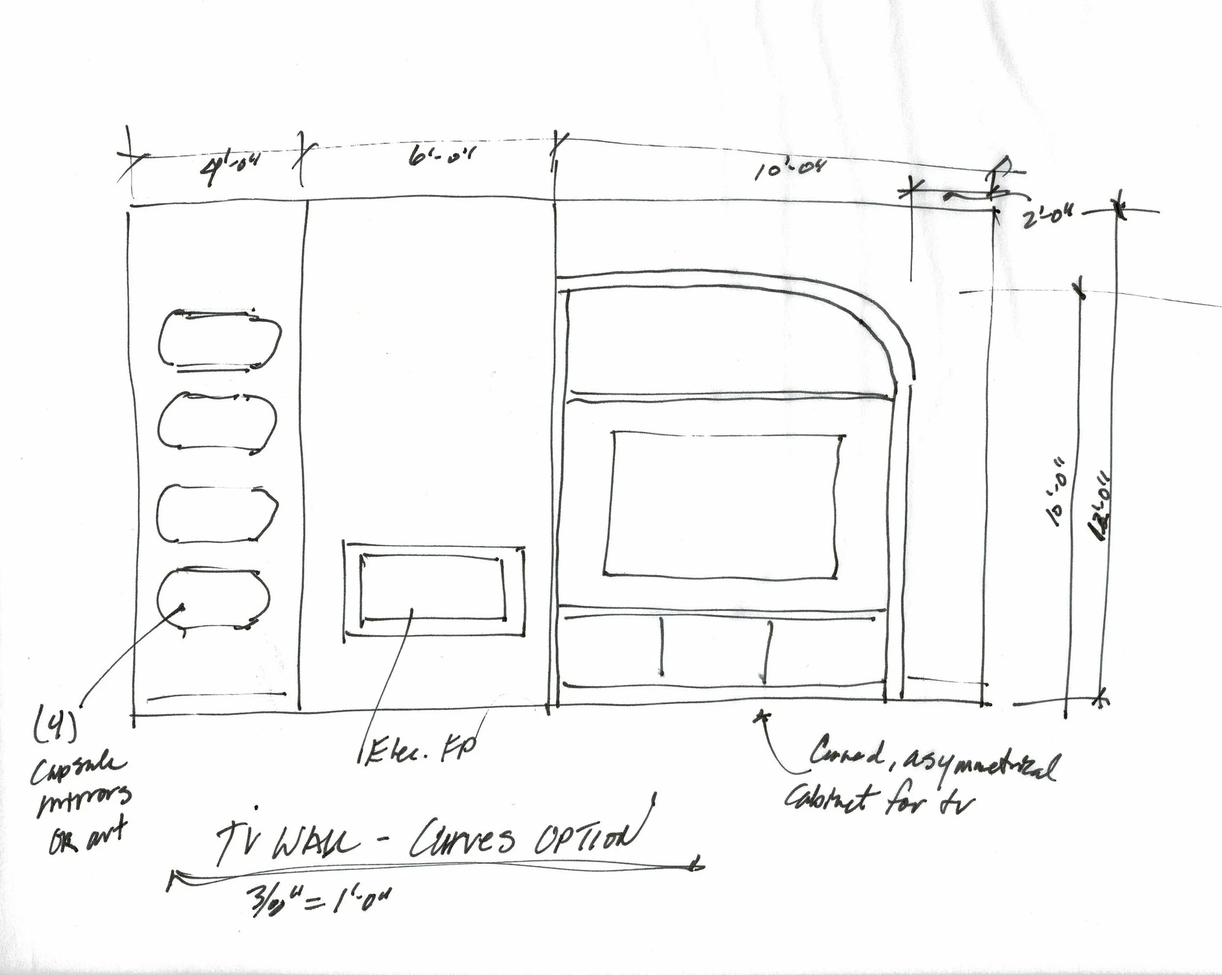
This furniture and wall layout were similar but I added some modern curves.
You know the curvy look is everywhere now, so I offered up this option.
A curvy sectional and some swivels work in this layout.
For the elevation, the fireplace tall section remains the same but I added a beefier built-in for the tv in an asymmetrical, curved. This reminds me of an 80’s look, but hey, that is popular right now. :-)
I like the first option best, I think it has more longevity. I did just want to experiment with this a bit though.
She could still do a curved sofa with the more squared off style of the first elevation.
Need some more fireplace / tv wall inspiration? I’ve got it below!
This blogpost was thoughtfully written by me, Carla Aston, and not by AI, ghostwriters, or guest posters.


![What to do with the big blank tv wall? [Plus a few more decorating dilemmas]](https://images.squarespace-cdn.com/content/v1/4fcf5c8684aef9ce6e0a44b0/1645377851354-W3LNJZM4D9O6F0LFEWGX/big+blank+tv+wall.jpg)
![Fireplace Wall Design Dilemma In A Rustic Mountain Home [Solved]](https://images.squarespace-cdn.com/content/v1/4fcf5c8684aef9ce6e0a44b0/1599227289788-9399JT9A3ZTI754G78CY/FP+Wall+mountain+house.jpg)
I have 3 TV wall challenges to share today with the solutions I presented in my Instagram subscriber group Q and A sessions.
These are problems that I see often out there, so see if any of these situations might be something you are dealing with now.