I recently had a Designed in a Click consultation with a reader who was overcome with the beige travertine in her newly purchased house and didn’t know how to minimize its impact to get the look she loved. She was about to embark on a considerable remodel and needed some direction.
I’m sharing my response to her today to help others out there who have similar problems. That beige and gray marriage thing can be tough. What will really make an impact here for her though, in my opinion, was combining it….. in a certain, particular place.
Her question:
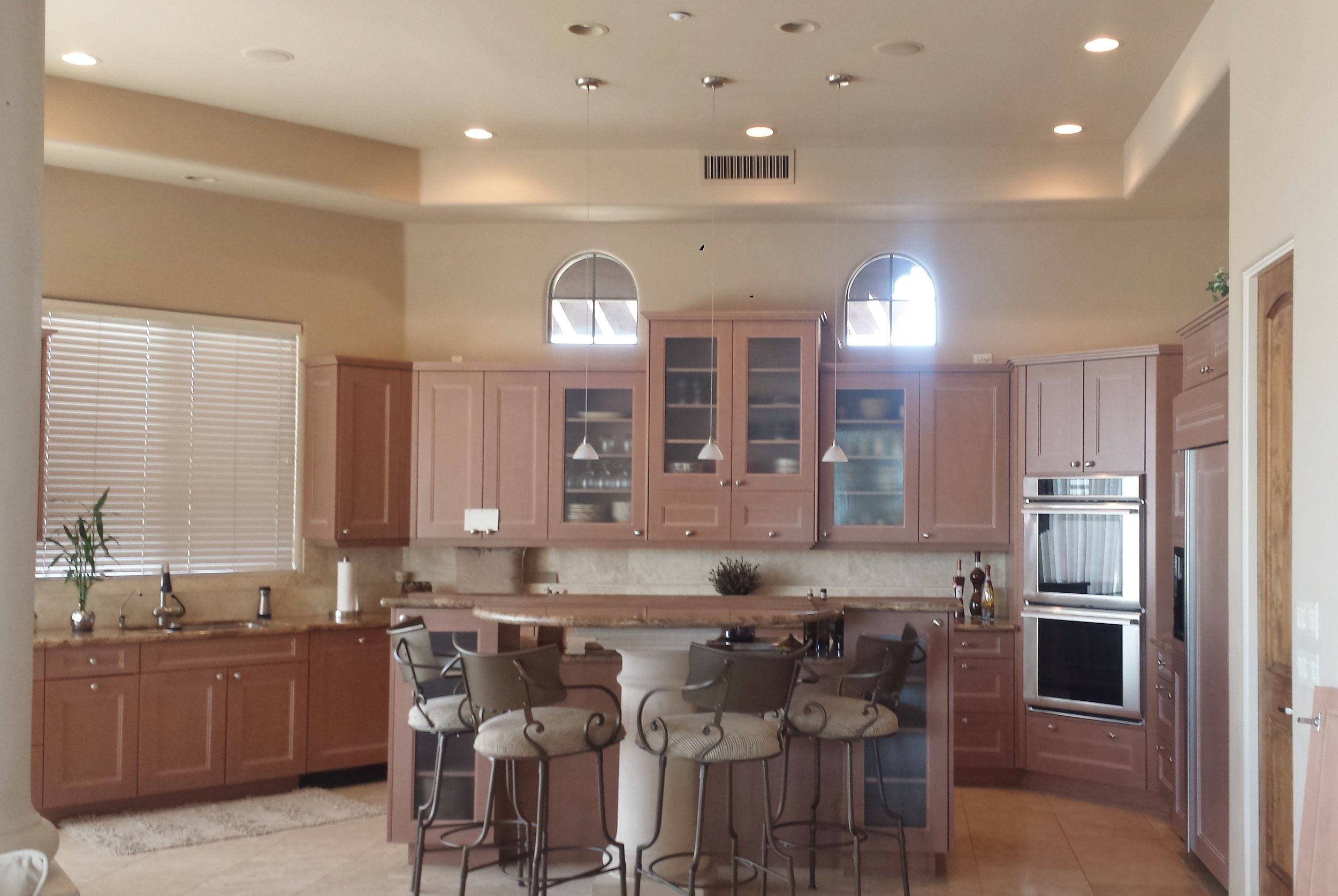
We purchased our new home, custom built in 2002, last November because of the location and view with the intention of remodeling the kitchen. I didn't imagine that this Torreon travertine (floor) would give me such a hard time. I have obsessively scoured Houzz, Pinterest, and decor sites like yours for ideas only to be left frustrated because all of my kitchen inspiration photos have wood floors. I feel like I'm being forced into a kitchen design that I don't love, all because of this floor. We just can't afford the expense of replacing it.
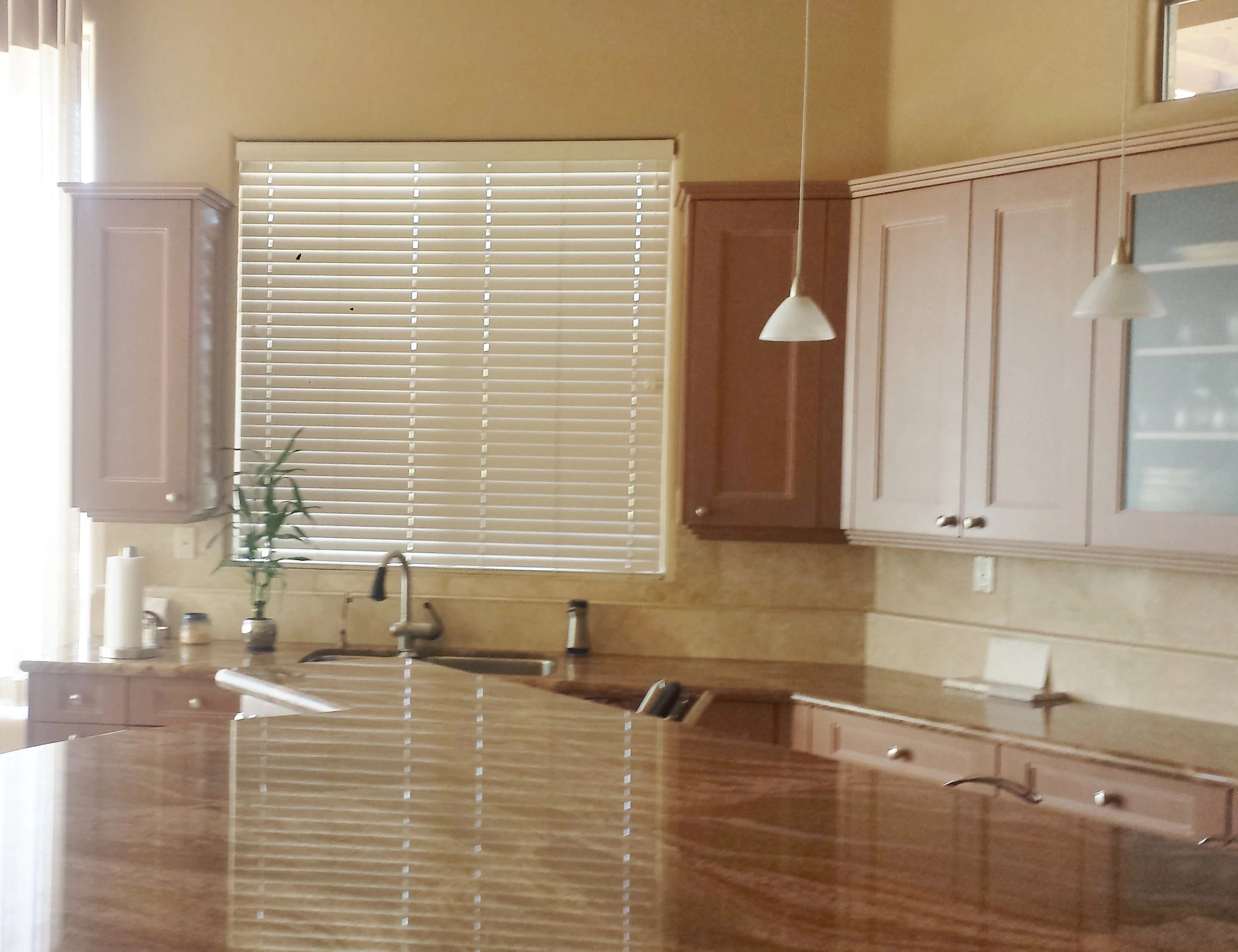
As you can see from the photos, the existing kitchen (as well as the rest of the house) needs a lot of updating. Everything is beige, beige, beige. Ugh! We are planning to redesign the island by lowering it to one level and will remove the pillar support (what were they thinking?!), have the hard wood maple cabinets painted (plus the interior doors in the kitchen the same color.)
We want to replace the countertops and backsplash. We are also planning to paint the walls (color recommendations welcome), replace the hardware on the cabinets, change the light pendants, add shutters to the arched windows above the cabinets (unless you recommend we extend cabinets upward), change the window blind to a coordinating roman shade, replace the bar stools and kitchen table/chairs, and replace the curtain on the curved window with a coordinating fabric. The cooktop is on the island (unseen in photos).
My biggest hurdles and where I especially need your help are with the counter tops, back splash, and cabinet color. I would like to know some options for each of these. I would appreciate any other ideas as well, including ideas for extending the cabinets up closer to the ceiling.
Here was one of my remodels which was in her kitchen inspiration folder.
I understand how people get frustrated with a lot of beige that is installed in the hard surfaces in their homes. It’s very expensive to rip out all that flooring and install something new.
However, there are ways to minimize its impact and to get a cooler or lighter look overall. I’ve written about them, all linked at the bottom of this post. They are really good guides to help you achieve a new look while working somewhat, with what you have.
Where can the biggest design impact be made?
When looking at a space, it is important to see where the high visibility or big impact can be made in a room. Affecting that element can often make a much bigger statement on the space than affecting other parts of the room. That “high visibility element” is often dictated by the architecture or layout of the space. It’s almost always the thing you notice first when you walk into a room.
In this space, that back wall is really where the biggest design impact can be made. That’s where significant change needed to happen to make this space feel fresh and up to date. It would also be the best place to mix that gray/beige scheme so that the combo seemed purposeful and thoughtfully designed.
My response:
I took a look at your kitchen, and here is what I would suggest. I like Taj Mahal quartzite for countertops and have used it many times. I think it would work well with the travertine floor. Taj Mahal varies a lot, so you'll have to find the right slabs for you, and I would recommend to go as gray as possible. They really look greige when I say gray, but they can tend to have some golden veins and then look more beige, so just watch the overall color of the slabs and try to find some with a cooler toned look.
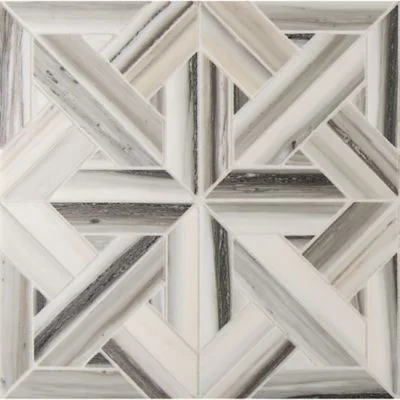
If you can find the right Taj Mahal, then I would focus on some wow backsplash tile that has some variation, like this Zebrino from Ann Sacks. I know this is pricey, but this is the idea.
You can see that it mixes gray, beige and white really beautifully.
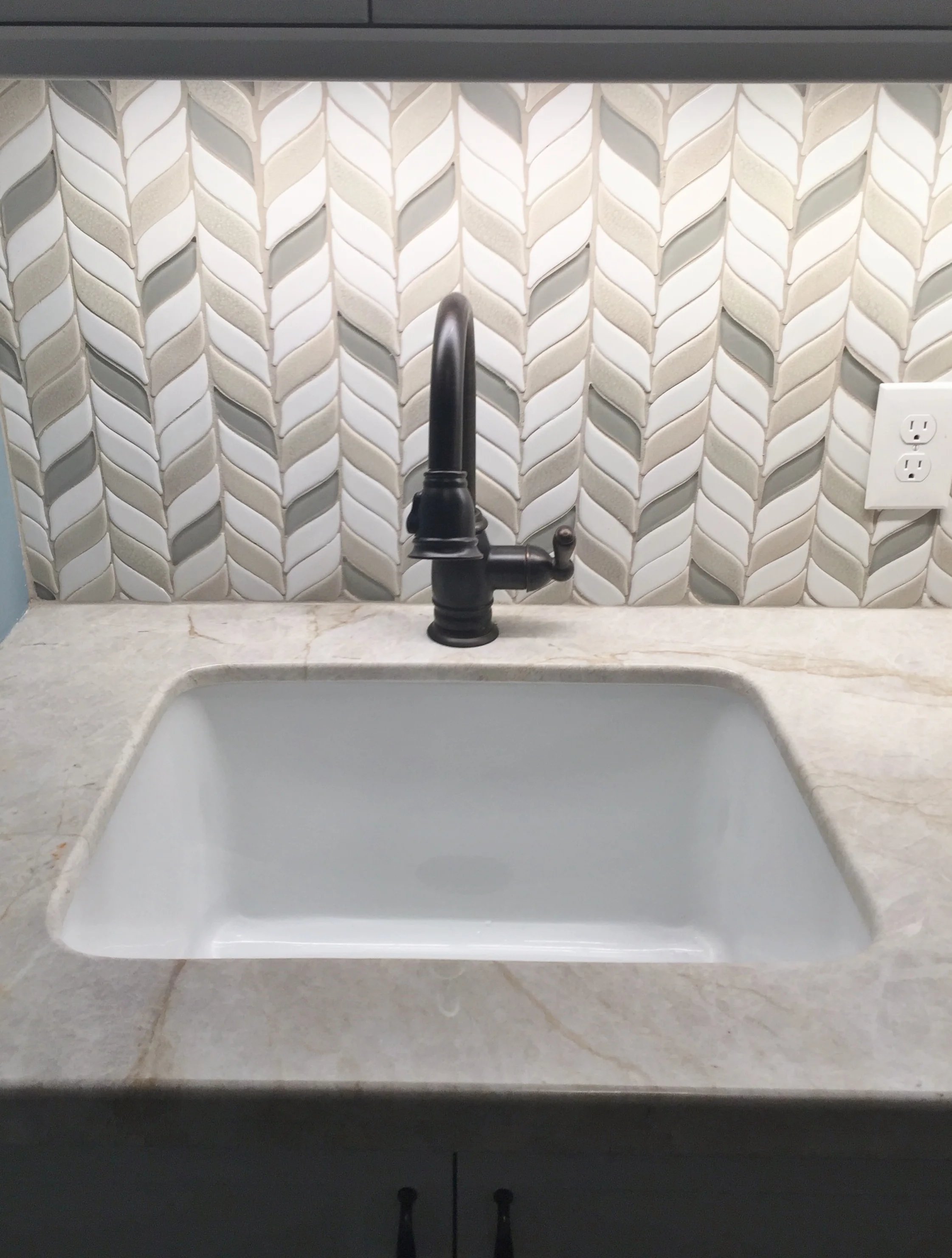
I saw this at a local showhouse with Taj Mahal, it's a mixed stone tile backsplash, possibly from Walker Zanger. Similar idea to the Ann Sacks tile.
ASID Showhouse Guesthouse Laundry Room - Designer: Latrice Gentry-Brooks
Your slabs and your backsplash will dictate your cabinet color, but I would go with an off-white. Keep it light and simple and really make the tile the star here.
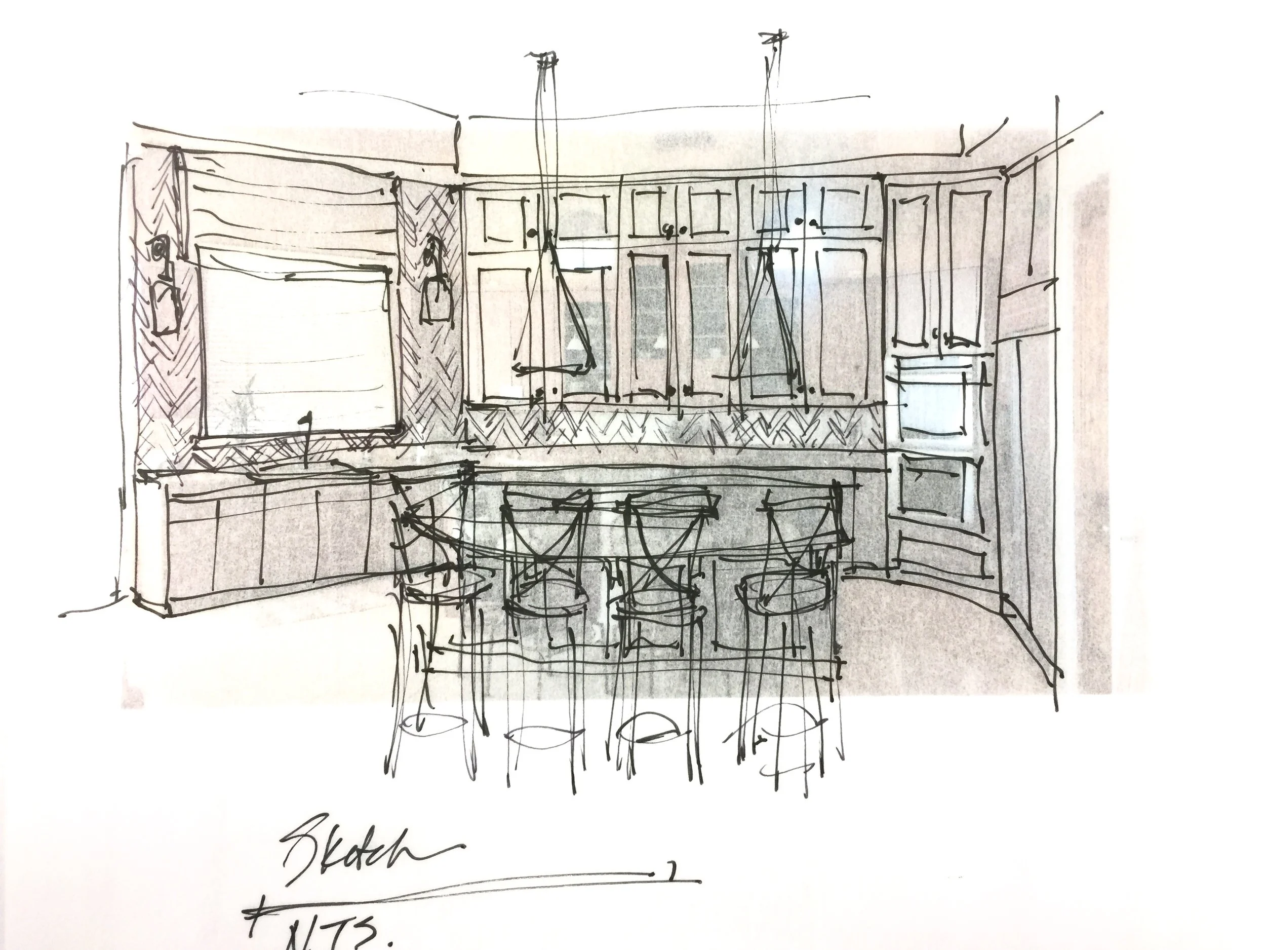
I've done a quick sketch to show you how I'd remodel your kitchen if I could modify the upper cabinets and the island. You could have a partially raised island at the bar if you want to hide your cooktop from view, but I prefer a rectangular shape with the bar part as a wide arched shape. I think it would compliment your kitchen nicely.
I also like going up to the furr down with your kitchen cabinets, taking out those little windows. Those cabinets up high can be glass paneled if you like, to break up the wall of white wood panels.
At the sink, I'd remove those two skinny upper cabinets (the size of the window makes them look small and they look squeezed in to me). Trim out the window with some wood framing, and then go up to the furr down with the tile. You can add some sconces on either side of the window and then do a window shade either in fabric or a woven wood type for some texture if you like.
Add in some cool pendants over the bar and you've got a brand new kitchen in a style that makes the space feel up to date and grander in appearance.
The place to start with the color selection is with the counters and finding the grayer Taj Mahal slabs. Then select the backsplash and paint colors to go with it. That has to be done in person at your local slab yards.
Can you see how affecting the cabinetry on that back wall makes a big impact on the design of the kitchen? Those little arched windows weren’t doing her any good really, it was a view to the underside of the structure outside. They were a dated shape and really limited her opportunity to make for a grander space.
The mix of gray and beige in the tile is highlighted by carrying the tile around that window.
Allowing that big window over the sink to breathe on each side creates more interest toward the view beyond. It serves to show off the tile, which does an excellent job of mixing beige and gray AND tying in the existing floor to her new, grayer countertop choice. Placing some sconces on top of tile helps to highlight that finish as well.
Larger, more impactful pendant lighting helps to fill up the tall space and please…...that quirky island is just too tricked up. (I’m sooo not a fan of weird “creative” island shapes. They often date themselves fast.)
If you are struggling with some kind of beige and gray combination or would like to read further info about many of the design concepts I’ve discussed above, I’ve conveniently linked them for you below. :-)
Oh, and don’t forget to subscribe to get more tips, tricks, and design goodness delivered directly to your inbox. The sign up is located on my sidebar. If viewing on a mobile device, just keep on scrolling.





Have you been wondering when the pendulum was going to swing back to beige and warm color tones in home decor and design? When will we be done with gray?
Maybe you’ve been secretly wondering……“When will my travertine floor come back in style?” :-)