We’ve been working on lots of bathrooms lately. These three upstairs baths are for a former client of mine who just needed to freshen things up a bit. They want to put their house on the market, so we are updating for resale.
We don’t want to be too taste specific or spend a boatload of money. However, updating countertops, paint, lighting, and tile surrounds at the tubs are in order for a fresh and more inviting appeal. Their digital boards turned out nice and I wanted to share them with you today.
Most likely, potential buyers will have children living up here, so we stayed neutral and kept them all somewhat similar while giving them a bit of an individual look.
Here's how they look now, not bad, but kind of lackluster.
Before remodel - upstairs bathroom
Before remodel - upstairs bathroom
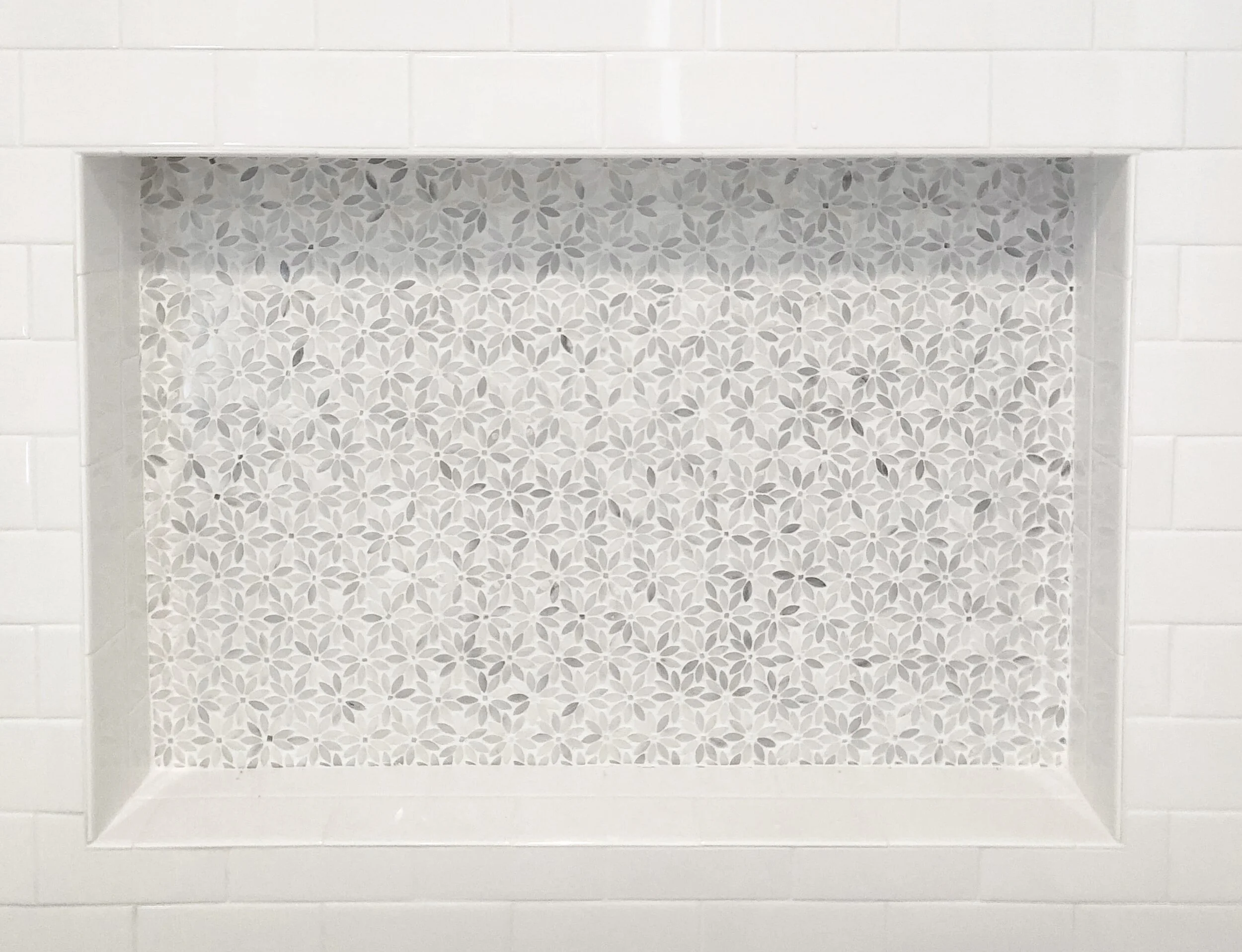
We are tiling to the ceiling at the tubs and then adding in large shampoo niches to give them an upgrade. I like to make shampoo niches a real design feature in a bathroom and besides, a big niche is always useful and appreciated!
Here’s a cool one done on another job in a girl’s bathroom.
Shampoo niche in girl’s bathroom with flower marble mosaic tile.
Since these are not huge bathrooms, I wanted to select a countertop where we could get all three counters with backsplashes out of one material. We’ll also do a shelf in the niches in the same product too. I chose a Caesarstone quartz, Frosty Carrina. It has soft white look with some grayish subtle veining. I’ve used it before and really, it goes with almost anything, is bright and super durable.
Bath 1 Remodel
In Bath 1 we wanted to go with some navy cabinets. Navy is the new black, right?
We've done it recently in this kitchen and then in this bathroom and I love it!
We’re painting the cabinets, adding some chrome pulls, a new faucet and cool light fixture. Then the shower surround will be a standard white subway with this navy Arabesque shape tile in the back of the large niche. Love the fringed shower curtain too!
Bath 2 Remodel
In Bath 2 we will keep the cabinets white, paint the walls a soft gray, go with some brushed nickel metal finishes in here and then do a light gray mini-brick tile in the niche. The shower curtain adds some pattern and interest.
Bath 3 Selections
Bath 3 will have a darker gray cabinet color for some contrast. We’ll use the same white subway tile to the ceiling, but with a dark grout to create a pattern and add some life to this bathroom. The darker penny tile will go in the back of this bathroom’s niche. I love the whale shower curtain in this bathroom.
You can see there are some standards and consistency with the subway tile, the Caesarstone counters, and the design of the niche. The plumbing fixtures and cabinet pulls are consistent too.
Where we individualized each bathroom was with the tile in the niche inset, the light fixtures, paint colors, and shower curtains. It is just enough of a difference to create a memorable space and help sell this house. :-)
I’ve got my handy Bathroom Design Guide to share here today. If you need some help planning your bathroom remodel, my project checklist can serve as your go-to source so you don’t leave anything out and can thoughtfully design the bathroom of your dreams!
Click Here >>>> Bathroom Design Guide
I’ve got more secondary bathrooms to inspire you from other jobs. Take a look at these:


I’m sharing 3 more new bathrooms, these with some fun tile, from my recent project reveal. You’ll love seeing these…..