I’m sharing 3 more new bathrooms, these with some fun tile, from my recent project reveal.
This family home has two upstairs baths that will be used by the children and then I’ve got the powder room, downstairs, that has a striking tiled wall.
powder bathroom
Since the powder room was going to get the wood floor flowing in there from the hallway, I decided to go with a tile on the wall to create an interesting view into the bathroom.
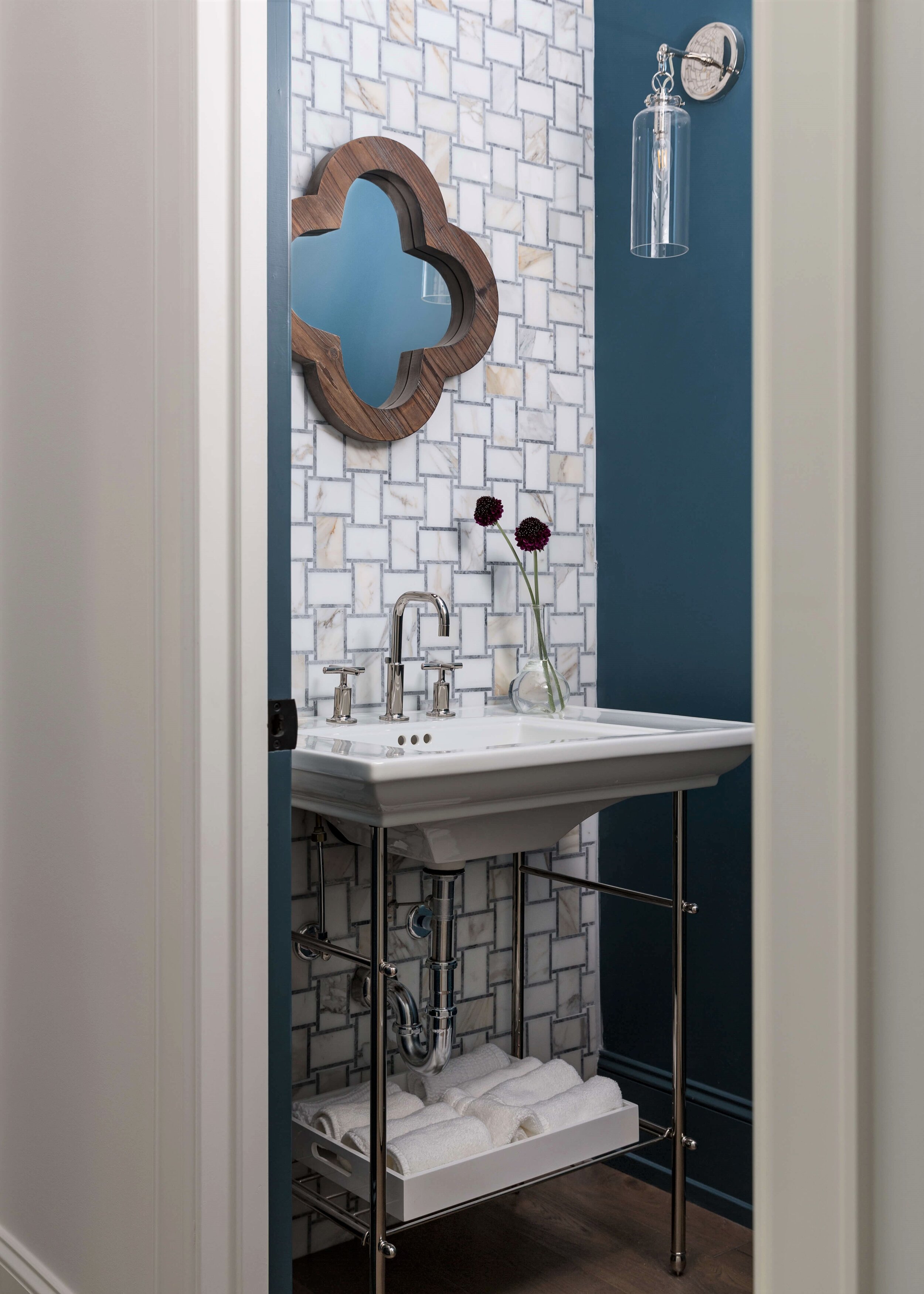
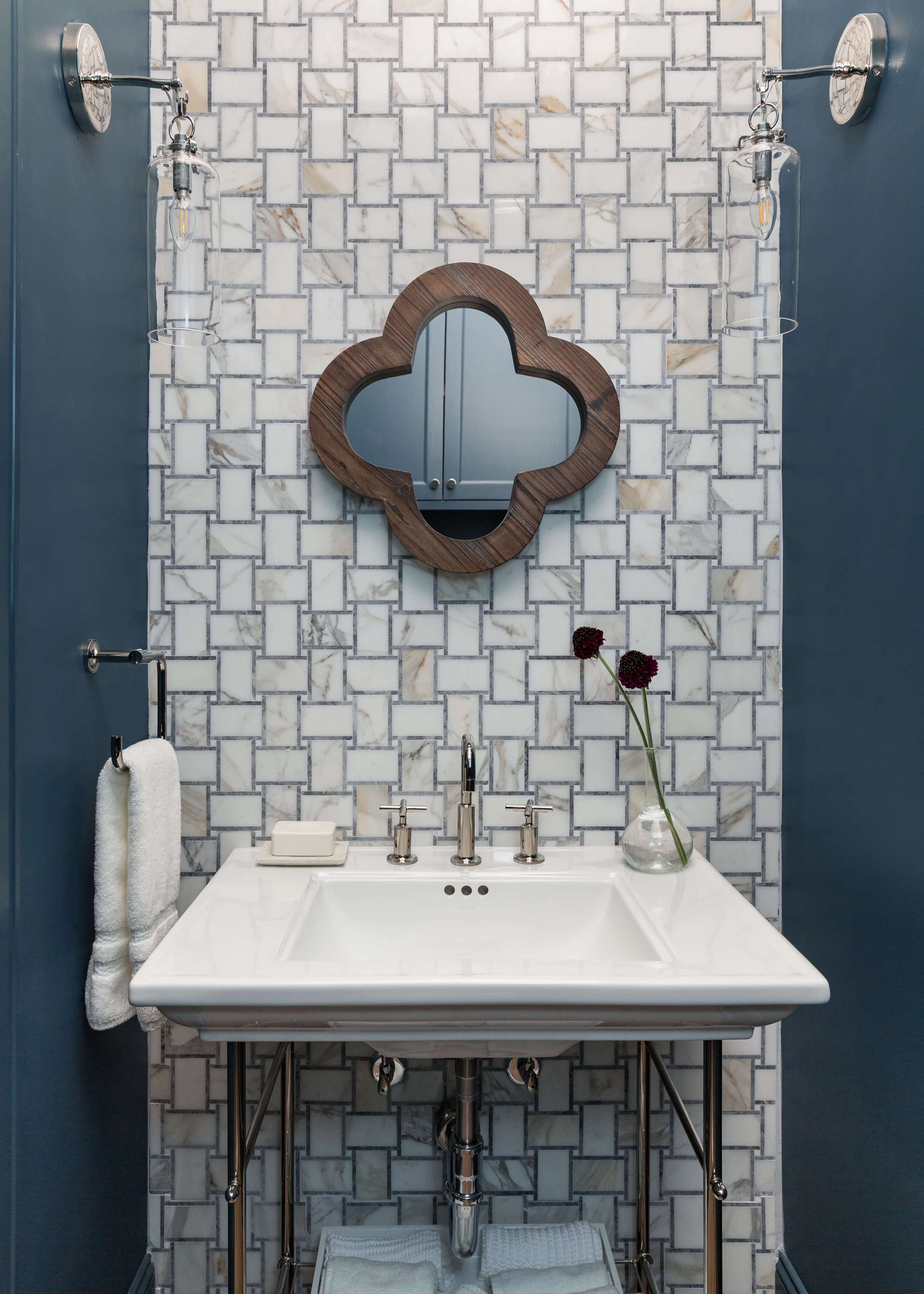
Here’s a peek into this powder bath with the beautiful marble mosaic tiled wall and striking constrasting paint color. Carla Aston, Designer | Colleen Scott, Photographer
I’m getting so tired of the usual pedestal sinks in powder rooms too, I used this open metal look that reminds me of a hotel bathroom. I love how you can fully see the tiled wall.
That mosaic tile is from Arizona Tile and it has such a nice mix of a warmer white marble with gray in the basketweave design.
I didn’t want to cover up the tile with a big mirror, so we went tiny, with this small one from Pottery Barn. It brings the wood element up on the tile wall nicely, I think, and I like the clover shape. It speaks to the rustic style that is evident in this home.
As a powder bath, no one is going to be shaving or doing a major make-up sesh in here, so a tiny mirror is just fine. :-)
The Kohler Purist faucet and simple sconces also add a bit of modern touch to this bath, also echoing some of the design elements in this home.
You can see, in the pic below, the cabinet we did above the toilet for storage, so we didn’t have to do a cabinet at the sink. Painted the color of the wall, it blends in nicely.
This pretty tiled wall in a powder room is such a gorgeous, quality feature. The white marble mosaic tile contrasts nicely with a deep, bold paint color, Sherwin Williams Bunglehouse Blue. Carla Aston, Designer | Colleen Scott, Photographer
The Kohler, Purist faucet is a fave of mine for it’s height and clean lines. It brings a modern look to this powder bath and looks great in front of the marble mosaic tile wall. Carla Aston, Designer | Colleen Scott, Photographer
Upstairs Bathroom 1
This bath has the fun tile in the tub area.
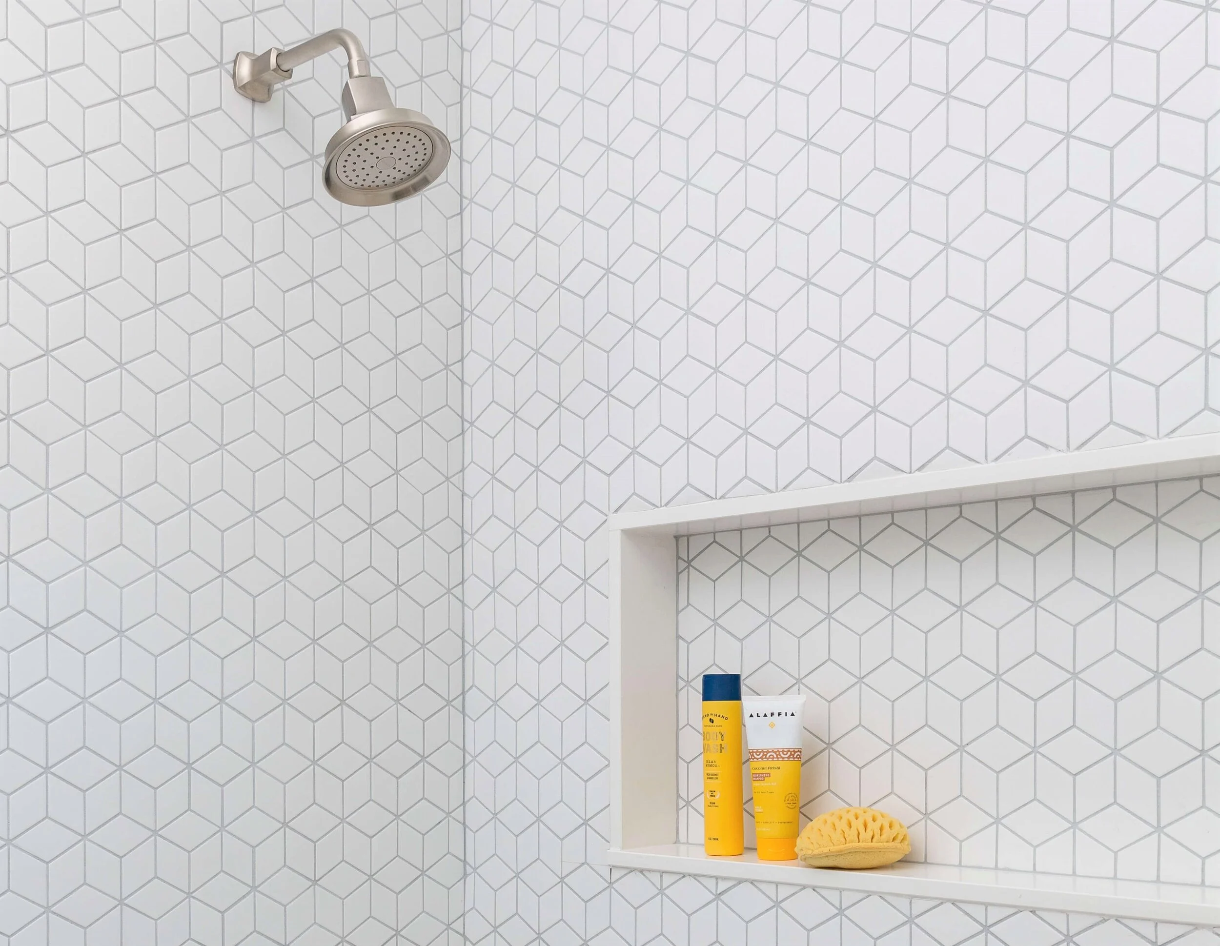
I used a horizontal style subway tile in several places in this home, and wanted to do something different in this bathroom. I selected a simple 12 x 24 strie look tile for the floor and then put this cool geometric patterned tile on the walls of the tub surround.
The installer did an amazing job of matching the pattern in the corners there!
White tile with gray grout makes the pattern stand out nicely without being too busy. The quartz slab pieces that frame out the shampoo niche make for a neat and tidy look. Carla Aston, Designer | Colleen Scott, Photographer
This sweet oversized shampoo niche is handy in a child’s bathroom. The quartz slab framing makes for easy maintenance and a tidy look overall. Carla Aston, Designer | Colleen Scott, Photographer
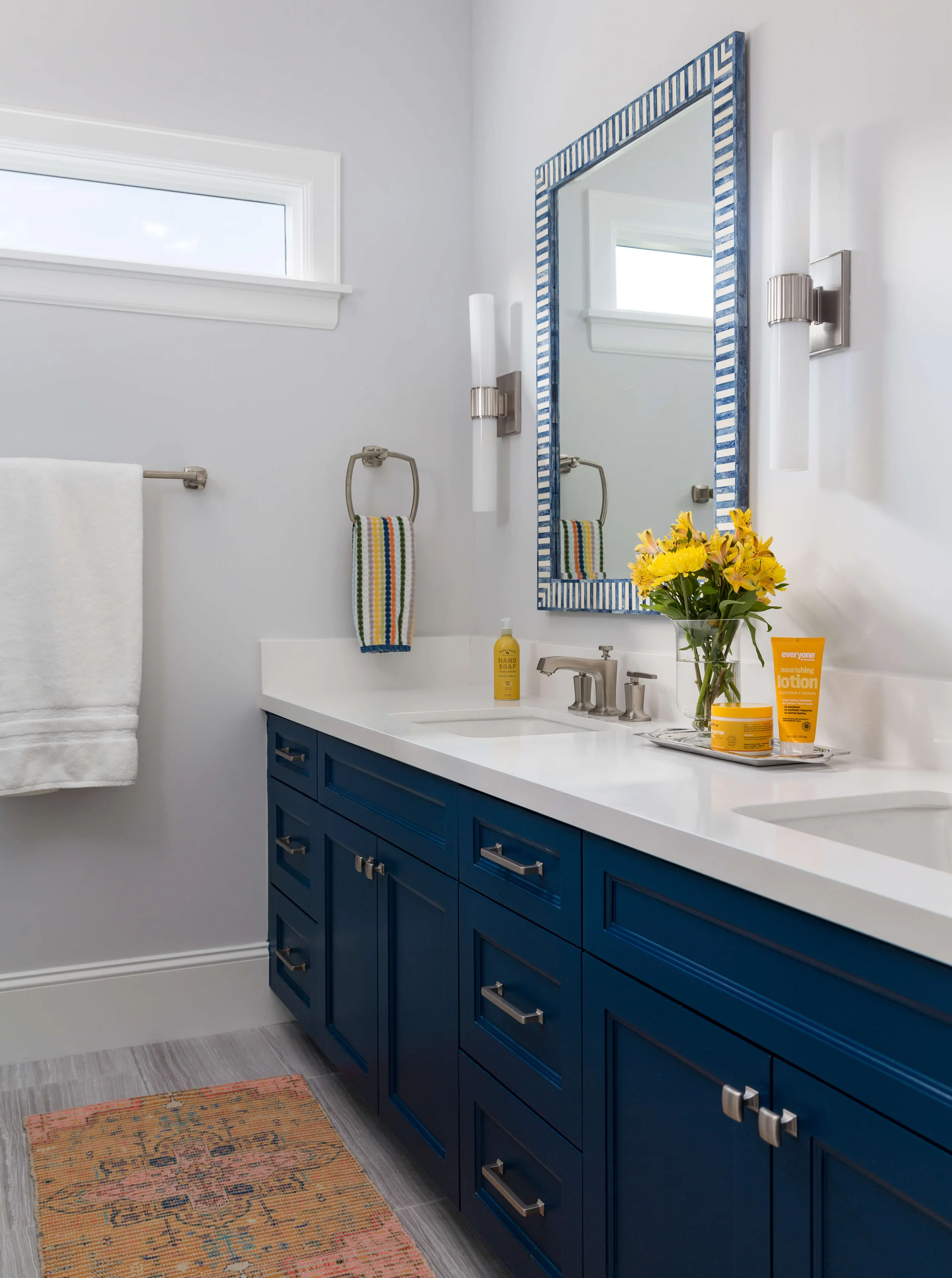
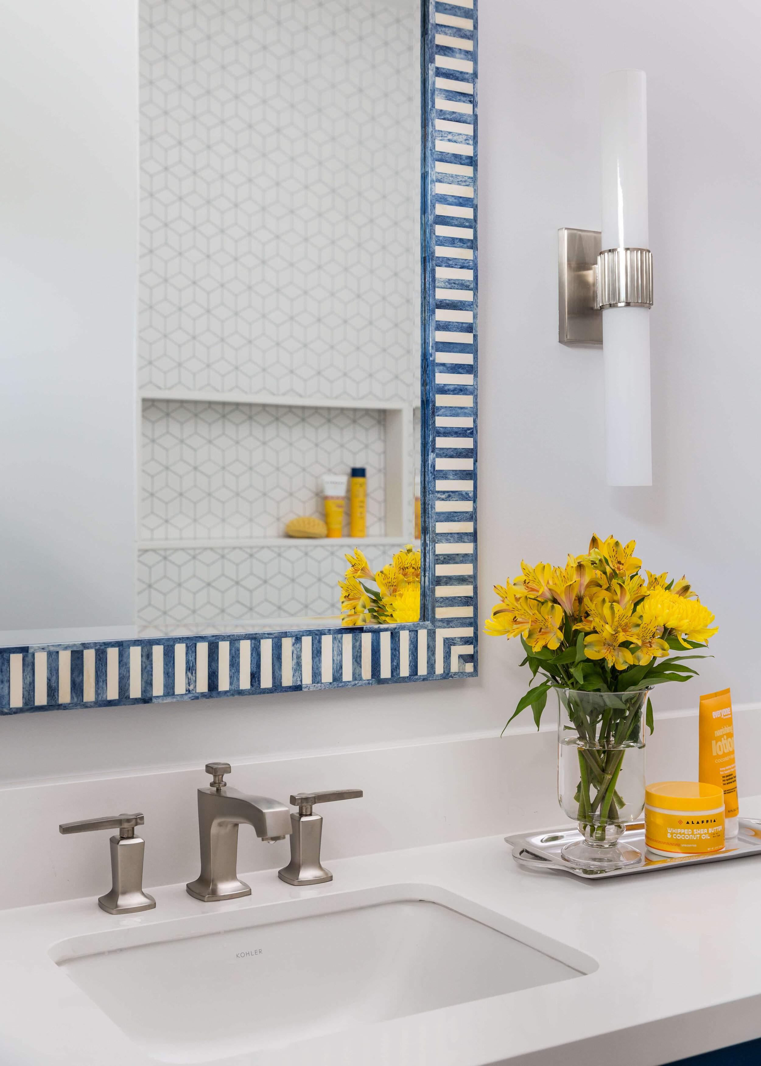
The opposite wall has the vanity and sinks. Painted a bold blue, with pristine white quartz counters, the Serena and Lily mirrors add the fun factor on this side of the bathroom.
I couldn’t help but bring in some yellow accents here, contrasting with that pretty blue bathroom cabinet and blue and white mirror. Carla Aston, Designer | Colleen Scott, Photographer
You can see the geometric tiled tub surround and niche in the mirrors. The patterns are subtle but play nicely together here.
Fun blue and white mirrors add color and pattern to this side of the bathroom. Carla Aston, Designer | Colleen Scott, Photographer
Upstairs Bath 2
This was a new bathroom added upstairs and it had space for this fab new shower. The patterned floor makes a cool statement and the color of the cabinetry was selected from that.
This roomy shower has some pretty sweet details and a useful shampoo niche. Carla Aston, Designer | Colleen Scott, Photographer
There’s no need for busy wallpaper, or a lot of pattern on the countertop material in this bathroom since the tile floor packs such a punch. Carla Aston, Designer | Colleen Scott, Photographer
More tile installation goodness here too!
When I have a good sized bathroom to design, I usually use the slab material on the curb, seat and at the shampoo niche. Sometimes on the jambs of the shower too, like I did here.
I used the quartz slab material that I also used on the bathroom vanity, on the shower seat and at the shampoo niche. Carla Aston, Designer | Colleen Scott, Photographer
Quartz slab material on the shower curb makes for easy maintenance and a tidy material transition. Carla Aston, Designer | Colleen Scott, Photographer
Love the penny tile in this oversized, statement shampoo niche. This upstairs bathroom makes getting ready for school in the morning a little more fun! Carla Aston, Designer | Colleen Scott, Photographer
Did you happen to miss the rest of the bathrooms and the kitchen of this family friendly home? I’ve got them linked here, below.
Kudos to the other pros on this job!
Billy Lucas - Lucas Craftsmanship
Gail Schorre - Morningside Architects
Colleen Scott - Colleen Scott Photography
Check out my Bathroom Design Guide to help you make decisions on selecting products and design features for your next bathroom project!





I am sharing a beautiful laundry room here with you today, Design Lovers! This one is light, bright and boy, do I wish I could do laundry in a room like this!