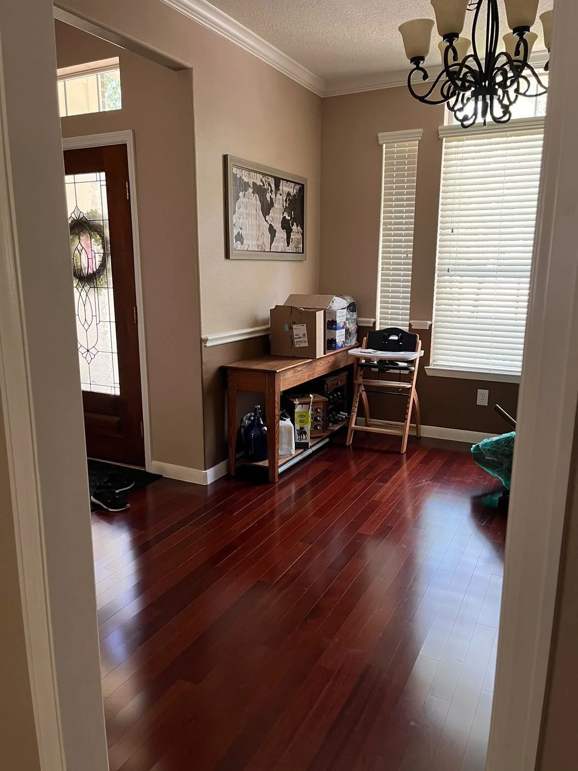
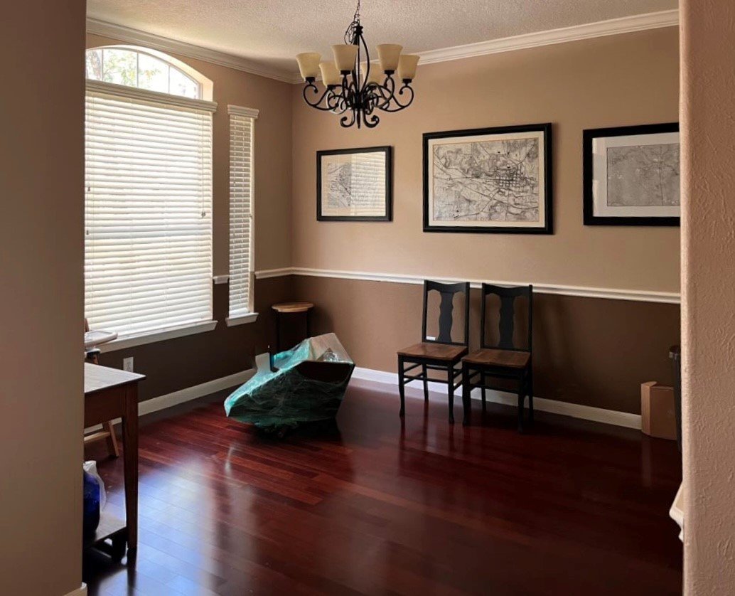
A recent Q and A involved a dining room that is going to become a playroom.
This is a popular concept theses days, converting formal dining room spaces. We want to use every inch of our homes and formal dining rooms are not exactly highly used spaces.
How can the homeowner make this look presentable and nice, while still being a fun, functional space for the kids to play?
I know it is so tempting to put bookshelves all along that back wall and fill them with toys. However, I think that will end up making this front room of the house feel a bit like you are walking into a child care center.
My blog contains affiliate links. Any purchases, at no additional charge to you, render me a small percentage, are most appreciated and make this blog possible. :-)
Dining room is right off the front entry - Design Dilemma Q&A
Dining room to convert to a playroom | Design Dilemma Q&A
First, I would consider some French doors here so that in a pinch, if someone was at the door and the room was a mess, you could pull the doors shut. You can do window film or get frosted glass for privacy, but still have the French door look.
While she may like everything open so she can have a watchful eye on the children, it is nice to pull the door if someone might have dropped off to sleep while playing or just needs a quiet place to be alone.
I did these for my own home office and it was the BEST investment. I don’t shut my doors much, but when the occasional person stops by and I’m in my pj’s in the office, my husband can pull the doors and answer the front door. Also, if the doors are shut, he knows I’m not to be interrupted. :-)
French doors to my home office with window film for privacy. carlaaston.com
First I’d paint the walls, I’d probably go with the same white that is on the trim, because colorful things will be going in here and not much wall space exposed. I think it should be bright and fun in here.
The big visual impact will be that long wall, so that’s where we want to have it look as neat as possible but get some use out of it too.
I’d do a small sofa in a performance fabric or a slipcover for that wall. It will be nice to have a comfy place to sit and will be much more pleasing to look at from the entry. A small sofa against the wall doesn’t take up that much room either.
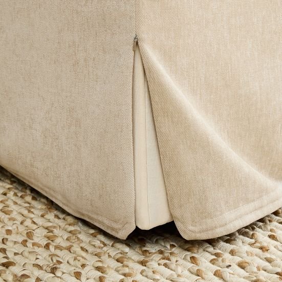
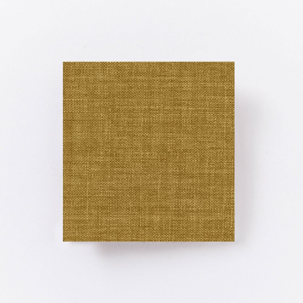
Here’s a fitted slipcover sofa which is rather small. I like the boxy shape here. I’d do it in a color, West Elm has it in yellow or blue, among other colors, which would be fun.
Zippered slipcover
Yellow fabric for slipcover
Fun pillows on top of that would be nice.
Add tall bookcases on each side for storage. Obviously, these need to be secured to the wall for safety purposes. I like these navy ones to add contrast and some color to the wall.
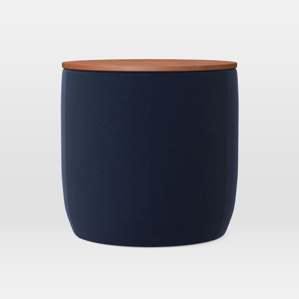
A play table at the window works well. Storage ottomans can be moved out of the way when the kids need the whole floor.
Bright yellow child’s chair
White and wood child’s table at the window
The wall behind the corner can house a cabinet for storage and even a tv.
Carpet squares by FLOR would be good here or a polypropylene, indoor/outdoor rug. I like a rug with a pile, instead of those washable rugs, as it will be more comfy to play on.
And of course, we don’t need a dining room chandelier anymore. Maybe a fun light fixture or even a white, modern ceiling fan would work.
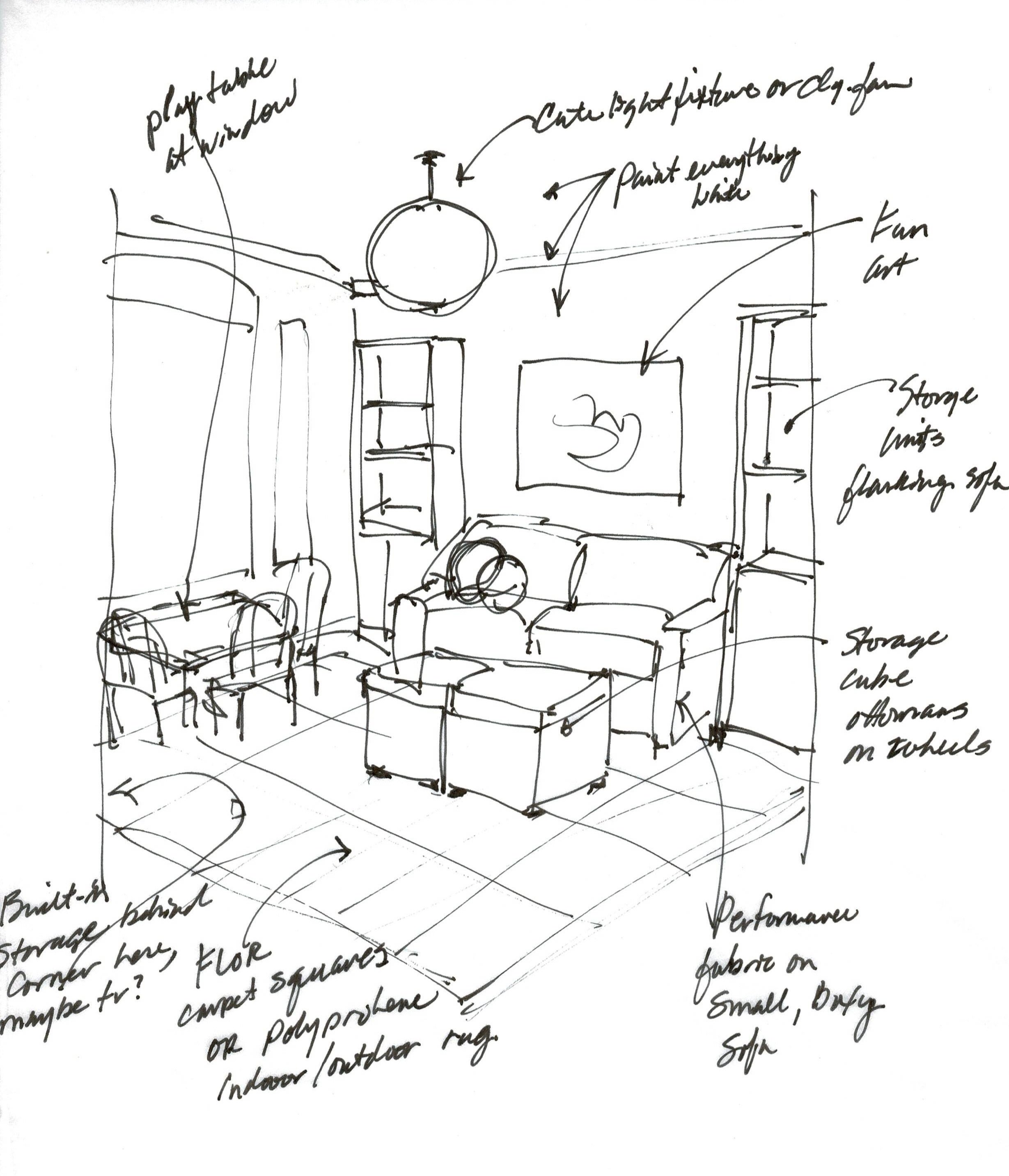
Here’s the sketch of what I was going for. (Typically I do the sketch and then find the products.)
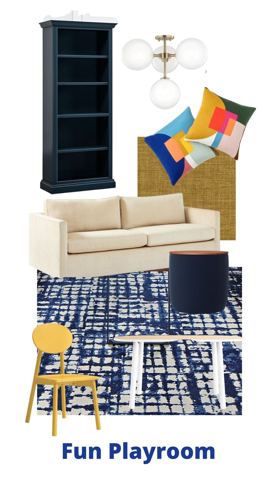
And here’s a little storyboard of what I would pick for this room.
The playroom was a dining room BEFORE. Now it is pretty and durable place for kids to play and hang out. carlaaston.com
With all my Designed in a Click consultations or the Instagram Q&A’s I do once a quarter, these are meant to give direction on design. It’s up to the person who submitted a question to do as much as they want or adapt it to their personal tastes and desires.
They have to check dimensions of their spaces with the dimensions and colors of any products too, as I can’t be on site to verify. A quick Q&A is much too short for me to get enough info to do a completely perfect full blown design plan.
You can check out more of these at the links below!









![What to do with the big blank tv wall? [Plus a few more decorating dilemmas]](https://images.squarespace-cdn.com/content/v1/4fcf5c8684aef9ce6e0a44b0/1645377851354-W3LNJZM4D9O6F0LFEWGX/big+blank+tv+wall.jpg)
How to make this kitchen less gold toned, with only a partial remodel? Find out by clicking through….