Decorating walls is always a top challenge among my Q&A clientele.
It was no different this time around in my recent July Q&A, so let’s revisit a few of these decorating problems to see if there are some good lessons to learn.
These particular ones are common problems I see.
Wall space above sectional sofa
Big, blank wall space
Awkward wall space on each side of bedroom dresser
Mirror or art? When is one better than the other?
My blog contains affiliate links. Any purchases, at no additional charge to you, render me a small percentage, are most appreciated and make this blog possible. :-)
1) wALL SPACE ABOVE SECTIONAL
Sectionals create really long, wide walls to decorate above. I get a lot of people asking what to do with these wall spaces.
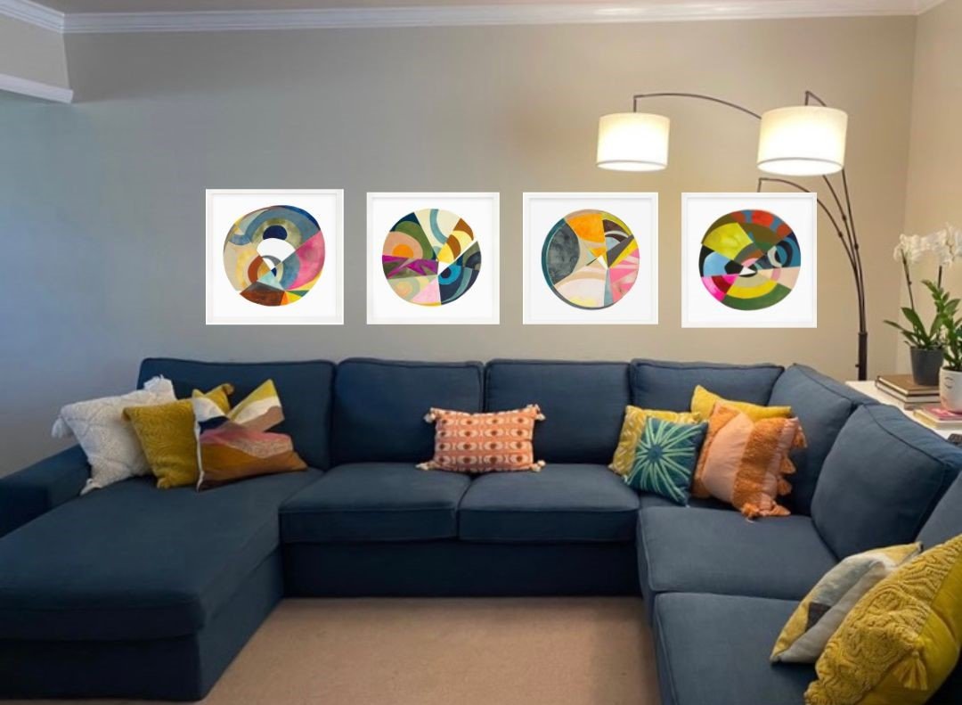
I loved this fun look here, a nice family room with lots of comfy seating for tv watching and hanging out together. But how can we decorate this long wall?
I really loved that she did that arc floor lamp. I often put those in my sketches with sectionals since you can’t do an end table with a lamp. This one adds height and interest there in the corner, as well as light. Perfect!
I also love the colorful pillows on the blue sofa and I think we should pick up that look in the artwork above the sofa.
In this case, I like doing something repetitious in a line, running the length of the sofa. Oh, and I found just the perfect artwork from Serena and Lily, by Sara Matsen Westover…..
2) Big Blank Wall Space
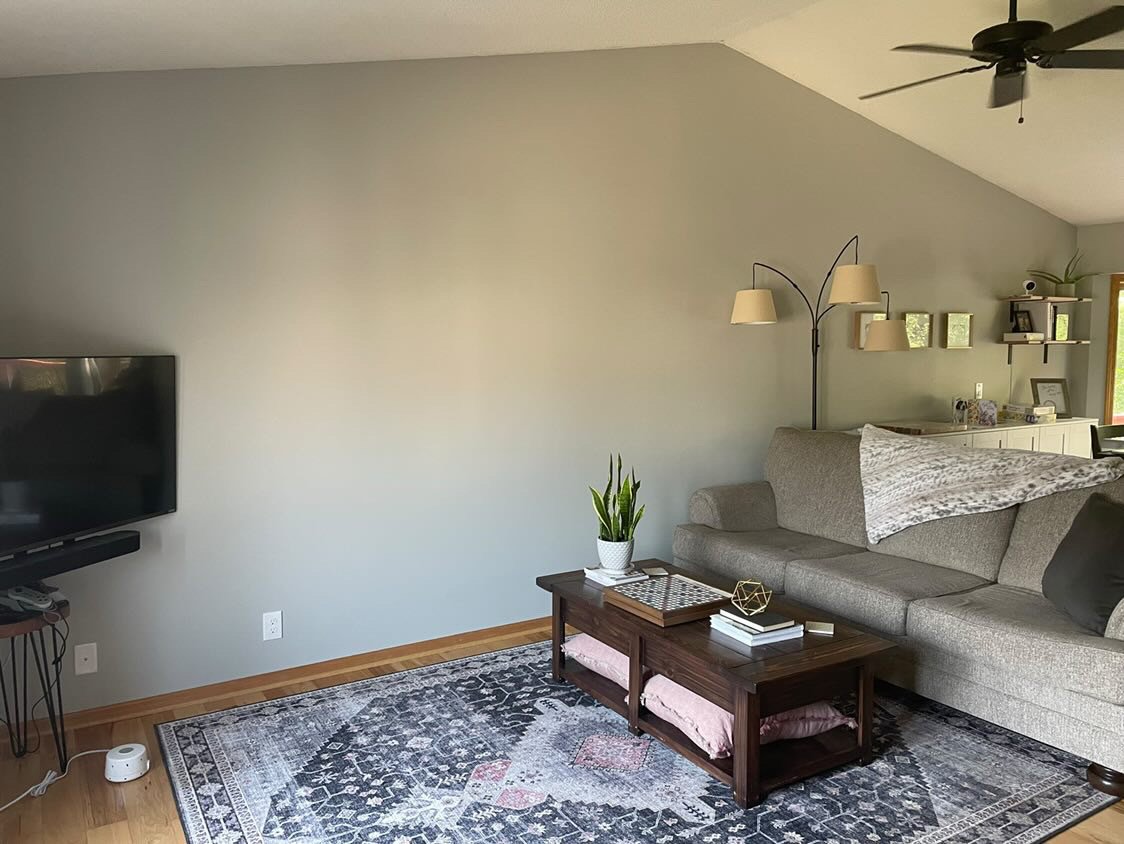
In this situation, like many others, there is just a big blank wall space to deal with.
This room is open to a stair on one side, open to the dining room on another and then has windows at the front. If you are like me you were probably asking, why not put the sofa, some end tables and lamps against the big blank wall?
Big, blank wall to decorate
Blank wall to decorate with corner tv - Look, they have one of that floor lamp too! :-)
Big blank wall to decorate with corner tv
The problem was the tv! I reviewed this room from each direction, there was no other place to put the tv. Where they had located it there in the corner was all they could do if they used a tv in the room.
First, I recommended a corner media cabinet, as it needs to get off that little stool and onto something sturdier, right?
Then I sketched out a gallery wall. They can start with about 4 or 5 pieces and add to it as they want.
With a gallery wall they don’t have to worry about size or matching frames or subject matter necessarily, so it is good for a situation if they are adding to it a bit at a time.
I really liked the staggered look of a gallery wall with the sloped ceiling line there.
If you want to go all in with most of the pieces and can’t figure out what to get, Pottery Barn can do it for you. This is one of their “Gallery in a Box” sets that has a nice mix of art for that wall.
3) Awkward Wall Space on each side of Bedroom Dresser
Here is yet another frequent problem when wall decorating, those wall spaces on either side of a dresser in a bedroom. Many people have a tv above the dresser, but often, there are generous wall sections on both sides that are kind of crying out for something!
That was the problem with this bedroom.
This homeowner had plenty of art, mostly smaller random sizes, with different frames and subject matter. Guess what I recommended for the right side (the larger space) of this wall?
A small gallery wall! I like doing this rather vertically, in a cluster there.
On the other side, which is more narrow, I’d do some large family photos all in the same size and frame, stacked vertically. Then, I’d hang the tv to get it off the top of the dresser.
Looks balanced and intentionally designed now, right?
4) Mirror or Art?
I do a lot of mirrors in my interiors. When it gets down to selecting the art on projects, clients can get a little particular. What I think works well and is a perfect fit just might not suit their particular desires for artwork in their home. Art is a very personal selection.
However, we can’t just reselect art again and again to see if we hit the favorite. And I hate to leave a client with a blank wall.
Often, I go to mirrors, but they are only used in strategic places where I am sure they will reflect some light from a window or something pretty like a chandelier or a gorgeous wall color from across the room.
See what I mean with this project below.
This mirror on the navy wall has an interesting shape and pattern to the frame, contrasting nicely with the wall color. Mostly what makes it perfect here is how it reflects the light from the window across the room. carlaaston.com
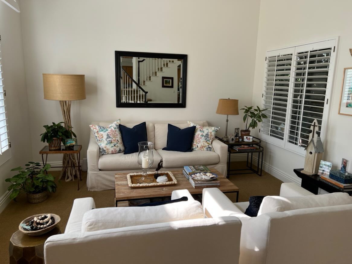
With this living room, the mirror just didn’t do anything for the space. It reflected just the stair and more white walls and the dark framed rectangle was a plain shape and style.
I suggested she go with art on this wall above the sofa and then do some ceramic lamps with some of the navy color she has in the pillows. That will add some more life to this room.
I like the matching lamps here with white shades to look crisp. The burlap colored shades work with the neutral rug, but they just look a little drab here. A new, heavier looking end table for the left side would work best with the ceramic lamp.
She could bring in other colors as well, but I think she needs to use art instead of a mirror, for sure.
If you’re still having problems, head to my shop to check out my Wall Decor Guide. I’ve got so many great examples like these that share good solutions so you will never be in doubt of what to do with your blank walls!


