I loved getting to weigh in on how to finish up these contemporary, luxury rooms in my recent Instagram Q and A. These were two different homes, one concerned the dining room and the other, the entry hall.
These were both new homes, both homeowners had recently moved in and were adjusting their existing furniture to work in the new spaces.
Both had questions about how their existing furniture would work and how they could “finish off” these spaces.
My blog contains affiliate links. Any purchases, at no additional charge to you, render me a small percentage, are most appreciated and make this blog possible. :-)
Contemporary Entry Hall
This entry hall needed some more pieces, but the homeowner had this gray sofa. She wanted to know if it would work here and what else might be needed to finish off this space. She was worried it was too big or just not appropriate here.
The rug was going, by the way, so ignore that.
Contemporary entry hall with sofa - Instagram Q&A | carlaaston.com
Contemporary Entry Hall - Instagram Q&A | carlaaston.com
It probably wouldn’t have been my first choice piece of furniture here, but I actually think it works. This is big entry hall and there is plenty of room for it. It has a low back so it doesn’t impede the view to the courtyard. It’s upholstered in a solid charcoal gray and contemporary, so the style and color work fine.
I would use it and just add a few more items to fill out the room.
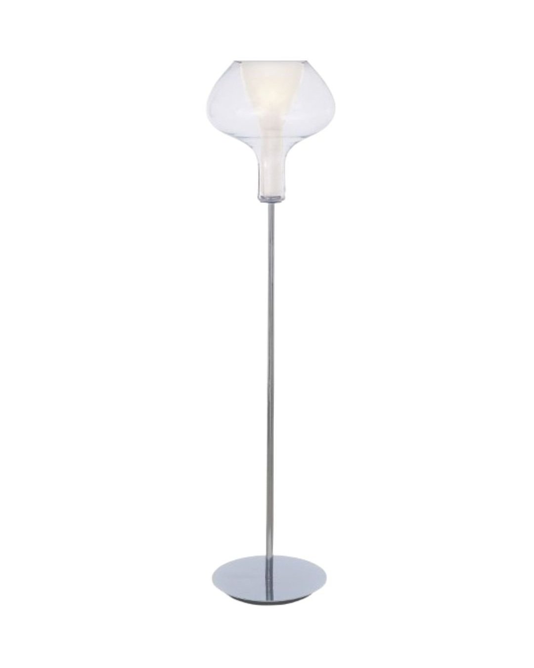
Two torchiere type fixtures, these modern look floor lamps from George Kovaks will work. The shade is glass and see-through, so it doesn’t get in the way visually and the shape resembles the modern chandelier. I’d do one on each side of the sofa.
Then I’d do a long patterned lumbar pillow, to accentuate that long, low bench-like look. A new bold, graphic runner that is not tucked under the sofa and then a vertical piece of art on the wall is all you really need in this minimalist entry.
Sketch - How to Finish Off These Two Contemporary Rooms - Instagram Q&A, Entry Hall | carlaaston.com
Contemporary Dining Room with Transitional Furniture
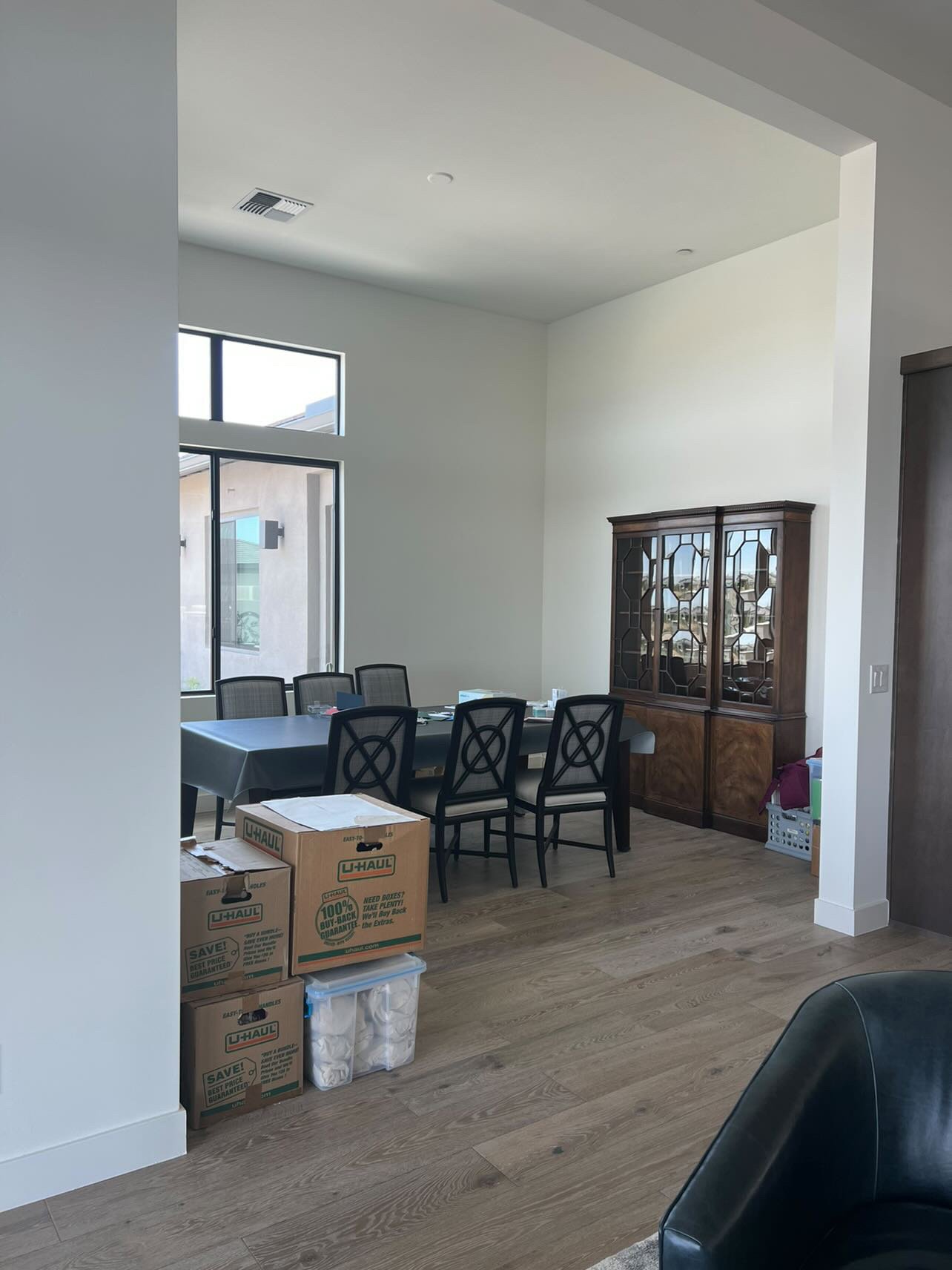
This homeowner just moved in and they are using the study or home office room (off the kitchen here) as the dining space. The intending dining room was out in the open area by the kitchen, but they chose to put a club chair seating grouping there. I like that idea here!
I especially like the dining room in that alcove. It will be even more dramatic that way.
She wants to reuse her existing transitional furniture if possible. The space is really clean lined, so she was wondering if she could add wallpaper and a neat chandelier or something to finish it off and make it feel intentionally designed.
I would not do wallpaper on the walls, as there is no trim around the door opening or windows, and I like using that trimwork typically to die the wallcovering into. Otherwise you have wallpaper ending on an outside corner and it might start peeling up on the edges, etc. It just really looks unfinished installed that way to me.
I also like to do some kind of crown or trim at the ceiling too when I spec wallcovering.
Contemporary dining room with transitional furniture - How to finish this room off? - Instagram Q&A | carlaaston.com
Contemporary dining room with transitional furniture - How to finish this room off? - Instagram Q&A | carlaaston.com
Contemporary dining room with transitional furniture - How to finish this room off? - Instagram Q&A | carlaaston.com
I would, however, do wallpaper on the ceiling here. I’d go with a metallic finish wallpaper to reflect some light and create some drama. I would also frame out the ceiling edge with about a 8-9” wide flat trim (painted to match the dark walls), to create a finished look.
A modern ceiling medallion would work too, to make that ceiling more interesting and create a more substantial center in the room. That large orb light fixture makes a statement and rides the fence on style, not too trad, not too contemporary. I like the 48” diameter large version in the Dark Smoke finish.
I’d paint those walls dark gray, so that when painted, the walls blend with the window frames. You will turn that dark gray color into the window opening to the black frame, so that will just all read together. (It won’t look odd either, from the exterior.)
Some silk sheer drapery, a graphic rug and reupholstering the chairs will go a long way into making this space feel designed with intention.
Sketch - How to Finish Off These Two Contemporary Rooms - Instagram Q&A , Dining Room | carlaaston.com
A little decorating above the cabinets with some large modern vases will add height to the existing cabinet. A sculpture pedestal in the corner will fill that space and make a beautiful artistic statement.
Lastly, a bold rug will finish off the space with a modern element added into the room.
Final touches for a contemporary dining room with transitional furniture. carlaaston.com
Can’t you just see a bold rug like this one from Kyle Bunting? It’s called Everlong.
Bold, graphic rug for contemporary dining room makes a big statement. carlaaston.com
I’d say these homes were well on their way to feeling ready for some chic, luxurious living!
See more of my Epic Instagram Q&A sessions below!


This is something people struggle with a bit in decorating bedrooms, how to fill those empty corners. You may not need dressers or extra furniture, but it definitely doesn’t feel complete or designed. Need some ideas for those corners of your bedroom? Click through to see more…..