The before and after pics of this laundry room makeover will have you doing a double take, I’m sure!
This was a Designed in a Click consultation I did a few years ago.
I don’t often get the after pics sent to me, as sometimes people take time to complete their job or sometimes they just don’t share those. :-(
I love it when they do though, and I’m excited to share these before and after pics with you today.
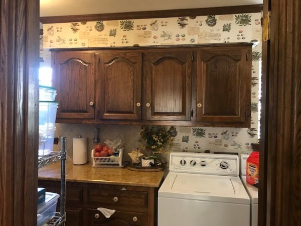
Do you remember this laundry room before pic?
BEFORE PIC - Laundry room to be remodeled #laundryroom #laundryroomideas
BEFORE PIC - Laundry room to be remodeled #laundryroom #laundryroomideas
BEFORE PIC - Laundry room to be remodeled #laundryroom #laundryroomideas
This homeowner was ready to remodel.
She was already doing cabinets to the ceiling, as I’ve mentioned I love many times on this blog. However, because of window placement and how the upper cabinets didn’t align with the lowers, she didn’t know what to do about the backsplash.
So, I encouraged her to tile the whole wall, behind the washer dryer and to the ceiling.
Here’s the Designed in a Click advice I gave her for this backsplash dilemma.
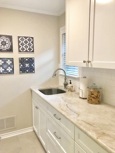
She didn’t go to the ceiling with the tile, but she did go behind the washer/dryer, which ended up looking great!
See how you can see right in to the space between the washer and the lower cabinet? That was one of the issues she had, because it was directly visible from the door.
She also decided not to tile the side splash, which is nice. I prefer that, but she had mentioned that it was a place where there was lots of splash and needed protection.
So, here are the after photos. I think she did a great job!
Laundry room makeover with Taj Mahal countertops, white subway tile backsplash and white cabinets to the ceiling | Designed in a Click Consultation #laundryroom #laundryroomideas
Laundry room makeover with Taj Mahal countertops, white subway tile backsplash and white cabinets to the ceiling | Designed in a Click Consultation #laundryroom #laundryroomideas
Laundry room makeover with Taj Mahal countertops, white subway tile backsplash and white cabinets to the ceiling | Designed in a Click Consultation #laundryroom #laundryroomideas
Where to end the backsplash? A quick email design consultation renders great results for this laundry room makeover! #laundryroom #laundryroomideas #tilebacksplash
White subway tile looks so good with white washers and dryers. It just looks so clean.
I know I wouldn’t mind doing laundry here!
If YOU need a quick Q&A consultation for a specific problem, like this homeowner did, you can check out this design service right here! :-)
Pin this to Pinterest to save this design solution and another great before and after!


I had a recent Designed in a Click Q and A with a reader of my blog about her laundry room backsplash. She wanted to know, when she remodeled, where and how to end it. There was just no apparent solution at all.