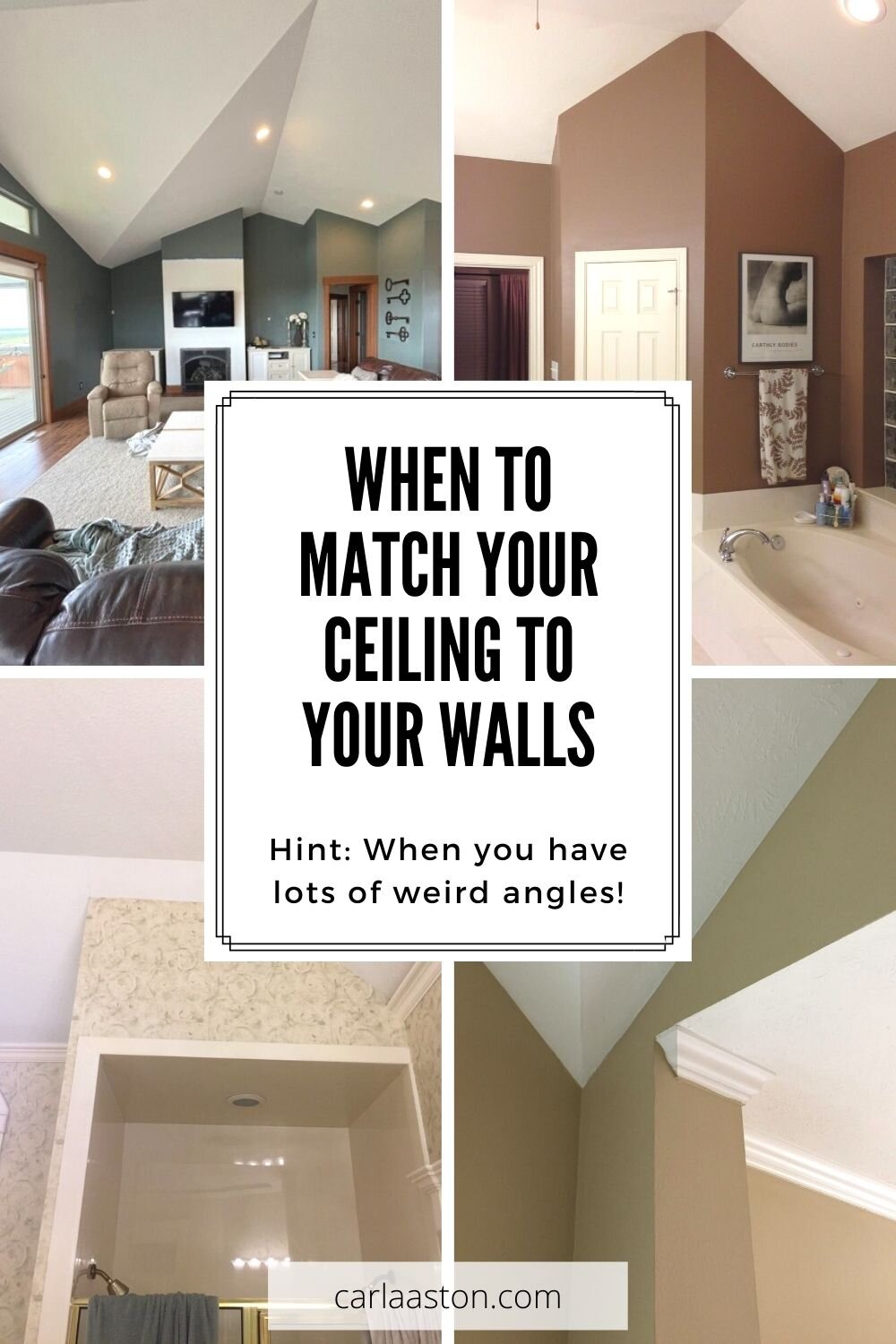
When is it a good idea to match your ceiling to your walls with the paint color, wallpaper, or finish?
I recently had a design consultation and it brought to mind a situation that I’ve mentioned in various blogposts about paint colors for walls and ceilings here, but failed to sort of give it the real attention it deserved.
This is a big deal to the overall look of the room and often, I find people can commonly overlook.
Angled Walls and Ceilings can Create Odd Lines Around the room
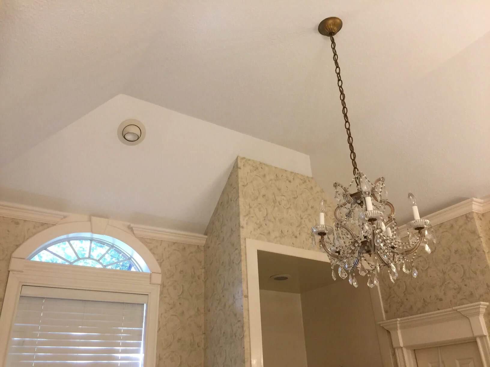
I went on a consultation several years ago where the bathroom had all these weird angles around the perimeter of the room where the walls met the ceiling. The walls were wallpapered and even had a crown moulding on some sections. There were awkward and irregular transitions everywhere.
When is it best to match the wall color with the ceiling? In situations like this, with a ceiling with lots of angles and irregular shapes. carlaaston.com
The fact that the walls and ceilings were different finishes really accentuated all that and broke up the envelope of the room. It really looked poorly conceived and designed.
This bathroom had lots of angles at the ceiling, so accentuating that break between walls and ceiling makes this room look rather chopped up. carlaaston.com
In this bathroom, I recommended that they remove the crown moulding and wallpaper and paint the walls and ceilings all the same. I wanted to have them decrease the attention that was put on all those angles and then focus instead on some beautiful tile that would be used in the shower and on the tub wall.
More angled ceiling creating unusual lines at perimeter of room
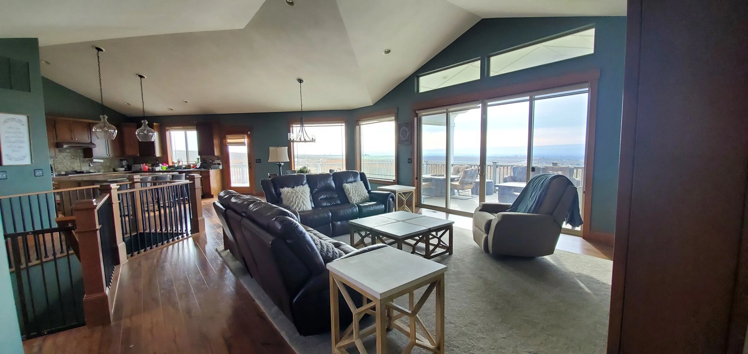
This recent consultation with a large kitchen and family room, there was a similar situation, with angles around the perimeter of the room at the ceiling.
These blue/green walls are a bit distracting with the angled ceiling. carlaaston.com
She liked the color but wanted a lighter space overall and was wondering about painting the cabinets.
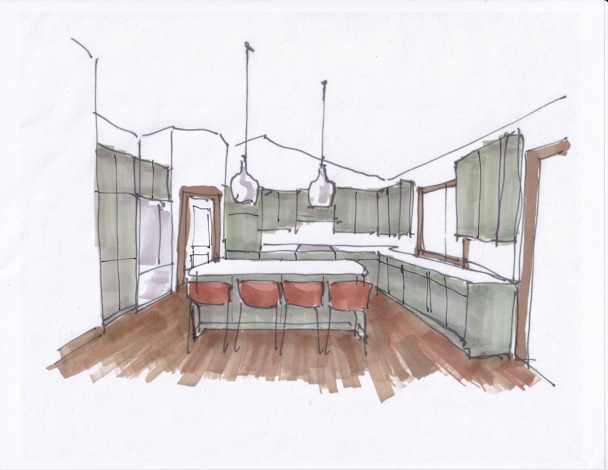
With so much ceiling in this space and all the angles, making the envelope all one light color would create a more simple envelope. Doing the cabinetry in the green, bolder color, will give a strong color statement but keep the room more cohesive in terms of overall look. carlaaston.com
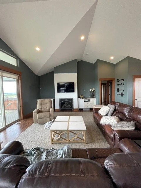
Angled ceilings in this living room are accentuated with dark walls and light ceilings. carlaaston.com
I totally agreed with her ideas, bringing color to the cabinetry in the kitchen and keeping the walls and ceiling the same color for a more cohesive and lighter look.
I also liked the idea of a white countertops and splash to freshen up the darker look and relate the light envelope to the finishes in this kitchen space.
Green on the cabinets would make a color statement, while white walls and ceiling would meld together to make a seamless envelope. Bringing white down to the countertops and backsplash would also brighten this kitchen.
Contrasting wall color creates odd lines at angled ceiling
Here’s another angled ceiling situation where making the walls and ceiling the same color helped create an illusion of a bigger space and more cohesive overall look.
BEFORE - The wall color was considerably darker than the ceiling and the odd crown ending there accentuated that even more. carlaaston.com
AFTER - We removed the crown and then painted everything a soft white in this instance, to keep those harsh angles from dominating the space. carlaaston.com
Here’s another case where creating high contrast between walls and ceilings in an angled wall situation is distracting to the eye and doesn’t really enhance the look of the room. Better to keep the whole envelope one color and create contrast within the space with other elements.
The high contrast here between the walls and angled ceiling is unsettling and distracting. Better to have a simple, continuous color for the envelope and create contrast elsewhere in the space to add interest. | carlaaston.com
Often people go with white walls in these situations because they are a little shy of doing color on the ceiling. If you want color in the space, then you can add it vertically in the room with window treatments, cabinetry and of course, wall decor.
Need more tips on selecting paint colors for your home? Click the easy button right here to get your copy of my guide to help you with your big paint color decisions. For sale for only $15!
Pin this image below to Pinterest, to save for later reference!
When to match your ceiling color to your walls……Hint: When you lots of weird angles! See more examples by clicking throught! carlaaston.com


