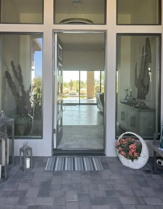
Here’s a recent consultation where a foyer / entry hall needed a more finished look. The homeowner had recently moved in and wanted some direction on how to make it feel more designed.
I love challenges like this!
My blog contains affiliate links. Any purchases, at no additional charge to you, render me a small percentage, are most appreciated and make this blog possible. :-)
Here are her pics:
Front door looking into entry from outside.
Console must stay here.
Wall opposite console - These containers were just a little too chocolate brown. We have enough of that here now.
Looking back into entry from living room.
We Need Color and Warmth
The first thing that hit me is that is was really plain and that the gray wood console with the brown floors had everything looking just too neutral. I felt it really needed some color and warmth.
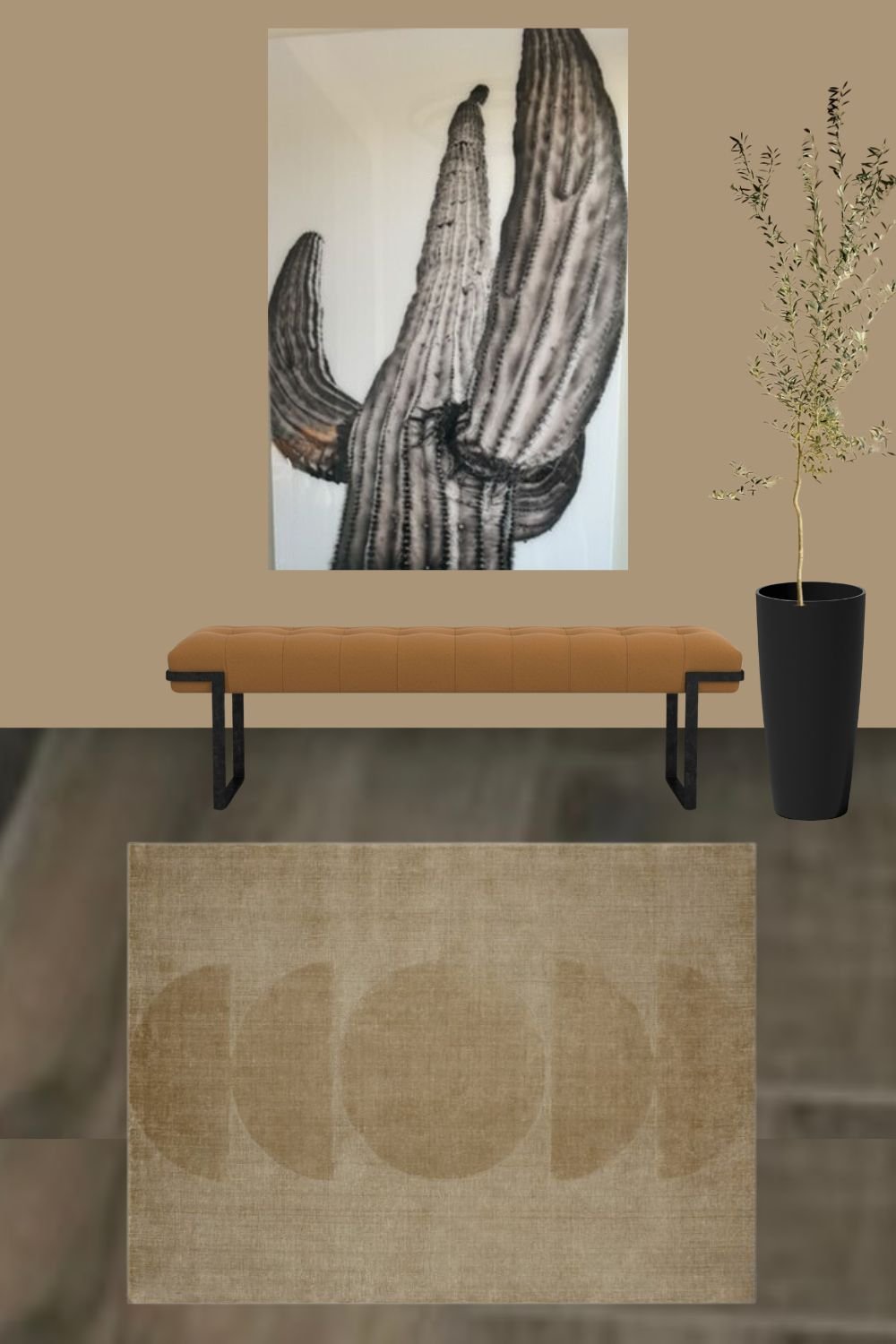
The console was staying, but I thought the graphic art would be better on the opposite wall, above a bench. I also thought that art would pop off the wall if it was a darker color, instead of the white.
I wanted to start with the rug, because, when it comes to color, that is always the best place to start.
After looking at all kinds of patterns, I decided something more solid might be a better choice here. I think it will be more elevated and definitely take the space in this new, warmer color direction. This home looks like a clean-lined modern home, so I thought the rug should emulate that.
Okay, I know this might be a surprise, but I really liked this as a wall color for the whole entry, front door and all. I’d like to have this color wrap that little room, SW Serengeti Grass.
Sherwin Williams Serengeti Grass, 9116
This color direction will turn that grayish toned wood into something richer, while still having a rather neutral vibe.
New Furnishings Items - Console Wall
The next items I wanted to tie down were the mirror and a lamp for the console. I played around with a lot of options using Canva, pulling in different lamps and mirror styles and finishes.
I landed on this mirror, with a brassy metal finish in a round shape. I love that this is a warm color and has a big frame part to the mirror.
Next, I wanted some contrast with a lamp. A black ceramic modern organic look will stand out on the painted wall color. This one is tall and I really like the shape of the shade. The white shade will stand out too, looking crisp and relating to the white interior in the next room.
In spite of these changes and additions so far, I felt like the cabinet itself was a little dull gray. I love these cabinet pulls, black with brass, I’ve used them on jobs before from Belwith Keeler. I would love to see them on this cabinet. (The Sinclair is fluted, the Ostia is smooth, but both have the black/brass combo.)
More accessories for the console are linked below.
Here is how this wall looks put together.
Console Wall - Foyer / Entry Hall Finished Look (warm up the gray finishes with a camel color) carlaaston.com
Art Wall
On the opposite wall, I want to put the art. The white background will stand out and relate to the white in the adjecnt living room and the lamp shade.
It needs a bench though, to fill out the space. I love something upholstered here, and this one with a modern, metal base works great.
I’d do a tall, slim, spare looking plant of some kind for height too, with a simple container. Here’s how that looks in a simple mock up.
I really like the idea of this little anteroom being a dark color, something unlike the rest of the house. Walking through an intimate space into something larger creates drama and has a wow effect, giving the destination a bigger impact. I think it is so nice to have it differentiated from the main part of the home.
Want some of this wow for your foyer or entry hall? You can shop it below!
See some of my past Q&A’s to see what a typical Designed in a Click™ service is like.
This blogpost was thoughtfully written by me, Carla Aston, and not by AI, ghostwriters, or guest posters.


This homeowner wants to know how to layout family photos in her long hallway wall, gallery style. I’m going to run through two ways I have done gallery walls, one with exacting measurements, and one with a more random approach.