Hey Design Lovers, I did some kitchen design tweaks for someone with a rather basic builder kitchen in a one of my recent Designed in a Click email consultations. I thought you might enjoy seeing these so I’m sharing them today with you!
There are always certain places I look to in a kitchen to upgrade with remodeling, aside from the typical countertops, backsplash and paint.
If you’ve read my blog for awhile, you know I look at the layout first to make sure we won’t be putting lipstick on a pig. I want to make sure a partial remodel will get the homeowner to a place where they will love their redo and not just sort of tolerate it. I don’t want to put good money on top of a problem that really needs to be fixed. :-)
My blog contains affiliate links. Any purchases, at no additional charge to you, render me a small percentage, are most appreciated and make this blog possible. :-)
First, determine if a few design tweaks in your kitchen will suffice.
For example, in this kitchen design consultation, I told the homeowner to not do anything to her kitchen until she fixed the big problem in the room as she would be wasting money camouflaging that with only new paint and finishes.
If you can only do a partial remodel and there is a major design flaw that takes more money to be fixed, then I think you should wait and do it when you can afford to take care of it properly.
However, many times partial remodels are just my jam. Although I love to rip out and start new, it is rather amazing the results you can get from a partial kitchen makeover.
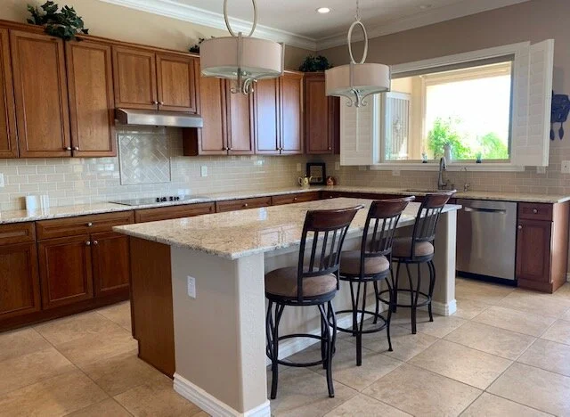
Here was the kitchen that needed a little upgrade.
The floor and cabinetry had to stay, she was thinking of painting or resurfacing the cabinets. The countertop and splash had been done 6 years ago and she didn’t want to redo those either.
She was considering what I always like to consider as a key place to tweak the design in a kitchen remodel, the hood!
Anything above the countertops usually gets much more attention in a kitchen than what is going on below, so make the vertical surface at eye level something nice to see. :-)
That is exactly what this kitchen needed, a focal point…..something interesting that added height and contrast.
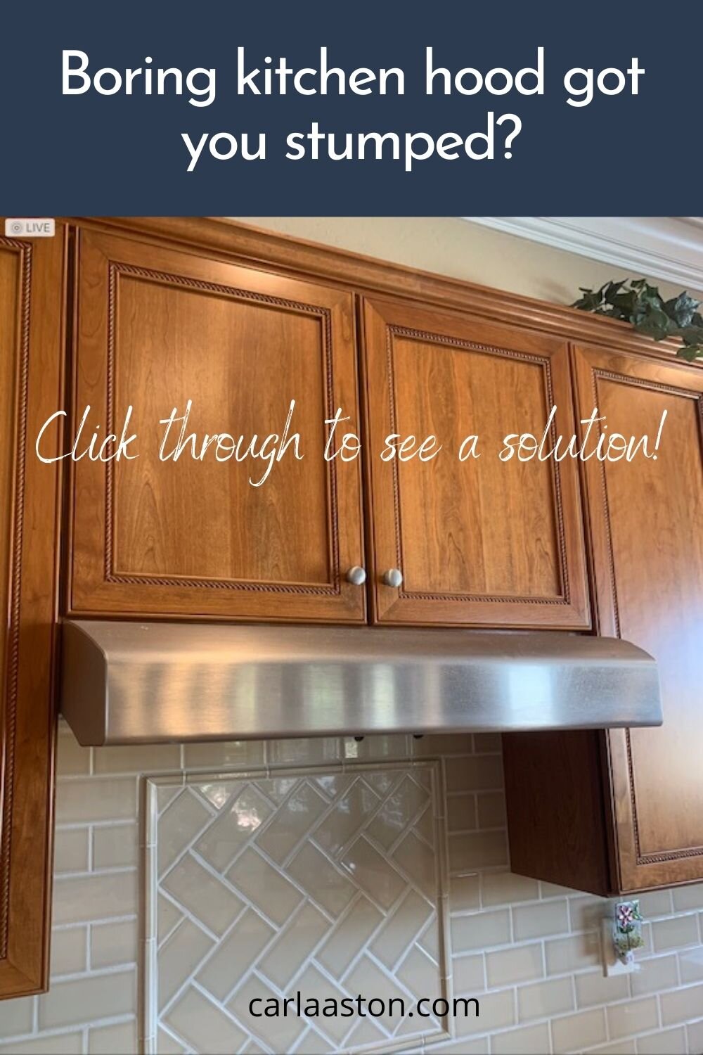
Here’s a close-up of the existing hood.
Existing hood up for a redesign in this partial kitchen remodel. carlaaston.com
With box cabinets, each box is mounted to the wall and can be separated from the cabinets on either side very easily, after you remove the crown.
The crown is usually just installed with little finishing nails so it is easily removed and then can be cut to fit whatever new situation you are creating.
In this case, I would cut it to return on both sides to the wall because the new hood has a nice curve to the side walls and will be made to go all the way to the ceiling! I love adding the height and a prominent feature. :-)
A kitchen update with a new hood, paint, cabinet pulls, lighting and some counterstools will go a long way in this kitchen! carlaaston.com
I advised her to go for a two tone kitchen with the hood and island going a darker gray and then a creamy white for the rest of the cabinets. Adding some new brassy hardware will work nicely with the brass finishes on the hood straps and the new pendant lighting over the island.
However, there’s something else that needs to be addressed.
That sheetrock wall on half the island.
I felt that island needed as much of an upgrade as the hood.
Since she had ample room around the island and decent overhang on the countertop edge, I felt she could have a carpenter come in and panel all 3 exposed sides so that it would read as a whole entire cabinet piece.
Something like this sketch, below.
Partial Kitchen Makeover Sketch - Some new paneling around the island, a new hood, pendant light fixtures and paint will make this kitchen look brand new! carlaaston.com
Some new counterstools will finish off the look and can be added in whenever the budget allows.
I love the contrasting dark gray as it will break up the beige color from the floor and make that hood stand out nicely with its special details.
I can’t wait to see the finished photos!
Shop This Post:
See More Partial Kitchen Remodels!
Pin these images below to Pinterest to save this for reference later!


This kitchen isn’t bad, but it isn’t what the homeowners want. The biggest complaint was how dark this kitchen really was.
(These are real estate photos, btw, so they are brightened up considerably more than how this kitchen looks in real life. :-( You know what I mean here.)
Come and see how this kitchen can become a more traditional, homey style and lightened up for a more enjoyable space.