I am sharing one of my recent email consultations today, a kitchen to be remodeled to a more sophisticated southwestern style.
The homeowner was a bit puzzled about where to spend those remodeling dollars, what would make the biggest impact, etc. You know, where to splurge and where to hold back.
Here were her kitchen design dilemmas.
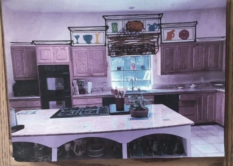
“My dilemma is my kitchen. It is dated with honey oak cabinets, beige/pink rustic tile, Madura Gold granite, 2 brick walls in dining area of kitchen and plaster walls. All these elements are in good shape and layout of kitchen is fine.
Rustic tile is in other areas of home so probably needs to stay. I have dark hardwood floors in adjacent LR. Colorist consultant suggests SW Rivers Edge for all these contiguous rooms as a paint color including kitchen. I am doing an "updated sophisticated southwest" in the rest of my home so having the kitchen be more rustic with wood cabs, rustic tile is okay with me.”
Kitchen to be partially remodeled in an updated, sophisticated, southwestern style. carlaaston.com
Kitchen to be partially remodeled in an updated, sophisticated, southwestern style. carlaaston.com
Kitchen to be partially remodeled in an updated, sophisticated, southwestern style. carlaaston.com
There were budget constraints, so I knew they couldn’t gut it all and start over. The good news was this it was a nice, big kitchen with high ceilings a great layout that worked.
Her questions were mostly about paint (she was considering SW Urbane Bronze and BM Cloud White). She also wanted to address the island by extending it for some seating in front, the backsplash, and what to do above the cabinetry in the big blank space above the uppers.
Here was the idea she was considering for that space with some stair stepped open boxed shelving.
Kitchen to be partially remodeled in an updated, sophisticated, southwestern style. carlaaston.com
After reviewing the whole kitchen and understanding her goals, here was the direction I gave her.
Kitchen Design Plan
I would love to see you make a bigger investment here than I think you are considering, adding on to the cabinets for taller cabinetry overall. You could do glass doors up there to show off your dishes and glassware that you now have at the island.
I’m not seeing that kind of stair-stepped type look much these days and I’ve actually written a post about cabinets with varying heights before as not really being on trend now.
Here's what I'd do, if you can grow your budget to accommodate it all.
Kitchen Cabinetry Changes
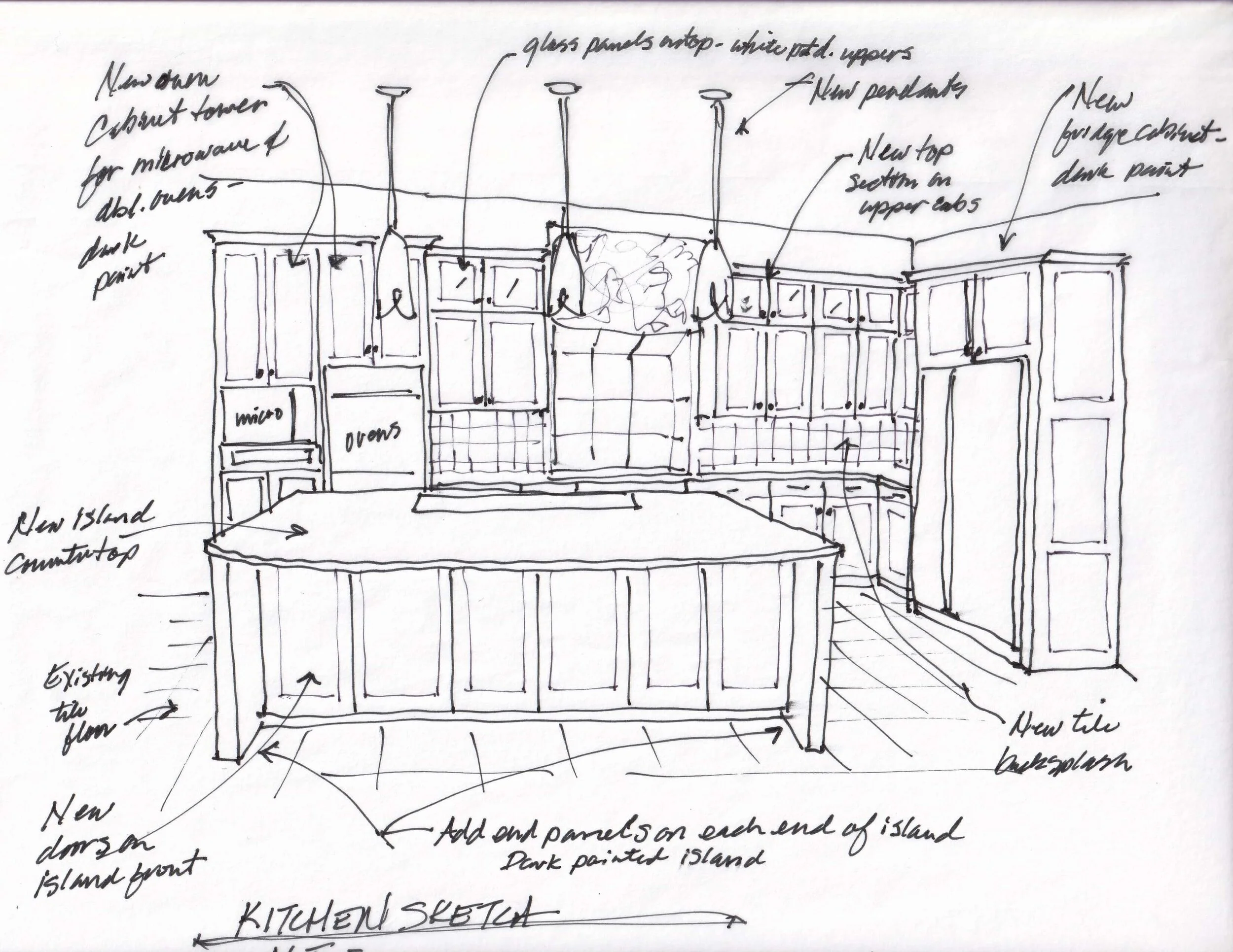
Remove the oven cabinet, the cabinet just to the side of the oven with the microwave there, and the fridge cabinet. Get new taller cabinet “towers” there to align with an extra upper section of cabinetry that you can add on top of your existing uppers. Do a small crown on top of all that cabinetry to tie it all together. I have a sketch, attached.
Add glass panel doors on the added box cabinets on top of the existing upper cabinets. The cabinets don't have to go all the way to the ceiling, another 2' will extend the height visually and give you some great extra storage and display space. The two taller sections with the ovens and fridge will bookend the other divided cabinets and feel intentionally designed.
You can add a window valance at the window to add height and some color and pattern there. It will also make the window feel taller.
I'd do new cabinet doors on the existing uppers, using a panel that is not arched, but straight, on all the uppers. The lowers can remain as is.
Add doors to the open cabinetry at the island and extend the bar beyond the cabinets, to accommodate counterstools there. I would add end panels to support the bar extension and make the island read as if it was originally designed this way.
Kitchen Countertops And Backsplash
I'd do a new countertop on the island for sure, you’ll have to, to extend the bar. You could look for a soapstone or for maybe a leathered Ubatuba granite to save money. Any leathered or satin type finish is in style these days.
You could go light with the countertop, but likely would be more pricey with something like quartzite or a quartz. Granite is really the least costly product for counters for a stone or stone like surface. If you can redo all the countertops in this same material, I would do that for a completely new refresh.
I like the idea of a new Zellige tile backsplash in a warm white to match the upper cabinets. It has a nice, handmade quality and is perfect for a southwestern vibe. Do not do a short slab backsplash there and top with tile, take the tile all the way from the countertop to the underside of the cabinetry.
Here’s an example of a Zellige backsplash in a similar type kitchen remodel that I consulted on before.
Here is a sketch of the cabinetry, countertop and tile changes discussed so far. I think it looks more appropriate for the space and intentionally designed as a new kitchen, doesn’t it?
Design plan sketch showing new cabinetry additions. carlaaston.com
Paint Colors
Paint all the lower cabinets, in Urbane Bronze, or some kind of really dark blackish color. I like the dark color contrasting with the floor here.
Paint the island and the two new towers the dark color too, Urbane Bronze, then paint all the existing uppers and their new top sections a white to match the wall.
You might want to update with new stainless appliances someday. For now though, with the dark color on those new cabinet towers, the black appliances will work fine.
Note: The darker color on those cabinets will sort of camouflage the black appliances. :-)
As far as the white color for the upper cabinets, I'd look to go a warm white. I'd probably go lighter overall with a paint color on the walls in the rest of the home too, just so it all feels more current and up to date.
SW Aesthetic White is a great color that typically works with a floor like yours. I used it all over my house on walls, trim, ceiling and on my kitchen cabinets too. I think you could find a nice Zellige tile that would work with that color, but by all means, start with the tile first, and key off that. Make sure it works well with your floor tile overall color.
I do think that SW Aesthetic White would work well with your brick too. I don't think you need to paint the wood bi-fold doors or their trim, on the brick wall. You can leave those, they go with the rustic look over there and they feel like an accent, so they don’t need to match your other door finishes.
I would paint the trim (in the kitchen at least) the white to match the cabinets and then either leave the doors on the other wall the wood or paint them the dark Urbane Bronze color. Definitely paint the trim around those doors the white color. The trim is small, so I would like to see it diminished in importance in the space.
New design plan sketch with color to show placement of lights and darks in the room. carlaaston.com
Desk Area
It doesn't look like you use the desk area as a desk much, and really, those are becoming a little outdated too. You might consider building new 36" high base cabinets there and adding a beverage fridge, many of my clients are adding those in their kitchens these days, they are really popular. It would work well with the wine rack you have.
Pic of desk area in kitchen
Existing desk area in the kitchen which doesn’t appear to be used much. carlaaston.com
You could do a new countertop there and then I'd put new doors on the open upper shelving. I'd paint all this cabinetry the dark color here, to make it feel different. You don't have to add to the uppers here, if it all goes dark, it doesn't really have to match the other upper cabinetry. I'd rather see you do the taller base cabinets and cover the clutter with the doors. Then, you can decorate above the cabinet there with some large baskets or demijohns.
If you could find a light colored remnant stone piece for the countertop here, that would be nice to break up the dark uppers and lowers. I would match it with the tile backsplash color. This is really a different area, it relates to the kitchen, but doesn’t have to match exactly.
Lighting
One last item to consider are some pendants over the island. I'm doing these pendants in the smoke finish in a warm toned kitchen now, and they are hefty in scale but have a nice organic feel. All handmade in Vermont. Really, many of this brand's pendants would work well here, if you want to consider some lighting over the island.
Here’s the before pic again and then my sketch with the design plan, below.
Kitchen to be remodeled in a sophisticated southwestern style. carlaaston.com
Kitchen design plan sketch - carlaaston.com
In summary:
While this whole redo was more than this homeowner had originally considered, I think this would really feel like a new kitchen and seem more intentionally designed than if they held back with some of these items.
I would love to see some lighter countertops, a quartzite like Taj Mahal with some warmth to it, perhaps. However, there is a lot of countertop in this kitchen so it would be a significant cost in the overall budget, likely close to $10,000 or maybe more. A leathered, brushed or honed granite would be a material cost savings, for sure.
Also, you have to be really careful when selecting a light countertop to go with a light floor that has a beige color tone to it. So often they can clash because the floor might tend to go more pink, as most tile like this was meant to resemble travertine.
And guess what? Travertine can definitely go more pink!
Check out how we went dark with the counters in this kitchen, because the travertine floor that ran throughout the downstairs open area of the home and that we had to work with, went pink. All the light colored stones I found did not look good with it, at all!
Keep this in mind when doing a partial kitchen remodel
It’s really important to bring everything up to a certain level of finishing when remodeling. Don’t leave the elephant in the room or something that telegraphs its past life or you might be disappointed even if you spend a lot of money.
Sometimes you are so close to the project that getting another pair of eyes on it can give you clarification and direction. There are lots of design options these days out there to explore to get some help for your project. Design advice, like my Designed in a Click email consultation, has never been more plentiful or accessible at varying price points.
I’m hopeful she will go all in and send me pics when done! :-)
Pin this image below to Pinterest to save for later reference!


