One of the highlights of KBIS for me, every year, is attending these home tours, The New American Remodel and The New American Home.
Sponsored by IBS, The International Builders Show, which runs at the same time with KBIS (kitchen and bath show), these homes are truly masterful recreations. They go all out to show off unique products, new building techniques, and share the expertise of the professionals involved.
This year the remodel home was designed by Phil Keane and engineered by Element Building Company.
Let’s take a look.
Floor tile flows outdoors from the interior to create a thin line of division between indoors and out in The New American Remodel. TNAR | #remodeling #remodel
One of the aspects of these houses that seems to always work so well, is the flow of the indoor/outdoor living spaces.
Glass sliding doors rule in this part of the US and it really helps to make a seamless experience. The back patio and yard feel completely part of the interior living space.
You can see the indoor / outdoor living spaces make for a great entertaining house. The New American Remodel TNAR | #remodeling #remodel
Open dining room and living room of The New American Remodel. TNAR | #remodeling #remodel #diningroom
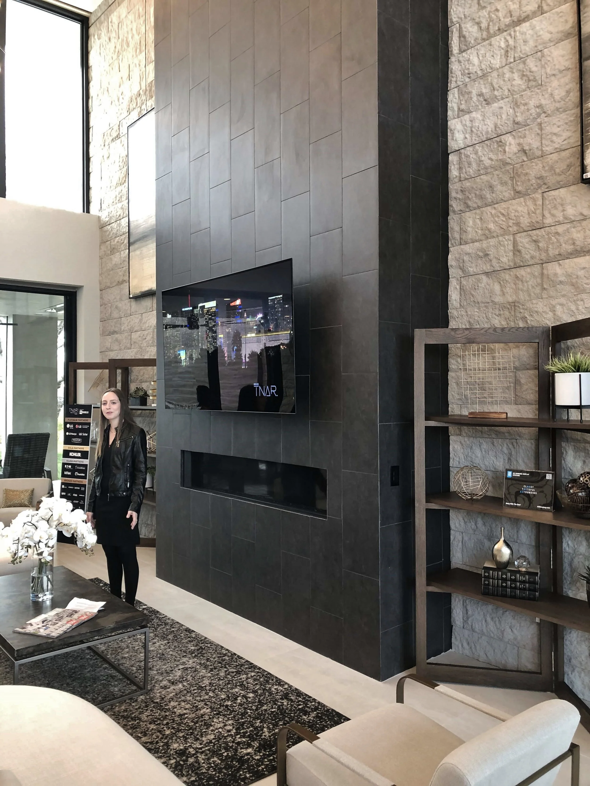
The tall black tiled modern fireplace provides a dramatic focal point and unites the upstairs open space with the first floor below.
Black tile makes for a strong vertical statement at the two story fireplace in The New American Remodel. TNAR | #remodeling #remodel
Kitchen, Bar, Laundry
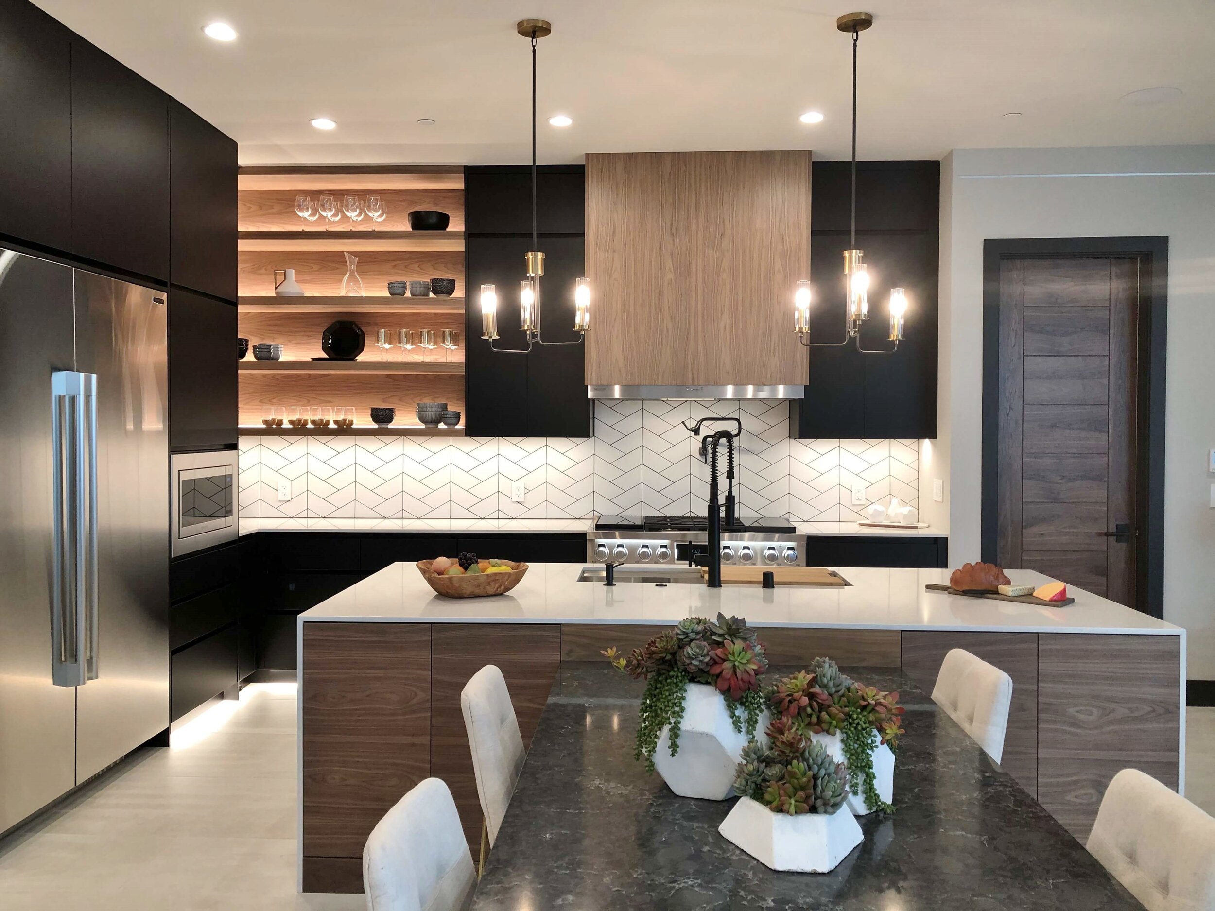
I took this photo, below, so you could see how the kitchen connects with the open living space. The black contemporary cabinets repeat the black monolithic fireplace and the introduction of wood at the hood and island make this space warm and relatable.
You could really have an amazing dinner party here, with the two dining areas positioned in this way.
Modern kitchen with lots of space for entertaining in The New American Remodel TNAR | #remodeling #remodel #kitchenideas #kitchendesign
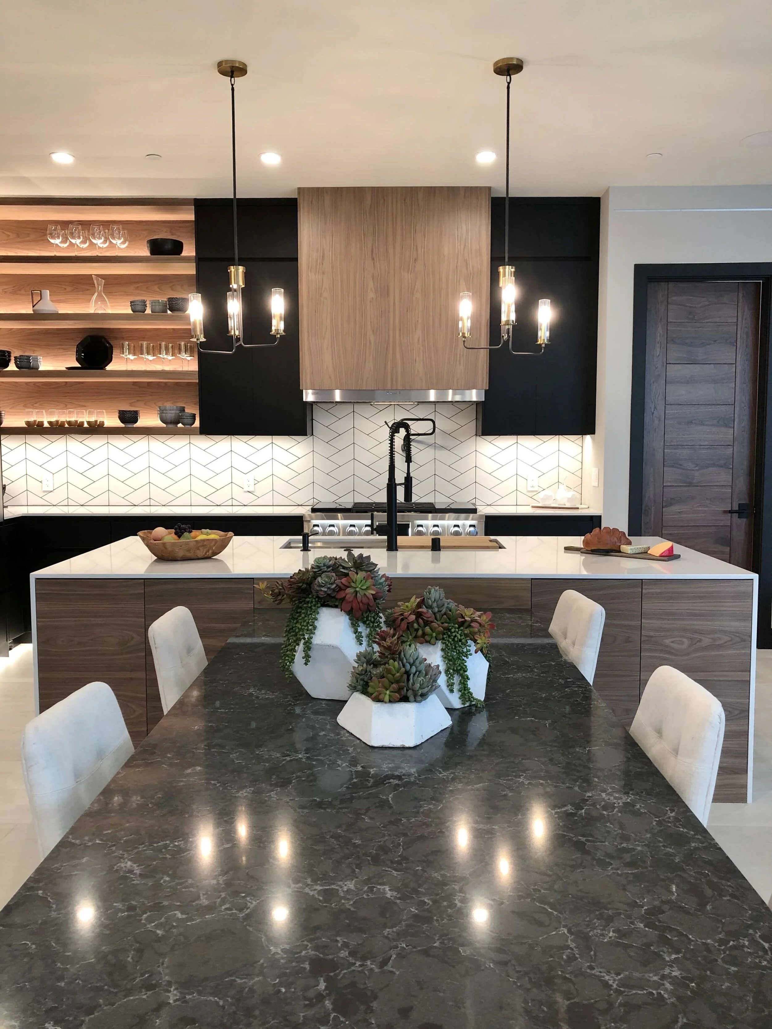
The built - in waterfall table attached to the island reaches out to the big dining table beyond. The New American Remodel TNAR | #remodeling #remodel #kitchenideas #kitchendesign
This fab layered sink from Kohler helps get so much more function in the sink. The New American Remodel TNAR | #remodeling #remodel #kitchenideas #kitchendesign
Warm wood shelves wrap the corner of this modern kitchen | The New American Remodel TNAR | #remodeling #remodel #kitchenideas #kitchendesign
I love this image the most of all I took here at this house. It’s just a really nice mix of all the materials in this house in one pretty silhouette.
The SKS Appliances range with sous vide cooking takes center stage under the contemporary wood venthood in this contemporary kitchen in The New American Remodel TNAR | #remodeling #remodel #kitchenideas #kitchendesign
This bar was tucked away around the corner. The wine fridge units from SKS Appliances line the back wall. You can see more about SKS Appliances and their extreme devotion to quality and innovation by checking out my visit to Napa to their gorgeous design center.
The wine bar in The New American Remodel TNAR | #remodeling #remodel #winebar #winebarideas
This rack makes for an interesting display of bottles. Great bar space for entertaining. The New American Remodel TNAR | #remodeling #remodel #winebar #winebarideas
Just beyond the wine bar area was the laundry room with my favorite appliance I’d love to have someday, the LG Styler.
The LG Styler built in the laundry room of The New American Remodel. TNAR | #remodeling #remodel #laundryroom
Master Suite
On the opposite side of the living room from the kitchen was the master suite.
I always love seeing the bathrooms in these homes, as I don’t often get to design in more contemporary style like this.
Here’s the master bath with a dramatic black chevron tiled wall and floating, lit mirrors. Check out the brass and black finish combination on the lighting. I saw that finish pop up repeatedly when I was at Dallas Market and Lightovation earlier this month.
Long vanity with tile wall and floating lit mirrors in The New American Remodel. TNAR | #remodeling #remodel #masterbathideas
The master bath tub was placed in the large shower, I’m seeing this more and more often these days. (A good way to handle overspray with a wand used at the tub!)
The lit mirrors are reflecting in the glass shower enclosure, so it’s a little hard to read here.
Free standing tub placed in large shower stall in The New American Remodel. TNAR | #remodeling #remodel #masterbathideas
Free standing tub placed in large shower stall in The New American Remodel. TNAR | #remodeling #remodel #masterbathideas
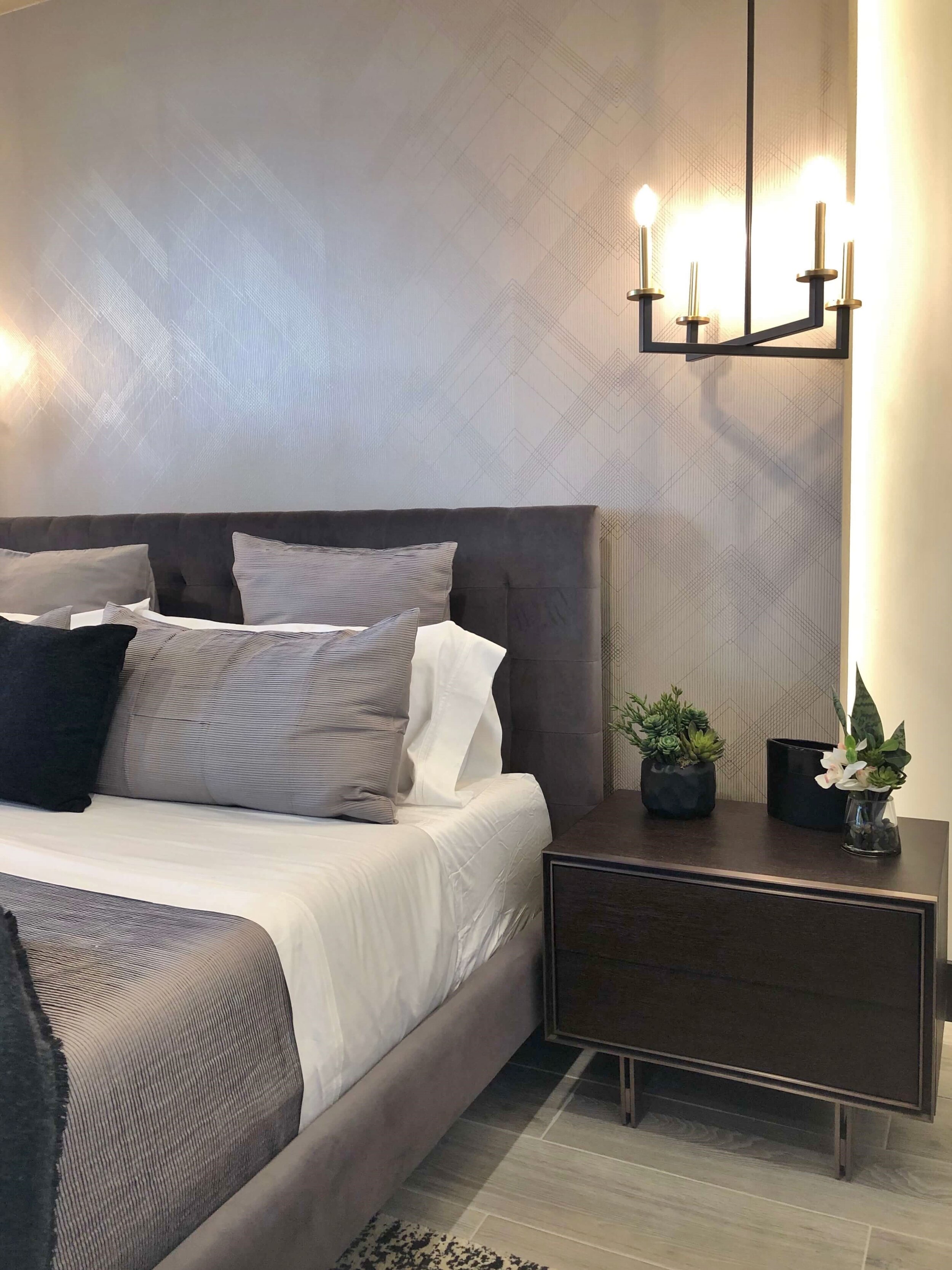
The master bedroom had an interesting wallcovering wrapping a dummy wall that was lit from behind. The New American Remodel TNAR | #remodeling #remodel #graybedroom
Upstairs Rooms
View of the open stair with its steel structure exposed. The touch of wood at the railing helps warm all this up.
This view is looking back on the dramatic stair and entry, from the dining table. The New American Remodel TNAR | #remodeling #remodel #contemporarystair
The space over the master suite was a covered patio/balcony, with more outdoor living.
Phantom screens covered the open areas, to make this space usable any time of year. The New American Remodel TNAR | #remodeling #remodel #balcony
The bathrooms for the upstairs bedrooms had tiled walls with floating mirrors, similar in concept to the master.
I really loved this idea of two faucets with a single extra wide sink. Perfect for a shared bath but with a vanity that might not be wide enough for two sinks.
One extra wide sink with two faucets for dual use in a small vanity. The New American Remodel TNAR | #remodeling #remodel #bathroomdesign
Pendant lighting, tiled back wall with floating, lit mirror in the upstairs bathroom. The New American Remodel TNAR | #remodeling #remodel #bathroomdesign
I’ve always thought pendants were a good idea for vanity lighting and these prove they work beautifully.
Here’s one last look at the back patio area, with the pool, fountain and outdoor grill area beyond. I really like how built in space creates a U shape around the green.
Contemporary outdoor living oasis at The New American Remodel TNAR | #remodeling #remodel #outdoorliving #patio #pool #outdoorfirepit
Contemporary outdoor living oasis at The New American Remodel TNAR | #remodeling #remodel #outdoorliving #patio #pool #outdoorfirepit
Hmmmm, I wonder how much this home will go for this year? The one last year sold within one month of the show for $4.6 million!
If you missed that one, you can check it out here.


